What is the environmental impact of video game graphics?

Reading Time: 11 minutes

According to a study by Statista, the video game sector will generate over US$155 billion in revenues worldwide by 2021. This figure can be explained by the increase in the number of gaming platforms and the diversification of the types of games available to consumers, as well as by the democratization of the industry thanks to the emergence of free-to-play games. By 2022, video games will have attracted almost 1.8 billion players across the globe, transforming the entertainment experience into a social dimension and fostering the emergence of new sectors such as streaming and esports.

However, all these games, albeit virtual, are run on physical hardware, and therefore consume energy. This article presents and compares the energy consumption of different video games and their parameters. To find out how much energy these uses actually consume, we have chosen to evaluate the following video games: Assassin’s Creed Valhalla, Total War Warhammer III, Borderlands 3, Anno 1800 and War Thunder.

We have previously carried out a study on mobile games.

Selection and methodology

These video games were selected because they offer a benchmark. Using these benchmarks as measurement subjects ensures the replicability of our experimental protocol, while eliminating the human factor from the results.

A benchmark is a feature offered by the game that allows you to measure the performance of a system (entire PC), or one of its components (CPU, GPU, memory, etc.) according to a given scenario and selected parameters.

We’ve also taken care to represent several types of game mode, such as RPG (role-playing game), strategy or simulation.

We measured these video games on a PC with the following configuration:

  • Processor: i7 6700 
  • Memory: 32 Go RAM DDR4 
  • Graphics card: RTX 3060 12Go 

This equipment was supplied to us by OPP!, a company offering PC and Mac repair and maintenance services, as well as individual component sales.

The screen used is an LG E2441 with the following specifications:

  • Screen technology : LED 
  • Screen Size : 24” 
  • Resolution : 1920×1080 

We collected energy metrics using a measurement module connected to our Greenspector Studio software, plugged directly into the PC and monitor power supplies and connected to the mains socket.

Benchmarks were carried out in 2 different graphics configurations:

  • A configuration with maximum settings for the graphics offered by the game
  • A configuration with minimal settings for the graphics offered by the game

6 iterations were performed on each scenario to ensure reliable results.

Benchmarks last between 80 and 240 seconds. These variations do not affect the results presented.

Graphic evolution impacts power

Modern games incorporate higher-quality graphics with ultra-detailed textures, advanced visual effects such as dynamic lighting, real-time shadows and sophisticated particle effects. This graphical complexity requires considerable rendering and graphics processing capabilities.

Gamers are also increasingly opting for high display resolutions for an optimal visual experience. This puts extra pressure on the GPU (Graphics Processing Unit) to render detailed images at ultra-high resolutions.

These GPUs have increasing energy consumption with each new generation, as shown below for NVDIA:

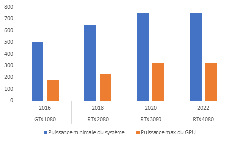
Evolution of minimum system power and maximum GPU power by GPU release date

Developers exploit advanced rendering techniques such as ray tracing to realistically simulate the behavior of light in virtual environments. Although these techniques offer an unprecedented level of realism, they are computationally intensive and require high-end GPUs.

Consumption differences depending on settings

Measurements of average PC power on the lowest and highest graphics configurations for each game show a wide disparity between them.

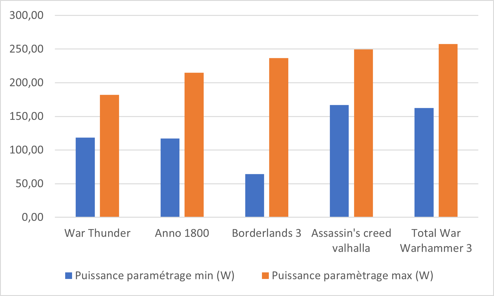
Total PC power at minimum or maximum setting

Switching from the maximum settings to the lowest settings offered by each game results in a measured power reduction of 45% on average. In the case of Borderlands 3, a power gain of 72% can even be observed.

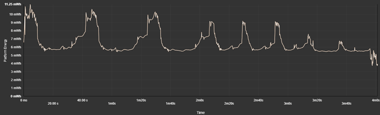
In Anno 1800, the benchmark is a panoramic aerial view of the game’s map. This sequence highlights details of the game world, such as landscapes, iconic buildings and animations of everyday life.

Below are graphs of one iteration measured with maximum parameterization and another iteration with minimum parameterization. The benchmark sweeps over the city from its zoomed-in aerial viewpoint at the start, then the same trajectory is repeated 8 times with increasingly higher viewpoints, which explains the 8 peaks on the graph.

Here, we can easily see the significant difference between the 2 parameter levels. On the two different settings, we can see first of all that the further the camera is from the city, the more the power is reduced, given the increasingly short time of the scenario.

What’s more, when the game is set to maximum, power consumption is at its peak for almost the entire duration of the scenario, whereas measurements taken with the lowest setting show lower and shorter power peaks.

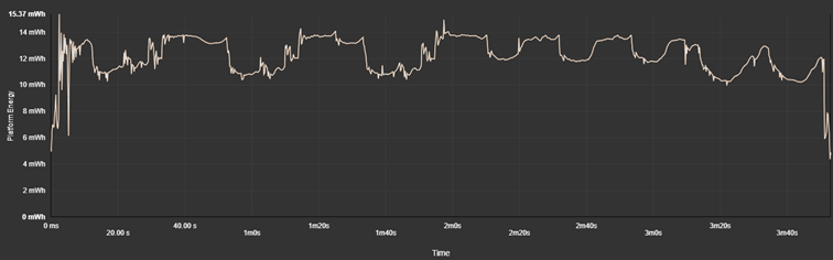
Anno 1800 benchmark power consumption with maximum settings

Anno 1800 benchmark power consumption with minimum settings

A Statista survey conducted in December 2023 revealed that 22% of US adults aged 18 to 29 spent six to ten hours a week playing video games. Overall, respondents in this age group were also more likely than others to be avid gamers, as a total of 8% played video games for more than 20 hours a week on average.

These figures enable us to evaluate overall energy consumption over the usage times of different types of players, in the case where the benchmark is representative of game consumption. Energy consumption has been projected with measurements taken on the minimum and maximum settings of each game.

The average consumption for one hour of play at minimum settings is 0.168 kWh, and 0.254 kWh at maximum settings. These results are higher than those of the European study on the environmental impact of digital services. The latter shows a consumption of 0.137 kWh for one hour of PC gaming at medium resolution.

 Energy consumption over 6 hours of play (Wh)Energy consumption over 10h of play (Wh)Energy consumption over 20h of play (Wh)
SettingsMin Max Min Max Min Max 
War Thunder 1469,70 1460,78 2449,50 2434,64 4899,00 4869,28 
Anno 1800 843,26 1352,27 1405,43 2253,78 2810,86 4507,56 
Borderlands 522,33 1537,53 870,55 2562,55 1741,09 5125,09 
Assassin’s Creed Valhalla 1110,49 1618,73 1850,82 2697,88 3701,65 5395,76 
Total War Warhammer III 1108,08 1651,01 1846,80 2751,68 3693,60 5503,37 

Most gamers therefore consume between 1.5 kWh and 2.5 kWh per week, playing between 6 and 10 hours a week. For more involved gamers playing around 20h a week (2h40 a day), their PC and screen have a weekly consumption of 5 kWh. By the same token, a conventional refrigerator consumes an average of 3.29 kWh per week.

Evolution by release date

On maximum configurations, we note an evolution in measured power proportional to the release date of these games.

GamesGame releasePower at maximum setting (W)
War Thunder November 2012 181,86 
Anno 1800 April 2019 214,94 
Borderlands 3 September 2019 236,62 
Assassin’s Creed Valhalla November 2020 249,46 
Total War Warhammer III February 2022 257,70 

In this context, the maximum configurations of video games reflect this technological evolution. Game developers design their games to take advantage of the latest hardware advances, and this translates into increasingly high demands on components. As a result, to take full advantage of graphics performance and game fluidity, gamers often have to invest in state-of-the-art hardware.

These complex, detailed graphics require real-time rendering, which often relies on the CPU to perform calculations related to physics, artificial intelligence of non-player characters, collision management and other aspects of gameplay.

This is what a technical director of the Total War game explains in an interview with Intel:

“We model thousands of soldiers with a high level of detail applied to each in terms of animations, interactions, pathfinding decisions, etc.”

In video games, pathfinding consists in figuring out how to move a character from point A to point B, taking into account the environment: obstacles, other characters, length of paths, etc.

What’s more, the processor is often juggling numerous tasks simultaneously, depending on what’s displayed on the screen. “Take a scene where two huge fronts with thousands of soldiers are smashing into each other, and you’ve zoomed in quite close,” explains the game’s technical director. “In this situation, the processor is divided mainly between entity agent-based combat, collision mechanisms and building matrix stacks to draw all the entities.”

In other words, the processor must simultaneously manage the presence and interactions of thousands of NPCs (non-player characters).

What’s more, the more advanced the graphics, the greater the demand on the GPU to process data and instructions efficiently, which can lead to bottlenecks and slowdowns if the processor isn’t powerful enough.

In the Assassin’s Creed Valhalla game, when the settings are at their lowest, the graphics card is called upon for 46% on average. Conversely, at maximum setting, with water reflections activated or cloud quality at maximum, the graphics card is used at 99% during the benchmark.

Optimization vs. graphic quality

We’ve just seen that setting a game to its maximum setting involves high energy consumption. But are the visual effects enhanced? Are all settings relevant to the gaming experience, depending on the PC configuration?

An interesting indicator to answer these questions is the number of frames per second (FPS), as it is often used as an indicator of a game’s fluidity: the higher the FPS, the more fluid and responsive the game appears.

FPS (Frame Per Second) indicates the number of individual images (or “frames”) displayed on the screen each second.

The more complex an image is to generate and display, the slower the processor and graphics card can display it. So, when the settings exceed the capabilities of the PC configuration, the visual effect for the player is not necessarily enhanced.

What’s more, gameplay can be impacted by the bottleneck phenomenon.

A bottleneck is a phenomenon produced by a hardware or software component with limited performance compared to other, more powerful components. This means that one part of the system is operating at maximum capacity, while other parts can’t keep up, resulting in a drop in overall performance.

By correctly balancing the hardware configuration and adjusting graphics settings accordingly, gamers can minimize the risk of slowdowns and jerks, delivering a more enjoyable and immersive gaming experience.

Here are some differences from benchmarks set to their maximum gaming parameters and then to their minimum:

Implications for materials and environmental impact

The constant evolution of video games towards ever more immersive and realistic experiences has significant implications for the hardware used. Game developers are seeking to fully exploit the graphics and processing capabilities of new technologies, which translates into higher hardware requirements.

In France, 2020 will see the sale of 2.3 million consoles, 27.5 million complete games (console + PC / physical + dematerialized) and almost 7 million accessories (console + PC). With growth of 10%, the console ecosystem represents 51% of the total video game market, while PC gaming is up 9%. (Source: Sell)

Gamers are looking to stay at the cutting edge of technology to take full advantage of the latest releases. Beyond the financial stakes this may represent, this quest for hardware performance is also very critical from an environmental point of view.

As we’ve seen, all the components in a configuration need to be at roughly the same level of performance for an optimized gaming experience. If the gamer has a high-performance graphics card but a lower-resolution screen, or a less powerful processor or motherboard, the gaming experience will not necessarily be enhanced or even altered. So, from an optimization point of view, it’s not so much a matter of buying the latest components to improve performance as it is of optimizing game parameters according to your hardware configuration. On the one hand, this extends their life expectancy through reduced stress, but it also improves the gaming experience for users.

Over-solicitation causes components such as the graphics card or processor to heat up to high temperatures due to the amount of calculations they handle, and damages their transistors and chips, thus shortening their lifespan.

According to HP, the lifespan of an average desktop PC is between 2 and 3 years, and that of a gamer PC between 3 and 5 years.

We have no information about the environmental impact of gamer PC manufacturing, but the frequency of release of the latest generation of products, which pushes gamers to renew their PC configuration every year, considerably increases the impact of this industry.

It’s worth noting that game consoles also have a significant carbon footprint.

Climate and sustainability researcher Ben Abraham analyzes the PlayStation 4’s central processing unit using mass spectrometry, revealing the presence of atomic components such as titanium, whose extraction, refining and manufacture contribute to greenhouse gas emissions.

This observation underlines the challenge of making the production of these devices sustainable, with decades needed to achieve this goal.

The importance of measurement

Video game publishers play a crucial role in reducing the industry’s environmental footprint. To do so, it is imperative to take energy consumption into account throughout the game development process.

First and foremost, measuring energy consumption enables game publishers to understand the environmental impact of their products. This includes not only the direct energy consumption of the devices on which the games are run, but also the carbon footprint associated with game servers, updates and downloads.

Secondly, this awareness enables game developers to design game mechanics and graphics that optimize energy efficiency. For example, by minimizing complex visual effects that require high computing power, games can reduce their energy consumption while still offering an immersive gaming experience.

The subject of the environmental footprint of video games is increasingly being taken on board by publishers, which is encouraging. Initiatives such as Ukie’s Green Games Guide and Ecran d’après offer practical advice and best practices for reducing the environmental impact of game design and development. Similarly, tools such as Microsoft’s Xbox Sustainability Toolkit or Jyros, the environmental impact measurement tool dedicated to the video game industry in France, provide developers with concrete ways of assessing and improving the sustainability of their games.

However, it is important to generalize these practices and integrate them more systematically throughout the industry. Too often, the environmental aspect is relegated to the background, while the emphasis is placed on the performance and aesthetics of games. It is therefore essential that publishers take greater account of the environmental implications of their design and development decisions.

Study limits 

In the context of this study, it is important to recognize certain limitations that could affect the scope and representativeness of the results obtained:

  1. Manufacturer/designer partnerships: It is possible that some video games have established partnerships with hardware manufacturers to optimize their performance on specific configurations. These agreements could distort benchmark results by favoring certain brands or models of components. These results may alter comparisons between games, but not comparisons between configurations within the same game.
  1. Benchmark scenario not necessarily representative of game modes: Benchmark scenarios used to evaluate video game performance may not reflect actual gameplay conditions. For example, a benchmark may focus on specific game sequences that do not necessarily represent general gameplay. As a result, the results obtained may not be fully representative of the overall gaming experience.
  1. No measurement of multiplayer or online play: This study focuses primarily on the performance of single-player games, and does not take into account aspects related to multiplayer or online play. Consequently, data exchanges between game servers and clients, as well as network performance, are not taken into account in the analysis. This could limit a complete understanding of hardware requirements for an optimal online gaming experience.

Conclusion  

In conclusion, this study highlights the growing impact of video games on computer hardware performance. With the constant evolution of graphics and functionality, modern games require increasingly powerful hardware configurations to deliver an optimal gaming experience. This raises important questions about the sustainability and energy efficiency of computer equipment, as well as consumer hardware choices. Ultimately, it is crucial for both publishers and gamers to strike a balance between video game performance and the sustainability of the technology industry to ensure a more sustainable future.

RGESN / REEN law: what are we talking about?

Reading Time: 9 minutes

The subject of the environmental impact of digital technology has been gaining momentum in recent years. Particularly in France, where it is benefiting from the rapid establishment of a structuring legal context. This topic was discussed in another article on the Greenspector blog: https://greenspector.com/fr/le-cadre-legislatif-de-lecoconception-de-services-numeriques/

As a company seeking to reduce the environmental and societal impacts of digital technology, Greenspector is keen to explore this subject in detail. Here, we’d like to take a brief look at the REEN law (Reducing the Environmental Footprint of Digital Services), before moving on to the RGESN (Référentiel général d’écoconception de services numériques).

REEN law framework

The REEN law requires towns and cities with more than 50,000 inhabitants to define their Responsible Digital strategy by 2025. This necessarily includes elements linked to the eco-design of digital services. However, local authorities are often confronted with a first obstacle: the subject of eco-design of digital services is still relatively recent. As a result, it can be difficult to find one’s way around, whether it’s a question of choosing a measurement tool or a guide or repository that will enable effective progress to be made on the subject.

This is why another aspect of the REEN law is eagerly awaited by many: the definition of legal obligations for the eco-design of digital services. This should take the form of 2 items:

  • The RGESN, which we’ll look at in more detail in this article.
  •  An implementing decree that defines who is subject to these obligations, and with what constraints (what types of digital services, what deadlines for implementation, what deliverables are expected, etc.).

The reference to bind them all together: the RGESN

Its origins

In 2020, the INR (Institution du Numérique Responsable) is bringing together a hundred (!) experts to work on a reference framework for the eco-design of digital services. The aim: to offer recommendations covering all types of digital services, at all stages of the lifecycle and for everyone involved. In short, a holistic approach. It’s a colossal project, but it’s nearing completion in the summer of 2021. It will give rise to GR491, which currently comprises 61 recommendations and 516 criteria. It is due to be updated once again in the near future. To date, it represents a unique reference worldwide.

Just before the repository went online, DINUM (Direction interministérielle du numérique) intervened. Its objective was simple, and entirely relevant: to build on the work already done, and to create its own repository. This is how, in autumn 2021, two repositories came into being: GR491 and RGESN.

There have already been two versions of the RGESN: the first proposed by DINUM, then a new version put out to public consultation by ARCEP (Autorité de régulation des communications électroniques, des postes et de la distribution de la presse) at the end of 2023.

The final version is scheduled for release in early 2024, and may already have been released by the time you read this.

Its role

Existing versions of the RGESN referential already highlight its specific features. In the case of accessibility, the RGAA (Référentiel général d’amélioration de l’accessibilité) enables us to check the accessibility of a digital service, based on criteria derived from the WCAG (Web Content Accessibility Guidelines) issued by the W3C (World Wide Web Consortium). The French legal framework also requires compliance to be demonstrated by means of an accessibility declaration, as well as the publication of a multi-year plan for the digital accessibility of the entity. All these elements can be consulted here: https://accessibilite.numerique.gouv.fr/

In the case of the RGESN, the notion of ecodesign declaration is included directly in the standard, and its content is detailed throughout the criteria. However, this standard is not based on an international benchmark. Indeed, the WSGs (Web Sustainability Guidelines: Web Sustainability Guidelines (WSG) 1.0 [EN]) were published by the W3C after the RGESN. As a result, the WSG are partly based on the RGESN and not vice versa.

In the case of the RGESN, the ambition is not so much to “verify” that a digital service is eco-designed, as to check that an eco-design approach has indeed been implemented. This makes it possible to involve all stakeholders in the process (including the host and third-party service providers, as well as questioning the strategy and even the business model), and to adopt a continuous improvement approach. This approach is ambitious, but it is also linked to the fact that it is complicated, if not impossible, to establish factually (via purely technical criteria) whether a digital service is eco-designed or not. Rather, it’s a matter of ensuring that it is part of an eco-design approach.

Contents

V1 (the DINUM version)

In its first version, the RGESN proposes 79 recommendations divided into 8 families:

Each recommendation takes the following form:

  • Objective
  • Implementation 
  • Means of testing or checking

So, for example, the first recommendation of the standard is entitled “1.1 Has the digital service been favorably evaluated in terms of utility, taking into account its environmental impacts?”

  • Its “Objective” is to ensure that the digital service we are seeking to eco-design does indeed contribute to the Sustainable Development Goals (SDGs).
  • To this end, the “Implementation” section suggests a few ways of checking this, as well as the elements to be specified in the ecodesign declaration.
  • The “Means of testing or checking” section summarizes what to look for to ensure that this criterion is met.

Here we come to one of the limits of this version of the standard: the objective is laudable, but it lacks concrete means of verification and implementation.

Other points have been raised by experts in the field, but the tool remains important, and many are taking it up to test it in the field.

The standard defines a number of elements for structuring the eco-design approach, in particular by :

  • Appointment of a referent
  • Drawing up an ecodesign declaration (with full details of its content)
  • Implementation of a measurement strategy. In particular, the definition of an environmental budget, aiming among other things at wider service compatibility in terms of browsers, operating systems, terminal types and connectivity.

The tools that accompany the repository (a browser extension, Excel spreadsheet templates as audit grids) are welcome, but sometimes insufficient in the field. This is particularly true when it comes to carrying out multiple audits on different digital services, or building a comprehensive action plan.

To take all this into account, here is the version of the RGESN proposed by ARCEP [PDF, 1.6 Mo].

V2 (ARCEP’s version)

This version was put out to public consultation two years after the first version.

It introduces a number of significant changes:

  • The number of criteria has risen from 79 to 91, notably thanks to the addition of a “Learning” section (relating to machine learning) which introduces 5 new criteria.
  • In addition to “Objective”, “Implementation” and “Means of test or control”, 3 new attributes appear:
  • difficulty level
  • priority level
  • Non-applicability criteria

As a result of the addition of the priority level, the recommendations are first grouped by priority. 20 of them have been identified as priorities, in particular all those related to the new Learning section.

Beyond these contributions, the new version differs from the previous one in being more operational: it aims to provide concrete elements to facilitate the implementation of recommendations.

For example, we find the same 1.1 criterion presented in a more complete way:

  • Action identified as a priority and easy to implement, no cases of non-applicability
  • Objective more or less identical
  • More contextual information to go further in the process of verifying the contributions of the digital service in terms of environmental (and societal) impacts.
  • Concrete control tools: the Designers Éthiques questionnaire and the consequence tree as formalized by ADEME (Agence de l’Environnement et de la Maîtrise de l’Energie). This consequence tree is used again later, in Criteria 2.1, as part of design reviews.

The criterion relating to the ecodesign declaration has disappeared. The ecodesign declaration is nonetheless essential, and its content has been defined in various recommendations.

Another element emerging from this new version of the standard is the implementation of a measurement strategy via the definition of environmental indicators (at least primary energy, greenhouse gas emissions, blue water consumption and depletion of abiotic resources) as well as a strategy for their reduction and an environmental budget via thresholds. This measurement strategy should also include elements for verifying that the digital service functions correctly on older terminals and operating systems (or even older browsers), and in degraded connections. Through the changes made to recommendation 4.4, this measurement strategy should be extended to include user paths.

This is where Greenspector can help, both in strategy development and implementation. This includes not only the measurement itself, but also the definition of environmental indicators and their calculation, as well as the definition of routes, terminals and connection conditions. Today, this approach can be applied to websites, mobile applications and connected objects alike.

Some of the new criteria make the link with the RGPD (Réglement général sur la protection des données), the RGS (Référentiel général de sécurité), the IoT (Internet of Things) and open source. Recommendation 2.6 also requires that the environmental impact of software bricks such as AI and blockchain be taken into account. That said, this recommendation could have been placed directly in the Strategy section.

The Content section provides a wealth of information on content compression formats and methods, enabling us to go even further into the technical aspects of a sober editorial approach.

New criteria also provide information on blockchain, as well as on the asynchronous launch of complex processes.

This is clearly a step in the right direction. There’s no doubt that the public consultation will have yielded an enormous amount of input for an excellent repository, as well as the tools that must accompany it (by improving the browser extension, but above all the Excel template for conducting compliance audits and monitoring them over time via an action plan).

It is already clear from these additions and clarifications that carrying out an ESMR audit will take longer than with V1, which is important in order to take account of the criteria as a whole and thus remove any ambiguities as far as possible. While the intentions of RGESN V1 were already good, V2 provides the necessary elements to facilitate its adoption and implementation. This version also reflects a high degree of maturity on the subject, making it a resource that can already be read to facilitate skills upgrading.

What to expect next?

Already, the final version of the RGESN is expected (which is in itself a very positive sign).

It will undoubtedly be an essential tool for structuring eco-design initiatives for digital services. This will enable everyone’s practices to evolve in this area.

The accompanying tools are also eagerly awaited, as they should facilitate audits as well as compliance monitoring over time, notably through the definition of an action plan.

Among other things, the standard requires the publication of a complete ecodesign declaration, which not only raises awareness more widely, but also enables practices to be compared. In other words, to help this field of expertise evolve.

The big unknown remains the forthcoming application decree, which will set out the framework for the application of the REEN law, based on the RGESN. There are still several unknowns in this respect. Based on what is being done for accessibility (and in particular following the decree of October 2023), questions indeed remain unanswered:

  • Will the use of RGESN be limited to the web or extended to other types of digital services (mobile applications, street furniture, etc.)? At the very least, it would be important to include mobile applications in addition to web sites and applications.
  • What will the penalties be?
  • How long will it take to implement?
  • Which structures will be concerned? Public structures will be the first to be affected, but as with accessibility, it would be interesting to target businesses too. In fact, some of them have already begun to take up the subject, recognizing the value of this reference framework in guiding their eco-design initiatives for digital services.
  • What means will be officially put in place to facilitate the adoption of the RGESN (training, guides, tools, etc.)?

Other, more general questions arise. In particular, how will certain companies and professionals evolve their practices and offers, perhaps for some of them by evolving towards auditor roles (or even by training future auditors). It is also to be hoped that a more complete definition of the eco-design of digital services will lead to the emergence of training courses leading to certification (i.e., skills repositories validated by France Compétences).

One point of concern remains the declarative nature of the recommendations. The advantage of the RGAA is that it offers a technical and even factual approach (even if certain criteria are sometimes open to interpretation). In the case of the RGESN, the criteria are less factual and less easy to verify, which can sometimes make them rely on the auditor’s objectivity. The question of defining methods for validating certain criteria through measurement also remains open.

It will also be interesting to see how all these elements will find an echo beyond France, and how the RGESN will fit in with the possible introduction of new standards and other reference frameworks.

Where does Greenspector fit into all this?

The RGESN is an unprecedented, but above all indispensable, basis for improving our own practices and providing our customers with the best possible support. All the more so as they will soon be obliged to use these standards.

To this end, a number of actions have been carried out:

  • Integrate V1 of the RGESN into our own internal repository of best practices. As the time between V2 and the final version has been announced as being rather short, we have decided to wait for the final version before implementing the modifications. However, this does not prevent us from incorporating these changes into our day-to-day practices, and from taking V2’s contributions further.
  • Incorporate the RGESN into the training courses we offer: present the standard and its context, and propose activities based on it, notably via the rapid and supervised implementation of an RGESN audit. Other standards are also presented for comparison purposes, as well as their use cases.
  • We regularly carry out RGESN audits on behalf of our customers, and centralize information that enables us to track compliance rates and their evolution over time. What’s more, these audits enable us to develop our use of RGESN.
  • We systematically rely on the RGESN during audits and design reviews. Our Ecobuild offer is also evolving. The original aim of this offer was to support a project team from the outset, through training, design reviews, audits, monitoring and, more broadly, expertise. We are now proposing to back up this offer with the RGESN, enabling us to go even further in setting up or consolidating our customers’ eco-design approach.
  • In addition to the approach of using RGESN to audit/improve a site, we also use it as part of our support for a site creation solution, in order to have more global levers, but also to start thinking about the RGESN criteria that can be taken into account directly at this level. This type of reasoning could subsequently be extended to other tools such as WordPress, Drupal and other CMS. The interest here is manifold:
  • Raising customer and user awareness on the subject of RGESN
  • Reassure customers by taking responsibility for part of the criteria, which could ultimately have a differentiating effect (we can imagine customers opting for “RGESN-compliant” solutions to more easily meet their legal obligations on the subject).
  • Provide the means for users/customers to create less impactful sites

Conclusion 

The RGESN has already established itself as an essential tool not only for the eco-design of digital services, but also for structuring eco-design approaches. As such, it should help everyone to develop their skills in this area. It remains to be seen how the legal framework will facilitate this evolution and, in time, bring about what we hope will be far-reaching changes in the structures concerned.

Whatsapp, Discord, Slack, Teams… What is the environmental impact of a user journey on these applications?

Reading Time: 5 minutes

Introduction

The advent of instant messaging has transformed communications in the business world. In a world where speed is crucial, these applications offer a platform for real-time exchange, coordination and decision-making. Applications such as Microsoft Teams, Slack, WhatsApp and Discord and many others have thus changed the way teams interact, removing geographical limitations and facilitating communication. Instant messaging has also played a crucial role in the evolution of remote working, providing continuous connectivity between collaborators. However, behind this ease of use and speed lies an aspect that is often overlooked: the environmental impact of these applications.

Discord

Slack

Whatsapp

Teams

The impact of these applications is all the greater because they are widely used in companies, but also because they are consumed over long and frequent periods. That’s why it’s interesting to know the unitary impact of these uses, and to be able to project more global impacts.

Methodology

User path definition

For the measurement, we have determined a scenario that is compatible with all applications:

  • Step 0: 30s reference pause (with no application open)
  • Step 1: open application
  • Step 2: 30s pause with application open
  • Step 3: send message
  • Step 4: pause for 30s to read message
  • Step 5: receive reply
  • Step 6: send reply
  • Step 7: pause conversation for 30s while the other writes the message
  • Step 8: send an image (60.54 Kb)
  • Step 9: pause for 30s to view the image
  • Step 10: receive image (6.50 kB)
  • Step 11: send .gif file (3.36 MB)
  • Step 12: pause for 30s to view .gif file
  • Step 13: receive .gif file (3.36 MB)
  • Step 14: pause for 30s with application running in background
  • Step 15: 30s pause with application in background and message received
  • Step 16: pause for 30s after user closes application
  • Step 17: 30s pause after forced application closure

In order to compare performance between the different applications, two smartphones were used to send responses automatically after reception.

For this evaluation, we decided to use blank accounts for each application, so that the weight of previous conversations would not interfere with our results.

Measurement context

  •     Samsung Galaxy S10, Android 12  
  •     Network: Wi-Fi  
  •     Brightness : 50%  
  •    Tests carried out over a minimum of 3 iterations to ensure reliability of results

Measurement context

  •     Samsung Galaxy S10, Android 12  
  •     Network : Wi-Fi  
  •     Brightness : 50%  
  •     Tests carried out over a minimum of 3 iterations to ensure reliability of results

Applications

Required OS

In order to continue using the application to its full potential in complete safety, it’s important to have an up-to-date application. In 2020, according to the European Commission’s Eurobarometer, 19% of the reasons for renewing a digital device are due to software problems. It is therefore the responsibility of publishers to support older OSes. 

Minimum Android version required  Percentage of Android phone owners able to download the application (February 14, 2024)  Minimum iOS version required  Percentage of iOS phone owners able to download the application (January 4, 2024)  
WhatsApp  Android 5.0  99,5 iOS12  98,8 
Discord  Android 7.0  97,1 iOS12  98,8 
Slack  Android 10  84,3  iOS15  94,2 
Teams  Android 11  75,4 iOS15  94,2  

The best pupil here is WhatsApp, which supports Android 5.0 (version dating from 2014), iOS 12.0 (dating from 2018) and all subsequent versions. 

The worst performer is Teams, which only supports Android 11 (2020) and iOS 15.0 (2021). This means that 24 out of every 100 users with an Android smartphone cannot use this application.

Application size

A lightweight application is one that concentrates on the most useful features, and goes against the grain of the obese, which will offer unusable and/or unused functions. It also fills the smartphone’s memory, which may lead some users to change their terminal.

WhatsApp  Discord  Slack Teams 
Installed application size (MB) 108 165 189  226  

Once again, WhatsApp is the best pupil, with Teams, the worst performer, taking up more than double the space. 

Environnemental Impact

Following a detailed analysis, we were able to highlight the applications with the largest environmental footprint for this route. 

Environmental assessment assumptions

  • User localization: 100% France or 100% worldwide
  • Server localization: 100% worldwide
  • Devices used: smartphones only
Application  Impact of the journey (gCO2e) for users in FranceImpact of journey (gCO2e) for users outside France
WhatsApp  3,6 3,7 
Discord  4,5 4,6 
Teams   4,6 4,8 
Slack   5,2 5,4 
Application  Water consumption (l)*Land use (cm2)*
WhatsApp  0,5 6,2 
Discord  0,6 
Teams   0,6 6,2 
Slack  0,7 7,8 
*Due to lack of data, for the water and surface area indicators, the network part is not considered.

The most sober application 

WhatsApp has the lowest environmental impact on this route. This is mainly due to very low data consumption. 

The least sober application   

Slack has the highest environmental impact on this route. This is due to its high energy consumption.

Measurement analysis   

Energy consumption

To preserve battery life, it is imperative that the application is optimized for minimum power consumption, as the number of charge/discharge cycles of the phone plays a crucial role in the battery degradation process.

WhatsApp  Teams  Discord  Slack 
Energy impact of course (mAh) 11,1 10,6 11 16 

The most sober application

Teams offers the lowest energy consumption on this route.

The least sober application

Slack offers the highest energy consumption on this route.

The graph shows that for WhatsApp, the action of sending a gif seems to have a greater impact than for other applications.

What about dark mode?

Today’s applications offer a dark mode. This offers a number of advantages, not least of which is the ability to save screen power on devices with OLED screens, such as the Samsung Galaxy, on which tests were carried out. Discord offers two options, with a dark mode and a Midnight mode.

WhatsApp Dark Teams Dark Discord Dark Discord Midnight Slack Dark 
Energy impact of course (mAh) 7,8 7,6 7,3 7,2 12,7 
Reduction compared to light mode-30% -28% -34% -35% -21% 

As a result, the energy consumption of all applications is reduced by between 21 and 35%.

Mobile data consumption

WhatsApp  Teams  Discord  Slack  
Consommation de données mobiles du parcours (Mo)  0,8 7,8 7,3 7,5 

The most sober application 

WhatsApp offers the lowest data consumption on this route. This is due to the default compression of sent items.

The least sober application

Teams offers the highest data consumption on this path. We can see that more data is consumed during the application opening stage than during the other stages.

Usage performance

Performance enables us to meet a need by mobilizing a terminal for a shorter period of time, and therefore to have a lower manufacturing quota, which ultimately generates a lower impact.

WhatsApp Teams Discord Slack  
Running time (in seconds, excluding breaks) 55,6 37,4 42,5 49,9 

The most sober application 

Teams offers the shortest duration on this course.

The least sober application

WhatsApp offers the longest duration on this route. When we look at the duration of the different stages, we see that the longest stages for WhatsApp are sending and receiving GIFs.

Conclusion 

Among the range of solutions measured, the use of WhatsApp is the most effective in limiting CO2eq emissions in this scenario, thanks in particular to the compression of images and GIF files. This analysis also shows the cost of this compression, both in terms of energy and performance, but that the cost-benefit ratio is still in favor of this compression. The most impactful application, Slack, will emit 44% more than WhatsApp. Finally, the use of dark mode reduces the energy impact of phones with OLED screens by between 20% and 35%.

Environmental analysis of analytics tools: use, impact and responsible choice

Reading Time: 11 minutes

Context

The constant evolution of regulations, such as the RGPD (General Data Protection Regulation) and the REEN (Reducing the Digital Environmental Footprint) law, highlights a paradigm shift in the digital world. Companies and organizations are increasingly aware of the importance of regulatory compliance and the need to reduce their environmental impact. This has far-reaching implications for the tools and technologies used, particularly when it comes to web analytics solutions.

Today, these tools are used on a massive scale to monitor our behavior, and their impact is often underestimated when compared with other subjects, such as advertising. These are major challenges, as tracking is omnipresent in the paths and pages of digital services. What’s more, analyzing the areas frequented by the user via analytics makes it possible to target the points through which the user often passes, and therefore its main impacts. Tracking also helps to determine the usefulness of functionalities, encouraging the deactivation of unused functional elements. In this way, judicious use of analytics can bring environmental benefits by avoiding widespread impacts. Optimization and moderation in its use are crucial to minimize systemic impacts.

Choosing the right tools and adopting a good tracking strategy therefore seems to be a key element in the Digitally Responsible approach of your digital service.

In this article, we’ll explore the environmental impact of different solutions for web page tracking, to give you some idea of the impact generated by tracking, and to help you make an informed choice about which solutions to implement, based on their level of sobriety.

Why use Analytics?

Web tracking, also known as web monitoring, is the activity of collecting data on users’ interactions on the Internet, including website visits, clicks, browsing behavior and much more. It enables companies and organizations to analyze and understand users’ online behavior, measure the effectiveness of their marketing campaigns and personalize user experiences.

Web analytics focuses on the measurement and interpretation of website usage data, giving operators a detailed insight into the online activity of their visitors. This practice encompasses a wide range of information, such as :

  • Number of visitors over time, distinguishing between regular visitors and newcomers, as well as the duration of their visit and the pages consulted
  • Traffic sources: whether direct (when a user enters the site address directly), from other websites, from advertising or via search engines
  • Geographical location of visitors
  • Technical details, such as visitors’ operating system, screen resolution and web browser version
  • And much more, depending on the tool used

The initial idea behind web analytics is to collect and analyze this information for a number of reasons:

  • Personalizing the user experience: by gathering data collected in user profiles, these are then used to personalize ads. Instead of showing random ads to users, their profile information, such as age, gender and the sites they have visited in the past, is used to select content that matches their interests. This enables advertisers to focus their budgets on consumers who are likely to be influenced.
  • Security: law enforcement and intelligence agencies can use web tracking technologies to spy on individuals. The unique identification of individuals on the Internet is important in the fight against identity theft and for the prevention of credit card fraud, for example. This subject remains closely linked to the notion of privacy, because of the potential for abuse.
  • Web application usability testing or understanding user behavior: by observing the steps taken by an individual when trying to solve a certain task on a web page, usability problems can be discovered and corrected.
  • Measuring performance and objectives: the aim is to maximize revenues, for example by evaluating which pages generate the most revenue, which banner ads generate the most traffic, or which stages of the order process lose customers.

These motivations support data-driven decision-making. Indeed, the data collected through web tracking helps companies or other entities to make decisions based on proven statistics. Information on user behavior helps to identify potential problems, spot opportunities for improvement and guide decisions on marketing investments, user experience and other aspects of online activity. In particular, this is how the impact of SEO (Search Engine Optimization) or SEA (Search Engine Advertising) can be assessed.

However, retrieving such a mass of information not only generates data traffic and storage for daily or long-term analysis, but also involves processing on the user’s side, whether or not they use the digital service in question. This also involves the risk of temporarily blocking the loading of a website, or failing to respect the user’s consent.

As a site owner/operator, you need to think about the economic, social and environmental impact of these tracking solutions.

While it’s important to collect digital service usage data, you need to keep it to the essentials (which is in line with the RGPD: General Data Protection Regulation).

All the more so as external services tend to weigh down sites, notably via unwanted scripts collecting user data, for example. Examples include Google Analytics, Google Recaptcha (bot detection), Google Maps and FontAwesome.

What criteria should you use to make your choice?

So what criteria should you take into account when choosing an analytics tool? Which solutions can help you make this informed collection?

We won’t go into all the criteria for user requirements in terms of ergonomics, technical support, functionality, etc. of course, but these are of prime importance in making the right choice. Of course, this remains a key point in this choice, but it differs from one organization to another.

It’s important to prioritize tools that rigorously comply with data protection regulations, such as the RGPD. Sensitive user data must be secure and treated confidentially.

When selecting analytics tools, it’s crucial to maintain a smooth user experience that’s accessible to all users.

It’s also important to consider the tool’s ecological footprint. Does the data collected correspond to the stated need? The tool must also be able to evolve with technological advances and changes in the analytics landscape. Do servers and data centers have renewable energy sources and are they managed sustainably?

We’ve also published an article on the environmental commitments of web hosting offers.

It can be difficult to have access to all this information, but it can help refine the search for more respectful solutions. If the tool is transparent about how it collects, processes and uses data, this reflects a commitment to the company’s values. Users need to have a clear understanding of how their data is used.

Selection of solutions and definition of measurement scope

We’ve taken the trouble to select 3 analytics tools that are available free of charge. Here is our selection:

  • Google Analytics 
  • Matomo
  • Plausible

Methodology

Choice of solutions studied

The choice of solutions to be analyzed was made taking into account several key criteria, such as market popularity and cost. The aim was to select solutions representative of the current web analytics landscape, in order to obtain relevant and significant results.

It should be noted that this experimental study is not intended to promote a specific solution, but rather to provide an objective assessment based on concrete data. The results of this study can serve as a reference and decision-making tool for digital players seeking to optimize their web analytics while taking into account environmental and privacy issues.

According to usage statistics provided by HTTP Archive and Patrick Hulce’s third-party service identification tool, Google Analytics, Matomo and Plausible are the most popular web analytics solutions.

 Google Analytics  Matomo Plausible 
Occurrences d’utilisation 9 887 783 11 610 17 628 

Study preparation

As part of this comparative study of web analytics solutions, a necessary step is to measure the performance of a reference page that has no web analytics solution implemented, and to measure this same page with pages implementing web tracking solutions. This approach enables us to assess the specific impact of each solution in terms of page performance and consumption (energy, data, etc.). It’s important to note that we’ve deliberately excluded more advanced uses such as Tag Manager or advanced configuration of collected data. In addition, we have taken into account as far as possible the reality of the impact of server-side processing and storage of collected data, as projected by our model detailed in this article. Also excluded is the administrative part of these tools and the analysis of dashboards.

It’s worth noting that Matomo also offers a server-side only solution, which avoids worries about the RGPD (General Data Protection Regulation) in addition to reducing the environmental impact on the client side. We have not evaluated this solution.

We deployed a simple reference web page as well as 3 identical pages on which we implemented the 3 respective solutions. The reference page is a black screen with a standard text font and no script.

User path definition

To measure the activity of Analytics tools, we have established the following path:

  • Step 1: launch browser application
  • Step 2: launch url of page to be measured
  • Step 3: pause (30 sec)
  • Step 4: page scroll

The course consists in launching the browser application (here Chrome) and entering the url of the page to be measured (reference or with implemented solution). The process then pauses for 30 seconds to measure what happens when the user is inactive. Finally, a scroll is performed to detect the sending of additional requests describing the user’s behavior.

Measurement context

  • Samsung S7, Android 10
  • Network: 3G: used here to extend test performance and enable more measurement points
  • Brightness: 50%.
  • Tests carried out over at least 5 iterations to ensure reliability of results

Assumptions used for environmental projections

  • User location: 2% France, 98% Worldwide
  • Server localization: 100% worldwide (if not available for each application)
  • Devices used: 60% smartphone, 38% PC, 2% tablet
 Google Analytics  Matomo Plausible 
User location98% World 2% France 
Server localization100% World
Devices Used  60% smartphone, 38% PC, 2% tablet

The environmental footprint depends on the location of the application’s servers, their type, the location of users and the type of devices they use. We have chosen to study all users, which corresponds to a breakdown of 2% in France and 98% for the rest of the world. This ratio is taken from We are Social’s Digital report. The global report states that 5.16 billion people are Internet users, and the French edition indicates that 53.96 million French people are Internet users.

For the overall breakdown of devices used, the previous year’s report stated a split of around 60% for smartphones, 38% for PCs and 2% for tablets.

What’s the environmental impact?

By carrying out our actual environmental impact measurements for each of our web analytics solutions, we can directly calculate the unit impact of the tool alone on a visit (loading, pausing and scrolling) from which we have subtracted the impact of the reference page. The unit impact shown below is the delta between the black page presented with analytics and the black reference page without analytics implemented.

Solution Unitary impact per route (g CO2e) Impact for 10 visits/day of each instance over one year
Google Analytics 0,069 2 490 T CO2e 
Matomo 0,012 508 kg CO2e 
Plausible 0,039 2,5 T CO2e 

For each of the analytics solutions, we have assumed that each of the sites using the solutions has a visit frequency of 10 per day.

For Google Analytics, which produces 0.069 g CO2e per visit, generates almost 2,500 tonnes of CO2e on the scale of its 9,887,783 hits over a year.

Plausible, it has a unit impact per load of 0.039 g CO2e, i.e. 2.5 T CO2e over one year for 17,628 hits.

Finally, Matomo, with 11,610 hits and an impact of 0.012 g CO2e per trip, produces 508 kg CO2e per year.

We can specify that the difference is very small because the pages are very sober, but there is very little difference between a very business-oriented solution like Google Analytics, and Plausible, which is supposed to offer a lighter solution in terms of environmental impact. The biggest impact is on the volume of use of analytics solutions.

While the difference in unit impact is very small, at the same utilization rate, some solutions are much more environmentally sober.

It is therefore in our interest to limit the use of these solutions and to favor those with the lowest impact.

For example, if web services using Google Analytics transferred their analytics usage to Matomo, the environmental impact would be greatly reduced: while visits to the almost 10 million hits of Google Analytics have an impact of 2,490 T CO2e, using the Matomo alternative, this impact would be 433 T CO2e. That’s 6 times less than the impact of Google Analytics!

Especially as Matomo offers a server-side solution. Apart from the privacy benefits of having no intermediary at data collection level and improved performance for website visitors, greenhouse gas emissions are also reduced.

For comparison

Gerry McGovern, user experience expert and author of several books on digital design, including World Wide Waste, calculates the environmental cost of using Google Analytics.

He estimates that :

  • 21.6 kb of data are transferred to Google per visit
  • 50 M sites use Google Analytics according to Marketing Land in 2015 (which does not correspond to our estimates)

For an estimated total of 10 visits per day per website using Google Analytics, this represents 500M page views and therefore nearly 10,800GB transferred per day or 4MGB/year.

According to his research, 1GB = 4.2 g CO2eq. So the pollution caused by the Google Analytics solution amounts to 16556kg/year.

So, for the simplest use of the tool on a very sober page, Gerry McGovern’s estimates are very low compared to the impact we’ve measured.

However, this estimate is made by taking into account only the weight of the data to make a carbon impact projection, which differs from our methodology.

To go further…

Beyond general considerations of environmental impact, an in-depth technical analysis of the requests generated by analytics tools can provide information on how these solutions operate and interact with websites (request weight, delayed loading, third-party services, etc.).

Here are the measurement values for the path (loading, pause, scroll) of the 3 web pages from which we have subtracted the reference values:

 Performance (s) Battery discharge rate (µAh/s)Mobile data (Ko) 
Google Analytics 2,3 21 955 145,9 
Plausible 1,6 3 604 29,1 
Matomo 0,4 15 272 9,2 

Unsurprisingly, Google Analytics is the most consuming and least efficient, followed by Plausible and Matomo. In fact, for every 150KB of data exchanged on the route, the Javascript file responsible for sending the request to the Google server weighs over 90KB. That’s 66 times more than Plausible. Matomo, on the other hand, uses over 40kb for this request.

Page avec GA implémenté – Inspecteur Firefox, onglet network
Page with GA implemented – Firefox Inspector, network tab

On the other hand, this suggests that the larger the JS file, the more information it retrieves about the user, even if this is not necessarily a direct correlation. Other factors, such as client-side processing or code optimization, can also influence performance and data collection.

Here, a large volume of data is transmitted to the Google Tag Manager platform, yet this is not implemented in the code. The difference is obvious with Matomo, which transfers a smaller volume of data than its competitor.

What’s more, both Google Analytics and Matomo transfer cookies.

Basically, cookies were designed for a simple purpose: to store a user’s log-in information on a given site, so they’re not problematic in themselves, but they do serve many advertising, marketing and other needs to enable more targeted content based on user behavior.

So it’s important to look at the size and expiration date of these cookies. Google’s cookies are easily distinguished by their _ga prefix, while Matomo’s cookies can be identified by their _pk prefix. Google’s cookies have a total size of 80 bytes and expire only 13 months later, corresponding to the expiration date of advertising cookies. Matomo’s cookies account for 56 bytes, and one of the 2 cookies loaded expires on the same day. In both cases, the relevance of these cookies on such sober pages is questionable.

As we’ve seen, Google Analytics is the least efficient and most ecologically damaging solution, especially as the request to Google Analytics is loaded asynchronously. Although asynchronous loading is a common performance practice to avoid delaying page display, it can actually mask the real environmental impact of this solution.

In our measurement process, we sought to obtain a complete view of Google Analytics loading. It’s important to note that Google has implemented various strategies to minimize its impact on website performance. However, despite these efforts, our measurement data reveals that the impact in terms of energy and data transfer remains higher for GA than for its competitors.

The limits of our study

The results of our study have a number of limitations. Firstly, the pages measured are very simple in terms of functionality and visuals, which also implies a simple scenario, which is not necessarily representative of websites equipped with analytics tools. What’s more, due to their sobriety, these pages are very light, and the measurements taken may therefore fall within the margin of error of our measurement tool. Finally, we have very little information on the varying factors of environmental impact (server location, for example).

To conclude

In conclusion, our study of the various web analysis tools highlights some interesting nuances in terms of their environmental impact. It’s important to note that our analyses were carried out on a sober page and a very basic use case, which considerably limits the differences in impact. However, even in this context, we note high data volumes with efficiency techniques differing in certain loadings. All this for ever more analysis of user behavior, with a high environmental impact to boot.

Reduce the weight of a web page: which elements have the greatest impact?

Reading Time: 11 minutes

A few years ago, I had the chance to take part in the design of INRIA’s MOOC on the environmental and other impacts of digital technology. On that occasion, an activity was created by Benjamin Ninassi, with the aim of enabling participants to classify the elements of a web page according to their weight. The point here is to help participants build their own mental model of what constitutes a web page, and the respective impact of each element that makes it up. This is an essential step when considering web eco-design. That’s why I regularly use this activity for training purposes, as well as to raise awareness of the need for editorial restraint.

The primary objective of this article is to validate the classification proposed in this activity by measurement, but also to go further. This article was produced in collaboration with INRIA (thanks Benjamin!) and the MOOC activity will be modified accordingly in the near future.

Methodology

In order to measure the various elements that make up a web page, we started by creating as basic an HTML/CSS page as possible to serve as a reference for the measurements. This page has an all-black background. For each element to be measured, an HTML page is created from this reference page, to which only the element to be measured is added. The CSS is created in a separate file, containing at least the all-black background. This file is not minified (deletion of characters not required for code interpretation), as the input on such a short file is negligible.

Next, a simple path is automated in GDSL (Greenspector’s automation language) to simulate standard user behavior, based on a basic usage of the measured component. Then, once the measurements have been taken on the measurement bench, we generate a dashboard and environmental projection. These results are then used to analyze and rank the impact of the various elements measured.

As far as the media integrated into the page as an example for measurement purposes are concerned, we have used the elements used in the MOOC activity. The latter originally featured a Twitter feed, which has since been removed. With INRIA, we decided to replace it with a Facebook feed (INRIA’s own), both in the activity and in the sample measured here.

Furthermore, we decided to measure elements based on their nominal usage :

  • Images, animation and animated image : loading, pause
  • Audio and video files : loading, pause, playing
  • Facebook embed, table, text : loading, pause, scrolling, pause
  • Interactive map : loading, pause, zooming, pause.

The measurements were carried out on a Samsung Galaxy S9, using WIFI.

Various assumptions have been made for the environmental projection:

The environmental projection methodology is described in this dedicated article.

Ranking page elements by weight

Warning: this article contains spoilers. It is based on the expected result for the activity “Compare the weight of elements on a web page”. If you haven’t done this activity yet, do it now.

In the MOOC activity, the proposed ranking is as follows (from the component with the highest weight to the one with the lowest weight):

  1. High Definition Video
  2. Low Definition Video
  3. Audio podcast
  4. Raw image
  5. OpenStreetMap
  6. A social network feed
  7. Autres traductions
  8. Text only

As a result of the measurements we have carried out, the data transferred when the corresponding pages are loaded gives the following results:

Data transferred at page load for activity elements

This is more or less the same classification as in the activity, with slight differences due to the content chosen for each content type.. It should be noted that the weight of these elements depends on several factors, in particular the social network selected and the content integrated here (message, message thread, etc.). The same applies to the other elements measured here, but the order of magnitude is still quite correct.

So here we can validate the ranking of element weights as proposed in the INRIA MOOC activity. We could stop here, but now let’s take it a step further. To do so, let’s take a look at what happens after the page has loaded, as well as at other metrics and indicators.

Other impacts of web page elements

So we’re sticking with the eight elements proposed in the activity.

The dashboard generated via Greenspector Studio lists several other metrics and indicators. The first score calculated concerns performance. However, on such lightweight pages, loading is too fast to be able to differentiate between elements in any meaningful way due to “noise”, in particular TTFB (Time to First Byte), which can vary slightly from one iteration to the next.

Data transferred beyond initial upload

Let’s start by looking at the data transferred after the page has loaded: pause for 30 seconds, scroll to the bottom of the page, then pause again for 30 seconds.

Data transferred over the entire measure for activity elements

We see here that the data transferred beyond loading is most of the time not negligible. In particular, in the case of video and audio playback (as one might expect) but also for the Facebook feed.

Energy consumption

Over all the stages measured, the energy consumed according to the elements is as follows:

We see that the order remains generally coherent with a few exceptions (we will come back to this later) but especially the Facebook feed which, although less impactful than the video, is more so than the other elements (notably the audio player).

Facebook feed

The page containing the Facebook feed is by far the most impactful in terms of energy. While it’s logical that scrolling and loading should have an impact (since these steps involve at the very least a modification of the display), it’s even more surprising when it comes to pauses. Indeed, when the user is inactive, the display is normally not modified. So it remains to be seen whether any “parasite” requests occur. In the Greenspector Studio web interface, we obtain the following representation:

CPU visualization and data transferred during the pause after scrolling on the page containing the Facebook feed

On a “normal” pause stage, no data transfer takes place (apart from any requests related to Chrome browser telemetry). If, in addition, the display is not modified, we would expect to see a stable, low CPU load and no data transfer. This is not the case here. Apart from a strong CPU peak, correlated with data transfer, the CPU peaks seem to be more related to tracking.

Extract of HTTP requests captured in the Network tab of Firefox DevTools

When integrating content from an external service, it is common for requests to be sent at regular intervals to the source site to inform it of user behavior and interactions with the integrated content. We see it here in the case of Facebook but be aware that most social networks do this (in this regard, I recommend that you test the integration of Linkedin content…).

For more information, see our article on integrating third-party services on a web page: https://greenspector.com/fr/service-tiers-youtube/

Audio file integration

The text appears more impactful for energy than the interactive map or images. All these contents do not cause any change in the display once loaded and just viewed. On the other hand, on an AMOLED screen (like that of the S9 used here), the display of the text is more impactful than the images and the interactive map because the background is black but the text white. On this type of screen (and this is the reason for dark mode from a energy consumption point of view), a black pixel is much less expensive to display than a white pixel. We are therefore here in a special case but one which allows us to understand where the impact of a page in consultation only comes from.

For more information, see the article on the impact of color on energy consumption: https://greenspector.com/fr/faut-il-changer-son-fond-decran-pour-consommer-moins-de-batterie/

Intermediate conclusion

For MOOC activity elements, the measurement of transferred data confirms the expected ranking, with only a slight downside related to integrated social networking content.

However, if we look more closely at the energy consumed, we see that much of the impact of the Facebook feed occurs after loading, via regular requests to third-party services. This underlines the need to go beyond measuring requests, transferred data and the DOM, and also to measure what happens after the initial load, at the risk of missing out on third-party services (and elements whose loading is deferred, often for performance reasons). Also, it is a question (at the risk of insisting) of being as close as possible to user behavior.

Let’s take a look at how to add to the initial list of new items often found on the web.

Other elements integrated into a web page

In addition to the elements proposed in the MOOC activity, we looked at other items:

The methodology for measuring and creating the sample pages is exactly the same as that described above.

Let’s take a look at the results.

Data transferred during initial loading

As a result of the measurements we have carried out, the data transferred when the corresponding pages are loaded gives the following results:

Data transferred at page load for all elements

In addition to the above ranking of activity elements, we note that the selected GIF is heavier than most elements (which is of course linked to the content chosen for integration).

The table is less voluminous than the text because it contains fewer characters (fewer sentences of dummy content have been introduced into the table than into the page used to measure the impact of the text alone). We’ll see later that, in the case of the table, the overconsumption lies elsewhere. The animation here appears rather light (a few lines of HTML and CSS).

Note that the elements added here do not involve any additional data transfer beyond the initial loading stage.

Data transferred on all stages for all elements

Energy consumption

The results obtained here are as follows:

Energy consumed over the entire measure for the elements

When limited to the elements of the MOOC activity, we noted a few differences with the ranking initially proposed. In particular, the Facebook feed stood out as the most impactful in terms of energy.

Here, we can see that the CSS animation is by far the most impactful in terms of energy. The Facebook feed comes right after the videos, followed by the animated GIF. This order is noteworthy: unlike the animated GIF, which continuously modifies the display, the Facebook feed appears rather static when the user is inactive. As mentioned above, its excessive energy consumption is due to what is not visible: requests to Facebook and video preloading.

The native HTML table is slightly more energy-intensive than plain text, even though it contains fewer characters. So, from the moment it’s displayed, the table makes slightly greater demands on the CPU (more on this later).

This was already mentioned in the article on sober sites:
https://greenspector.com/fr/un-site-sobre-est-il-necessairement-moche/

When an element on a page causes continuous or almost continuous changes to the display, the energy impact can be considerable. We’ll see in the last part of this article how this affects environmental impact.

Intermediate conclusion

The three added elements fit in unsurprisingly with the initial ranking based on data transferred. However, from an energy point of view, the CSS animation and the animated GIF have a considerable impact. This underlines the need for measurement to go beyond HTTP requests, transferred data and DOM. The usefulness of the latter metric for environmental projection remains debatable. The cases presented here are good illustrations of cases where the DOM is very light but the impacts are very significant.

This is detailed in another blog post: https://greenspector.com/en/dom-as-a-metric-for-monitoring-web-sobriety/

Finally, we’re going to use a different measurement methodology and collect data to get a more global view of the various elements.

Measuring pages with a “classic” benchmark

For this new series of measurements, we started with the same sample of pages, but used a classic benchmark. Each page is measured over a period of 70s, using the following steps:

  • Page loading
  • A pause with the page displayed in the foreground
  • A pause step with the page displayed in the background
  • Scrolling on the page

To find out more about the benchmark, visit this page: https://greenspector.com/fr/comment-est-calcule-lecoscore-dans-le-cas-dun-benchmark-web-ou-mobile/

The results are as follows:

Aggregation of item benchmark results (sorted by quantity of data transferred)

As far as data transfer is concerned, we can see what we’ve already observed. However, it is more difficult to distinguish between CSS animation, text and HTML tables, as the quantities of data transferred are very small.

As for the CPU, we note some slight variations but above all the excess consumption for the CSS animation, the GIF and the Facebook feed are all the clearer. Following this top trio, we find the HTML table which, despite the small amount of data necessary for its loading, turns out to be impactful for the CPU.

For his part, Alexander Dawson has begun to investigate the impact of various standard HTML and CSS elements: https://websitesustainability.com/cache/files/research23.pdf [PDF 384 kb].

In terms of HTTP requests, the Facebook feed and the OpenStreetMap map are unsurprisingly at the top of the list. This involves the integration of dynamic elements provided by third-party services, which require more files to function. It’s worth noting that requests to and from Facebook are almost continuous, reaching more than 170 in all after a few minutes of user inactivity (as we saw above).

Regarding greenhouse gas emissions equivalents, animation and moving images have the most impact, followed by the Facebook feed (due to its high data and CPU consumption). For information, land use and water are also indicated (see the article on environmental projection: https://greenspector.com/en/environmental-footprint-methodology/). The rankings for these two other indicators remain broadly identical.

Intermediate conclusion

These new measurements, with a slightly different methodology, once again underline the need to take into account not only different metrics, but also the discrepancies observable during the evaluation of several environmental indicators.

Overall conclusion

Staying within the same perimeter (data transferred during initial loading), the measurements confirm the ranking of elements proposed by INRIA’s MOOC activity. The only point to be discussed is the integration of a social network element. In the sample selected here, the integration of the Facebook feed has a greater impact than the interactive map from OpenStreetMap (without even counting the other impacts identified beyond the initial loading or energy-related data).

If we go beyond this measurement perimeter (by also looking at other environmental metrics and indicators), the ranking may change, particularly because of the impact on energy consumption.

Lastly, the addition of new elements that can be integrated into a web page inevitably modifies the ranking, but above all refines the mental model mentioned in the introduction to this article. In particular, CSS animation and animated GIFs (as well as HTML tables to a lesser extent) highlight the impact on metrics that are not currently measured by most tools, even though they play a key role in environmental impact. For example, the CPU’s impact on the terminal’s battery discharge can lead to an acceleration in the terminal’s battery renewal, and therefore to major environmental impacts linked to this operation. This observation directly calls into question the widely adopted mental model for the environmental impacts of digital technology, which leads some people to “compensate” for their self-imposed diet of transferred data by setting up animations. By extension, this also raises questions about the impact of different formats and codecs for certain content (where the reduction in weight can be offset by a calculation overload that reduces or even cancels out the environmental gains).

While it’s normal to start with a simple mental model, this article also aims to highlight the need to refine it so that you have all the elements in hand to make informed choices. Hopefully, some of the results presented here will contribute to this.

In conclusion, two rankings are proposed here.

The first relies only on the data transferred during the initial loading, as initially planned in the activity (from least to most impacting):

  1. Table
  2. Text 
  3. Animation 
  4. Optimized image
  5. Interactive map
  6. Integration of social network content
  7. Animated GIF
  8. Audio file
  9. Low-definition video
  10. Raw image
  11. High-definition video

The second ranking is based directly on the projection of greenhouse gas emissions over all measurement stages (which means going back to the metrics to explain, but also being transparent about the environmental projection model):

  1. Text 
  2. Table 
  3. Light image
  4. Interactive map 
  5. Audio file
  6. Raw image
  7. Low-definition video
  8. High-definition video
  9. Integration of social network content
  10. Animated gif
  11. Animation 

What are the links between cybersecurity and eco-design?

Reading Time: 5 minutes

What do printers, connected cars and airliners have in common?

These are playgrounds for the ingenuity of cybercriminals, who exploit the slightest security loophole to infiltrate networks or take control of our most critical systems. Just as a drug lord like El Chapo escapes from his high-security prison through the least secure place: the toilet, a hacker will always try to find the most vulnerable part to attack you. As these attacks can be dramatic for the person or company that falls victim to them, it’s essential to think carefully about the subject.

In this article, we will mention a few stories of surprising computer attacks. This will enable us to question our choices when it comes to implementing new features. These misadventures all have a common cause: an increase in the attack surface.

The multiplication of access points is a risk factor

In recent years, we’ve all seen objects that communicate with the outside world appear in our living rooms. From connected voice assistants to smart thermostats, these objects provide more or less useful services. The business world is no exception to this rule. Whether as part of the Industry 4.0 vision, or simply to facilitate remote communication, these connected systems are playing an increasingly important role.

Unfortunately, some devices pose major risks. Combining a low level of security with a connection to a company’s internal network, connected objects are a goldmine for malicious individuals. And they don’t hold back.

In its article, 01net shows how a group of Russian hackers is attacking connected objects to target businesses: https://www.01net.com/actualites/un-groupe-de-hackers-russes-cible-les-objets-connectes-pour-s-attaquer-aux-entreprises-1743886.html

What’s more, these connected objects often have access to private data. Imagine someone turning on your webcam remotely, or accessing the microphone on your soup mixer. Worse still, imagine a malicious individual taking control of a child’s toy and using it to contact him or her: https://www.france24.com/fr/20170228-hackers-ont-pirate-peluches-connectees-fait-fuiter-messages-denfants-a-leurs-parents

The proliferation of these objects poses a real social problem that we cannot ignore.

From an environmental point of view, the distribution of these systems also has significant impacts. From mineral extraction to distribution, the production of IT systems generates significant CO2 emissions, not to mention other impacts such as soil pollution and the erosion of biodiversity.

For all these reasons, the purchase of a new connected device should not be taken lightly. The question is: do we really need it?

How can an ancillary feature turn into a Trojan horse?

New connected objects aren’t the only systems that can be attacked: existing software can be as well.

Nor is it just a question of resources. Aviation, one of the world’s most financially powerful industries, which has invested considerable resources in security, has also been the victim of criminal acts.

In this article, we won’t be discussing the impacts of flying, but rather the specific subject of in-flight entertainment.

The many films and series available bring undeniable benefits for users: boredom reduction, keeping children occupied, forgetting about stress (and the fact that you’re in an aircraft that burns thousands of liters of fuel per hour) …

Nevertheless, the screen is not a system totally isolated from the rest of the world. For example, cutting video during a staff call necessarily implies communication between the box and at least part of the rest of the device.

And this link can be used to support an attack.

Chris Roberts, a cybersecurity specialist, has demonstrated this by successfully modifying the power of a reactor using the entertainment system: https://www.01net.com/actualites/un-hacker-aurait-pris-le-controle-d-un-avion-en-vol-grace-a-son-systeme-de-divertissement-654810.html

In reality, it’s extremely difficult to totally isolate one system from another.

This story is just one example:

This last attack is an interesting one. It illustrates the issue of a well-known developer philosophy: “Why do it? Because we can.”

Hackers have taken advantage of a security flaw in a service of Meta’s flagship social network. The functionality in question allowed users to see how their profile was viewed by another user. Admittedly, this is of interest to the user, but it is not essential to the smooth operation of the social network. On the other hand, the consequences of an attack are extremely damaging, both for users and for the company, whose image is tarnished.

When the group became aware of the flaw, they immediately removed the service. The question then arises: did users notice the disappearance of the functionality?

From a general point of view, we can list a few disadvantages of the multiplication of possibilities offered by a digital service:

  • dispersion of resources that could have been allocated to securing key application or website services
  • implementation of little-used functionalities that receive little attention from the development team and are therefore more vulnerable
  • the need to reduce compatibility with older versions of Android or iOS. And consequently reduce the number of potential users
  • increase the weight of an application due to the development of more code or embedded media. Increasing the application’s environmental impact.

Taking into account the associated risks, we must always ask ourselves: is the comfort it brings really worth the impact it causes?

It’s also worth remembering that cybersecurity is an integral part of digital sustainability. As a designer of digital services, it is therefore our duty to protect users. Implementing security mechanisms is an important part of this, but we also need to think globally, encompassing all functionalities.

Malicious individuals will try to get into every nook and cranny of your system. By increasing the number of functions, you are giving them new doors that they will be happy to open.

Finally, all these attacks show us that digital sufficiency is not only a useful tool in the context of the ecological transition, but is also of interest in the fight against cybercrime.

Conclusion 

In short, digital sufficiency is proving to be our unexpected ally in the daily battle for IT security. Before rushing off to buy the latest gadget or design a new feature, let’s ask ourselves the following 2 questions:

  1. Is that useful ?
  1. Is the risk worth the benefit?

In some cases, the answer is obviously yes. The seatbelt makes the car heavier and therefore increases fuel consumption, but it considerably reduces the number of deaths on the roads. The reduction in comfort was worth it.

In many cases, the answer is the opposite. Today’s cars can reach speeds well in excess of 150km/h. Yet it is forbidden to exceed 130km/h. This measure, taken in France in 1974 to combat the 1973 oil crisis, was the result of a balancing act between individual freedoms on the one hand, and the collective effort needed to counter the consequences of the oil crisis on the other. It wasn’t worth the risk.

This central consideration in any decision must be at the heart of a development team’s questioning.

Today, only the advantage part of a feature is highlighted. But that’s forgotten:

  • User security
  • The financial cost of a computer attack
  • Damage to the image of the company that suffers a computer attack
  • The environmental impact of this functionality
  • Loss of compatibility with certain users
  • And many more…

33 years after the introduction of compulsory rear seat belts, the question of discomfort versus safety is no longer an issue in the automotive world. It must also become a reflex for digital service design teams in the IT world.

Which mobile carpooling application has the greatest environmental impact?

Reading Time: 8 minutes

Everyday car-sharing is a way of sharing the environmental impact of car travel. There are applications that put drivers and passengers in touch with each other. However, the savings made during a journey must not be outweighed by the impact of the IS of these services. In this article, we will look at the eco-design practices of three daily car-sharing applications: BlaBlaCarDaily, Karos and Klaxit.

Methodology 

This comparative study of mobile applications examines various aspects, such as the size of APK files (the installation files for Android applications), application compatibility and the greenhouse gas (GHG) emissions caused by their use. The results highlight significant differences between applications, underlining the importance of implementing an eco-design approach.

First of all, it’s important to remember that the vast majority of a smartphone’s environmental impact is due to its manufacturing phase. A great deal of energy and materials, some of them rare, are needed to manufacture the product. Therefore, to effectively reduce the impact of a mobile application, it is necessary to ensure that it does not force users to change phones in order to obtain a suitable user experience. This involves evaluating a number of criteria, including but not limited to the following:

Compatibility: an application must be compatible with all user terminals (OS, screen resolution, etc.). We found that some applications were designed exclusively for more recent versions, limiting access for users with older devices. This incompatibility often leads to frequent replacement of devices, which can waste natural resources and increase electronic waste.

Battery use: battery wear and tear is one of the material causes of the need to buy a new phone. One of the factors that wear out the battery is the number of charge/discharge cycles the phone goes through. It is therefore essential that using the application does not require too much energy so as not to accelerate the draining of the battery.

Performance: this criterion corresponds to the application’s response time. Firstly, the aim of an eco-design approach is to enable users who do not wish to renew their phone to have a pleasant user experience, even on older devices. Secondly, longer charging times mean faster battery wear. Finally, if the factor limiting performance is network quality, mobile users will be even more affected.

    – Taille de l’APK : cet indicateur provoque 2 impacts différents. Premièrement, une application avec une taille importante nécessite un échange de données plus important pour être installée ou mise à jour. Deuxièmement, un utilisateur qui souhaite conserver son téléphone longtemps peut être amené à devoir gérer des problèmes de manque de mémoire. En effet, la taille des logiciels et des applications va croissante (on parle d’obésiciel). Dans un objectif de l’encourager dans cette démarche, il est nécessaire que le stockage utilisé par l’application soit le plus réduit possible. Dans cet article, nous allons nous focaliser uniquement sur la taille de l’APK, mais une démarche d’éco-conception doit également être menée sur l’ensemble des données stockées sur le téléphone, comme le cache.

APK size: this indicator has 2 different impacts. Firstly, a large application requires more data to be exchanged in order to be installed or updated. Secondly, users who want to keep their phone for a long time may have to deal with memory shortages. This is because software and applications are becoming increasingly large (known as “bloatware“). To encourage this, the storage used by the application needs to be as small as possible. In this article, we will focus solely on the size of the APK, but an eco-design approach must also be applied to all the data stored on the phone, such as the cache.

During an environmental impact analysis at Greenspector, we examine all these points to provide recommendations that will enable our clients to gain an accurate picture of their situation and reduce their environmental impact.

APK size comparison

First of all, let’s assess the size of each app, once installed on a Samsung Galaxy S9 (Android 11). Given that they all fill the same functional areas, we’d expect them to be roughly similar in size. However, the Klaxit application stands out because of its size. There may be several reasons for this difference. For example, the application uses more external SDKs, or it embeds more uncompressed resources (images, videos, etc.).

Application APK size
Karos48.66 MB 
BlaBlaCarDaily55.70 MB 
Klaxit 84.23 MB 

Application compatibility comparison

Another essential criterion we studied was the compatibility of applications with different versions of Android. For example, an application that is not compatible with a version lower than Android 8 would prevent 7.1% of Android owners from using the application.

Application Minimum Android version requiredNumber of Android phone owners able to download the application
Karos Android 8.0 94.0% 
BlaBlaCarDailyAndroid 7.0 96.1% 
Klaxit Android 7.0 96.1% 

The Karos application therefore enables 2.1% more users to use their car-sharing service. This difference may not seem significant, but let’s calculate the emissions avoided by supporting Android 6.0 instead of just 7.0.

According to ARCEP, 37% of smartphone renewals are due to a partial malfunction (real or supposed), including breakage of non-essential components, battery wear, obsolescence and software obsolescence. 
Let’s assume a fair distribution of these four reasons. We arrive at a renewal rate due to the OS (software obsolescence) of 9.25%.

According to ARCEP, there will be an estimated 48.4 million smartphone owners in France in 2021. Let’s assume that each smartphone owner has just one device. Let’s also assume that 10% of French people need access to a daily car-sharing service (strong assumption). This is equivalent to saving on the manufacture of N smartphones:

N = 10% * 9.25% * 2.1% * 48.4 M 
N = 9.4 k 

According to our environmental assessment model, the entire life cycle of a smartphone, excluding the use phase, emits an average of 59 kgCO2eq. The emissions avoided represent:

Etot = 9.4 * 59 = 554 T CO2 eq 

Comparison of GHG emissions

a) Explanation of our methodology

Pour évaluer les émissions de gaz à effet de serre des applications, nous avons suivi une méthodologie rigoureuse basée sur la collecte de métriques pendant le parcours automatisé sur un téléphone réel : la consommation d’énergie de l’appareil, la quantité de données mobiles échangées et le nombre de requêtes HTTP effectuées. Grâce à ces données mesurées et le modèle d’évaluation d’impact environnemental Greenspector Studio, nous sommes en mesure de réaliser une estimation des émissions de CO2. Une explication plus précise du modèle utilisé est détaillée dans cet article : https://greenspector.com/fr/methodologie-calcul-empreinte-environnementale/ 

Assumptions used in the environmental assessment

  • Location of users: 100% in France
  • Location of servers: 100% in France
  • Devices used: smartphones only

b) Explanation of the route

These measurements have been carried out on the basis of user journeys that we have broken down into short stages. We are looking at the situation from the point of view of a passenger wishing to travel daily from the centre of Nantes to Carquefou. These routes have been set up in such a way that the same functionalities are evaluated, namely “listing available drivers” and “having details of a particular journey”. Each route is therefore made up of all or some of these stages:

  • Launching the application
  • Scroll to the home page
  • Load a list of available drivers
  • Load details of first journey

These different stages give us an overview of several elements generally present in a mobile application, such as a scrolling page or a complex element (integration of a route map). The launch stage is also very important because it can provide us with essential information, for example on the caching of data or the time taken to launch the application.

In order to obtain the most reliable measurement possible, we are writing a GDSL script to automate the execution of 5 identical series of tests. GDSL is a language developed by Greenspector that can be used to script test runs on Android and iOS smartphones. For more information, see our dedicated article.

Measurement context

  • Samsung Galaxy S10, Android 10
  • Network: Wi-Fi
  • Brightness: 50
  • Tests carried out over at least 3 iterations to ensure reliability of results

C) Results 

Once the measurements had been taken, the results were analysed to establish an assessment of the carbon footprint of the route chosen for the three car-sharing applications. A table comparing the results was drawn up. The following results are expressed in grams of CO2 equivalent.

Application CO2 emissions (g CO2e)
Karos 1,32
BlaBlaCarDaily 1,88
Klaxit 2,15

The results show a certain disparity between the different applications, which clearly demonstrates the impact that the design and development of an application can have on its greenhouse gas emissions. In this article, we will confine ourselves to a superficial analysis, including only comparative elements for the sake of brevity. For example, the choice of implementation of the interactive map will not be analysed. However, in the context of an application optimisation project, the analysis would be extended to provide more exhaustive recommendations.

In addition to our study on CO2 emissions, it should be emphasised that the environmental impact of applications goes beyond greenhouse gas emissions alone. The manufacture of a smartphone generates other pollution factors. Taking other environmental factors into account, such as aquatic eco-toxicity or the depletion of abiotic resources, would enable us to understand the issues linked to digital pollution in their entirety.

Analyse

Les résultats de l’évaluation environnementale ont montré que le parcours Klaxit était plus émetteur en GES que les deux autres, à hypothèses équivalentes. La cause de ses moins bonnes performances est double : la quantité de données échangée de Klaxit est très importante comparée aux consommations d’énergie et la consommation en énergie se démarque du meilleur parcours, Karos. 95% des consommations de données du parcours de Klaxit se font lors du lancement de l’application.

Application Amount of mobile data exchangedEnergy consumption
Karos 115 ko 9,1 mAh
BlaBlaDaily336 ko 13,1 mAh  
Klaxit 3150 ko 12,7 mAh 
Capture d'écran de l'application Klaxit

On inspecting the Klaxit screen, we noticed the presence of an image carousel, a practice we tend not to recommend to our customers: as well as making navigation unintuitive, the animation leads to continuous energy consumption. As it happens, none of the images in this carousel are cached, which leads to very large data exchanges from the very first screen of the application.

In terms of energy consumption, the Klaxit application is not really more intense than the others. In fact, it’s the number of steps required to complete the same functions that is greater, which lengthens the user journey and consequently increases energy consumption. In fact, compared with Karos, additional scrolling and loading are required. Reviewing the user path and proposing optimisations to shorten it would bring the Klaxit application up to the level of the other two.

So, by simply taking measurements on a rudimentary path, we find two fundamental levers for action in digital eco-design: upstream conception and design (optimisation of the user path, carousel), and development practices (image caching). These two areas for improvement need to be considered together, in order to bring together two key players in the design of digital services: designers and developers.

Conclusion

The analysis highlights the fact that some applications are lagging behind in terms of eco-design. However, there are ways of improving digital services. By better understanding every aspect of a mobile application, we can identify opportunities to reduce the ecological footprint while improving the user experience. For example, designers and developers need to work together to encourage more sustainable and responsible use to ensure the environmental benefits of using a virtuous service. We are ready to support any company wishing to improve its approach to application design.

What is the correlation between eco-design and editorial sobriety?

Reading Time: 4 minutes

An ecodesign approach for digital services can only be successful if all project stakeholders are involved at all stages of the project lifecycle. Sometimes, despite all the efforts made to apply eco-design principles to the creation of a website, environmental impacts can increase due to elements outside the defined scope. In particular, it’s essential to involve those who will be producing content for the site. It’s not all that simple. Some best practices can be technically automated, while others require you to keep in mind all the content proposed, as well as its durability.
This article suggests a number of best practices aimed at facilitating content management with a view to reducing the impact (environmental and otherwise) of proposed content.

Further reading

Ferréole Lespinasse has already written extensively on this subject: https://www.sobriete-editoriale.fr/
The INR (Institut du Numérique Responsable) reference framework has a category dedicated to content: https://gr491.isit-europe.org/?famille=contenus
The same goes for the RGESN (Référentiel Général d’Ecoconception de Services Numériques): https://ecoresponsable.numerique.gouv.fr/publications/referentiel-general-ecoconception/#contenus

Best practices in editorial sobriety

Integrate as little non-textual content as possible

Context

Each piece of integrated content will generate requests and data transfers. It is therefore important to integrate as little as possible, while maintaining the attractiveness of your publications. Once only essential content remains, it’s time to integrate it as efficiently as possible (see below).

Most often, at impact level: video > podcast > moving image > static image > text

Please note that animated GIF images can be very large, posing accessibility problems.

The INRIA (Institut national de recherche en informatique et en automatique) MOOC offers a simple activity to help you understand these impacts.

How can we do it?

  • Limit the number of contents, taking into account their respective impacts
  • Avoid purely decorative content as much as possible (e.g. stock images or carousels)
  • Keep accessibility in mind

Reduce the weight of videos

Context

Especially in the age of social networks, video is often favored as a communication channel.

Today,video represents 60% of global data flows

How to do it?

Reduce the size of audio files

Context

Particularly with podcasts, audio content is multiplying on the web.

How to do it ?

  • Favor MP3, OGG or AAC formats
  • Use audio files that are as concise as possible
  • Rather than directly integrating the content on the page, integrate a clickable thumbnail leading to it

Reduce the weight of images

Context

Overall, on web pages, images are the source ofthe majority of data transferred [EN]

How to do it?

  • Favor the Webp format and other formats adapted for the web
  • Offer images with a size and quality adapted to user terminals
  • Optimize images using a tool (example:Squoosh
  • Load text by default and image only on demand

Tutorial (in English) on image optimization.

Limit the impact of third-party content

Context

It is easy to integrate content from other sites (Youtube/Dailymotion videos, Twitter/Facebook/Instagram/etc. messages or feeds).

Their direct integration often results in numerous requests (especially trackers) and data transferred.

How to do it?

Adopt sober management of publications

Context

Beyond the design of each publication, it is important to keep in mind all the publications available. The goal here is to keep content relevant and up-to-date. The point is to prevent the content from being drowned out in the crowd, which in turn helps improve natural referencing.

How to do it ?

  • Rely on concrete indicators: number of visits, number of arrivals on the site via this page, bounce rate, etc.
  • Update older posts that are still of interest. Possibly take advantage of this to change the format: the video becomes an article
  • Combine publications similar in their themes: informative articles are aggregated into a reference article
  • Delete posts that are no longer seen or no longer relevant (outdated content or relating to past events)

To go further, it is also possible to:

  • Set an expiration date for the publications created (examples: hot content VS cold content, unpublish date for temporary content)
  • Audit a site’s publications [EN]
  • Publish content in a reasoned and relevant way, particularly for its distribution on social networks and in newsletters. The latter must themselves be subject to an eco-design and accessibility process.This subject alone could be the subject of an article.

Propose explicit labels for links

Context

When browsing content, it is common to come across links that enrich the content in question. In order to avoid unpleasant surprises for users, the labels of these links must be as explicit as possible. The interest in the user experience is obvious but it is also a question here of preventing the user from loading content which is not useful to them or which their terminal or their internet connection does not allow them to use in specific situations. good conditions.

The criteria for this good practice are mostly derived from the rulesOPQUAST (OPen QUALITY STANDARDS). It is appropriate here to emphasize again the need to offer accessible links (but also more generally content).

How to do it?

Conclusion

We have discussed here what can be done to ensure that content is as light as possible. If certain actions rely mainly on contributors, it is ultimately important that thecontent management tools such as CMS (Content Management System) integrate tools to assist contributors. This may involve, for example, automating certain technical optimizations, visualizing the environmental impacts of the content produced but also facilitating the implementation of a more global content management approach (expiry of documents, visualization of consultations, etc. .). Some publishers have already taken the initiative to initiate such an approach; it remains to be hoped that it will become systematic.


The legislative framework for the eco-design of digital services

Reading Time: 4 minutes

In France, the accessibility of digital services has had a legislative framework for several years now (initiated by article 47 of the 2005-102 law of 11 February 2005 [FR] and specified in decree no. 2019-768 of 24 July 2019 [FR]). This is based primarily on the RGAA [FR] (Référentiel Général d’Amélioration de l’Accessibilité – General Accessibility Improvement Reference Framework). The eco-design of digital services, which has been discussed in France for over 15 years, has gained considerable momentum in recent years. However, the subject is still struggling to establish itself, or even to take precise shape within organisations. The legislative framework has been taking shape since 2021 and should enable the eco-design of digital services to take hold over the next few years. The aim of this article is to shed some light on the subject.

A quick reminder

ADEME (Agence de l’Environnement et de la Maîtrise de l’Energie) and ARCEP (Autorité de régulation des communications électroniques, des postes et de la distribution de la presse) are working together on the environmental impact of digital technology. Their work covers, in particular, the estimation of these impacts on a French scale, as well as best practices and prospects. This information can be found here: https://www.arcep.fr/nos-sujets/numerique-et-environnement.html [FR]

Ecodesign [FR] can be defined as an approach that integrates the reduction of environmental impacts right from the design stage of a digital service, with a global vision of the entire life cycle, via continuous improvement.

A digital service [FR] is a set of human, software and hardware resources needed to provide a service.

Consequently (but we’ll come back to this in a later article), talking about an eco-designed website can be perceived as a misuse of language. As part of an eco-design approach, we need to take an interest in all the site’s digital services (or at least a representative sample), through continuous improvement and by covering all the stages in the project’s lifecycle. All this goes much further than simply measuring a sample of pages on a site that is already online.

The laws

In France, there are currently 2 main laws: the AGEC law (Anti-Gaspillage pour une Économie Circulaire) and the REEN law (Réduction de l’Empreinte Environnementale du Numérique).

The AGEC law [FR] briefly addresses the subject, but this requirement does not yet seem to have been dealt with exhaustively. On this subject, see the Guide pratique pour des achats numériques écoresponsables from the Mission interministérielle Numérique Écoresponsable [FR].

Even if certain elements still need to be clarified, the REEN law [FR] goes further by mentioning (among other things) :

  • The need to train engineering students in digital-related courses in the eco-design of digital services. But there is also a need to raise awareness of digital sobriety from an early age.
  • The creation of an observatory on the environmental impact of digital technology, via ADEME (Agence de l’Environnement et de la Maîtrise de l’Énergie) and ARCEP (Autorité de régulation des communications électroniques, des postes et de la distribution de la presse).
  • A general reference framework for the eco-design of digital services to set criteria for the sustainable design of websites, to be implemented from 2024. ARCEP has since confirmed that this benchmark will be based on the RGESN (Référentiel général d’écoconception de services numériques [FR]): https://www.arcep.fr/actualites/actualites-et-communiques/detail/n/environnement-091023.html [FR] A public consultation, launched in October 2023, aims to consolidate this benchmark and practices around it, with a view to wider adoption from early 2024.
  • The fight against the various forms of obsolescence, as well as actions to promote re-use and recycling.
  • Reduce the impact of data centres (in particular by monitoring the efficiency of energy and water consumption) and networks. The decree is currently being published [FR].
  • Require municipalities and groups of municipalities with more than 50,000 inhabitants to draw up and implement a Responsible Digital Strategy by 2025. This strategy must include elements relating to the eco-design of digital services. A number of guides have been published to help establish this strategy, including this one: https://www.interconnectes.com/wp-content/uploads/2023/06/web-Guide-methodologique_V8.pdf [FR]

All of this is accompanied by the establishment of the HCNE (High Committee for Eco-responsible Digitisation), various roadmaps and an eco-responsible digital acceleration strategy. All this is detailed on this page: https://www.ecologie.gouv.fr/numerique-responsable [FR]

What’s next?

Once all these elements have been defined, the question arises of what remains to be done.

In 2024, the REEN law will require public websites to be designed in a sustainable way. By 2025, local authorities with more than 50,000 inhabitants will have to have integrated this dimension into their Responsible Digital Strategy.

Greenspector has been involved in the eco-design of digital services for several years. This evolution in the legislative framework coincides with our involvement in projects at an increasingly early stage, sometimes even from the expression of need. This inevitably requires changes in practices, including the introduction of ideation workshops that take into account the environmental footprint of a service. More and more often, the RGESN is used as a reference to guide the approach throughout the project. This reference framework is ideal for this type of support, but it also provides a basis for managing eco-design as a continuous improvement process.

This way of rethinking support for the eco-design of digital services also makes it possible to move towards greater impact reduction levers and to involve more types of profiles in the projects supported.

As the process begins with public institutions, it is to be hoped that companies will follow suit. In fact, some have already begun the process of complying with the RGESN. Not just in anticipation of a possible change in the legislative framework affecting them, but also because these standards provide a long-awaited framework for the eco-design approach.

To support all these efforts, financial aid is available for both companies [FR] and local authorities [FR].

On all the issues raised here, France has made great strides. Now it’s up to other countries to follow suit. In September, the W3C (World Wide Web Consortium) published its WSG [FR] (Web Sustainability Guidelines). They are now out for public consultation with a view to making further progress on the subject and perhaps eventually establishing web standards. They are also accompanied by discussions on the best way to introduce levers directly at institutional level. In Europe, some countries, notably Belgium and Switzerland, are federating around structures similar to the INR. It is to be hoped that the RGESN and other elements currently in place in France can be adapted to other countries.

What is the environmental impact of opening or not opening links in another tab?

Reading Time: 5 minutes

Introduction

Older users may remember a time when browsers didn’t yet offer the option of opening content in multiple tabs. The emergence of this possibility has given rise to a debate that has yet to find a definitive answer: should links be opened by default in another tab or not?

Key numbers

The results obtained for opening links in another tab are summarized as follows:
The overall impact is 1.9 gCO2eq, 0.4 L water consumption and 4.1 cm2 land use.

The results obtained for opening links in the same tab are summarized as follows:
The overall impact is 1.8 gCO2eq, 0.3 L water consumption and 3.9 cm2 land use.

On a website, the default behavior when a link is clicked is to open it in the tab the user is already in. To return to the initial page, the easiest thing to do is to use the browser’s (or your phone’s) backspace function. This may be seen by some Internet users as an inconvenience. There are at least two possible solutions:

  • On the user’s side: hold down the Ctrl key to open the link in another tab, or click with the mouse wheel.
  • For developers: force the link to open in a new tab (via the target=”_blank” attribute or via JS). However, this means leaving the user no choice. It is therefore advisable to notify the user of this behavior (Opquast Rule 141 – Users are notified of new window openings). Otherwise, this may lead to accessibility problems.

In all cases, target=”_blank” must be accompanied by additional attributes for security reasons, as follows:

<a href=”https://greenspector.com/fr/le-petit-bout-de-la-lorgnette/” target=”_blank” rel=”noopener noreferrer”> 

The “noopener” (https://html.spec.whatwg.org/multipage/links.html#link-type-noopener [EN]) and “noreferrer” (https://html.spec.whatwg.org/multipage/links.html#link-type-noreferrer [EN]) values ensure that context information is not passed on when the link is clicked. Seemingly redundant, they are mentioned here together to support some (very) older browsers: https://stackoverflow.com/a/57630677 [EN].

The discussion about whether or not to open links in another tab (or on another page) is not new, and the arguments are numerous. Many of them can be found here: https://www.badsender.com/en/2023/01/27/target-blank-links-email/

From the point of view of environmental impact, there is also room for discussion. Opening the link in another tab could lead to an unnecessary multiplication of open tabs, thus increasing the environmental impact (by putting more strain on the terminal). Conversely, opening the link on the same page could lengthen the user’s journey on the original site, risking a loss of progress after going back (entering information, reading an article in progress, etc.).

As always, it’s important to get back to the real reasons behind this choice, especially if it’s a question of improving your own site’s statistics by keeping it open while the user explores other links (which is not a good way of doing things).

In the absence of an ideal answer to this problem, we decided to use measurement to shed further light on the issue.

Methodology

We’ve created a test page that’s as simple as possible. It features two links leading to the same page. The first opens in the same tab, the second in another tab.

For the measurement, two GDSL scripts were created to automate the route and take the measurements:

  • A script that consists of clicking on the link that opens in another tab and then returning to the first tab (three times in a row)
  • A script that consists in clicking on the link that opens in the same tab and then going back via the browser directly (three times in a row)

Each of these routes follows the same stages :

  1. Load test page
  1. Pause for 30s on test page
  1. Load destination page (click on link)
  1. Pause for 30s on destination page
  1. Going back
  2. Pause for 30s on original page

Steps 3 to 6 are repeated 3 times each, in this order.

In all cases, the link destination page is the same. The idea here was to choose a lightweight page with enough content for the measurements to be meaningful. We therefore chose an article from the Greenspector blog: https://greenspector.com/fr/le-petit-bout-de-la-lorgnette/ Beyond the first iteration, the cache limits the number of requests made by relying on elements stored on the client side (as with any web page, provided it is correctly configured).

The measurements are performed on the latest version of the Chrome browser on a Samsung S9 phone with brightness set to 50%, in WIFI. Ten iterations of measurements were performed for each script.

Measurements were taken between August 24 and 29, 2023. Following these measurements, a campaign dashboard (aggregating data from Greenspector tools) was generated, in particular to be able to compare measurement stages and calculate an overall Ecoscore based on Performance, Transferred Data and Energy scores.

For the environmental projection, the following assumptions are made:

  • 100% of users and servers in France
  • 100% complex servers
  • 51% of users on smartphone, 3% on tablet, 46% on PC (average stats for France)

Results 

The results obtained for opening links in another tab are summarized as follows:

The overall impact is 1.9 g CO2e, 0.4 L water consumption and 4.1 cm2 land use.

The results obtained for opening links in the same tab are summarized as follows:

The overall impact is 1.8 g CO2e, 0.3 L water consumption and 3.9 cm² land use.

Initially, therefore, it appears that opening links in the same tab is slightly more advantageous from an environmental point of view. In particular, it appears that the path is much shorter when opened in the same tab. In fact, it’s easier to go back via the button on Android phones than to go through the list of open tabs.

Presumably, keeping tabs open has a greater impact on the phone’s battery. Let’s take a closer look.

The following diagram shows the energy consumption of the various stages:

Blue indicates the opening of links in another tab. Black indicates opening in the same tab.

Stages of the journey with links opened in the same tab are almost systematically less impactful. In particular, this is true for pause steps, which seems to confirm the impact of multiple tabs opened when pausing on the current tab. This also reflects the fact that going back is much easier via the phone button than via the tab list.

For all the steps measured, very little data is transferred. However, for users who need to go back, it’s important to integrate the bfcache (https://web.dev/bfcache/ [EN]). This browser optimization makes backtracking and forwarding smoother.

Conclusion 

Based on the environmental metrics and projections for the test case chosen here, it seems more advantageous to open the links in the same tab by default. On the other hand, it’s important to bear in mind that the user mustn’t lose progress in this way (e.g. while typing or reading a long page). What’s more, the bfcache must be correctly implemented to allow subsequent backtracking. In this case, the user is free to open the link in another tab using the shortcuts provided. However, it is essential to provide information on the behavior of links if this is not the default behavior (as well as the language of the destination page if it differs from the original page). In conclusion, let’s not forget that accessibility and quality (as implemented via the Opquast rules) must remain a priority when integrating links.