The advent of instant messaging has transformed communications in the business world. In a world where speed is crucial, these applications offer a platform for real-time exchange, coordination and decision-making. Applications such as Microsoft Teams, Slack, WhatsApp and Discord and many others have thus changed the way teams interact, removing geographical limitations and facilitating communication. Instant messaging has also played a crucial role in the evolution of remote working, providing continuous connectivity between collaborators. However, behind this ease of use and speed lies an aspect that is often overlooked: the environmental impact of these applications.
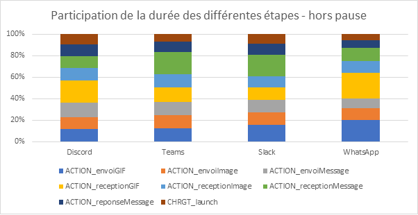
Discord
Slack
Whatsapp
Teams
The impact of these applications is all the greater because they are widely used in companies, but also because they are consumed over long and frequent periods. That’s why it’s interesting to know the unitary impact of these uses, and to be able to project more global impacts.
Methodology
User path definition
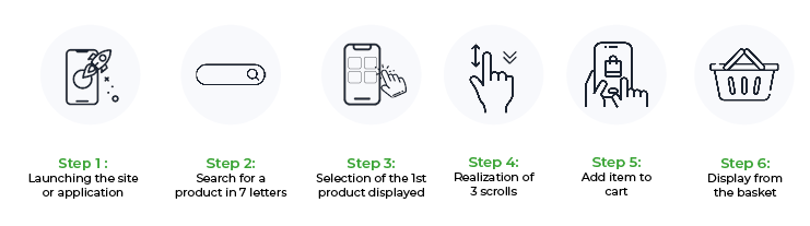
For the measurement, we have determined a scenario that is compatible with all applications:
Step 0: 30s reference pause (with no application open)
Step 1: open application
Step 2: 30s pause with application open
Step 3: send message
Step 4: pause for 30s to read message
Step 5: receive reply
Step 6: send reply
Step 7: pause conversation for 30s while the other writes the message
Step 8: send an image (60.54 Kb)
Step 9: pause for 30s to view the image
Step 10: receive image (6.50 kB)
Step 11: send .gif file (3.36 MB)
Step 12: pause for 30s to view .gif file
Step 13: receive .gif file (3.36 MB)
Step 14: pause for 30s with application running in background
Step 15: 30s pause with application in background and message received
Step 16: pause for 30s after user closes application
Step 17: 30s pause after forced application closure
In order to compare performance between the different applications, two smartphones were used to send responses automatically after reception.
For this evaluation, we decided to use blank accounts for each application, so that the weight of previous conversations would not interfere with our results.
Measurement context
Samsung Galaxy S10, Android 12
Network: Wi-Fi
Brightness : 50%
Tests carried out over a minimum of 3 iterations to ensure reliability of results
Measurement context
Samsung Galaxy S10, Android 12
Network : Wi-Fi
Brightness : 50%
Tests carried out over a minimum of 3 iterations to ensure reliability of results
Applications
Required OS
In order to continue using the application to its full potential in complete safety, it’s important to have an up-to-date application. In 2020, according to the European Commission’s Eurobarometer, 19% of the reasons for renewing a digital device are due to software problems. It is therefore the responsibility of publishers to support older OSes.
Minimum Android version required
Percentage of Android phone owners able to download the application (February 14, 2024)
Minimum iOS version required
Percentage of iOS phone owners able to download the application (January 4, 2024)
WhatsApp
Android 5.0
99,5
iOS12
98,8
Discord
Android 7.0
97,1
iOS12
98,8
Slack
Android 10
84,3
iOS15
94,2
Teams
Android 11
75,4
iOS15
94,2
The best pupil here is WhatsApp, which supports Android 5.0 (version dating from 2014), iOS 12.0 (dating from 2018) and all subsequent versions.
The worst performer is Teams, which only supports Android 11 (2020) and iOS 15.0 (2021). This means that 24 out of every 100 users with an Android smartphone cannot use this application.
Application size
A lightweight application is one that concentrates on the most useful features, and goes against the grain of the obese, which will offer unusable and/or unused functions. It also fills the smartphone’s memory, which may lead some users to change their terminal.
WhatsApp
Discord
Slack
Teams
Installed application size (MB)
108
165
189
226
Once again, WhatsApp is the best pupil, with Teams, the worst performer, taking up more than double the space.
Environnemental Impact
Following a detailed analysis, we were able to highlight the applications with the largest environmental footprint for this route.
Environmental assessment assumptions
User localization: 100% France or 100% worldwide
Server localization: 100% worldwide
Devices used: smartphones only
Application
Impact of the journey (gCO2e) for users in France
Impact of journey (gCO2e) for users outside France
WhatsApp
3,6
3,7
Discord
4,5
4,6
Teams
4,6
4,8
Slack
5,2
5,4
Application
Water consumption (l)*
Land use (cm2)*
WhatsApp
0,5
6,2
Discord
0,6
5
Teams
0,6
6,2
Slack
0,7
7,8
*Due to lack of data, for the water and surface area indicators, the network part is not considered.
The most sober application
WhatsApp has the lowest environmental impact on this route. This is mainly due to very low data consumption.
The least sober application
Slack has the highest environmental impact on this route. This is due to its high energy consumption.
Measurement analysis
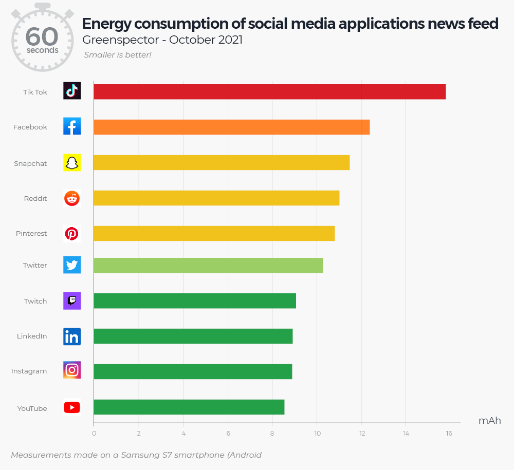
Energy consumption
To preserve battery life, it is imperative that the application is optimized for minimum power consumption, as the number of charge/discharge cycles of the phone plays a crucial role in the battery degradation process.
WhatsApp
Teams
Discord
Slack
Energy impact of course (mAh)
11,1
10,6
11
16
The most sober application
Teams offers the lowest energy consumption on this route.
The least sober application
Slack offers the highest energy consumption on this route.
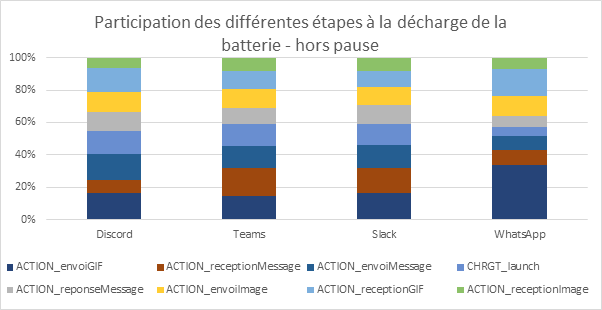
The graph shows that for WhatsApp, the action of sending a gif seems to have a greater impact than for other applications.
What about dark mode?
Today’s applications offer a dark mode. This offers a number of advantages, not least of which is the ability to save screen power on devices with OLED screens, such as the Samsung Galaxy, on which tests were carried out. Discord offers two options, with a dark mode and a Midnight mode.
WhatsApp Dark
Teams Dark
Discord Dark
Discord Midnight
Slack Dark
Energy impact of course (mAh)
7,8
7,6
7,3
7,2
12,7
Reduction compared to light mode
-30%
-28%
-34%
-35%
-21%
As a result, the energy consumption of all applications is reduced by between 21 and 35%.
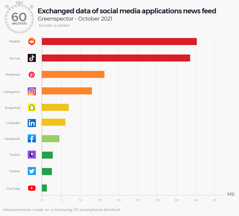
Mobile data consumption
WhatsApp
Teams
Discord
Slack
Consommation de données mobiles du parcours (Mo)
0,8
7,8
7,3
7,5
The most sober application
WhatsApp offers the lowest data consumption on this route. This is due to the default compression of sent items.
The least sober application
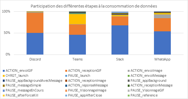
Teams offers the highest data consumption on this path. We can see that more data is consumed during the application opening stage than during the other stages.
Usage performance
Performance enables us to meet a need by mobilizing a terminal for a shorter period of time, and therefore to have a lower manufacturing quota, which ultimately generates a lower impact.
WhatsApp
Teams
Discord
Slack
Running time (in seconds, excluding breaks)
55,6
37,4
42,5
49,9
The most sober application
Teams offers the shortest duration on this course.
The least sober application
WhatsApp offers the longest duration on this route. When we look at the duration of the different stages, we see that the longest stages for WhatsApp are sending and receiving GIFs.
Conclusion
Among the range of solutions measured, the use of WhatsApp is the most effective in limiting CO2eq emissions in this scenario, thanks in particular to the compression of images and GIF files. This analysis also shows the cost of this compression, both in terms of energy and performance, but that the cost-benefit ratio is still in favor of this compression. The most impactful application, Slack, will emit 44% more than WhatsApp. Finally, the use of dark mode reduces the energy impact of phones with OLED screens by between 20% and 35%.
Everyday car-sharing is a way of sharing the environmental impact of car travel. There are applications that put drivers and passengers in touch with each other. However, the savings made during a journey must not be outweighed by the impact of the IS of these services. In this article, we will look at the eco-design practices of three daily car-sharing applications: BlaBlaCarDaily, Karos and Klaxit.
Methodology
This comparative study of mobile applications examines various aspects, such as the size of APK files (the installation files for Android applications), application compatibility and the greenhouse gas (GHG) emissions caused by their use. The results highlight significant differences between applications, underlining the importance of implementing an eco-design approach.
First of all, it’s important to remember that the vast majority of a smartphone’s environmental impact is due to its manufacturing phase. A great deal of energy and materials, some of them rare, are needed to manufacture the product. Therefore, to effectively reduce the impact of a mobile application, it is necessary to ensure that it does not force users to change phones in order to obtain a suitable user experience. This involves evaluating a number of criteria, including but not limited to the following:
Compatibility: an application must be compatible with all user terminals (OS, screen resolution, etc.). We found that some applications were designed exclusively for more recent versions, limiting access for users with older devices. This incompatibility often leads to frequent replacement of devices, which can waste natural resources and increase electronic waste.
Battery use: battery wear and tear is one of the material causes of the need to buy a new phone. One of the factors that wear out the battery is the number of charge/discharge cycles the phone goes through. It is therefore essential that using the application does not require too much energy so as not to accelerate the draining of the battery.
Performance: this criterion corresponds to the application’s response time. Firstly, the aim of an eco-design approach is to enable users who do not wish to renew their phone to have a pleasant user experience, even on older devices. Secondly, longer charging times mean faster battery wear. Finally, if the factor limiting performance is network quality, mobile users will be even more affected.
– Taille de l’APK : cet indicateur provoque 2 impacts différents. Premièrement, une application avec une taille importante nécessite un échange de données plus important pour être installée ou mise à jour. Deuxièmement, un utilisateur qui souhaite conserver son téléphone longtemps peut être amené à devoir gérer des problèmes de manque de mémoire. En effet, la taille des logiciels et des applications va croissante (on parle d’obésiciel). Dans un objectif de l’encourager dans cette démarche, il est nécessaire que le stockage utilisé par l’application soit le plus réduit possible. Dans cet article, nous allons nous focaliser uniquement sur la taille de l’APK, mais une démarche d’éco-conception doit également être menée sur l’ensemble des données stockées sur le téléphone, comme le cache.
APK size: this indicator has 2 different impacts. Firstly, a large application requires more data to be exchanged in order to be installed or updated. Secondly, users who want to keep their phone for a long time may have to deal with memory shortages. This is because software and applications are becoming increasingly large (known as “bloatware“). To encourage this, the storage used by the application needs to be as small as possible. In this article, we will focus solely on the size of the APK, but an eco-design approach must also be applied to all the data stored on the phone, such as the cache.
During an environmental impact analysis at Greenspector, we examine all these points to provide recommendations that will enable our clients to gain an accurate picture of their situation and reduce their environmental impact.
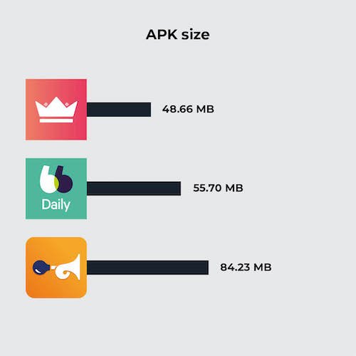
APK size comparison
First of all, let’s assess the size of each app, once installed on a Samsung Galaxy S9 (Android 11). Given that they all fill the same functional areas, we’d expect them to be roughly similar in size. However, the Klaxit application stands out because of its size. There may be several reasons for this difference. For example, the application uses more external SDKs, or it embeds more uncompressed resources (images, videos, etc.).
Application
APK size
Karos
48.66 MB
BlaBlaCarDaily
55.70 MB
Klaxit
84.23 MB
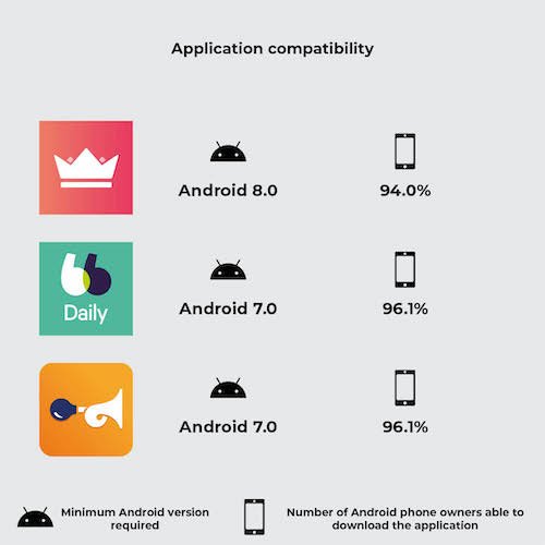
Application compatibility comparison
Another essential criterion we studied was the compatibility of applications with different versions of Android. For example, an application that is not compatible with a version lower than Android 8 would prevent 7.1% of Android owners from using the application.
Application
Minimum Android version required
Number of Android phone owners able to download the application
Karos
Android 8.0
94.0%
BlaBlaCarDaily
Android 7.0
96.1%
Klaxit
Android 7.0
96.1%
The Karos application therefore enables 2.1% more users to use their car-sharing service. This difference may not seem significant, but let’s calculate the emissions avoided by supporting Android 6.0 instead of just 7.0.
According to ARCEP, 37% of smartphone renewals are due to a partial malfunction (real or supposed), including breakage of non-essential components, battery wear, obsolescence and software obsolescence. Let’s assume a fair distribution of these four reasons. We arrive at a renewal rate due to the OS (software obsolescence) of 9.25%.
According to ARCEP, there will be an estimated 48.4 million smartphone owners in France in 2021. Let’s assume that each smartphone owner has just one device. Let’s also assume that 10% of French people need access to a daily car-sharing service (strong assumption). This is equivalent to saving on the manufacture of N smartphones:
N = 10% * 9.25% * 2.1% * 48.4 M
N = 9.4 k
According to our environmental assessment model, the entire life cycle of a smartphone, excluding the use phase, emits an average of 59 kgCO2eq. The emissions avoided represent:
Etot = 9.4 * 59 = 554 T CO2 eq
Comparison of GHG emissions
a) Explanation of our methodology
Pour évaluer les émissions de gaz à effet de serre des applications, nous avons suivi une méthodologie rigoureuse basée sur la collecte de métriques pendant le parcours automatisé sur un téléphone réel : la consommation d’énergie de l’appareil, la quantité de données mobiles échangées et le nombre de requêtes HTTP effectuées. Grâce à ces données mesurées et le modèle d’évaluation d’impact environnemental Greenspector Studio, nous sommes en mesure de réaliser une estimation des émissions de CO2. Une explication plus précise du modèle utilisé est détaillée dans cet article : https://greenspector.com/fr/methodologie-calcul-empreinte-environnementale/
Assumptions used in the environmental assessment
Location of users: 100% in France
Location of servers: 100% in France
Devices used: smartphones only
b) Explanation of the route
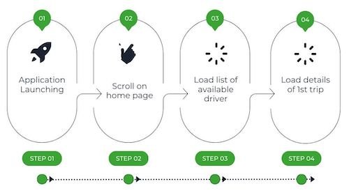
These measurements have been carried out on the basis of user journeys that we have broken down into short stages. We are looking at the situation from the point of view of a passenger wishing to travel daily from the centre of Nantes to Carquefou. These routes have been set up in such a way that the same functionalities are evaluated, namely “listing available drivers” and “having details of a particular journey”. Each route is therefore made up of all or some of these stages:
Launching the application
Scroll to the home page
Load a list of available drivers
Load details of first journey
These different stages give us an overview of several elements generally present in a mobile application, such as a scrolling page or a complex element (integration of a route map). The launch stage is also very important because it can provide us with essential information, for example on the caching of data or the time taken to launch the application.
In order to obtain the most reliable measurement possible, we are writing a GDSL script to automate the execution of 5 identical series of tests. GDSL is a language developed by Greenspector that can be used to script test runs on Android and iOS smartphones. For more information, see our dedicated article.
Measurement context
Samsung Galaxy S10, Android 10
Network: Wi-Fi
Brightness: 50
Tests carried out over at least 3 iterations to ensure reliability of results
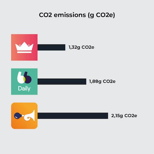
C) Results
Once the measurements had been taken, the results were analysed to establish an assessment of the carbon footprint of the route chosen for the three car-sharing applications. A table comparing the results was drawn up. The following results are expressed in grams of CO2 equivalent.
Application
CO2 emissions (g CO2e)
Karos
1,32
BlaBlaCarDaily
1,88
Klaxit
2,15
The results show a certain disparity between the different applications, which clearly demonstrates the impact that the design and development of an application can have on its greenhouse gas emissions. In this article, we will confine ourselves to a superficial analysis, including only comparative elements for the sake of brevity. For example, the choice of implementation of the interactive map will not be analysed. However, in the context of an application optimisation project, the analysis would be extended to provide more exhaustive recommendations.
In addition to our study on CO2 emissions, it should be emphasised that the environmental impact of applications goes beyond greenhouse gas emissions alone. The manufacture of a smartphone generates other pollution factors. Taking other environmental factors into account, such as aquatic eco-toxicity or the depletion of abiotic resources, would enable us to understand the issues linked to digital pollution in their entirety.
Analyse
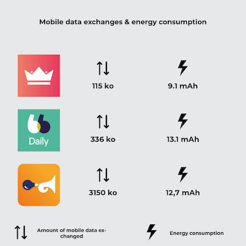
Les résultats de l’évaluation environnementale ont montré que le parcours Klaxit était plus émetteur en GES que les deux autres, à hypothèses équivalentes. La cause de ses moins bonnes performances est double : la quantité de données échangée de Klaxit est très importante comparée aux consommations d’énergie et la consommation en énergie se démarque du meilleur parcours, Karos. 95% des consommations de données du parcours de Klaxit se font lors du lancement de l’application.
Application
Amount of mobile data exchanged
Energy consumption
Karos
115 ko
9,1 mAh
BlaBlaDaily
336 ko
13,1 mAh
Klaxit
3150 ko
12,7 mAh
On inspecting the Klaxit screen, we noticed the presence of an image carousel, a practice we tend not to recommend to our customers: as well as making navigation unintuitive, the animation leads to continuous energy consumption. As it happens, none of the images in this carousel are cached, which leads to very large data exchanges from the very first screen of the application.
In terms of energy consumption, the Klaxit application is not really more intense than the others. In fact, it’s the number of steps required to complete the same functions that is greater, which lengthens the user journey and consequently increases energy consumption. In fact, compared with Karos, additional scrolling and loading are required. Reviewing the user path and proposing optimisations to shorten it would bring the Klaxit application up to the level of the other two.
So, by simply taking measurements on a rudimentary path, we find two fundamental levers for action in digital eco-design: upstream conception and design (optimisation of the user path, carousel), and development practices (image caching). These two areas for improvement need to be considered together, in order to bring together two key players in the design of digital services: designers and developers.
Conclusion
The analysis highlights the fact that some applications are lagging behind in terms of eco-design. However, there are ways of improving digital services. By better understanding every aspect of a mobile application, we can identify opportunities to reduce the ecological footprint while improving the user experience. For example, designers and developers need to work together to encourage more sustainable and responsible use to ensure the environmental benefits of using a virtuous service. We are ready to support any company wishing to improve its approach to application design.
Since 2021, Alban RAHIER has worked as a digital sobriety consultant for Greenspector. Graduated from Centrale Lille, he is an expert in evaluating Android applications for sobriety.
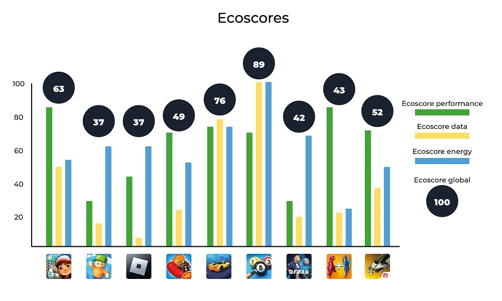
The first thing that stands out compared to the previous mobile games ranking is that three games reappear: Subway Surfers, Candy Crush Saga, and 8 Ball Pool. In terms of downloads, Subway Surfers remains in the first position of the ranking
Looking at the APK deployments, we notice that the frequency of new APK versions varies widely: at most one every 15 days or so for Candy Crush Saga or Race Master 3D, and at least one per week for Roblox. These updates undoubtedly have an environmental impact. For the sake of simplicity, we will focus here on the impact of their usage, assuming the conditions of the initial game launch. The functional unit would thus be: “starting a game session for the first time on a mid-range Android mobile device using Wi-Fi.
This will allow us to assess the environmental impacts of these games to compare them.
While the initial intention was to assess the expected increase in revenue generated by mobile games, some interesting facts have emerged:
More than half of mobile gamers are female.
73% of gamers spend money on these games.
Most of the gamers are in Asia and the Pacific region.
Methodology
Definition of the User Journey
For measurement, it was essential but challenging to define a common user journey for all the games. As mentioned earlier, the obvious choice for us was a journey starting with the launch of the application and then the start of a game session. However, things quickly became more complex.
For most of the games studied, the initial launch involves several intermediate screens:
Gathering GDPR-related consent
Input of the player’s age
Gathering consent related to advertisements
Creating a profile or linking to an account on a third-party service (Google, Facebook, etc…) (It would be interesting to analyze the third-party services used in each game in more detail at a later stage)
Loading content updates
If the first three items on the list are only filled out once, content updates can occur unexpectedly and independently of the APK update.
Linking the games to a Google account made automating the Bridge Race game too complex compared to the time we had decided to allocate for this study. This led to the exclusion of the game from the sample studied here. We observed differences in behavior when linking the Google profile depending on the device used. In the future, we will consider conducting a complementary study that directly assesses the impacts of one minute of gameplay using Greenspector’s Testunner tool.
In the end, we still attempted to automate the following user journey for each game:
Step 1: Launching the application
Step 2: Loading the title screen
Step 3: Starting a game session
Between these measured steps, some actions for consent validation or login that were not measured because they were absent in some applications. The significant number of elements to click on and intermediate screens during the initial launch of the FIFA Mobile game prevented us from reaching the actual gameplay launch. The measurements and calculations presented here are therefore below the actual values but have been retained to highlight other aspects.
As part of this study, the data was collected between August 11th and August 16th, 2023, using Greenspector Studio. We utilized the Greenspector Domain-Specific Language (GDSL) to create test scripts that automatically replicate the actions to be performed on a mobile phone. The Testrunner module then enabled us to take measurements on an Android smartphone, providing us with energy and resource consumption (memory, CPU, data exchanged), and response times for each step of the user journey.
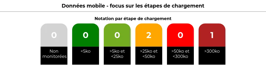
Subsequently, based on these measurements, the impact model integrated into Greenspector Studio assessed the corresponding environmental impact and Eco-Scores. As a reminder, in the case of a user journey measurement, the overall Eco-Score is divided into three Eco-Scores: Performance, Mobile Data, and Energy. Each is rated on a scale from 0 to 100, with 100 being the best score. Each of these scores is derived from the ratings achieved for each measurement step, which depend on predefined thresholds. For instance, in the case of mobile data for loading steps:
Hypotheses
During this evaluation, we started from the perspective of the initial application launch. This inherently represents a more impactful journey than subsequent uses but provides a better understanding of the game’s operation. It’s worth noting that during actual gameplay, there are often regular updates that can also have an impact.
Measurement Context
Device: Samsung Galaxy S9, Android 10
Network Connection: Wi-Fi
Screen Brightness: 50%
Tests were conducted over at least 3 iterations to ensure result reliability.
Hypotheses for Environmental Projections
User Location: 100% World
Server Location: 100% World
Devices Used: Smartphones only
The environmental footprint depends on the location and type of application servers, user locations, and the type of devices they use. We have focused our study solely on the use of applications on smartphones. We have also assumed that users and servers are overwhelmingly located outside of France, as precise statistics were unavailable.
Résultats
App name
APK size (Mo)
Data exchanged (MB)
Total battery discharge (mAh)
Subway Surfers
177,1
5,3
18,3
Stumble Guys
198
46,4
44,9
Roblox
160,8
17
15,4
Candy Crush Saga
92,2
12,1
22,3
Race Master 3D
182,6
33,2
17,1
8 Ball Pool
89,9
0
7,8
FIFA Mobile
180,4
161,5
34,3
Merge Master - Dinoasaur game
175
26,1
24,5
Garena Free Fire
400,8
5,7
19,8
Bridge Race
170,9
First and foremost, we observe that APK files for initial downloads are mostly between 160 and 200 MB, which is already quite substantial. Only Candy Crush Saga and 8 Ball Pool are below this range, at around 90 MB. For Free Fire, the file size goes up to 400 MB!
The duration of usage is estimated to be a little over 20 minutes per day according to this study by Statista: https://www.statista.com/statistics/1272891/worldwide-game-apps-time-spent-daily-age/. The impact of installation and updates, assuming daily or near-daily usage, has therefore been excluded from the present study. However, it’s possible that for a game used sporadically over time, updates might have a more significant impact than actual usage. In such cases, there is a risk for the game publisher that users may lose interest in the game. While the APK update can be managed daily like other mobile applications, it’s the content update during the game launch that can become problematic. As we will discuss later, everything is designed to encourage daily play.
Regarding the data transferred for the initial launch of the game, most games require a few additional megabytes. Only 8 Ball Pool does not require any data transfer. Conversely, FIFA Mobile, Stumble Guys, Race Master 3D, and Merge Master require downloading a few tens of megabytes. In particular, FIFA Mobile requires downloading over 160 MB, which includes updating the content based on sports news. This is seen as added value by the publisher but is considered a poor practice from a sustainability perspective. Initially, efforts should focus on how to reduce the technical size of the necessary information, and ideally, limit the refresh frequency and the comprehensiveness of the information.
These substantial data transfers are often correlated with degraded performance. For instance, for Stumble Guys and FIFA Mobile, it sometimes takes 1 to 2 minutes for the screen that allows the game to appear to be launched. For half of the games, simply launching the application takes between 10 and 20 seconds, which is particularly long. In the case of Roblox, the title screen loads quickly, with content loading occurring after selecting a game (and generally taking quite a while). The longest launch time is for 8 Ball Pool, but for this game, no data is transferred, and the impact on the battery is relatively low (particularly due to the limited number of animations). This game ultimately has the best scores. In general, the scores obtained are as follows:
We can observe that 8 Ball Pool is the game with the best scores, mainly due to what we just discussed (few animations, no data transferred). In this regard, its operation during launch is closer to what I would tend to associate with “old-school” mobile games: offline and relatively simple games (though not as basic as Snake and similar games). It’s worth noting that once the onboarding process of 8 Ball Pool is completed, it reverts to a more typical operation, including online gameplay by default, which would need to be measured separately.
In comparison, the other games have lower scores. Only Race Master 3D and Subway Surfers stand out somewhat. It appears that the games studied here have scores that are at best around the average, with very few exceptions. All of this may indicate concerns regarding efficiency or sustainability but is more likely attributed to the nature of these applications themselves: animation, data exchanges, and often a multitude of persuasive design mechanisms. We will revisit this later.
As for the environmental impacts, the calculations lead to the following results:
App name
GHG emissions in gCO2e
Water consumption in L
Land use in cm2
Subway Surfers
1,1
0,1
1,3
Stumble Guys
6,5
0,6
3,6
Roblox
2,5
0,2
1,6
Candy Crush Saga
1,9
0,2
1,6
Race Master 3D
4,4
0,4
1,9
8 Ball Pool
0,2
0
0,6
FIFA Mobile
20,1
1,6
6,1
Merge Master - Dinoasaur game
3,8
0,4
2,4
Garena Free Fire
1,1
0,1
1,3
The high impacts observed here are correlated with findings made previously, particularly significant data loads that lead to performance degradation and increased battery consumption on the device. Consequently, the games with the highest impacts are FIFA Mobile (far ahead of the others), as well as Stumble Guys and Merge Master. Unsurprisingly, 8 Ball Pool is also the least impactful game in this regard.
Analyse
The measurements conducted highlight certain design choices that directly contribute to increased environmental impacts.
As mentioned earlier, the length of onboarding processes often highlights three interrelated concerns: the collection of personal data, advertising, and more broadly, the use of persuasive design mechanisms. As a reminder, these mechanisms are aimed at keeping the user engaged with the application for as long as possible and are present in many applications and websites. Ethical Designers, among others, have a keen interest in this matter. However, let’s delve into the case of the games studied here.
The RGPD consent, as well as that related to advertisements (and sometimes age verification), aim to minimize the display of ads during the game. This, of course, serves as a source of revenue for game developers. The level of intrusiveness of advertisements can vary. Often, players are offered the option to watch video ads in exchange for rewards or to continue playing. Sometimes, it’s even possible to purchase the game to get rid of these ads. The vigilance and attention of players make them more susceptible to such suggestions, which is linked to persuasion mechanisms.
In the field of design, particularly in terms of user interface and interaction design, the concept of “gamification” has been discussed for several years. This involves incorporating game elements to increase user engagement and make the experience more enjoyable. This shouldn’t be underestimated, as some games are very skilled at attracting and retaining players. Furthermore, by taking this approach further, it’s possible to encourage players to spend money.
For example (among many others), let’s consider Candy Crush Saga. It would be possible to offer this game in a more limited form, focused solely on the gameplay itself: progressing through levels of varying difficulty with the objective of clearing candies or obstacles. The rules and challenges are simple and form the core of the game as such. However, various artificial elements have been added here:
Bright colors, visual effects, and sounds are used to enhance the impact of user actions. This is referred to as feedback.
Limited resources (lives, bonuses, etc.) are introduced to create the need and, more importantly, a sense of scarcity. Often, it’s possible to replenish these resources by watching videos or spending money (virtual or real).
Progress bars (level or otherwise), trophies, rewards, avatars, and scores are incorporated to encourage constant improvement and enable users to compare themselves with others. This leads us to another important element of gamification and attention capture:
Social connection: seeing what others are doing, comparing oneself with them, and allowing them to see what one is doing. Like social networks (often through a connection with them), this mechanism encourages more and better gameplay but also creates attachment to the game through connections with other players. This is accomplished through online gameplay or by connecting with social networks (for sharing achievements, finding players, etc.).
All of this contributes to the player’s motivation, particularly through a subtle balance of their frustration between two states that the player consciously or unconsciously seeks to achieve:
Flow: The player’s state of concentration where objectives seamlessly follow one another. This is typically the period when time seems to fly by. Consequently, this can encourage the player to invest (time, virtual resources, real money) to maintain this state and avoid frustration.
Fiero: A state of satisfaction linked to overcoming a particularly formidable obstacle (in non-mobile video games, this is one of the basic mechanics in what is sometimes called “Souls-like” games: games that emphasize player mastery to offer a very high challenge).
The game design often revolves around these two states, directly or indirectly (gradual increase in difficulty, rewards, etc.). This delicate balance will be crucial for the quality of a game and, more importantly, the gaming experience. For publishers, it also affects the time players spend on the game and the money they spend. This can sometimes lead to higher environmental impacts.
Directly, it encourages players to spend as much time as possible on the game by utilizing online play and links with social networks, displaying advertisements, and designing interfaces that are rich in information and visual effects.
Indirectly, it promotes consumption (spending money) but also overconsumption (wanting more and generating frustration). This leads to environmentally unfriendly behaviors that go against the principles of environmental sustainability.
It’s worth noting that the video game industry is becoming increasingly aware of its environmental impacts.
However, more and more relevant resources are emerging on the subject: https://playing4theplanet.org/resources. Some manufacturers are looking into the environmental impact of their hardware, while publishers are trying to assess their environmental footprint. The regular turnover of gaming machines and the release schedules of games themselves pose inherent environmental challenges. Online gaming and digitization do not necessarily make things better. In this regard, you can refer to the study by ADEME (French Agency for Ecological Transition) on the digitization of cultural services. Similar to what can be observed, for example, with websites, optimizations are possible (efficiency), but the real challenge lies in sustainability (in contrast to the extravagance of open-world games). There are also broader issues to consider:
How video games can implement systems that do not encourage excessive consumption (accumulation logic, power race, etc.)
How to strengthen our connection to nature? How to introduce game mechanics that go beyond accumulation and competition? How to portray possible (e.g., The Climate Trail ) or desirable futures?
Conclusion
Mobile games are an integral part of many people’s daily lives, making it even more essential to study their environmental impacts (although other aspects of Responsible Digital, such as the attention economy, accessibility, and personal data management, remain relevant). While technical optimizations are still possible, the crux of the issue lies in their design and the behaviors they induce (including the risk of addiction and financial risks for players).
Video games, in general, could and should become a catalyst for raising awareness about ecological issues. Just as with accessibility, some initiatives have already begun, and it will be interesting to see how they evolve in response to the urgent challenges at hand.
After working for more than 15 years in web development, Laurent Devernay became a technical consultant in responsible digital technology at Greenspector. When he is not coaching organizations on the eco-design of their digital services, he teaches courses on digital sobriety technologies.
With the emergence of transport apps in France, urban mobility has undergone a significant transformation in recent years. Indeed, these mobile applications are among the most downloaded and used by the French. Every major city has an app published by an urban transport company, offering practical, flexible solutions for getting around town. However, behind this ease of use and convenience lies an aspect that is often overlooked: the environmental impact of these applications.
These companies have understood that the development of mobile applications makes it possible to offer services to passengers (timetables, traffic information, transport maps, intermodality), but also to reduce costs by providing ticket sales and stamping services directly integrated into the application on our phones.
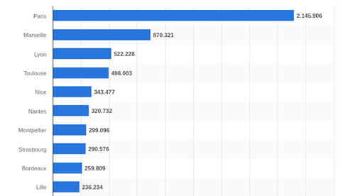
The aim of this study is to measure the environmental impact of transport applications in France’s 10 most populous cities, according to the Statista website:
Bonjour RATP for the Paris region
RTM in Marseille
TCL in Lyon
Tisséo for Toulouse
Lignes d’azur in Nice
TAN in Nantes
TAM in Montpellier
CTS in Strasbourg
TBM in Bordeaux
Ilevia in Lille
These applications differ in terms of user interface, but they all meet a set of essential user needs. We have therefore determined a common user path, enabling us to compare these applications in terms of carbon impact, energy consumption and data exchanged. Finally, in the second part, we analyze the causes of these results.
Ranking of France’s 10 most populous cities in 2020
Methodology
User path definition
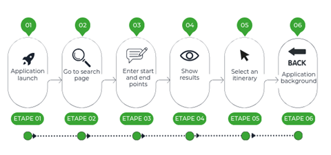
For the measurement, we determined a common scenario compatible for all applications, namely the search for a route from point A to point B (geolocation activated), with the following steps.
Step 1: Launch the application
Step 2: Access to search page
Step 3: Enter route
Step 4: Display results
Step 5: Route selection
Step 6: Application background (30 sec)
For this study, data was measured on June 19, 2023, using Greenspector Studio. We used GDSL (Greenspector Domain-Specific Language) to write test scripts, which automatically reproduce the actions to be performed on a phone. The Testrunner module then enabled us to carry out the measurements on an Android smartphone: we thus obtained energy and resource consumption (memory, CPU, exchanged data) and response times for each step of the journey. Finally, based on these measurements, the impact model integrated into Greenspector Studio evaluates the corresponding environmental impact.
Hypothesis
For this evaluation, we decided to study the behavior of a user who regularly uses the application and therefore searches for his itinerary with as few clicks as possible.
Measurement context
Samsung Galaxy S10, Android 10
Network: Wi-Fi
Brightness: 50%.
Tests carried out over at least 3 iterations to ensure reliability of results
Environmental projection hypothesis
User location: 100% in France
Server location: 100% in France
Devices used: smartphones only
The environmental footprint depends on the location of the application servers, their type, the location of the users and the type of devices they use. We have studied the use of applications only on smartphones and on users present on French soil, as their use is intended only for this part of the population. In the absence of better information, servers were considered to have a medium level of complexity.
Results
After a detailed analysis, we drew up a comparative table of the results, highlighting the applications with the lowest GHG emissions and those with the largest environmental footprint.
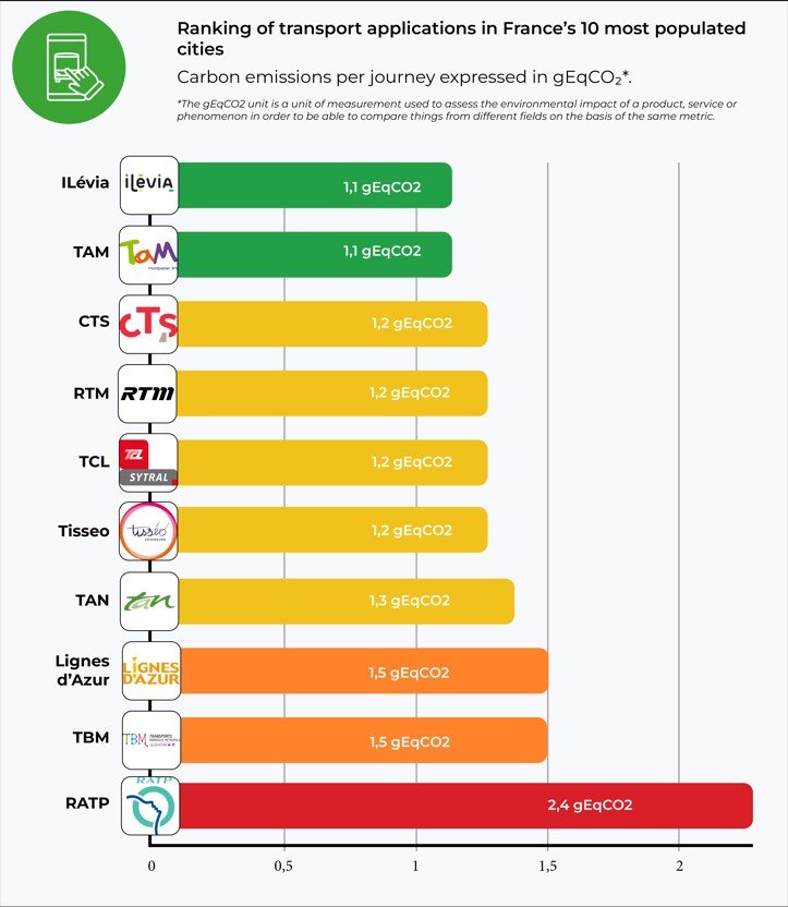
The following results are expressed in g of CO2 equivalent per trip.
The soberest application
Lille’s Ilévia and Montpellier’s Tam are the applications with the lowest impact according to our results. They consume very little energy. The fact that the route measured contains a small number of images and animations explains this figure in particular.
Least sober application
Bonjour RATP comes last in the ranking, but that’s no great surprise. In fact, the application consumes a lot of energy. This enormous power consumption is due in particular to the integration of third-party geolocation services and the large amount of multimedia content (photos, icons, etc.). What’s more, the application offers a host of features right from the home screen, such as scooter scanning.
The application preloads a wide range of content. Even if the user is offline, they can still access the interactive map to search for a station. This is a negative point for the application, as this pre-loading is not a critical step for the rest of the journey. It is irrelevant for the user to load a map that goes beyond the borders of Paris.
Projection for 10,000 regular users
Most apps have between 100,000 and 500,000 downloads on the Playstore. For each city, let’s take 10,000 regular users who use the app every day to make a round trip: this equates to 600,000 monthly visits.
Application (Ville)
Impact per visit (g CO2e)
Impact per day for 10000 users (2x/day) (kg CO2e)
Impact total par an (kg CO2e)
TAM (Montpellier)
1,1
22
8030
Ilévia (Lille)
1,1
22
8030
CTS (Strasbourg)
1.2
24
8760
Tisseo (Toulouse)
1.2
24
8760
RTM (Marseille)
1.2
24
8760
TCL (Lyon)
1.2
24
8760
TAN (Nantes)
1.3
26
9490
Azur (Nice)
1.5
30
10950
TBM (Bordeaux)
1.5
30
10950
RATP (Paris)
2.4
48
17520
The table shows the carbon impact of a single visit in g CO2e and presents the projection of twice-daily use for 10,000 users in kg CO2e. Finally, the projection is made over a one-year period using the same unit.
For low-impact applications such as TAM or CTS, such annual use represents 8.03 tonnes of CO2e. This is equivalent to more than 36,903 km driven in a light vehicle, according to Ademe’s Impact CO2 website.
For the RATP, by far the biggest contributor, the impact is more than double, amounting to 17.5 tonnes of CO2e per year. This is equivalent to over 80,000 km in a light vehicle.
According to the Ministry of Ecological Transition’s Bilan annuel des transports en 2019, a car registered in mainland France has driven an average of 12,200 km over the year. The impact of a sober transport app used by 10,000 people 2 times a day represents the annual emissions of more than 2 light vehicles, while the impact of the RATP represents the annual emissions of around 7 vehicles!
One-year impact projection
According to the RATP Group website, the Bonjour RATP application is visited by 2.5 million unique monthly visitors and generates over 20 million monthly visits. If we assume that each visit includes at least one route search, we can obtain the app’s monthly carbon impact.
This represents 48 t CO2e per month, or more than 220,000 km by car.
But what causes these impacts?
In this second part, we analyze where these environmental impact values may come from. Using energy consumption and data exchanged over the network during the user’s journey, applications are again ranked according to their energy consumption.
Application
launch
Incative foreground
Access route page
Input departure/arrival
Results display
route selection
Inactive background
TAM
0,4
1,2
0,1
1,3
0,3
0,2
1,1
TCL
0,6
1,1
0,3
1
0,3
0,5
1,2
ILévia
0,6
1
0,2
1,4
0,3
0,4
1,2
TAN
0,6
1,1
0,1
1,7
0,4
0,5
2
CTS
0,5
1
0,2
2,2
0,4
0,4
1,1
RTM
1,5
1,1
0,3
1,6
0,2
0,3
1,1
Tisseo
1,3
1,1
0,2
1,9
1
0
1,1
Azur
1,6
1
0,2
1,8
1
1,5
1
TBM
0,8
1,1
0,6
2,7
0,4
1,5
1,1
RATP
1,6
1,1
0,7
5,8
1,8
0,7
1,2
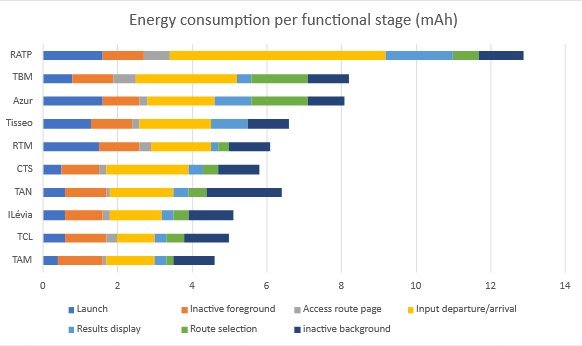
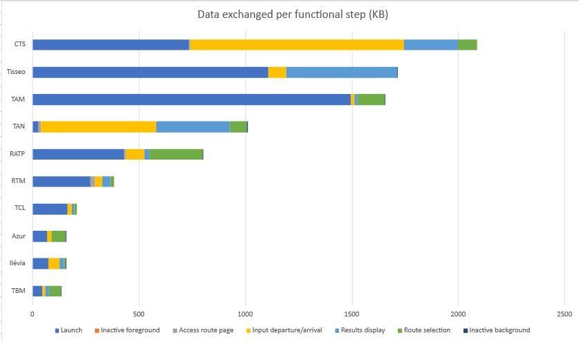
The graph above compares the different stages (apart from a few pauses) of each route measured in terms of energy consumed.
We notice that the pauses in the foreground are generally consuming, i.e. the user is present on the application’s home screen but without performing a single action. This can be explained by the fact that the launch is not long enough to generate all the content, so that even when inactive after being launched, it continues to generate content such as the little bus station icons, for example. It’s also possible that the user’s location is constantly being sought, as evidenced by the activity on the background pause stage.
We also note that background applications consume almost the same amount of energy in all measurements.
The most time-consuming step is the entry of the start and end points of the user’s itinerary, due to the search and loading of the itineraries entered for the section. Indeed, on many transport applications, it is necessary to perform several actions, or even load new pages for each entry step, whereas on other applications, entry is directly accessible from the home page. For example, CTS and Ilevia.
A disparity in consumption is also observed at the route selection stage in the applications. Some applications, such as Tisseo, directly propose the only route available in the next few minutes.
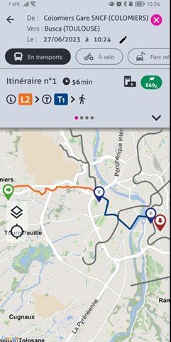
Moreover, RATP displays a route page access step that consumes much more power than the others. Some applications that display zero consumption at this stage simply don’t load a new page, as this functionality is present on the home page. The user’s journey is optimized by reducing actions, thus reducing energy consumption. This is the case with Tisséo, which has no results page to display the different routes. Instead, the application directly suggests the shortest route, as seen in the screenshot below.
One notable observation concerns the route entry stage, where Ratp stands out for its higher energy consumption, being 5.8 times more power-hungry than the TCL. This excessive consumption could be attributed to trackers and integrated third-party services.
Finally, on the Azur application from Nice and TBM from Montpelier, the route display stage consumes more energy than the others. This may be due to the map generated for this display being uncompressed or loading beyond what is necessary, i.e. beyond the limits of the city’s transport network.
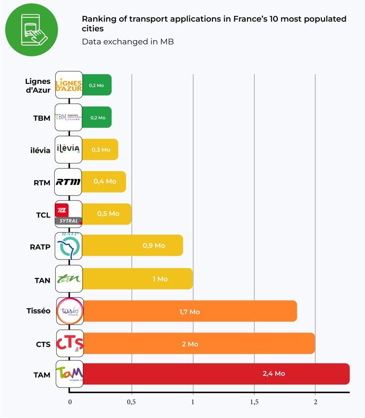
In terms of data exchanged, the CTS, Tisseo and TAM applications are the least frugal. TAM exchanges 2.4 MB, twice the average for all applications. The best performers in terms of data exchanged are Azur, Ilevia, TCL, RTM and TBM, which consume less than 0.5 MB.
According to Green IT, the average size of an e-mail is 81 Kb. So, on average, a route search is equivalent to the exchange of 12 e-mails.
According to our tool, during the launch stage of most applications, a significant amount of data exchange occurs to ensure a smooth and responsive user experience. However, some applications, such as TAN, have chosen to adopt a progressive data loading approach. This means that only essential information is retrieved initially, while other data is loaded as the application is used.
As mentioned earlier, the RATP application loads a lot of content at launch, as does TAM. This can be seen when the application is launched offline, with the map already loaded with metro and bus stations and stops, for example.
Are all these third-party services necessary?
The integration of third-party services will depend on the specific benefits they bring, their relevance to end-users and the overall impact on application performance and technical complexity. Testing, performance monitoring and user feedback are recommended to assess the effectiveness of third-party services and make informed decisions.
Conclusion
A study of the environmental impact of transport applications in France’s 10 largest cities reveals contrasting results. Some applications, such as RATP, TBM and Azur, have less sober journeys and consume more energy, which can have a negative impact on the environment. On the other hand, applications such as Azur, Ilevia and TAM stand out by consuming less data and energy.
It is essential that designers and product owners of transport applications become aware of the impact their solutions have on the environment, and look for ways to reduce their ecological footprint. Adopting best practices in terms of digital sobriety and carbon emissions reduction can help mitigate the environmental impact of these applications.
Maëva Rondeau has been a responsible digital consultant at Greenspector since November 2023. She joined the team after completing her end-of-study internship with us from April to September 2023.
The e-commerce market in France in 2022 amounted to 146.7 billion euros in sales. This is a growth of 13.8% compared to 2021. Although the turnover (CA) of product sales is down compared to the previous year, the considerable increase (+36%) in the CA of service sales supports the overall growth of the e-commerce sector.
There were 2.3 billion transactions made on the internet in France in 2022, 6.5% more than in 2021. Inflation and the sale of services contributed to an increase in the average basket with 6.9% increase. It was on average 65 euros in 2022.
This article can be used as a comparison with the previous content made on the subject in 2022. The article focused on the e-commerce figures in 2021 and the ranking of m-commerce apps and websites in the 2nd quarter of 2021.
E-commerce refers to all transactions made on the Internet, while m-commerce refers to all types of purchases made on an e-commerce website with a mobile device. M-commerce is therefore a sub-category of e-commerce.
Selection method of websites and applications
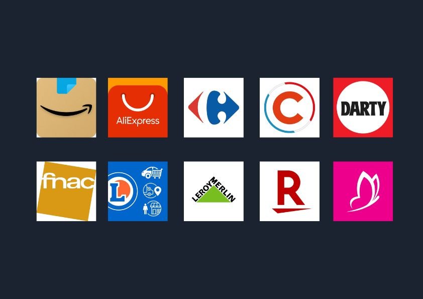
For this new version, we based ourselves on the measurement of the 10 most visited m-commerce sites and applications in France (figures of the 4th quarter 2022 exposed by Fevad). Compared to the previous ranking, 2 players have appeared: Rakuten and Darty. It is eBay and ManoMano that are out of the top 10.
User path definition
After refining the selection of the 10 applications and websites to be measured, we went back to the path that was defined in last year’s article.
Implementation of Greenspector’s solution
We used our innovative solution to measure the environmental impact of different stages of the user journey. We ran the automated tests several times on a real device, in this case the Samsung Galaxy Note 8. We measured resource consumption (energy, memory, data) and response times. This data then allowed us to obtain the environmental impact of applications and websites. We explain it all in detail in our methodology.
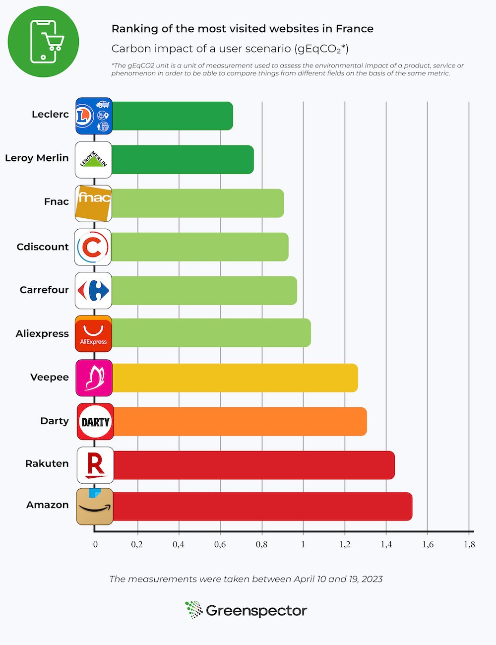
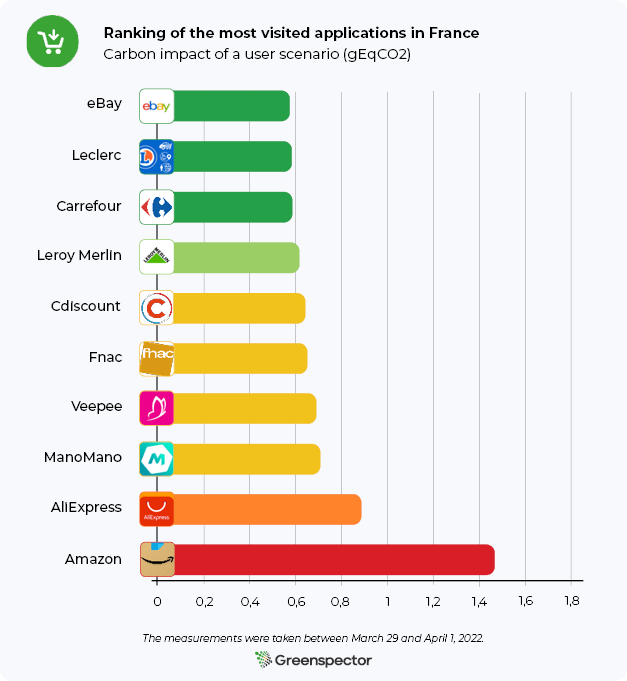
Ranking of the environmental footprint of the 10 most visited m-commerce sites in France
The 3 sites with the least impact are : Leclerc, Leroy Merlin and Fnac. Compared to the article published last year, Cdiscount is back on the podium while the Fnac site is in the top 3 of the least impactful sites.
The 3 most impactful sites are: Amazon, Rakuten and Darty. The Amazon site is 2.2 times more impactful than the Leclerc site. The average carbon impact of these 10 websites is 1.09gEqCO2 for an average duration of the scenario (see methodology at the end of the article) of 1 minute and 58 seconds, which is the equivalent of 5 meters driven by light vehicle.
Projection of global carbon impacts over one month
For this projection, we consider that the share of global e-commerce traffic is 55% on mobile, 39% on PC and 6% on tablet (source). We also used the ADEME tool to project the equivalences.
With an average of 16.15 million monthly users and an average visit time of 5 minutes and 50 seconds, these 10 e-commerce sites have an average projected impact of 172 tons of CO2e per month (29 tons on mobiles, 139 tons on PCs, 4 tons on tablets). This is the equivalent of 20 times the circumference of the Earth covered by a light vehicle.
Impact projection for the most and least sober website
Concerning the best website of this ranking (Leclerc) for 14.84 million visits / month with a duration of 3 minutes, the total carbon impact would be 58 tons of EqCO2 per month (9 tons on mobile, 47 tons on PC and 1 ton on tablet). This is the equivalent of 6 times the circumference of the Earth travelled in a light vehicle. Concerning the worst website of this ranking (Amazon) for 38.29 million visits / month with a duration of 8 minutes, the carbon impact would be 690 tons of EqCO2 per month (121 tons on mobile, 553 tons on PC and 15 tons on tablet). This is equivalent to 79 times the circumference of the Earth travelled by light vehicle.
The fact that the Leclerc site is at the top of the ranking is mainly due to the low energy consumption of the product viewing and shopping cart viewing stages. Only the essential information is present on this search page (product name, price, availability). On the product page, there is the possibility to quickly add the product to the cart, and drop-down menus are proposed if the customer wants more information. This site is also the one that exchanges the least amount of data to complete the scenario.
By analyzing the product search results page with our measurement tool, we can see that many good practices are applied. There are few network exchanges with 19 HTTP requests and only one CSS file. The lazy-loading of images is applied.
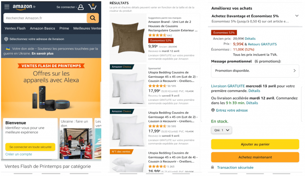
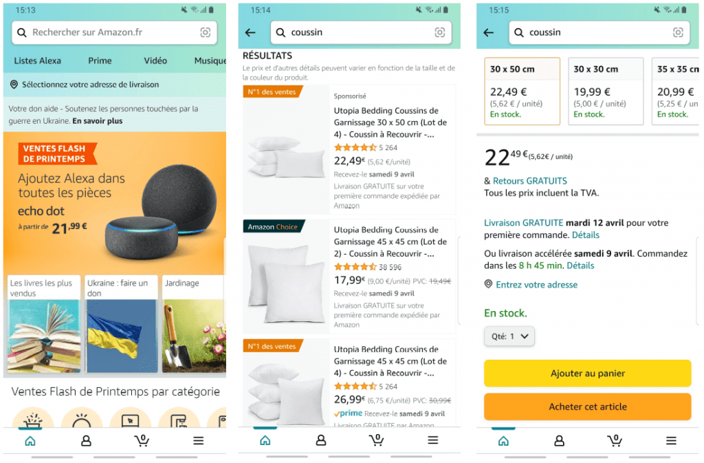
The fact that the Amazon site is last in the ranking is explained by the search and product viewing stages. Indeed, this site consumes a lot of energy on these phases. The data exchange is also important. There are 2,62Mb of data exchanged for the search phase, and 5,85Mb of data exchanged for the visualization of the product sheet. During the search, a lot of information appears (indication “Suggestions”, “Sponsored”, “Amazon Choice” or “No. 1 in sales”, product name, rating, number of reviews, price, discount, delivery date). However, unlike last year, we notice that there are no more autoplay video ads on this phase. When viewing the product, a lot of information also appears (offers, delivery dates in case of free or accelerated delivery, product details, products frequently purchased together…). Moreover, the customer is obliged to scroll before being able to access and click on the “Add to cart” button.
Going into more detail on the product search page, there are a lot of network exchanges with 119 HTTP requests and 11 CSS files. These figures are up from last year’s 109 and 9 respectively. The lazy-loading of images is not applied, which implies that the images are not visible on the screen. This practice should be avoided, as the user will not necessarily scroll to these images.
Ranking of the environmental footprint of the 10 most visited m-commerce applications in France
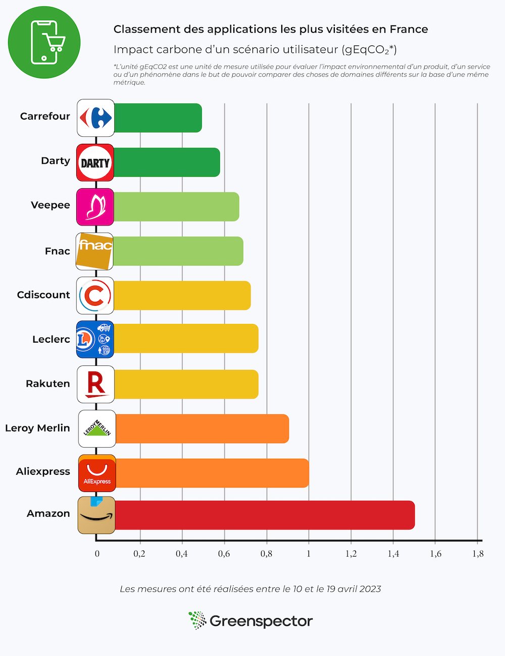
The 3 applications with the least impact are: Carrefour, Darty and Veepee
The 3 most impactful applications are: Amazon, Aliexpress and Leroy Merlin We observe that the Amazon application has a carbon impact 3 times higher than the Carrefour application. The average carbon impact of these 10 applications is 0.81 gEqCO2 for an average scenario duration of 1 minute and 58 seconds, or the equivalent of 3 meters driven in a light vehicle.
The Carrefour application takes its place in the phases of viewing the product sheet and adding the product to the cart, which are lower in energy consumption and in the amount of data exchanged. On the add to cart stage, this can be explained by the fact that it does not automatically redirect to the cart and only generates a simple change on the add to cart button which becomes a quantity selector.
This year again Amazon is at the last place of the ranking. This result is explained once again by the product search and visualization phases, during which the application consumes a lot of energy. In terms of data exchanged we observe 4.73MB on the product visualization stage (against 0.05MB for Carrefour) and 4.15MB on the search stage (against 0.19MB for Carrefour).
Review of the study
This year again we observe that the impact is almost three times greater between the most sober platform and the one with the highest impact. To shop online, it is better to use applications than websites. Indeed, in the scenario studied, websites have on average 44% more impact. Only Leroy Merlin and Leclerc have a greater carbon impact on applications than on the web. We remind you that applications have an impact on their download and their updates. They are therefore to be preferred only in case of regular orders.
We would like to complete this assessment with an observation we made during our tests. Indeed, we observed that on some websites and applications the path could change or be altered. This is the case for Amazon which has implemented AB testing. This method allows the application and the website to vary the displays. For example, on the description of a product, the description can be different from one user to another.
In our case we encountered a phenomenon of change of path on the Amazon website. During a first test we were redirected directly to the shopping cart with the addition of the product to it. In a second test the next day we were no longer automatically redirected to the shopping cart page. Instead, we had to go to the shopping cart ourselves by clicking on the icon provided for this purpose.
Depending on the path, the site or application will consume more or less energy and exchange more or less data. AB testing is a feature used by many digital solutions in the world and we handle it in our path automation thanks to our GDSL language. In the case of our study we have of course taken care to base our measurements on a single path.
Results tables
Ranking of the 10 most visited websites in France
Sites web
url
Energy (mAh)
Exchanged Datas (Mo)
Impact carbone (gEqCO2)
Water Imprint (Litres)
Ground Imprint (cm2)
Scenario length (secondes)
Leclerc
e.leclerc
12,09
3,97
0,67
0,12
1,37
102,71
Leroy Merlin
leroymerlin.fr
14,85
4,19
0,79
0,14
1,67
123,27
Fnac
fnac.com
17,26
4,43
0,90
0,16
1,94
109,37
Cdiscount
https://cdiscount.com/
15,07
7,32
0,94
0,16
1,73
123,48
Carrefour
carrefour.fr
18,93
4,74
0,99
0,18
2,12
125,94
Aliexpress
https://fr.aliexpress.com/
18,35
6,75
1,05
0,18
2,08
128,71
Veepee
veepee.fr
17,00
14,27
1,32
0,20
2,03
118,11
Darty
https://www.darty.com/
22,19
9,98
1,35
0,23
2,54
117,84
Rakuten
https://fr.shopping.rakuten.com/
21,57
12,12
1,41
0,23
2,50
113,64
Amazon
amazon.fr
24,38
11,17
1,49
0,25
2,80
123,62
Ranking of the 10 most visited applications in France
Application
Version
Energy (mAh)
Data exchanged (Mo)
Impact carbone (gEqCO2)
Water Imprint (Litres)
Ground Imprint (cm2)
Length Scenario (secondes)
Carrefour
16.9.1
11,27
1,35
0,52
0,10
1,25
107,77
Darty
4.2.5
11,40
2,70
0,59
0,11
1,28
108,52
Veepee
5.43.1
9,87
5,70
0,65
0,11
1,15
102,25
Fnac
5.3.6
13,46
2,37
0,66
0,12
1,50
126,91
Cdiscount
1.62.0-twa
16,63
1,07
0,73
0,14
1,83
111,73
Leclerc
19.2.0
14,38
3,42
0,74
0,13
1,61
127,75
Rakuten
9.3.0
13,75
4,03
0,74
0,13
1,55
130,35
Leroy Merlin
8.11.2
13,30
8,85
0,93
0,15
1,56
119,27
Aliexpress
8.67.2
16,17
9,12
1,06
0,17
1,88
120,11
Amazon
24.6.0.100
21,59
14,29
1,51
0,24
2,53
130,15
The selection is based on applications and sites where we can define a common path. We therefore discarded some sites and apps that presented a path too different from the one displayed below. Example: Booking.com. We also discarded 2 solutions based on the purchase between individuals which are Leboncoin and Vinted. For each site and each application, measured on a Samsung Galaxy Note 8 (Android 9), the measurements were made from scripts using GDSL (Greenspector Domain-Specific Language). This language allows to automate actions to be performed on a phone. The measurements were performed between April 10 and 19, 2023.
The scenario is defined based on the user’s path to purchase a product. We do not go to the payment stage. We stop at the product visualization.
Details of the common scenario for the 20 measures:
-Launching the site or application -Pause for 30 seconds on the home page -Search for a product using the search bar, then view the products offered -Select a product, then view its characteristics (details, reviews…) -Add the product to the cart -Pause for 30 seconds on the shopping cart page
Each measurement is the average of 5 homogeneous measurements (with a low standard deviation). The consumptions measured on the given smartphone according to a wifi type network can be different on a laptop with a wired network for example. For each iteration on the websites, the cache is emptied beforehand.
Côté projection de l’empreinte, les paramètres pris en compte pour réaliser ces classements sont :
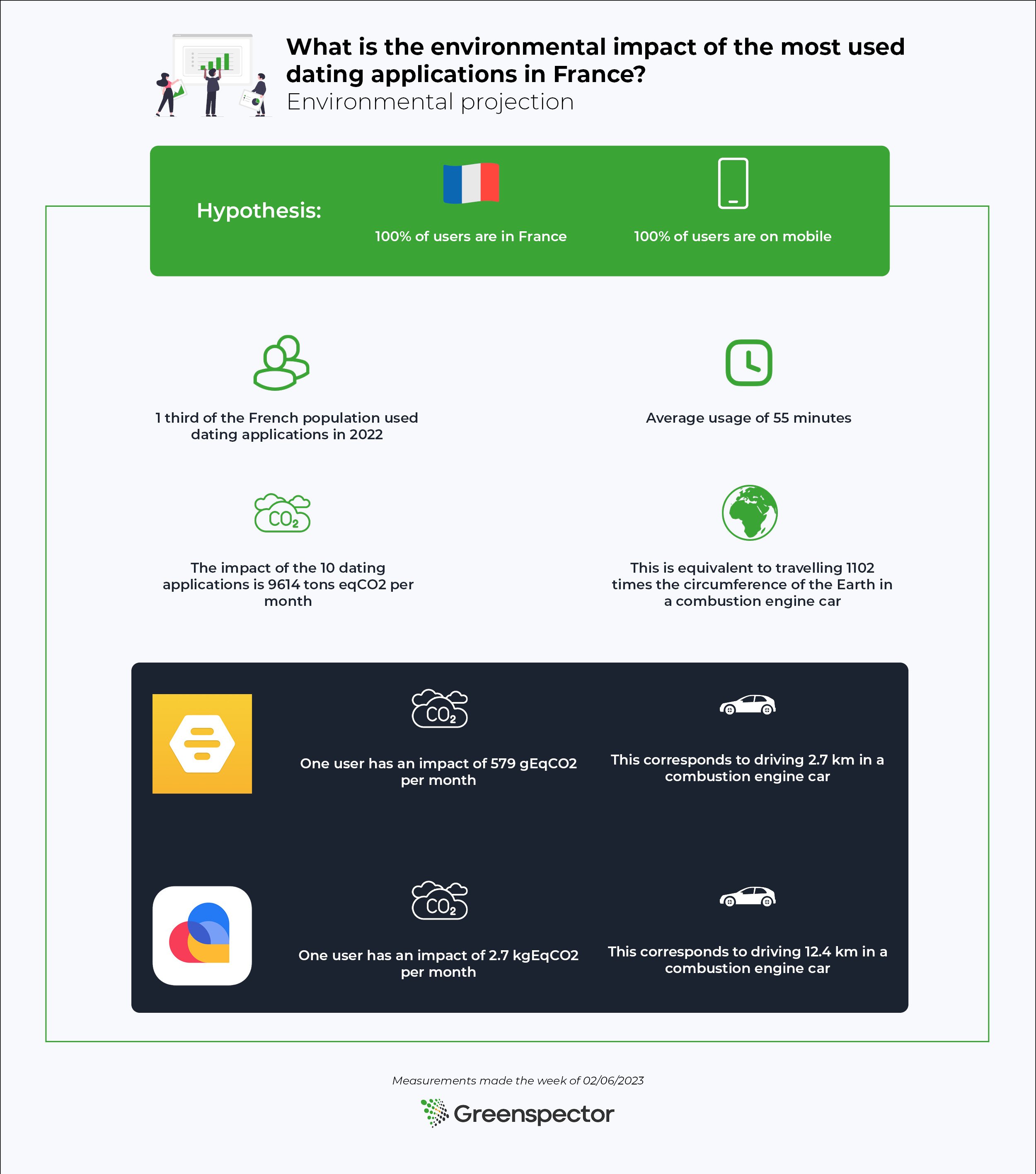
In 2022, a third of the French population used a dating application. But what is the environmental impact of looking for love?
We measured the 10 most popular mobile dating apps (on a common user journey).
Here is the Flop 3 (the most impactful apps): Lovoo, Grindr and OkCupid.
Here is the Top 3 (the least impactful apps): Bumble, Tinder and Happn.
The impactful number: Projected over a month, the impact of these 10 dating apps is 9614 tons EqCO2. That’s equivalent to driving around the Earth 1102 times in a combustion engine car (counting 23 million French users with an average use of 55 minutes per day).
Note that many people use several applications (even if it means maximizing their chances 😉 )
Since the creation of the geolocation feature for smartphones, dating applications have become very popular. Today, there are more than 8,000 of them in the world, including 2,000 in France. Nearly a third of French people use or have used a dating application. Moreover, users spend 55 minutes a day on them.
Given these figures, we can wonder about the impact of these applications on the environment.
The dating applications we chose to measure
Three criteria were used to choose the 10 applications we evaluated: popularity, free access, and availability on Android. Indeed, we chose to evaluate applications that are free to use because they are among the most used. Less than 3% of French people use paid applications.
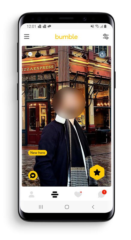
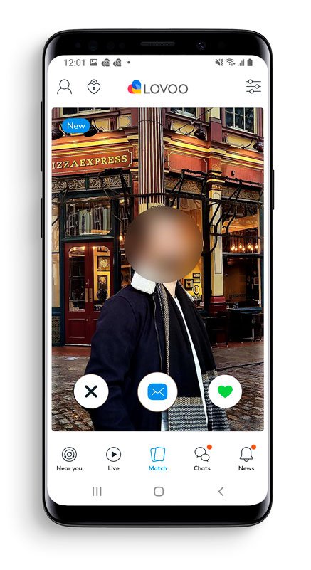
Regarding the evaluation, a common scenario was determined that is compatible with all applications, namely consulting profiles, liking or not liking the profile, and sending a message. This allows us to get as close as possible to the real use of the application.
Step 1: Launching the application
Step 2: Dislike a profile (by swiping or clicking on “reject”)
Step 3: Like a profile (or send a tap) (by swiping or clicking on “like”)
Step 4: View the details of a profile (by scrolling)
Step 5: Like the profile (or send a tap) (by swiping or clicking on “like”)
Step 6: View the last conversation
Step 7: Send a message in this conversation
Ranking of the environmental footprint of the 10 most used free dating applications in France
The 3 most impactful applications: are Lovoo, Grindr, and OkCupid.
The 3 applications with the least impact: are Bumble, Tinder, and Happn.
We note that the most impactful application (Lovoo) has an impact 5 times greater than that of the least impactful application (Bumble).
The average carbon impact of these applications is 0.25 gEqCO2 for an average duration of 25 seconds. This is equivalent to driving 1 meter in a combustion engine car.
Projecting carbon impacts over one month
To project the impact of the applications in this ranking, we will use the following assumptions
100% of users are in France
100% of users are on mobile phones
Various studies show that one-third of the French population (23 million individuals) used dating applications in 2022 with an average of 55 minutes spent on them.
Projected over a month, the impact of these 10 dating apps is 9614 tons of CO2e. This is equivalent to driving around the Earth’s circumference 1102 times in a combustion engine car.
For the highest-ranked application (Bumble), for an average of 55 minutes per day for a month, a user has an impact of 579 gEqCO2. This is equivalent to driving 2.7 kilometers in a combustion-engine car.
For the lowest ranked application (Lovoo), for an average of 55 minutes per day for a month, a user has an impact of 2.7 kgEqCO2. This is equivalent to driving 12.4 kilometers in a combustion-engine car.
Greenspector experts focus on the soberest application: Bumble
The Bumble application is particularly sober during the launch and opening phases of the message page. During these phases, little data is loaded and there is no major energy overconsumption.
On the page where the profiles are displayed, only about 4 are pre-loaded. Animations are also limited during actions on the application and a delayed loading of photos has been implemented for those not seen on the screen.
Greenspector experts focus on the least sober application: Lovoo
The Lovoo application is at the bottom of the ranking with a much higher impact than its competitors. Although the performance is excellent except for the rather long opening time of the application, the energy and data consumption is very high. The integration of ubiquitous advertising with carousels or videos contributes greatly to this over-consumption.
Opening the page to swiping loads an average of 1.9 MB of data. Many profiles are pre-loaded to be displayed smoothly after each swipe compared to competing applications. More than 20 profiles are preloaded compared to about 4 on other applications.
Summary
Between the soberest dating application and the least sober application, we note that the impact is 5 times more important.
Note that the differences are mostly due to animations, the consequent loading of data (photos, videos…), and the management of the elements displayed on the screen. By applying good practices, it is possible to reduce the environmental impact of applications.
As a user, we can reduce our impact by using only one dating application if we have several.
And to go further in digital sobriety, it is always possible to meet people in real life!
Results table
Applications
Version
Energy (mAh)
Data exchanged (MB)
Carbon impact (gEqCO2)
Water Footprint (Litres)
Soil Footprint (cm²)
Scenario duration (seconds)
Lovoo
143.0
58,9
5,3
0,7
0,1
0,2
25,3
Grindr
9.2.0
44,5
3,3
0,4
0,0
0,2
21,0
Happn
26.31.2
36,6
0,9
0,2
0,0
0,1
30,7
Fruitz
3.6.2
41,4
0,9
0,2
0,0
0,1
27,6
Hinge
9.15.1
36,6
1,0
0,2
0,0
0,1
29,0
Adopte un mec
4.9.21
86,0
0,6
0,2
0,0
0,2
30,4
Badoo
5.306.0
37,2
1,5
0,2
0,0
0,1
23,6
OKCupid
74.1.0
42,1
1,5
0,2
0,0
0,1
20,2
Bumble
5.307.0
35,6
0,8
0,1
0,0
0,1
23,2
Tinder
14.2.0
55,2
0,6
0,1
0,0
0,1
21,4
For each of the applications, measured on a Samsung Galaxy S9 (Android 10), the measurements were carried out using scripts based on GDSL (Greenspector Domain-Specific Language). This language allows automated actions to be performed on a phone. The measurements were carried out in February 2023.
Details of the scenario :
Disliking a profile
Liked a profile
View the details of a profile (see the information and the different photos) and like it
Go to the inbox and send a message in the last conversation held
Each measurement is the average of 5 homogeneous measurements (with a small standard deviation). The consumption measured on a given smartphone according to a wifi type network can be different if one is in 4G or 3G.
On the footprint projection side, the parameters taken into account to achieve these rankings are :
Following his internship at Greenspector in 2021, Corentin became a consultant in digital responsibility. He has at heart to accompany you in your projects as well as the measurement of your sites and applications.
We have decided to proceed differently for this year’s ranking 2022. Unlike the 2021 edition, we have reduced the number of applications measured. We have both taken measurements on the phone and also on the PC to meet demand. It is the purpose of these new measures to compare how the solutions stack up in terms of environmental impact (Carbon) on different user scenarios but also on two platforms: PCs and phones.
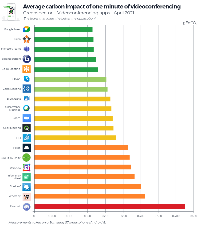
We compared 10 apps: BlueJeans, Google Meet, Go To Meeting, JITSI, Skype, Teams, Webex, Whereby, Zoho Meetings et Zoom.
For each of its applications, measured on an S7 smartphone (Android 8) and on a computer, the following three scenarios were carried out through our Greenspector Test Runner, allowing manual tests to be carried out over a period of 1 minute in one- one-to-one: :
Audio conference only
Audio and video conferencing (camera activated on both sides)
Projected ranking in the carbon impact of videoconferencing apps (gEqCO2) on mobile
Scenario / Year
1 min audio videoconference
1 min audio + camera videoconference
1 min audio + screen sharing videoconference
2022
0.31 gEqCO2
1.10 gEqCO2
0.54 gEqCO2
Equivalent in meters travelled in a light vehicle
2,76 meters
9,82 meters
4,82 meters
Audio video conferencing has an average impact of 71% less than cameras active and 42% less than sharing a screen.
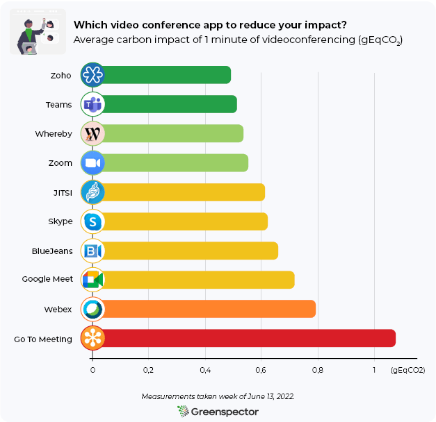
The Top 3 of one minute of videoconference on average: Zoho Meeting (0.49 gEqCO2), Microsoft Teams (0.513 gEqCO2) and Whereby (0.533 gEqCO2). Zoho Meeting, first in this ranking on the carbon impact side, has an impact 2.2 times less than GoToMeeting, the last in this ranking. The average of this ranking is 0.657 gEqCO2, 4 solutions are above.
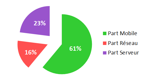
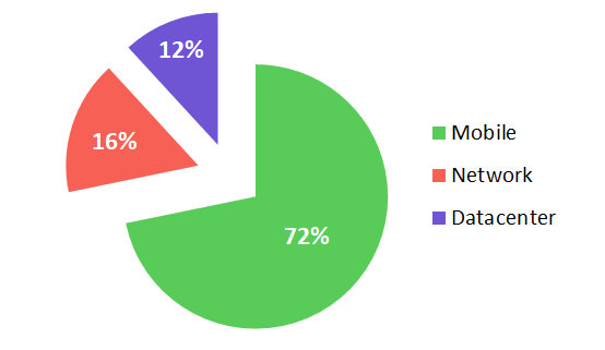
The main part of the Carbon impacts is on the user device part (61%), followed by the Server part (23%) and finally the Network part (16%).
Here are the three mobile applications with the least impact in terms of Carbon according to the scenario:
Audio (Top 3)
Audio + camera (Top 3)
Audio + Screen Sharing (Top 3)
Microsoft Teams
Whereby
Microsoft Teams & Zoho Meeting
Cisco Webex Meeting
Zoho Meeting
Zoom & Google Meet
JITSI Meet
Teams & Zoom
Cisco Webex Meeting
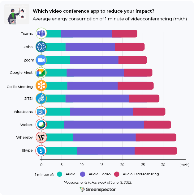
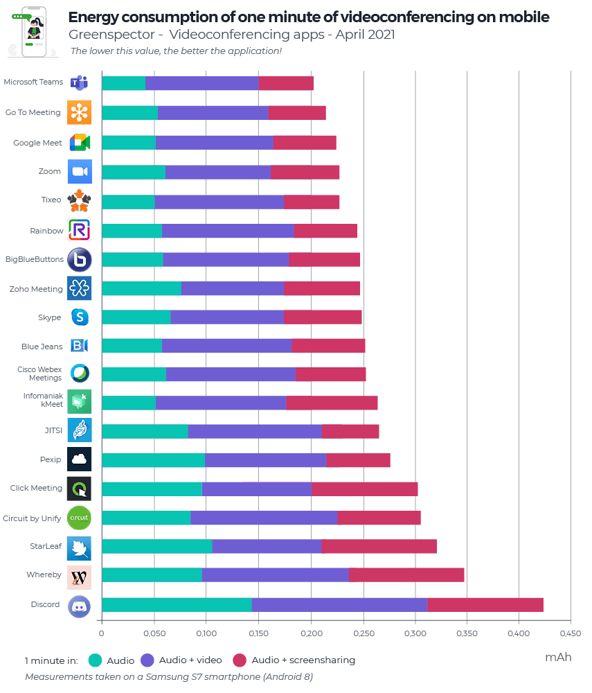
Energy consumption of videoconferencing apps (mAh) on mobile
Here are the power consumption averages for the three phone scenarios:
Scenario / Year
1 min audio videoconference
1 min audio + camera videoconference
1 min audio + screen sharing videoconference
2022
6.68 mAh
14.29 mAh
7.82 mAh
A single minute of audio video conference consumes 53% less energy (or 2.1 times less) than with cameras activated, and 14.5% less than sharing a screen.
Energy consumption of videoconferencing apps (mAh) on PC
Here are the computer energy consumption averages:
Average: 1mn of audio videoconference
Average: 1mn of audio + camera videoconference
Average: 1mn of audio + scree sharing videoconference
17.25 mAh
23.65 mAh
22.82 mAh
Here, one minute of audio video conferencing consumes 27% less (or 1.4 times less) energy than with cameras activated and 24% less than sharing a screen. Therefore, depending on the scenario, we see a much more significant difference in energy consumption on the telephone.
Zoho Meeting (76.21 mAh), BlueJeans (81.70 mAh) and Microsoft Teams (83 mAh) are the top 3 in energy consumption (all scenarios combined). First in this ranking in terms of energy consumption, Zoho Meeting consumes 1.4 times less energy than the last.
Here are the three mobile applications with the least impact in terms of Carbon according to the scenario:
Audio (Top 3)
Audio + camera (Top 3)
Audio + Screen Sharing (Top 3)
Blue Jeans
Zoho Meeting
Zoho Meeting
Cisco Webex Meeting
Zoom
Teams
Google Meet
Teams
BlueJeans
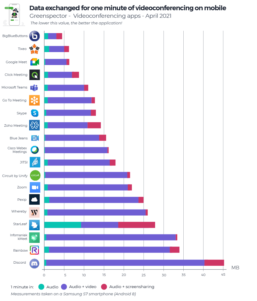
Exchanged data from videoconferencing apps (MB) on mobile
Here are the averages of the data exchanged for the three scenarios:
Scenario / Year
1 min audio videoconference
1 min audio + camera videoconference
1 min audio + screen sharing videoconference
2022
0,88 MB
10,34 MB
4,49 MB
Data consumption is where the gap between tools and uses is widening.
On average, one minute of audio video conferencing consumes 91% less (or 12 times less) data exchanged than with activated cameras and 80% less than sharing a screen.
The Top 3 (all scenarios combined) in data exchange: Whereby (4.54 MB), Zoho Meeting (8.39 MB) and Skype (9.68 MB). Whereby (via Firefox) first in this ranking in terms of data exchanged consumes 9.2 times less than the last in this ranking: GoToMeeting.
Here are the three least data-consuming apps according to the scenario:
Audio (Top 3)
Audio + camera (Top 3)
Audio + Screen Sharing (Top 3)
Blue Jeans
Whereby
Zoho Meeting
Zoho Meeting
Zoho Meeting
Skype
Whereby
Skype
Zoom
For our daily use of videoconferencing:
In the study carried out in 2021, we indicated that videoconferencing is preferable to travelling by car. Indeed, this solution is less polluting, however, beware of rebound effects! Since the global pandemic, working from home has become widespread in many companies, but this practice encourages more people to live away from their workplaces. As a result, the environmental benefits of working from home can be offset depending on the pace of remote working and the means of transport used.
In addition, it is necessary to draw attention to the increase in energy consumption of the generated hearths. It is possible that this increase might compensate for the drop in energy needs on business premises, but this must be considered on a case-by-case basis.
For each of its applications, measured on an S7 smartphone (Android 8), user scenarios were carried out using our Greenspector Test Runner, allowing manual tests.
Once the app is downloaded and installed, we run our measurements on the app’s baseline and original settings. No changes are made (even if some options allow you to reduce energy or resource consumption: data saving mode, dark theme, etc. However, we encourage you to check the settings of your favourite application in order to optimize its impact.
The average of five homogeneous measurements (with a low standard deviation) is used for each measurement. The consumption measured on the given smartphone according to a Wi-Fi type network may be different on a laptop PC with a wired network for example. For each of the iterations, the cache is first emptied.
As for computer measurements, the Yocto-Watt from YoctoPuce was used to measure energy consumption. In the same way as for mobile applications, heavy clients, when one existed, were downloaded and then installed without changing the basic parameters. This chip, therefore, only allows you to have energy consumption, which is why the carbon impact and the data exchanged in this article only concern the telephone part. Additional resource on the Yoctopuce.
Lysa CORCUFF is a 5th-year student in computer science engineering school at Polytech Nantes. Currently on an end-of-studies internship since March, she participates in Greenspector missions as a Digital Sobriety consultant.
The e-commerce market in France is experiencing very significant growth. E-commerce sales have increased from 57 billion in 2014 to 112.2 billion euros in 2021. The health crisis is partly responsible for this increase. It has considerably increased online shopping and created habits among the French. Among these sales, those on mobile have experienced impressive growth. They increased by 13% in 2021. Nearly one in two French people (48%) now make purchases via their phones. One in three French people (34%) buys via their phone at least once a month.
Shopping cart abandonment accounts for $18 billion in lost sales every year. Mobile abandonment rates are higher (97%) than desktop abandonment rates (between 70 and 75%). The reasons are multiple: the price, the shipping costs, the speed of delivery, the discounts available, but also the loading time of the site (Source). M-commerce sites and applications, therefore, have every interest in demonstrating performance and digital sobriety.
What about the ten most visited e-commerce sites and applications in France? What are the most frugal sites and applications on which to do your e-shopping in complete sobriety?
This study’s distinguishing feature is that it is based on a common scenario that goes from the search and consultation of a product to the consultation of the basket before payment. Thus, we can be as close as possible to the real uses of Internet users and mobile users.
Ranking of the environmental footprint of the ten most popular e-commerce sites in France
The three least impacting sites are Leclerc, Cdiscount et eBay.
The three most impactful sites are Amazon, Carrefour et Veepee.
We observe more than 2.7 times more impact between the least impacting site (Leclerc) and the most impacting site (Amazon) in this ranking.
The average carbon impact of these ten websites is 0.92 gEqCO2 for an average duration of the scenario of 1 minute and 54 seconds, i.e. the equivalent of 8 meters travelled in a light vehicle.
Projection of carbon impacts over one month
It is estimated that 55% of global e-commerce traffic is done on mobile devices, compared with 39% on PCs and 6% on tablets (Source).
If we project the carbon impact of these ten e-commerce sites for an average of 37.41 million visits per month lasting 5 minutes and 54 seconds, this impact would be 439.6 tonnes of CO2eq per month (87.5 tonnes on mobile, 341.0 tonnes on PC and 11.1 tonnes on tablet). It is the equivalent of 98 times the circumference of the Earth travelled by light vehicle.
Regarding the best website in this ranking (Leclerc) for 9.99 million visits/month with an average duration of 3 minutes, this impact would be 37.0 tonnes of CO2eq per month (5.9 tonnes on mobile, 30 .3 tons on PC and 0.8 tons on a tablet). It is the equivalent of 8 times the circumference of the Earth travelled by light vehicle.
For the worst website in this ranking (Amazon) with 164,32 million monthly visits and an average duration of 8 minutes, the carbon impact would be 2639.4 tonnes of CO2eq (588.1 tonnes on mobile, 1978.4 tons on PC and 72.9 tons on tablet). It is the equivalent of 588 times the circumference of the Earth travelled by light vehicle.
The Leclerc website stands out especially in terms of the stages of research, viewing a product and viewing the basket. Indeed, this site consumes little energy on these phases compared to its competitors. Only essential information is present on this search page (name of products, price, availability). When viewing the product sheet, customers have the option of adding the item quickly to their basket, and drop-down menus are provided for additional information. Also, this site exchanges the least amount of data to complete the scenario.
On the search page of a product, many good practices are applied. There are few network exchanges with 12 HTTP requests and a single CSS file. The images are lazy-loaded.
The Amazon website gets its poor ranking mainly from the research and viewing stages of a product. Indeed, this site consumes a lot of energy during these phases, and exchanges a lot of data. There are 9.10 MB of data exchanged for the research phase (compared to 1.03 MB for Leclerc), and 5.58 MB of data exchanged for the product sheet (compared to 0.18 MB for Leclerc). When searching, a lot of information appears (indication “Suggestions”, “Sponsored”, “Amazon Choice” or “No. 1 in sales”, product name, rating, number of reviews, price, reduction, date of delivery). An autoplay advertising video even appears in the middle of the products. When viewing the product, a lot of information also appears (offers, delivery dates in case of free or accelerated delivery, product details, products frequently purchased together…). In addition, the customer is obliged to scroll before being able to access and click on the “Add to cart” button.
Going into more detail on the product search page, there are a lot of network exchanges with 109 HTTP requests and 9 CSS files. The deferred loading (lazy-loading) of images is not applied, which implies a loading of images not visible on the screen. This practice should be avoided because the user will not necessarily scroll to these images.
Ranking of the environmental footprint of the then most popular m-commerce apps in France
The three least impacting apps are eBay, Leclerc et Carrefour.
The three most impactful apps are Amazon, AliExpress et ManoMano.
We observe more than 2.8 times more impact between the least impacting app (eBay) and the most impactful app (Amazon) in this ranking.
The average carbon impact of these 10 applications is 0.69 gEqCO2 for an average duration of the scenario of 2 minutes and 1 second, i.e. the equivalent of 6 meters travelled in a light vehicle.
The eBay application takes its first place in the phases of launching the application and viewing the basket. Indeed, during these phases, this application consumes little energy. In addition, it exchanges little data over the entire duration of the scenario (only 0.53 MB).
Amazon once again finds itself in last place in the ranking, far behind its competitors. This result can again be explained by the research and visualization phases of the product, where this application consumes much more energy than the others. In terms of data exchanged, we observe 8.22 MB for research (compared to 0.23 MB for eBay) and 2.6 MB for the product sheet (compared to 0.13 MB for eBay).
Conclusion
Whether for the most visited websites or m-commerce applications in France, we see an impact almost three times greater between the soberest platform and the most impactful one.
It shows that by managing the information visible on the screen, the loading of images, the consumption of scripts and the data exchanged during the scenario differently, it is possible to reduce the environmental impact of a website and a mobile app.
As an e-shopper using his mobile, it is better to go through applications than websites. Indeed, websites have an average impact of 39% more on the scenario studied. Only AliExpress has a higher consumption on the app than on the website. However, applications have an effect on their download and updates. They are therefore to be preferred only in the event of regular orders.
In terms of digital sobriety, nothing will equal buying food products at the market and other products from local traders, of course!
Results
Ranking of the 10 most popular websites in France
Websites
URL
Energy consumption (mAh)
Exchanged Data (Mo)
Carbon Impact (gEqCO2)
Water footprint (Litres)
Surface footprint (cm²)
Scenario duration (seconds)
Leclerc
e.leclerc
11,57
2,59
0,61
0,10
1,29
102.72
Cdiscount
cdiscount.com
13,49
2,62
0,69
0,13
1,50
108.03
eBay
ebay.fr
14,00
3,96
0,78
0,14
1,58
122.24
Leroy Merlin
leroymerlin.fr
15,47
3,15
0,80
0,14
1,72
112.67
AliExpress
fr.aliexpress.com
14,84
3,89
0,80
0,13
1,67
114.46
ManoMano
manomano.fr
13,60
6,30
0,87
0,14
1,56
107.33
Fnac
fnac.com
16,88
4,20
0,90
0,15
1,90
118.37
Veepee
veepee.fr
14,50
8,19
1,00
0,16
1,68
114.95
Carrefour
carrefour.fr
20,25
4,14
1,04
0,19
2,25
118.8
Amazon
amazon.fr
19,04
18,06
1,68
0,24
2,29
123.84
Ranking of the 10 most popular apps in France
Applications
Version
Energy consumption (mAh)
Exchanged Data (Mo)
Carbon Impact (gEqCO2)
Water footprint (Litres)
Surface footprint (m²)
Scenario duration (seconds)
eBay
6.51.0.2
11,69
0,53
0,51
0,09
1,27
119,73
Carrefour
14.4.3
11,67
0,57
0,52
0,10
1,29
108,64
LeclercDrive
15.2.0
11,97
0,45
0,52
0,10
1,30
128,01
Leroy Merlin
7.12.3
12,95
0,51
0,55
0,11
1,41
115,84
Cdiscount
1.43.0-twa
13,81
0,04
0,58
0,11
1,49
115,44
Fnac
5.2.7
12,78
1,14
0,59
0,11
1,41
128,84
Veepee
5.24.2
12,17
2,32
0,63
0,11
1,35
114,47
ManoMano
1.15.2
15,48
0,26
0,65
0,12
1,69
124,59
AliExpress
8.44.0
17,55
2,33
0,84
0,17
1,94
123,71
Amazon Shopping
24.6.0.100
19,74
12,86
1,46
0,22
2,31
126,03
For each site and each application, measured on a Samsung Galaxy Note 8 (Android 9), the measurements were carried out using scripts using the GDSL (Greenspector Domain-Specific Language) language. This language makes it possible to automate actions to be carried out on a telephone. The measurements were taken between March 29 and April 1, 2022.
Detail of the scenario common to the 20 measures: -Launch of the site or application -30 second pause on the homepage -Search for a product using the search bar, then view the products on offer -Selection of a product, then visualization of its characteristics (details, opinions, etc.) -Adding the product to the cart -30 second pause on the shopping cart page
Each measurement is the average of 5 homogeneous measurements (with a low standard deviation). The consumption measured on the given smartphone according to a wifi type network may be different on a laptop PC with a wired network for example. For each of the iterations on the websites, the cache is first emptied.
On the projection side of the footprint, the parameters taken into account to carry out these classifications are:
Viewing Ratio: 100% Smartphone Viewing ratio: 100% France Server location: 100% World
Léo CHAUVIN is a student in the 5th year of engineering school in electronics and computer science at ESEO in Angers. He has been on an end-of-studies internship at Greenspector since March.
He participates in the development of functionalities on Greenspector tools.
The use of social networking-type mobile applications is increasing every year. Like the professional use of videoconferencing tools, these uses have put additional pressure on the network and the servers of these solutions.
How do the players take the environmental impact into account in their strategy? What are the impacts of our activities on social networks? What are the most/least impacting solutions for the environment, network congestion and the autonomy of our smartphones?
For this study, we chose to measure the news feed of the 10 most popular social media applications: Facebook, Instagram, LinkedIn, Pinterest, Reddit, Snapchat, TikTok, Twitch, Twitter, andYoutube. These applications are different in terms of functionality. We have chosen to compare them in terms of carbon impact, consumption of energy and data exchanged.
Projected ranking in the carbon impact of social network applications newsfeed (g EqCO2)
Application
The carbon impact of newsfeed/min
2021 Rank
2020 Evolution
Water Resource
Land Use
Youtube
0.46 gEqCO2/min
1
=
0.08 Liters
0.92 m²
Twitch
0.55 gEqCO2/min
2
+3
0.09 Liters
1.01 m²
Twitter
0.60 gEqCO2/min
3
+1
0.10 Liters
1.14 m²
LinkedIn
0.71 gEqCO2/min
4
-1
0.10 Liters
1.00 m²
Facebook
0.79 gEqCO2/min
5
-3
0.12 Liters
1.38 m²
Snapchat
0.87 gEqCO2/min
6
+1
0.12 Liters
1.29 m²
Instagram
1.05 gEqCO2/min
7
-1
0.12 Liters
1.03 m²
Pinterest
1.30 gEqCO2/min
8
=
0.15 Liters
1.25 m²
Reddit
2.48 gEqCO2/min
9
=
0.23 Liters
1.35 m²
TikTok
2.63 gEqCO2/min
10
=
0.27 Liters
1.88 m²
According to the Global Web Index July 2021, we spend an average of 2 hours and 24 minutes on social networks, i.e. +2 minutes compared to 2019. If we project the average carbon impact of the 10 applications measured (1.15 gEqCO2) out of 60 seconds to the average time spent per user, we obtain for one user/day: 165.6 gEqCO2. It is the equivalent of 1.4 km in a light vehicle. It also corresponds to 60 kgEqCO2 per user per year, or the equivalent of 535 km travelled in an average light vehicle in France. It is equivalent to 1% of the carbon impact of a French (7 Tons).
In May 2021, the number of active users of social networks stood at 4.33 billion (55.1% of the world population), or + 35% compared to 2019. 99% access social networks on a mobile device. 80% of the time (2 hours and 24 minutes) on social networks is spent on a mobile device. If we project our carbon/user impact to these data, we obtain 262 million Tons EqCO2 per year for the 4.33 billion mobile users, i.e. the equivalent of 0.61% of the EqCO2 impacts in the world in 2019 and more than half of France’s carbon emissions (56%).
Energy consumption of social media applications newsfeed (mAh)
Application
Energy Consumption of newsfeed/min
2021 Rank
2020 Evolution
Youtube
8.58 mAh
1
=
Instagram
8.9 mAh
2
+5
LinkedIn
8.92 mAh
3
-1
Twitch
9.05 mAh
4
-1
Twitter
10.28 mAh
5
+1
Pinterest
10.83 mAh
6
+2
Reddit
11.04 mAh
7
-4
Snapchat
11.48 mAh
8
+2
Facebook
12.36 mAh
9
-5
TikTok
15.81 mAh
10
-1
When it comes to energy consumption, the news feeds for Snapchat, Facebook and TikTok apps are the worst performers. Good students on the energy side are Youtube, Instagram and LinkedIn. The TikTok news feed here consumes 1.8 times more power than Youtube‘s.
The average established for energy consumption is 10.73 mAh or + 1.2% compared to our 2020 ranking.
Data exchanged from social network applications newsfeed (MB)
Application
Exchanged Data on newsfeed/min
2021 Rank
2020 Evolution
Youtube
3.09 MB
1
=
Twitter
6.28 MB
2
+2
Twitch
6.87 MB
3
+2
Facebook
11.15 MB
4
-2
LinkedIn
15.34 MB
5
-2
Snapchat
17.26 MB
6
+1
Instagram
32.46 MB
7
-1
Pinterest
40.65 MB
8
=
TikTok
96.23 MB
9
+1
Reddit
100 MB
10
-1
In terms of the exchanged data, the bad guys are the news feeds of the Reddit, TikTok and Pinterest apps. The good students in terms of data exchanged are Youtube, Twitter and Twitch. Reddit consumes 32 times more data than the Youtube app.
The average established for the data exchanged is 32.93 MB for this use, or 71% more compared to the 2020 edition. Only 3 applications are above this threshold. Watch out for your data plans! Projection in 1 month, you will have consumed 142 Go!
Taking into account the average time spent on the social networks according to the Visionary Marketing blog: if you only use Tik Tok (up to 52 minutes per projected day), you will consume nearly 149 GB per month. While Instagram (up to 53 minutes per day) will make you consume 51 GB! Are you more into Facebook? It will make you consume nearly 19 GB (up to 58 minutes per day) per month.
Pour chacune de ses applications, mesurées sur un smartphone S7 (Android 8), le scénario suivant a été réalisé au travers de notre Greenspector Test Runner, permettant la réalisation de tests manuels sur une durée de 1 minute en one-to-one.
Launch the application (wait 20 seconds)
Scroll through the news feed or the “Discover” tab of the applications
Application
Version
Downloads
Google Playstore Grade
YouTube
16.40.35
10 000 000 000+
4,3
LinkedIn
4.1.627.1
500 000 000+
4,3
Reddit
2021.41.0
50 000 000+
4,3
Facebook
340.0.0.27.113
5 000 000 000+
2,6
Twitch
11.7.0
100 000 000+
4,5
Twitter
9.16.1
1 000 000 000+
3,5
Instagram
210.0.0.28.71
1 000 000 000+
3,8
Pinterest
9.35.0
500 000 000+
4,6
TikTok
21.6.5
1 000 000 000+
4,4
Snapchat
11.50.0.29
1 000 000 000+
4,2
Each measurement is the average of 3 homogeneous measurements (with a low standard deviation). The measured consumption on the smartphone according to a wifi type network can be different on a laptop PC with a wired network. For each of the iterations, the cache is first emptied.
Kimberley DERUDDER has been digital marketing manager at Greenspector for more than 5 years. Kimberley graduated with a master’s degree in Marketing – Communication and specialized in Inbound Marketing after her first two years at Greenspector. Today in charge of the animation of the marketing, social media and lead generation strategy, she also takes care of app comparisons and battles.
For this new 2021 edition of our ranking, we have completed our 2020 study with new solutions and even extended it to web solutions. The objective of these measures is to see how the solutions stand in terms of environmental impact (Carbon) with each other on common user scenarios but also to provide benchmarks on our uses of videoconferencing.
So this time we compared 19 mobile applications: Big Blue Button, BlueJeans, Circuit by Unify, Cisco Webex Meetings, ClickMeeting, Go To Meeting, Discord, Google Meet, Infomaniak kMeet, Jitsi, Pexip, Rainbow, Skype, StarLeaf, Microsoft Teams, Tixeo, WhereBy, Zoho Meeting et Zoom.
For each of its applications, measured on an S7 smartphone (Android 8), the following three scenarios were carried out through our Greenspector Test Runner, allowing manual tests to be carried out over a period of 1 minute in one-to-one:
Audio conference only
Audio + video conference (camera activated on each side)
Projected carbon impact ranking of videoconferencing applications (gEqCO2)
Here are the impact averages for the three scenarios:
User scenario / Year
1 mn of audio conference
1 min of audio + video conference
1 min of audio + screen sharing conference
2021
0.155 gEqCO2
0.403 gEqCO2
0.163 gEqCO2
1,38 meters made in a light vehicle
3,6 meters made in a light vehicle
1,46 meters made in a light vehicle
2020
0.102 gEqCO2
0.289 gEqCO2
0.121 gEqCO2
On average, one minute of audio-video conferencing impacts 61% less (or 2.6 times less) than with activated cameras and 5% less than when sharing a screen. According to our recent study on the impact of streaming a MyCanal video, on average, one hour of video streaming corresponds to an impact of 14g eqCO2. Or 0.233g eqCO2 per minute, or 1.7 less impacting than a minute of video conferencing in audio and camera but 1.5 times more than a minute of video conferencing in audio-only.
The Top 3 for one minute of videoconferencing on average: Google Meet (0.164 gEqCO2), Tixeo (0.166 gEqCO2), and Microsoft Teams (0.167 gEqCO2). Google Meet, first in this ranking on the carbon impact side, has an impact 2.5 times less than, Discord, the last app in this ranking. The average of this ranking is 0.237 gEqCO2, only 7 solutions are above.
The main part of the Carbon impacts is situated on the user device part (72%), followed by the Network part (16%) and finally the Server part (12%).
Here are the three least impacting applications in terms of Carbon depending on the scenario:
Audio (Top 3)
Audio + camera (Top 3)
Audio + screensharing (Top 3)
Microsoft Teams
Big Blue Buttons (via Chrome)
Microsoft Teams
Google Meet
Click Meeting
Go To Meeting
Infomaniak Meet
Google Meet
Tixeo
Energy Consumption of Video Conferencing Applications (mAh)
Here are the energy consumption averages for the three scenarios:
User scenario/year
1 mn of audio conference
1 mn of audio + video conference
1 mn of audio + screen-sharing conference
2021
9.84 mAh
16.26 mAh
9.98 mAh
2020
6.6 mAh
14.24 mAh
7.50 mAh
On average, one minute of audio-video conferencing consumes 39% less (or 1.6 times less) energy than with activated cameras and 1.5% less than when sharing a screen.
The Top 3 (all scenarios combined) in energy consumption: Microsoft Teams (27.27 mAh), Go To Meeting (28.79 mAh), and Google Meet (30.11 mAh). Microsoft Teams first in this ranking in terms of energy consumption consumes 2 times less than the last in this ranking: Discord.
Here are the three most energy efficient applications depending on the scenario:
Audio (Top 3)
Audio + camera (Top 3)
Audio + screen-sharing (Top 3)
Microsoft Teams
Zoho Meeting
Microsoft Teams
Tixeo
Zoom
Tixeo
Infomaniak kMeet
StarLeaf
Go To Meeting
Exchanged data from videoconferencing applications (MB)
Here are the averages of the data exchanged for the three scenarios:
User scenario/year
1mn of audio conference
1 mn of audio + video conference
1 mn of audio + screen-sharing conference
2021
1.15 Mo
16.01 Mo
1.87 Mo
2020
0.806 Mo
8.44 Mo
1.43 Mo
It is on the consumption of data that the gaps are widening between tools and uses.
On average, one minute of audio conferencing consumes 92% less (or 14 times less) data exchanged than with activated cameras and 38% less than when sharing a screen.
The Top 3 (all scenarios combined) in energy consumption: Big Blue Buttons (4.49 MB), Tixeo (6.21 MB), and Google Meet (6.30 MB). Big Blue Buttons (via Chrome) first in this ranking for exchanged data consumes 10 times less than the last in this ranking: Discord.
Here are the three applications that consume the least amount of data according to the scenario:
Audio (Top 3)
Audio + camera (Top 3)
Audio + screensharing (Top 3)
Cisco Webex Meetings
Big Blue Buttons
Cisco Webex Meetings
Blue Jeans
Tixeo
Infomaniak kMeet
Google Meet
Google Meet
Google Meet
And for our daily use of videoconferencing:
Just like our first study, we advise you during your online conferences to:
Favour audio only during your meetings: the video stream (camera) will tend to consume a lot more. A mobile session is on average 2.6 times more impactful for the environment in terms of carbon impact when the video is added to the audio. Adding screen sharing is not penalizing if it is useful.
Optimize the settings (when possible): adopt the dark theme, activate the data or energy-saving settings (in the case of LED, AMOLED type screens).
Prefer videoconferencing over travelling by car!
Comparison for 2 people who talk to each other in a 3-hour session in audio and active cameras (0.403 gEqCO2 per minute) while one of the two has made 20 km (112 gEqCO2 / km in France) round trip for a face to face.
By videoconference: 180 * 0.403 * 2 = 145 gEqCO2
By car: 112 * 20 = 2.4 kg EqCO2 or approximately 16x more impact.
Measured versions: Big Blue Button via Chrome (87.0.4280.101), BlueJeans (45.0.2516), Circuit by Unify (1.2.5102), Cisco Webex Meetings (41.2.1), ClickMeeting (4.4.6), Go To Meeting (4.6.0.7), Discord (62.5), Google Meet (2021.01.24.355466926), Infomaniak kMeet (2.2), Jitsi (20.6.2), Pexip (3.4.6), Rainbow (1.84.1), Skype (8.68.0.97), StarLeaf (4.4.29), Microsoft Teams (1416.1.0.0.2021020402), Tixeo (16.0.1.2), WhereBy (2.3.0), Zoho Meeting (2.1.4) et Zoom (5.5.2.1328).
For each of its applications, measured on an S7 smartphone (Android 8), the user scenarios were carried out through our Greenspector Test Runner, allowing manual tests to be carried out.
Once the application is downloaded and installed, we run our measurements on the basic and original settings of the application. No modification is made (even if certain options make it possible to reduce the consumption of energy or resources: data saving mode, dark theme, etc. However, we encourage you to check the settings of your favourite application to optimize it. impact.
Each measurement is the average of 5 homogeneous measurements (with a low standard deviation). The consumption measured on the given smartphone according to a Wi-Fi type network can be different on a laptop PC with a wired network for example. For each of the iterations, the cache is first emptied.
To assess the French impacts of infrastructures (datacenter, network) in the carbon projection calculations, we relied on a Greenspector methodology based on real data measured from the volume of data exchanged. This evaluation methodology takes into account the consumption of resources and energy in use for the requested equipment. As this is a very macroscopic approach, it is subject to uncertainty and could be fine-tuned to adapt to a given context, to a given tool. For the Carbon projection, we assumed a 50% projection via a Wi-Fi network and 50% via a mobile network.
To assess the impacts of the mobile in the carbon projection calculations, we measure on a real device, the energy consumption of the user scenario and in order to integrate the material impact share, we rely on the wear rate theory generated by the user scenario on the battery, the first wearing part of a smartphone. 500 full charge and discharge cycles, therefore, cause a change of smartphone in our model. This methodology and method of calculation have been validated by the consulting firm specializing in eco-design, Evea.
In a process of continuous improvement, we are vigilant in constantly improving the consistency of our measurements as well as our methodology for projecting CO2 impact data. Therefore, it is unfortunately not possible to compare a study published a year earlier with a recent study.
Kimberley DERUDDER has been digital marketing manager at Greenspector for more than 5 years. Kimberley graduated with a master’s degree in Marketing – Communication and specialized in Inbound Marketing after her first two years at Greenspector. Today in charge of the animation of the marketing, social media and lead generation strategy, she also takes care of app comparisons and battles.
Greenspector may use cookies to improve your experience. We are careful to only collect essential information to better understand your use of our website.
This website uses cookies to improve your experience while you navigate through the website. Out of these, the cookies that are categorized as necessary are stored on your browser as they are essential for the working of basic functionalities of the website. We also use third-party cookies that help us analyze and understand how you use this website. These cookies will be stored in your browser only with your consent. You also have the option to opt-out of these cookies. But opting out of some of these cookies may affect your browsing experience.