Google unveiled the best of 2019 Google Playstore in early December last year. Thanks to the GREENSPECTOR App Mark technology, we are revealing the ranking of these applications according to the App Mark, which assesses applications according to 5 criteria: performance, sobriety, discretion, inclusion and, of course, ecology.
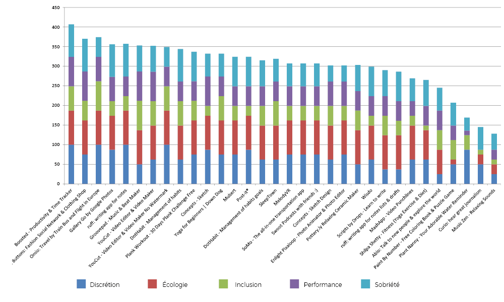
Favorite 2019 applications ranking
At the top of this ranking we find the following three applications: Boosted, 21 Buttons and Omio. Only 1/3 of the applications are below the global ecoscore average. Among the 3 least sober applications of this ranking, 2 are strongly impacted by a zero score on at least one of the key indicators. In fact, the Plant Nanny application presents a score of zero on the ecological side (32 MB of data loaded during our evaluation), for the Curio application, it is the performance indicator which is zero, impacted by the time of application loading more than 23 seconds.
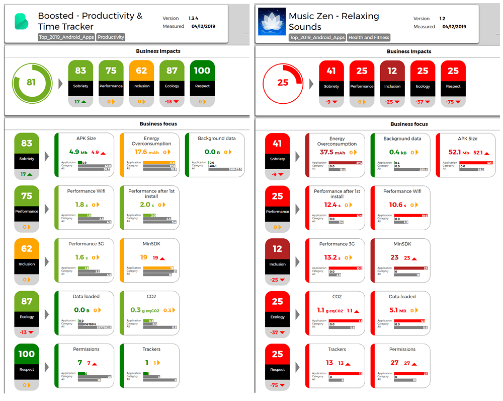
Focus on Boosted vs Music Zen
Here we compare the application with the best GREENSPECTOR App Mark (Bosted) versus the lowest ranked application in this ranking (Music Zen).
Even if the energy consumption is not the strong point of Boosted, MusicZen consumes 2 times more battery than Boosted on an identical route … what not to be “Zen” For its autonomy! Simple explanations: there are many trackers in this application which alters its performance and its sobriety. As a reminder, an added tracker also means an average of 8.5% more resource consumption.
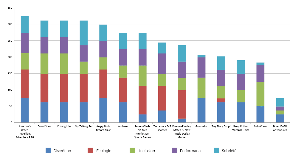
Favorite 2019 games apps ranking
On the podium of the highest ranked game applications, we find: Assassin’s Creed Rebellion, Brawl Stars and Fishing Life. We observe that the last three game applications have a zero score for the ecology indicator. This is explained by two highly high technical criteria: the volume of data loaded as well as the CO2 impact. By the way, gaming applications are also more impactful on average than other applications.
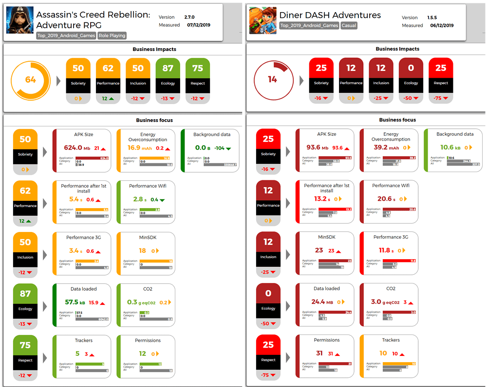
Focus on Assassin’s Creed Rebellion vs Diner Dash Adventures
This time we are comparing the Assassin’s Creed Rebellion application versus Diner Dash Adventures.
The 2021 edition of this ranking is available! Read the study
The web browser is a main tool on a mobile device. Not only for websites but also for new applications based on web technologies (progressive web app, games, …).
In our 30 most popular mobile apps ranking, among the mails, direct messaging, social networks, browsers categories, web browsing and social networks are on average more consuming than games or multimedia applications. The ratio would be 1 to 4 between the least and most energy consuming applications.
Decreasing the environmental impact of the digital life and increasing the autonomy of phones go in part through the choice of a good browser. Just as if you want to reduce the impact of your mode of transport, it is important to take the most efficient vehicle.
Last year we published the 2018 ranking of the least energy-consuming browsers, we made a new edition for 2020, more complete, made with our GREENSPECTOR App Mark.
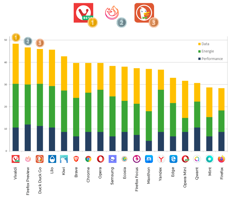
Overall Ranking
The average rating is 36/100 which is pretty mediocre. It can be explained by low notes for each of the metrics. The three least energy-consuming browsers are: Vivaldi, Firefox Preview, Duck Duck Go.
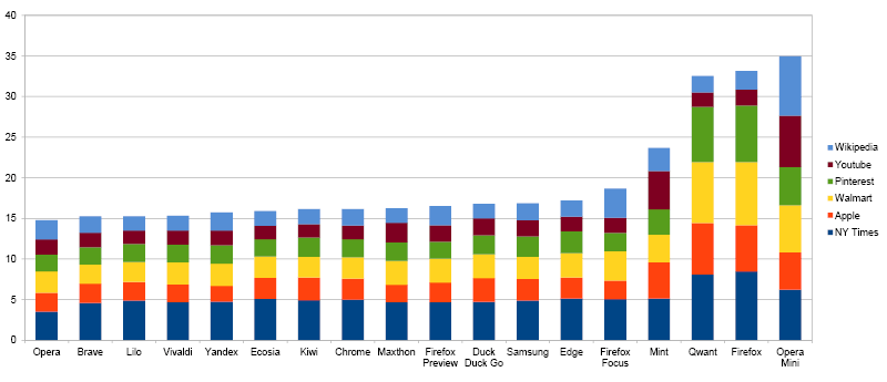
Overall energy consumption (in mAh)
The median is 47 mAh and a large part of the browsers are in this consumption level (8/18 are in the 2nd quartile). Note that the last 3 browsers in the ranking are recognized by a consumption 75% higher than the median. Firefox, Qwant and Opera Mini are indeed very energy intensive.
Energy consumption of navigation (in mAh)
The last 3 browsers of the global ranking (Opera Mini, Firefox and Qwant) as well as Mint consume much more than the average (between 20 and 35 mAh against 16 mAh).
It is sufficient to say that for most browsers (apart from the previous exceptions), pure navigation is not going to be the reason for the difference in overall consumption. This is mainly due to the use of visualization engines. Most browsers use the Chromium engine. For Opera Mini, the specificity is that a proxy is used and can compress the size of the sites. It seems that this proxy is not good for the energy, in fact the decompression on the user’s phone consumes a lot of energy.
For the Firefox app, over-consumption of energy is a known and shared thing, this is one of the reasons why Mozilla is under development of a new browser. Internal code name is Fenix and public one is Preview. The measures in this ranking are rather encouraging on consumption (in the average). For Qwant, this is due to the use of the Firefox engine! The measurements between Qwant and Firefox are indeed very close.
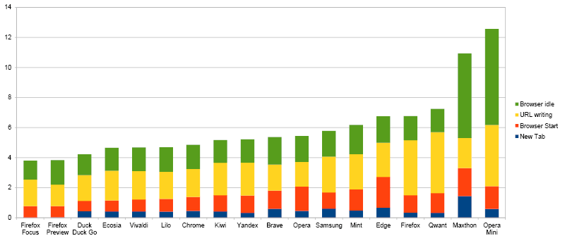
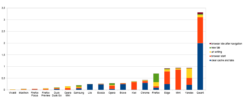
Power consumption of features (in mAh)
The main feature that is browsing the web also requires other important features: new tab opening, enter an address in the taskbar … Indeed, when we open a new tab, each browser offers different features: mainly used websites, latest news, …
On pure navigation, browsers differ little, there are significant differences in energy consumption on other features with a ratio of more than 3 (between 4 mAh and 12 mAh).
Note that the first 3 (Firefox Focus, Firefox Preview and Duck Duck Go) have a simple homepage. The consumption of the browser in Idle (inactivity) is then very low. Functional sobriety pays the consequences!
When launching browsers, the energy consumptions are quite similar to each other. Note, however, that opening a tab and writing a URL are actions that are performed several times. If we take a daily projection of 30 new tabs and 10 URL entries, we can still see the difference between browsers and the large advance of Firefox Preview and Focus!
The basic features are not insignificant in the overall consumption.
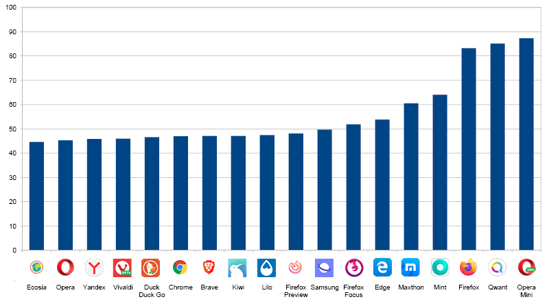
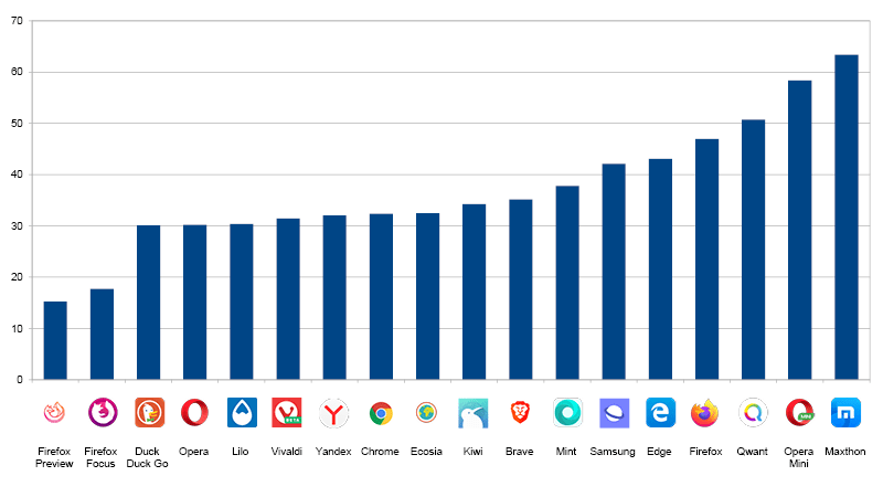
Projection of autonomy (in number of hours)
If we take this energy data and project it for a navigation of several websites, we identify the maximum time that the user can navigate to the complete discharge of his battery:
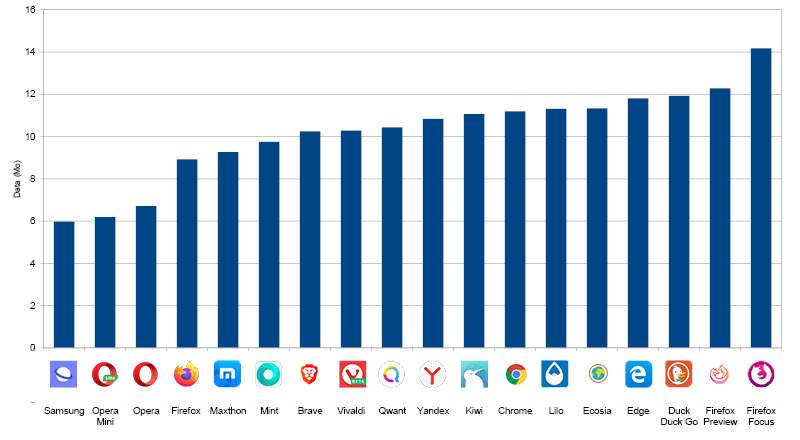
Data consumption (in MB)
The difference in data consumption between browsers (8 MB difference) is explained by the pure navigation and the different features.
On the navigation, we explain this difference:
some applications do not manage the cache at all for reasons of data protection and confidentiality (Firefox Focus)
proxy usage that optimizes data (Opera Mini)
a difference in the implementation of cache management. It is possible that some browsers invalidate the cache and that data is loaded while they are cached.
additional data consumption continues in the background (idle tabs, background data not blocked …)
download performance differences that increase the duration of the measurement. Indeed, if a browser is powerful, the counterpart is that many more data are potentially loaded in the background.
The difference in overall consumption can also be explained by the data consumption of the basic functionalities:
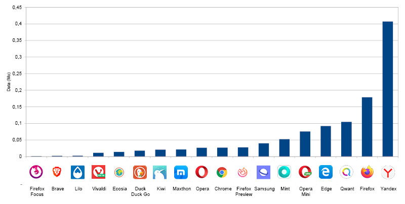
Many browsers are very consuming. We note the 3 MB of Qwant that seem abnormal! It can be considered that for browsers, this consumption should be close to 0. Indeed, the main feature of a browser is to display a website, any feature (and associated consumption) can be considered as “over-consumption”. In this context, many browsers consume data when writing the URL. This is mainly explained by the URL proposal features. There is indeed exchange between the mobile and the servers, either directly by the browser or by the associated search engine.
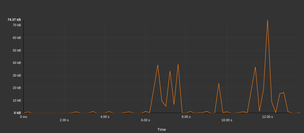
For example, for the Yandex browser below, the details of data exchanges when writing a URL show more than 400 KB of data exchanged.
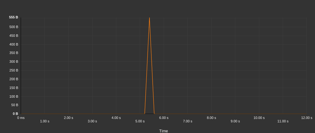
In contrast, below, trading for Brave is frugal with less than 2 KB.
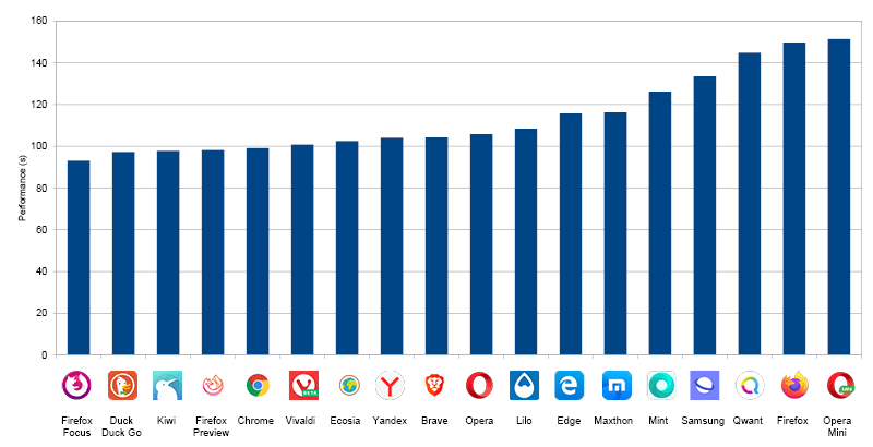
Browser performance (in seconds)
The measures allow us to evaluate the performance of the key features:
Launching the browser
Adding a tab
Writing a URL
Removing the cache
Mozilla Kraken Bench
NB: This study does not evaluate the display performance of websites. However, the Mozilla Kraken benchmark allows this in part by evaluating the functionality of browsers.
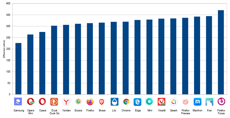
Efficiency of browsers (in mAh/s)
We can evaluate the efficiency of browsers by taking the performance of the Mozilla Kraken benchmark and the associated energy. Efficiency is the energy consumption per unit of time:
Samsung, Opera Mini and Opera are the most efficient browsers. This ranking is different from that of overall energy consumption. For Samsung Internet, this first place in terms of efficiency on a Samsung hardware can be explained by the optimized link that can have the manufacturer with a pre-installed software. The Opera browser has a good positioning (2nd for overall consumption and 3rd for efficiency).
Track of improvements
It is possible to improve the consumption of navigation.
For the user :
Choosing an efficient browser
Use bookmarks or favorites to avoid going through the entry bar
Configure the energy saving options of browsers (mode or dark theme, data server …)
For developers of sites:
Eco-design their site
Test and measure on different browsers to identify different behaviors and take them into account
For browser editors:
Measure energy consumption and efficiency
Eco-design features
Reduce resource consumption of recurring features (url write, new tab …)
Make the homepage as simple as possible.
Measurement protocol
The measurements were carried out by the laboratory GREENSPECTOR App Mark on the basis of a protocol Standardized: Samsung S7 Smartphone, Android 8, Wi-Fi, 50% brightness. Between 4 and 8 iterations were carried out and the value used is the average of these measurements. Measurement campaigns follow a scenario that evaluates browsers in different situations.
Evaluation of features
Launching the browser
Adding a tab
Writing a URL in the search bar
Remove tabs and clean the cache
Navigation
Launch of 6 sites and wait for 20 seconds to be representative of a user journey
At launch (this allows to evaluate the homepage of the browser)
After navigation
After closing the browser (to identify closing problems)
For each iteration, the following tests are performed:
Deleting the cache and tabs (without measurement)
First measure
Second measure to measure the behavior with cache
Remove cache and tabs (with measure)
System shutdown of the browser (and not only a closure by the user to ensure a real closing of the browser)
The average measurement therefore takes into account a navigation with and without cache.
The main metrics analyzed are: display performance, power consumption, data exchange. Other metrics such as CPU consumption, memory consumption, system data … are measured but will not be displayed in this report. Contact GREENSPECTOR for more information.
In order to improve the stability of the measurements, the protocol is completely automated. We use an abstract GREENSPECTOR test description language that allows us to fully automate this protocol. Browser configurations are the default ones. We have not changed any settings of the browser or its search engine.
Rating
A notation out of 100 makes it possible to classify the browsers between them. It is based on the notation of 3 main metrics:
Metric
Definition
Unit
Performance
Duration required for a test step
seconds (s)
Energy
Battery discharge rate found on the device during the test step, compared to the battery discharge rate of the device before the application is launched
Measurements in uAh / s, then classification in multiples of the reference discharge velocity
Data
Total data volume (transmitted + received) during the test step
kilo-bytes (kB)
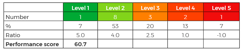
A weighting ratio is applied to the 5 step levels (from 5 for dark green to -1 for dark red) as described in the following example table:
The score of this application is then calculated at 61/100 for the energy metric. Once the score of each of the three metrics obtained on 100 points, the total score of the application is calculated with equal weighting of the three metrics: Total Score = (Performance Score + Energy Score + Score Data) / 3
Browsers evaluated
Browser name
Version
Brave
1.5.2
Chrome
78.0.3904.108
Duck Duck Go
5.32.3
Ecosia
39632
Edge
42.0.4.4052
Firefox
68.3.0
Firefox Focus
8.0.24
Firefox Preview
2.3.0
Kiwi
Quadea
Lilo
1.0.22
Maxthon
5.2.3.3241
Mint
37290
Opera
54.3.2672.502
Opera Mini
44.1.2254.143
Qwant
37714
Samsung
10.1.01.3
Vivaldi
2.7.1624.277
Yandex
19.10.2.116
Some browsers were discarded because they did not allow the tests automation. For instance, UC Browser and Dolphin browsers could not be measured. Beyond automation, this is a symptom of a accessibility issue of the application. To improve the accessibility of applications for people with visual impairments (among others), it is necessary to set up buttons labels. The automation that we realized is based on this information. In the end, these browsers do not appear in the ranking, but we can consider that accessibility problems are in all cases a crippling problem.
Note : The 2020 ranking is hardly comparable to that of 2018. Indeed, our protocol having completely evolved, the tests are thus more advanced and automated.
Digital Sobriety Expert
Books author «Green Patterns», «Green IT – Gérer la consommation d’énergie de vos systèmes informatiques», …
Speaker (VOXXED Luxembourg, EGG Berlin, ICT4S Stockholm, …)
Green Code Lab Founder, ecodesign software national association
In a previous article on this blog, we introduced you the 5 keys to success of a mobile application. We present today the 12 rules by business indicator to respect that will make the success of your application.
The application should not require a recent OS version like Android to be used. Some users do not follow updates, either voluntarily or because of their platform that does not allow them. According to our “PlayStore Efficiency Report 2019“, only 70% of apps on the store are compatible with all versions of Android.
The application must comply with the accessibility rules and must not exclude users with disabilities.
The app should work well on older phones too only on recent and latest models. This criterion will be degraded if you do not respect that of sobriety. 1/4 of the Google PlayStore applications are 10% of the oldest mobiles. (Source: PlayStore Efficiency Report 2019)
The application must limit its resource consumption (number of CPUs, memory occupied, data exchanged) in order to avoid any slowness or pollution of the other applications (for instance because of the memory leak). 50% of Google PlayStore apps continue to process after the app closes. (Source: PlayStore Efficiency Report 2019)
The application must limit its network consumption in order to not involve any load on the data centers and thus avoid the additional costs related to the unnecessary congestion of the servers.
Performance
The first launch of the application must be fast: otherwise, it is possible that your users won’t go further, the inclusion criterion will not be respected either.
The loading times of the application must be acceptable in all network situations.
Discretion
The application requires few or no permission. Do you really need to consult the list of contacts of your user? It’s all the more important to optimize this since the more permissions there are, the more the application consumes resources. This will therefore negatively influence the performance criterion.
The application has little or no tracker. The integration of a large amount of trackers implies a greater consumption of resources but can also cause bugs. This observation is even more true that the connection is degraded. On average, adding a tracker causes an over-consumption of resources of 8.5%.(Source : PlayStore Efficiency Report 2019)
According to our “PlayStore Efficiency Report 2019“, trackers, analytics and permissions are ubiquitous (44% applications have more than 5).
Ecology
The application must respect the sobriety criterion, the CO2 impact linked to the use is lower as well as the pressure of the resources on the components of the equipment of the user (battery obsolescence, loss of performance). As a result, the user is less likely to renew their equipment, which reduces the risk of obsolescence of his material. Our latest study shows that mobile apps contribute at least 6% of CO2 emissions digital.
Some tracks for the improvement of its GREENSPECTOR App Mark score
Directly improve the application
Several metrics are evaluated by the GREENSPECTOR App Mark and can be directly improved.
Minimum SDK version: Allow Android older versions to avoid the exclusion of users using older generation platforms.
Number of trackers: the fewer trackers the application has, the more it will respect the user’s data as well as the protection of his privacy. In addition, trackers via processing and data exchange increase the consumption of the application.
APK size: the bigger the binary of the application, the more the network is solicited and the less efficient the application. In addition, a large application size will use the limited storage space of some users.
Loaded data: number of loaded data throughout the test run. Limiting this data will reduce the consumption of resources on both the smartphone and the network.
Data loaded in the background: when the application is not used, it must limit its impact and send or receive as less data as possible.
More global metrics
Some metrics are directly related to the impact of the application and its efficiency. It is possible to act on it via the previous metrics, see by other axes (functional optimization, improvement of the source code …)
CO2: the more the application consumes energy, the more the battery is solicited and become obsolete. This may lead to a premature renewal of the battery or even the smartphone and therefore to a higher environmental impact. Let’s not forget that most of the environmental impact of a smartphone is predominant in its manufacturing phase than in its use phase: keeping it longer reduces its overall impact.
Energy Overconsumption: if the application overconsumes, it increases the environmental impact but also creates discomfort for the user especially on the loss of autonomy and generates an additional stress factor.
Performance after the first installation: applications sometimes perform additional treatments during the first launch, so the launch time is sometimes increased. It is necessary to limit its treatments because this loss of performance can be inconvenient for the user.
Performance: the launch time of the application is an important data for the user. It is necessary to reduce it to the maximum while consuming the least possible resources.
3G Performance: in poor network conditions, it is necessary to master the performance to maintain a good user experience. It is even possible that some users do not have access to the application in the case of degraded performance. Having a frugal service that takes into account the constraints of mobility is therefore a key to success.
What about now?
You are certainly wondering how your application is doing on these 5 indicators. Is it rather virtuous? Is there any risk? How is it ranked against its competitors? Do you have quick progress actions? If you ask us, we will tell you! Contact-us, and we will introduce you to your own inclusive, sober, fast, ecological and discreet evaluation – just like your application very soon.
Digital Sobriety Expert
Books author «Green Patterns», «Green IT – Gérer la consommation d’énergie de vos systèmes informatiques», …
Speaker (VOXXED Luxembourg, EGG Berlin, ICT4S Stockholm, …)
Green Code Lab Founder, ecodesign software national association
During the Mobile One event, GREENSPECTOR announces a survey of the major mobile consumer trends of the Google Play Store. More than 1000 applications were sifted through for Performance, Sobriety and Inclusion by the measurement tools developed by GREENSPECTOR.
Digital Sobriety Expert
Books author «Green Patterns», «Green IT – Gérer la consommation d’énergie de vos systèmes informatiques», …
Speaker (VOXXED Luxembourg, EGG Berlin, ICT4S Stockholm, …)
Green Code Lab Founder, ecodesign software national association
We measured the energy and resources consumption of the most popular e-commerce websites in France. Thanks to a recent study of SimilarWeb and ECN introducing a ranking of the Top 100 e-commerce websites, we selected the top 30 websites in this ranking and compared them according to their consumption of energy and mobile resources based on a simple functional path representative of their market activity.
Why measure energy consumption?
A website that consumes less energy will be more efficient because it will be “frugal”, with latency times shorter especially on a mobile phone that can sometimes be already crowded, older or low-tech. We can talk about a better “inclusion” business if the service responds in an acceptable way for users who do not always benefit from a favorable network conditions (degraded or saturated network) in their navigation. The battery life will also be a curb for the user who does not wish to activate services too greedy for its autonomy, especially if it intends to use them very regularly. But surfing the web via mobile is it consumer on a smartphone? In our 2019 study of the Top 30 most popular mobile apps in the world, we had measured web browsing which is on average the most consuming category compared to video applications, video games or social networks. Tt’s enough to make buyers doubt and value their battery life.
In addition, a less energy-consuming website, and this is not the least argument, ultimately improves the website SEO …
Indeed, the statistics of several tens of millions of visits in the month make it possible to imagine the extent of the impact throughout the chain of dissemination of the content and services of these websites. Even a slight improvement will benefit from a very important multiplier of reduction on the totality of the impact, whether on the user side or the server and network infrastructure. The digital actors must absolutely take into account this dimension of environmental responsibility in their business digital because as recalls the Shift Project, the digital climate impact will be equivalent in 2025 to that of light vehicles.
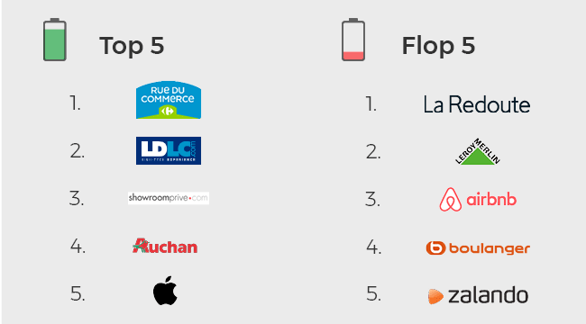
The 5 websites with the lowest energy consumption and the 5 most consuming ones
On the podium of the most energy-efficient websites, we find in first place the Rue Du Commerce website (10.6 mAh), LDLC (11.3 mAh) and ShowroomPrivé (12 mAh). Not far behind are the websites : Auchan (12.1 mAh) and Apple (12.4 mAh). The Rue Du Commerce website consumes 6.2% less than the second most energy-efficient one: LDLC and nearly 27% less than the average ranking (14.5 mAh).
On the side of the most energy-consuming websites, we find in last place the La Redoute website (18.1 mAh) followed by [Leroy Merlin] (https: //www.leroymerlin.fr/) (17.6 mAh) and Airbnb (16.8 mAh). Finally, the websites Boulanger and Zalando (16.4 mAh) share the 26th and 27th place. The most energy-hungry website La Redoute consumes 24% more than the average of the ranking.
Projection
If we project the measured consumption on a Nexus 6 (voltage 3, 7 Volt), therefore only on the smartphone of the user, according to the average time of visit on a month: the flop 3 of the navigations the more consumers over the month are the sites: Leboncoin (99.34 MWh / month), Amazon (56.36 MWh / month), Ebay (19.34 MWh / month) . These 3 sites are at the same time penalized by a large number of visits, a rather long average visit time and a strong consumption of the purchase route.
The top 3 is made up of RueDuCommerce, LDLC and Auchan which are much less frequented but which also have the advantage of being in the best students on the market. consumption of the purchase route. If a site like Leboncoin was at the consumption level of the RueDuCommerce website, they could save their smartphone users more than 30 GWh/month, the equivalent of a country’s electricity consumption. like Haiti.
The projection of this Top 30 e-commerce websites, if all users had a Nexus 6 smartphone according to statistics visits indicated, would be about 3.7 TWh per year, the equivalent of the annual consumption of a country like Somalia. The server and network impacts were not taken into account in this study. It would be interesting to be able to estimate server side with the editors.
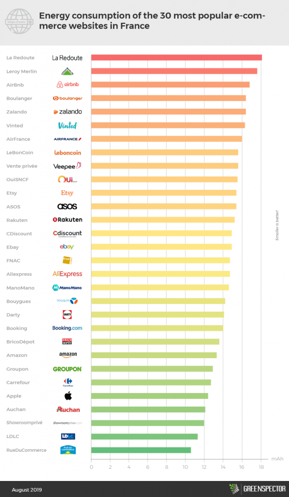
Energy consumption of 30 e-commerce websites
Only 12 websites are below the average (14.5 mAh) of this ranking. There is a 1.7 ratio between the least energy-consuming site (Rue Du Commerce) and the most energy-intensive (La Redoute).
Methodology
The measurements were carried out by our laboratory on the basis of a standardized protocol: Nexus 6 Smartphone, Android 6, Wi-Fi, low brightness. 3 campaigns were conducted and the value used is the average of these 3 measurements. The measurement campaigns respect a specific user scenario adapted to each website (launch of Google Chrome, access to the URL of the website, search scenario, selection, basket and display basket)
Summary table of the 5 best sites and the 5 worst ones
Website
Energy consumption (mAh)
Exchanged data (Mo)
Memory consumption (Mo)
RueDuCommerce
10.6
2
337.5
LDLC
11.3
6.3
356.4
ShowroomPrivé
12
3.7
335.6
Auchan
12.1
4.8
347
Apple
12.4
6.6
353.6
…
…
…
…
Zalando
16.4
6
332.2
Boulanger
16.4
6
332
AirBnb
16.8
6.9
371.5
LeroyMerlin
17.6
4
346.4
La Redoute
18.1
5
390.9
Do you want to access the results of a particular site? Contact us!
Smartphone navigation apps are our daily tools for car, bike or on-foot navigation. They are regularly used in our business or personal activities. It is also a precious tool for holidays. And it is not uncommon to have two applications installed.
Geolocation activity can be activated on your smartphone but it will cost you an average battery consumption that doubles or even triple depending on the applications and use cases! Pay attention to this parameter for a level of precision that will be in most cases, useless. The particularity of these tools is that they can work in online mode and others only work in offline mode with pre-loading map data before navigation. Even though there are significant differences between these 10 applications for a result of movement and information quite comparable. It’s up to you to choose the most relevant!
For this GPS applications ranking, GREENSPECTOR measured the most used apps on the Google Play Store.
Energy consumption for 1 journey of 3 minutes
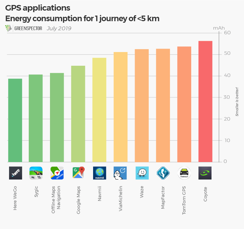
Regarding the battery consumption for a simple journey over a period of 3 minutes corresponding to an average simulated movement of 40 km per hour, we observe a very varied consumption between those applications. There is a 45% difference in consumption between Here WeGo and Coyote, both in the online mapping category.
Exchanged data for 1 journey of 3 minutes
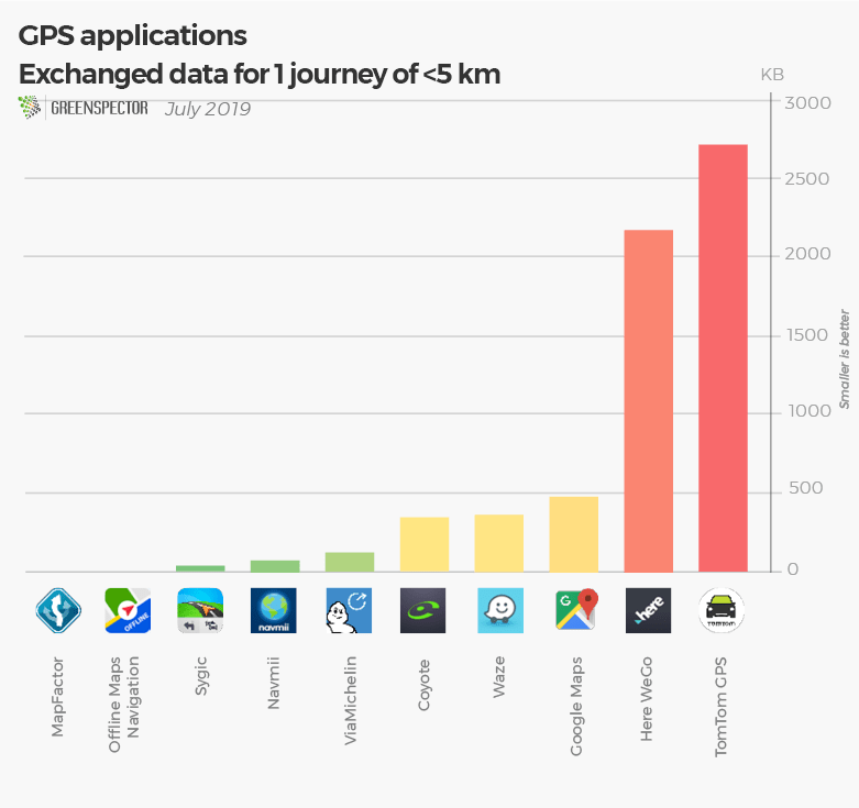
In terms of data, Here WeGo and Tomtom GPS are by far the most consuming ones with an exchanged data between 2 and 3 MB. TomTom GPS is both a consuming app in prior mapping (1.3 GB pre-loaded) but also in exchanged data during navigation. ViaMichelin is the least data consuming one for online mapping applications with 113 KB of data consumed.
Memory consumption for 1 journey of 3 minutes
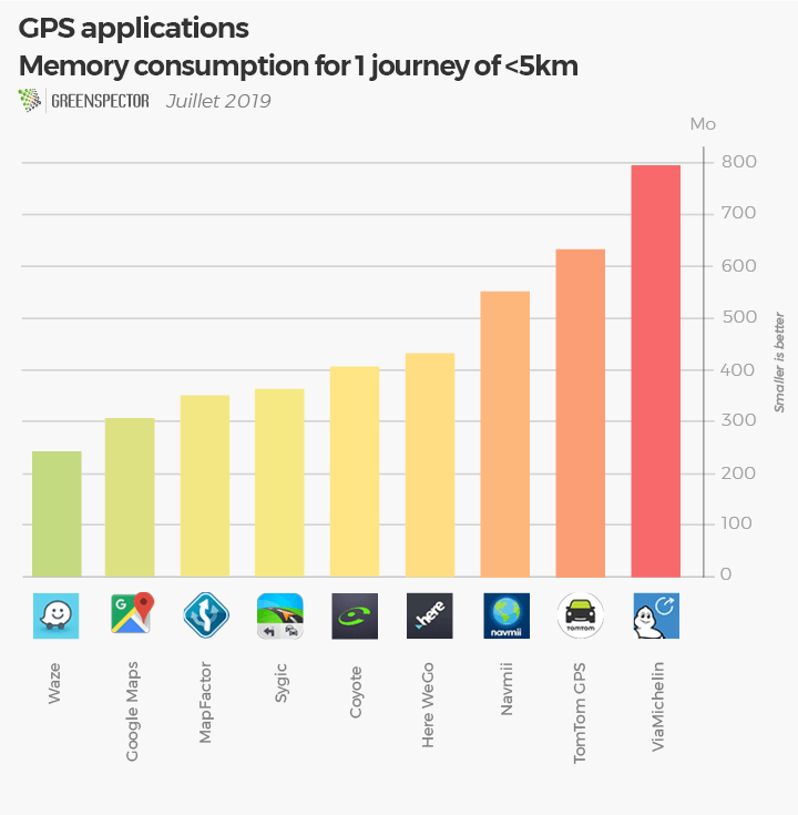
There is a 70% difference in memory consumption between Waze and ViaMichelin, to make this journey in a panel where all applications consume between 241 MB and 800 MB. The application Waze, one of the least consuming, will be able to work on older platforms while the ViaMichelin application will be more demanding on the phone’s memory requirements.
Ecoscore on a standardized journey without movement
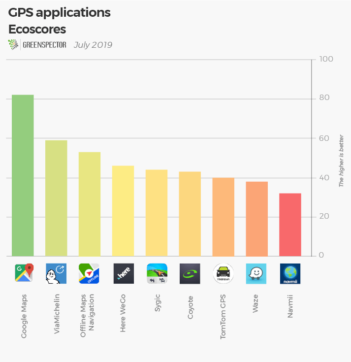
The EcoScore reflects the consumption of resources (CPU, memory, data,…) and energy on the first screen of the application. The top 1 award goes to Google Maps, which scores 81 out of 100! In heavy applications in resource consumption and energy TomToom GPS, Waze and Navmii are much more resourceful. MapFactor wasn’t ranked because the application has a different behavior on its first screen compared to the other applications.
Methodology
Application
Version
Downloads
Playstore grade
Offline
Prior download (GB)
Energy consumption (mAh)
Exchanged data (MB)
Memory consumption (MB)
Ecoscore (/100)
Coyote
11.1.920
1 000 000+
3.9
No
0
56.3
0.342
431
43
Google Maps
9.67.1
5 000 000 000+
4.3
No
0
44.8
0.478
304
82
Here WeGo
2.0.13173
10 000 000+
4.4
No
0
38.8
2.2
343
46
MapFactor
5.0.63
10 000 000+
4.5
Yes
1.2
54.6
0
0
N/A
Navmii
3.7.13
10 000 000+
4.0
Yes
2.2
48.5
0.069
550
32
Offline Maps Navigation
17.9.4
10 000 000+
4.7
Yes
France=1.4 Regional= 10-200 Mo
41.5
0
796
53
Sygic
18.1.4
50 000 000+
4.4
Yes
France=2 Regional= 7-250 Mo
40.8
0.035
241
44
TomTom GPS
1.17.7
10 000 000+
4.1
Yes
1.3
55.9
2.75
352
40
ViaMichelin
8.3.3
5 000 000+
4.3
No
51.1
0.113
633
59
Waze
4.52.5.5
100 000 000+
4.6
No
52.5
0.364
404
38
The measurements were made by our laboratory on the basis of a standardized protocol: Smartphone Nexus 6, Android 6, Wi-Fi, low brightness. 4 campaigns were carried out and the value used is the average of these 4 measures.
To carry out these measurements, we measured at the same time a technical course with a phase of loading of the application, a phase of inactivity foreground with displayed app in the foreground and a phase of inactivity with app in the background. This step was done without any movement. Only 9 applications were ranked out of the 10 in ecoscores because one wasn’t comparable with the others on its first screen operation. To measure the movement consumption of these tools, we simulated a movement of less than 5km with a GPS data simulator that allows us to obtain a result very close to a real result.
Postal services around the world are changing. Digital has gone through this … the traditional mail business is only 28% for La Poste Group in France. New businesses all based on digital tools are being validated or deployed to take over and allow new levers of growth and profitability for these organizations that have often lived on monopoly situations. All this digital transformation is accompanied by a societal transformation and a consideration of environmental issues.
Where are these companies in this transformation? Few indices or indicators of concrete results of this triple transformation. The website of these organizations is a “visible” symbol of this transformation. The site:
Is it inclusive (People), do you need a lot of resources to navigate and do you put a lot of people in the service?
is he sober (Planet), consumes a lot of energy on a device, a lot of requests on our servers, a lot of data on networks
Is it powerful (Profit)? Is it displayed quickly?
Admittedly, the perimeters of postal activity in the world vary significantly from one country to another in the context of this economic transformation. Admittedly, the proposed benchmark is not exhaustive and does not measure all the pages of the site. It nevertheless allows to get a good idea of the level of maturity of digital eco-design.
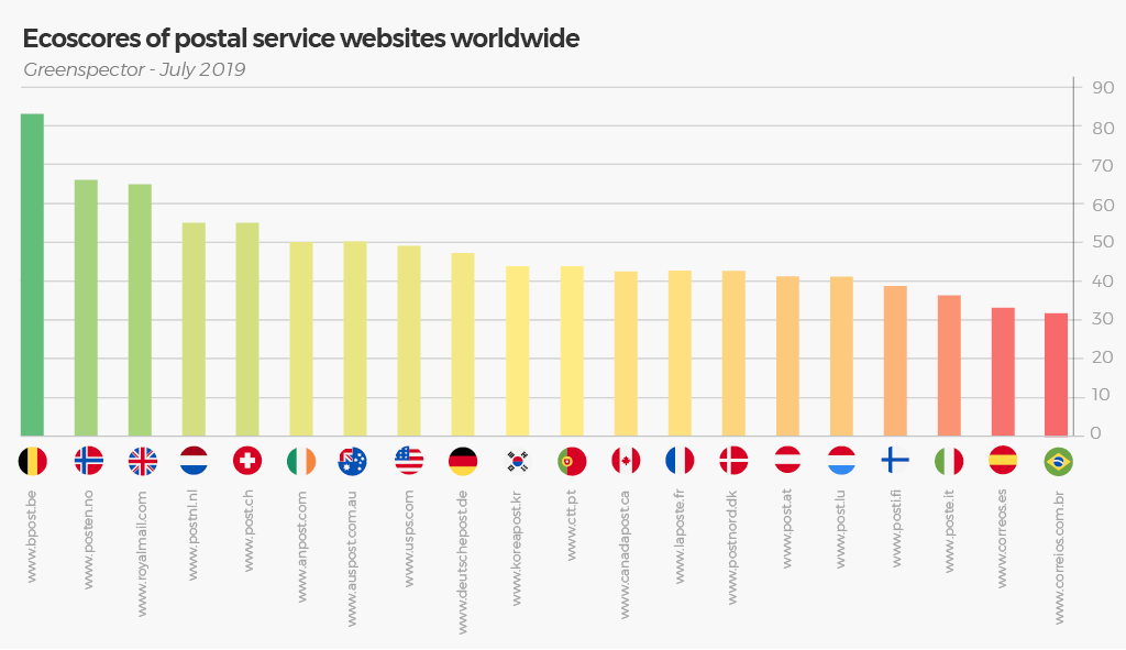
Synthesis of results by Greenspector ECOSCORE
The Ecoscore takes into account the energy consumption, the memory used, the data exchanged, the number of queries and other metrics that contribute to the level of eco-design of a Web to a score of 100 for a website or a page. It is a perfect synthesis of this study and all the indicators presented below that will make it possible to explain the main points of work to analyze and improve.
An excellent result for Belgium, example of sobriety on all the fields and which surpasses all the other countries in our benchmark. Good job for Norway and Great Britain ! To be improved for South Korea, Portugal, Canada, France, Denmark, Austria, Luxembourg and Finland. France in the second third must progress on this topic of digital eco-responsibility. Last rankings for Italy, Spain and Brazil.
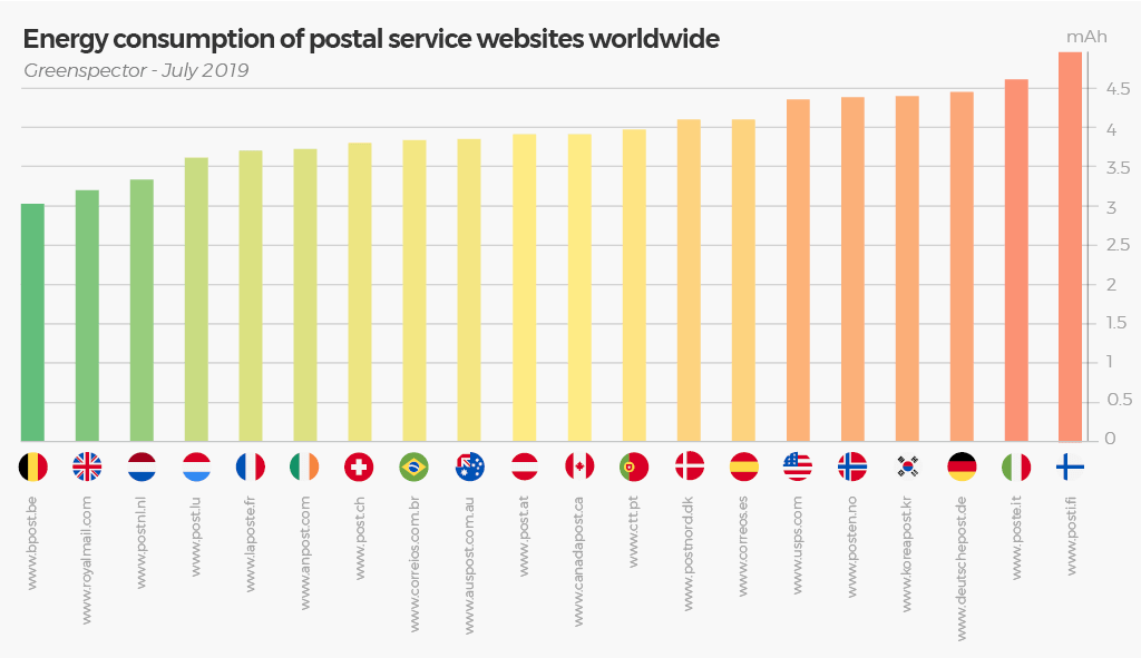
The energy consumption of a website:
This energy consumption will vary between 3 and 5 mAh, or 66% difference on a simple scenario between the Belgian website and the Finnish website. Note that the distribution is rather homogeneous and that the average is about 4 mAh. The French Post is in 5th place with 3.71 mAh.
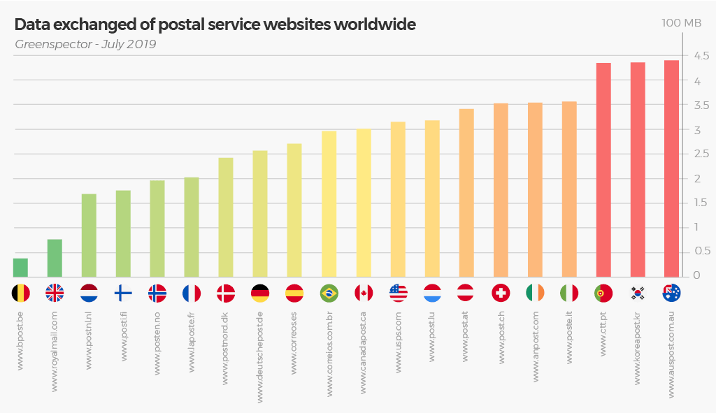
Data exchanged:
The difference is very important between the less and the more “voracious in data”. we can divide by 11 between the Belgian Post Office (0.38 MB) and the Australian Post (over 4.4 MB). The French company ranks 6th.
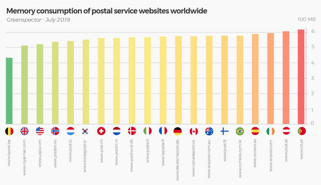
Memory Consumption:
Belgium still has the place of honor in this classification with a consumption very lower than all other websites with a small difference between the best and the last, Portugal (42%) but a gap of 20% between the second and the last. latest. France ranks in 11th position.
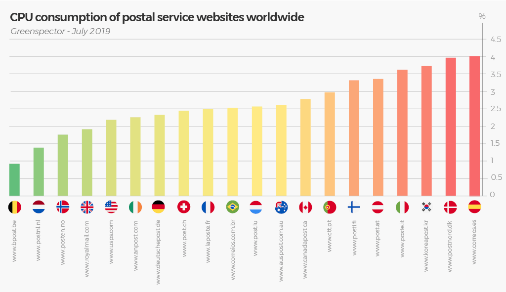
CPU Consumption:
A significant consumption ratio between the first, Belgium and the last Spain (ratio of over 4). France ranks 9th.
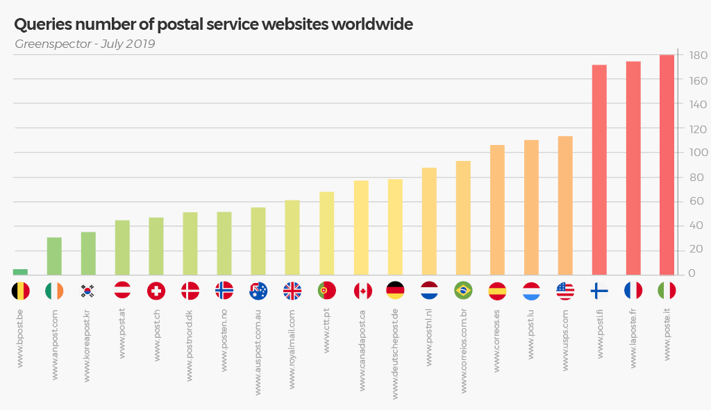
The number of requests sent to the data centers:
An important ratio between the first, Belgium and the last, Italy with a ratio of 36! Many requests for Finland (171), France (174) and Italy (180). France and Finland share the last places with about 10 kb of data averaged per query versus 117 kb on average for Ireland. The number of requests is a factor increasing the consumption on the device of the user but also on the solicitation of the servers. Objective: group queries to limit the consumption.
Table of raw results:
Countries
Websites
Energy consumption (mAh)
Data exchanged (100 MB)
Memory consumption (100 MB)
Number of queries
CPU (%)
Ecoscore (on 100)
Germany
www.deutschepost.de
4,4
2,5
574,4
78
2,3%
47
Austria
www.post.at
3,9
3,4
604,6
45
3,3%
41
Australia
www.auspost.com.au
3,8
4,4
575,5
55
2,6%
50
Belgium
www.bpost.be
3
0,3
433,2
5
0,9%
83
Brazil
www.correios.com.br
3,8
2,9
579,4
93
2,5%
32
Canada
www.canadapost.ca
3,9
3
575,2
78
2,7%
43
South Korea
www.koreapost.kr
4,3
4,3
552,2
35
3,7%
44
Spain
www.correos.es
4,1
2,7
587,6
106
3,9%
33
Danemark
www.postnord.dk
4,1
2,4
567,5
51
3,9%
42
Finland
www.posti.fi
4,9
1,7
578,4
171
3,3%
39
France
www.laposte.fr
3,7
2
572,7
174
2,4%
43
Great Britain
www.royalmail.com
3,2
0,73
514,2
61
1,9%
65
Irland
www.anpost.com
3,7
3,5
594,7
31
2,2%
50
Italy
www.poste.it
4,6
3,5
568,2
180
3,6%
36
Luxembourg
www.post.lu
3,6
3,1
544,0
110
2,5%
41
Norway
www.posten.no
4,3
1,9
537,8
51
1,7%
66
Netherlands
www.postnl.nl
3,3
1,6
562,8
88
1,3%
55
Portugal
www.ctt.pt
3,9
4,3
618,6
68
2,9%
44
Swiss
www.post.ch
3,8
3,5
561,5
47
2,4%
55
USA
www.usps.com
4,3
3,1
522
113
2,1%
49
Average
3,9
2,7
561,2
82
2,6%
47,9
Min
3
0,3
433,2
5
0,9%
32
Max
4,9
4,4
618,6
180
3,9%
83
This test was performed under the following conditions:
Measured the 06/28/2019 on real device Galaxy S7 (Android 8)
Private Wi-Fi network, Chrome browser
Protocol used 1 minute and 10 seconds of test on the homepage: 20 seconds of loading, 20 seconds of idle foreground, 10 seconds of scroll, 20 seconds in idle background.
You work hard on the design, ergonomics and UI which are prerequisites to the success of your application. But that’s not enough: more than 7 out of 10 users are ready to uninstall an application if they feel it to be too slow. Battery consumption is also a leading criterion for them. But how can you master these “technical” aspects, when you are a Product owner or Business owner? Now there is a solution…
Thomas CORVAISIER is the CEO of GREENSPECTOR. After getting his degree in Engineering he worked for over 15 years in IT consulting alongside major companies, focusing on testing and software quality. He then worked on CSR topics (carbon accounting, environmental management) and eventually mixed these skills into GreenIT expertness and cofounding Greenspector.
A few weeks ago, the Statista institute published the most used messagings app ranking. A market dominated by two giants: Facebook (Messenger owner and WhatsApp) and Chinese Tencent (QQ and WeChat).
Kimberley DERUDDER has been digital marketing manager at Greenspector for more than 5 years. Kimberley graduated with a master’s degree in Marketing – Communication and specialized in Inbound Marketing after her first two years at Greenspector. Today in charge of the animation of the marketing, social media and lead generation strategy, she also takes care of app comparisons and battles.
By facilitating access to digital solutions, the number of mobile application users will increase significantly. Mechanically the rate of commitment related to the service offered will also increase. This metric is essential to an application’s success. Without accessibility, the risk that users don’t use the service is high. And if the engagement rate is low, the revenue from the application could be heavily impacted.
The success and adherence of an application are too often reduced to ASO (App Store Optimization) or SEO (Search Engine Optimization). If the application is well ranked, then users will be at the rendezvous.
Why do we have this feeling of speed and access by all?
Operator communications are numerous on the speed and the good coverage of the network. For instance, operators advertise 98% coverage of the population for 4G. This is for them an differentiation asset.
And new technologies announcements reinforce the idea that current technologies are widely deployed. 5G communications make indeed the 4G thing outdated. This is the case of Xiaomi who recently unveiled the first 5G smartphone.
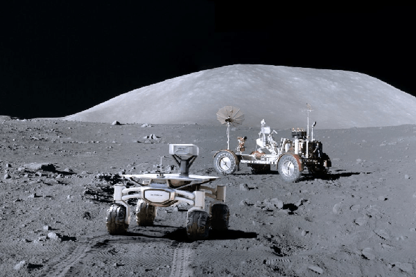
Moreover, the current technologies deployment seems to have no limit: 4G is on the moon
The feeling of connection speed is also due to the fact that decision makers and application designers are in perfect connection conditions zones (urban areas, premises with fiber connection…). The used analytics tools at the application editors don’t help. Indeed, how to know that a user exists if he doesn’t connect … The abundance of data makes the analysis of connection problems too difficult to achieve.
What is really on the side of the users?
The ARCEP reports since 2000 a digital barometer that counts the figures of the true use of the mobile in France. Its 2018 edition presents the following observations:
61% of mobile owners use 4G networks (compared to 42% in 2016)
This figure drops to 51% in municipalities with less than 2000 inhabitants.
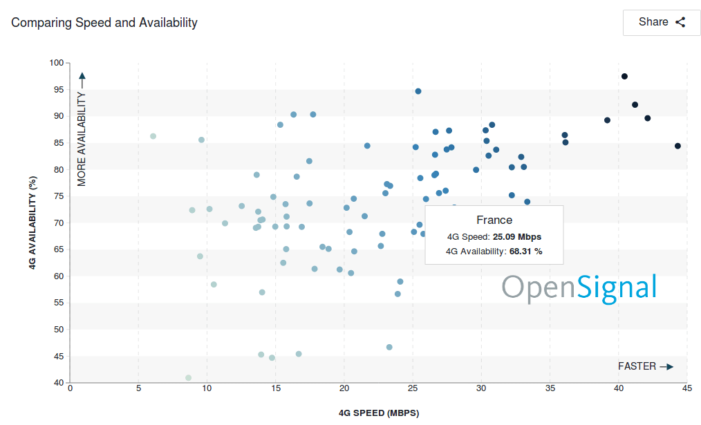
We can notice that we are still far from the promise of 100% coverage. And this is confirmed by OpenSignal which realizes real measurements through user tests.
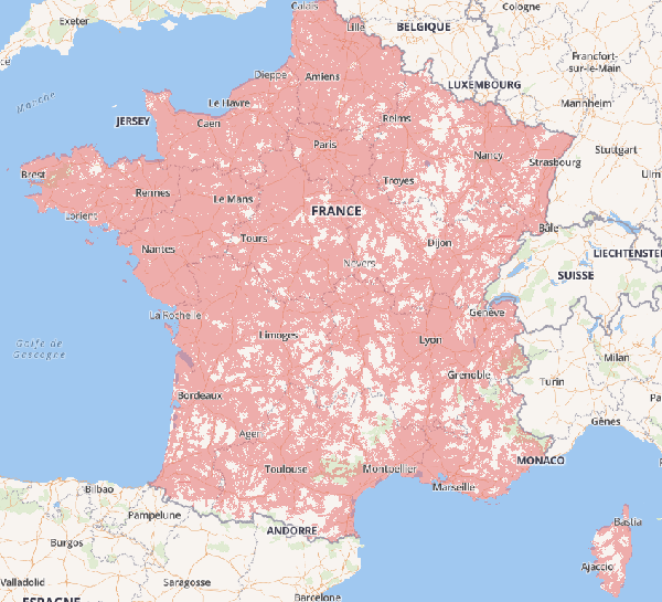
According to the measures, France has a coverage rate of 68%. Interestingly, the average connection speed at 25 Mbps is not among the best. This raises an important factor to take into account: the quality of the infrastructure (Operators, antennas …). The countries, the different areas even within the same city have inequalities in terms of coverage 4G:
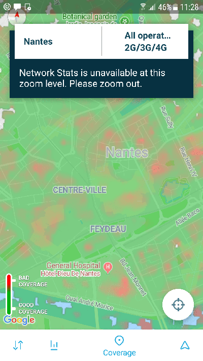
For example, here is the network coverage map of downtown Nantes (France, 44):
We notice that there are very few areas in dark green (color meaning good network coverage) and many areas in red (bad coverage). In the end, network coverage and user speed is very variable. This is the same observation both locally and globally. Overall, users are unsatisfied with the 4G connection.
The deployment of technologies is accelerating so everything will be back to normal?
The belief in the evolution of technologies could make us believe that this situation is cyclical and that everything will soon return to order. This is the reassuring message from the operators, not only in France but also in countries that seem less advanced in terms of deployment.
It’s also the message of the politicians who announce the high speed of connection accessible to all. However it’s only a strategy and empty promises. The reality is much more complex.
On the one hand, we can see it even if new technologies are deployed, access for all may take longer. Many users are still in 2G. And this for many reasons. 100% coverage is impossible as we have observed but also some areas will always be white. The new buildings built with full metal are Faraday cages that block the waves and make access to networks complicated. This is only an example but we could mention a multitude of similar situations.
And even if you get 100% coverage, users’ equipment should follow closer. It would be necessary to be equipped with the latest generation of smartphones. And this isn’t necessarily the willingness of users to change as often. In any case, repackaging tends to maintain older generation equipment on the market. 1 in 3 French people say they have bought a used phone. But there is only a little luck that these phones integrate the 5G quickly.
The promises of new technologies are also often overestimated. The arrival of the 5G is associated with more speed. This isn’t that simple. The 5G will allow new uses (that of the IoT for example) and decongest the 4G network… In other words, if you expect to reach all mobile users, you must rely on the fact that a large part of them won’t in perfect connection conditions.
What impact on the business of your application or that of your services?
The use of mobile in different areas has become widespread. For example, that of M-Commerce, according to the french ARCEP study, 61% of mobile users make purchases with their smartphone. It’s basically the same statistics in other countries. In England, it’s 41%. The income of an application is generated and based on the number of users. But if the user has a bad experience or even if he can’t go after his desire to buy because of bad experience, the income will not be at the rendez-vous.
Lack of performance is one of the criteria for user disengagement. As we have seen, a large part of your users will be in non-optimal connection conditions. In this case, the application will probably be less responsive or unusable in some cases. For reference, we have measured with our tool GREENSPECTOR loading times of up to 4 minutes for some applications in 2G. In the end, the risk that the user uninstalls the application is high. In addition, the uninstall rate at 30 days is 28%. It’s even more important in some countries, such as developing countries, for reasons of space and heaviness. In this case, connection problems are very important for membership. This matches the observed data on the web performance side where 53% of visitors leave the site if it doesn’t load in less than 3 seconds (Chrome Dev Summit 2017).
Impacts other than economic ones?
If your application isn’t functional for slow connections, some users will not be able to use your services. You will therefore exclude users. And this exclusion doesn’t go in the direction of the social pillar of sustainable development which, among other things, requires the inclusion of all populations.
In the same way, if your application works poorly with slower networks, it will consume more battery. And here is the environmental pillar that you will not respect.
How to act?
Don’t wait for feedback from your users or those of your monitoring tools to act. A user who cann’t connect to your application may not be visible or reassembled in your data. It’s therefore necessary to anticipate and detect potential performance issues.
1) When designing and expressing the requirement, ask and specify that your solution is usable is visible under limited connection conditions. This can simply be summarized as “my application, or such function, can load in less than 3s on a 2G connection”
2) It’s necessary to test your solution in limited connections (2G, 3G …) automatically or manually.
3) You can monitor user performance through monitoring tools. Be careful however because it’s very possible that many users aren’t visible at all from these tools.
Solutions 1 and 2 are the solutions we advocate and use at GREENSPECTOR. Solution 3 is possible with GREENSPECTOR by measuring the solution immediately after going into production.
Digital Sobriety Expert
Books author «Green Patterns», «Green IT – Gérer la consommation d’énergie de vos systèmes informatiques», …
Speaker (VOXXED Luxembourg, EGG Berlin, ICT4S Stockholm, …)
Green Code Lab Founder, ecodesign software national association
Greenspector may use cookies to improve your experience. We are careful to only collect essential information to better understand your use of our website.
This website uses cookies to improve your experience while you navigate through the website. Out of these, the cookies that are categorized as necessary are stored on your browser as they are essential for the working of basic functionalities of the website. We also use third-party cookies that help us analyze and understand how you use this website. These cookies will be stored in your browser only with your consent. You also have the option to opt-out of these cookies. But opting out of some of these cookies may affect your browsing experience.