Category: Digital sobriety

What is the correlation between eco-design and editorial sobriety?

Reading Time: 4 minutes

An ecodesign approach for digital services can only be successful if all project stakeholders are involved at all stages of the project lifecycle. Sometimes, despite all the efforts made to apply eco-design principles to the creation of a website, environmental impacts can increase due to elements outside the defined scope. In particular, it’s essential to involve those who will be producing content for the site. It’s not all that simple. Some best practices can be technically automated, while others require you to keep in mind all the content proposed, as well as its durability.
This article suggests a number of best practices aimed at facilitating content management with a view to reducing the impact (environmental and otherwise) of proposed content.

Further reading

Ferréole Lespinasse has already written extensively on this subject: https://www.sobriete-editoriale.fr/
The INR (Institut du Numérique Responsable) reference framework has a category dedicated to content: https://gr491.isit-europe.org/?famille=contenus
The same goes for the RGESN (Référentiel Général d’Ecoconception de Services Numériques): https://ecoresponsable.numerique.gouv.fr/publications/referentiel-general-ecoconception/#contenus

Best practices in editorial sobriety

Integrate as little non-textual content as possible

Context

Each piece of integrated content will generate requests and data transfers. It is therefore important to integrate as little as possible, while maintaining the attractiveness of your publications. Once only essential content remains, it’s time to integrate it as efficiently as possible (see below).

Most often, at impact level: video > podcast > moving image > static image > text

Please note that animated GIF images can be very large, posing accessibility problems.

The INRIA (Institut national de recherche en informatique et en automatique) MOOC offers a simple activity to help you understand these impacts.

How can we do it?

  • Limit the number of contents, taking into account their respective impacts
  • Avoid purely decorative content as much as possible (e.g. stock images or carousels)
  • Keep accessibility in mind

Reduce the weight of videos

Context

Especially in the age of social networks, video is often favored as a communication channel.

Today,video represents 60% of global data flows

How to do it?

Reduce the size of audio files

Context

Particularly with podcasts, audio content is multiplying on the web.

How to do it ?

  • Favor MP3, OGG or AAC formats
  • Use audio files that are as concise as possible
  • Rather than directly integrating the content on the page, integrate a clickable thumbnail leading to it

Reduce the weight of images

Context

Overall, on web pages, images are the source ofthe majority of data transferred [EN]

How to do it?

  • Favor the Webp format and other formats adapted for the web
  • Offer images with a size and quality adapted to user terminals
  • Optimize images using a tool (example:Squoosh
  • Load text by default and image only on demand

Tutorial (in English) on image optimization.

Limit the impact of third-party content

Context

It is easy to integrate content from other sites (Youtube/Dailymotion videos, Twitter/Facebook/Instagram/etc. messages or feeds).

Their direct integration often results in numerous requests (especially trackers) and data transferred.

How to do it?

Adopt sober management of publications

Context

Beyond the design of each publication, it is important to keep in mind all the publications available. The goal here is to keep content relevant and up-to-date. The point is to prevent the content from being drowned out in the crowd, which in turn helps improve natural referencing.

How to do it ?

  • Rely on concrete indicators: number of visits, number of arrivals on the site via this page, bounce rate, etc.
  • Update older posts that are still of interest. Possibly take advantage of this to change the format: the video becomes an article
  • Combine publications similar in their themes: informative articles are aggregated into a reference article
  • Delete posts that are no longer seen or no longer relevant (outdated content or relating to past events)

To go further, it is also possible to:

  • Set an expiration date for the publications created (examples: hot content VS cold content, unpublish date for temporary content)
  • Audit a site’s publications [EN]
  • Publish content in a reasoned and relevant way, particularly for its distribution on social networks and in newsletters. The latter must themselves be subject to an eco-design and accessibility process.This subject alone could be the subject of an article.

Propose explicit labels for links

Context

When browsing content, it is common to come across links that enrich the content in question. In order to avoid unpleasant surprises for users, the labels of these links must be as explicit as possible. The interest in the user experience is obvious but it is also a question here of preventing the user from loading content which is not useful to them or which their terminal or their internet connection does not allow them to use in specific situations. good conditions.

The criteria for this good practice are mostly derived from the rulesOPQUAST (OPen QUALITY STANDARDS). It is appropriate here to emphasize again the need to offer accessible links (but also more generally content).

How to do it?

Conclusion

We have discussed here what can be done to ensure that content is as light as possible. If certain actions rely mainly on contributors, it is ultimately important that thecontent management tools such as CMS (Content Management System) integrate tools to assist contributors. This may involve, for example, automating certain technical optimizations, visualizing the environmental impacts of the content produced but also facilitating the implementation of a more global content management approach (expiry of documents, visualization of consultations, etc. .). Some publishers have already taken the initiative to initiate such an approach; it remains to be hoped that it will become systematic.


The legislative framework for the eco-design of digital services

Reading Time: 4 minutes

In France, the accessibility of digital services has had a legislative framework for several years now (initiated by article 47 of the 2005-102 law of 11 February 2005 [FR] and specified in decree no. 2019-768 of 24 July 2019 [FR]). This is based primarily on the RGAA [FR] (Référentiel Général d’Amélioration de l’Accessibilité – General Accessibility Improvement Reference Framework). The eco-design of digital services, which has been discussed in France for over 15 years, has gained considerable momentum in recent years. However, the subject is still struggling to establish itself, or even to take precise shape within organisations. The legislative framework has been taking shape since 2021 and should enable the eco-design of digital services to take hold over the next few years. The aim of this article is to shed some light on the subject.

A quick reminder

ADEME (Agence de l’Environnement et de la Maîtrise de l’Energie) and ARCEP (Autorité de régulation des communications électroniques, des postes et de la distribution de la presse) are working together on the environmental impact of digital technology. Their work covers, in particular, the estimation of these impacts on a French scale, as well as best practices and prospects. This information can be found here: https://www.arcep.fr/nos-sujets/numerique-et-environnement.html [FR]

Ecodesign [FR] can be defined as an approach that integrates the reduction of environmental impacts right from the design stage of a digital service, with a global vision of the entire life cycle, via continuous improvement.

A digital service [FR] is a set of human, software and hardware resources needed to provide a service.

Consequently (but we’ll come back to this in a later article), talking about an eco-designed website can be perceived as a misuse of language. As part of an eco-design approach, we need to take an interest in all the site’s digital services (or at least a representative sample), through continuous improvement and by covering all the stages in the project’s lifecycle. All this goes much further than simply measuring a sample of pages on a site that is already online.

The laws

In France, there are currently 2 main laws: the AGEC law (Anti-Gaspillage pour une Économie Circulaire) and the REEN law (Réduction de l’Empreinte Environnementale du Numérique).

The AGEC law [FR] briefly addresses the subject, but this requirement does not yet seem to have been dealt with exhaustively. On this subject, see the Guide pratique pour des achats numériques écoresponsables from the Mission interministérielle Numérique Écoresponsable [FR].

Even if certain elements still need to be clarified, the REEN law [FR] goes further by mentioning (among other things) :

  • The need to train engineering students in digital-related courses in the eco-design of digital services. But there is also a need to raise awareness of digital sobriety from an early age.
  • The creation of an observatory on the environmental impact of digital technology, via ADEME (Agence de l’Environnement et de la Maîtrise de l’Énergie) and ARCEP (Autorité de régulation des communications électroniques, des postes et de la distribution de la presse).
  • A general reference framework for the eco-design of digital services to set criteria for the sustainable design of websites, to be implemented from 2024. ARCEP has since confirmed that this benchmark will be based on the RGESN (Référentiel général d’écoconception de services numériques [FR]): https://www.arcep.fr/actualites/actualites-et-communiques/detail/n/environnement-091023.html [FR] A public consultation, launched in October 2023, aims to consolidate this benchmark and practices around it, with a view to wider adoption from early 2024.
  • The fight against the various forms of obsolescence, as well as actions to promote re-use and recycling.
  • Reduce the impact of data centres (in particular by monitoring the efficiency of energy and water consumption) and networks. The decree is currently being published [FR].
  • Require municipalities and groups of municipalities with more than 50,000 inhabitants to draw up and implement a Responsible Digital Strategy by 2025. This strategy must include elements relating to the eco-design of digital services. A number of guides have been published to help establish this strategy, including this one: https://www.interconnectes.com/wp-content/uploads/2023/06/web-Guide-methodologique_V8.pdf [FR]

All of this is accompanied by the establishment of the HCNE (High Committee for Eco-responsible Digitisation), various roadmaps and an eco-responsible digital acceleration strategy. All this is detailed on this page: https://www.ecologie.gouv.fr/numerique-responsable [FR]

What’s next?

Once all these elements have been defined, the question arises of what remains to be done.

In 2024, the REEN law will require public websites to be designed in a sustainable way. By 2025, local authorities with more than 50,000 inhabitants will have to have integrated this dimension into their Responsible Digital Strategy.

Greenspector has been involved in the eco-design of digital services for several years. This evolution in the legislative framework coincides with our involvement in projects at an increasingly early stage, sometimes even from the expression of need. This inevitably requires changes in practices, including the introduction of ideation workshops that take into account the environmental footprint of a service. More and more often, the RGESN is used as a reference to guide the approach throughout the project. This reference framework is ideal for this type of support, but it also provides a basis for managing eco-design as a continuous improvement process.

This way of rethinking support for the eco-design of digital services also makes it possible to move towards greater impact reduction levers and to involve more types of profiles in the projects supported.

As the process begins with public institutions, it is to be hoped that companies will follow suit. In fact, some have already begun the process of complying with the RGESN. Not just in anticipation of a possible change in the legislative framework affecting them, but also because these standards provide a long-awaited framework for the eco-design approach.

To support all these efforts, financial aid is available for both companies [FR] and local authorities [FR].

On all the issues raised here, France has made great strides. Now it’s up to other countries to follow suit. In September, the W3C (World Wide Web Consortium) published its WSG [FR] (Web Sustainability Guidelines). They are now out for public consultation with a view to making further progress on the subject and perhaps eventually establishing web standards. They are also accompanied by discussions on the best way to introduce levers directly at institutional level. In Europe, some countries, notably Belgium and Switzerland, are federating around structures similar to the INR. It is to be hoped that the RGESN and other elements currently in place in France can be adapted to other countries.

A closer look

Reading Time: 4 minutes

Just ten years ago, the subject of the environmental impact of digital technology was confined to a handful of specialists. Over the past few years, however, the subject has gained considerable momentum, particularly in France but also internationally. While some people are (rightly) concerned about the preponderance of discourse around net zero and carbon neutrality, this trend is merely a symptom of a biased approach to the subject.

Reducing a global crisis to a technical problem

The climate emergency is a key issue that has gained enormous momentum in recent years. The digital sector has not been spared, and studies and tools have made many people aware of the issue. The problem is alarming, but also complex, which is why some aspects have been lost along the way in favor of broader awareness.

In the case of digital services, it is understood that an LCA (Life Cycle Assessment) is an excellent way of estimating environmental impacts, but the process can prove cumbersome and costly. Defining the scope, selecting the indicators, collecting and analyzing the data. The complexity is all the more difficult to take into account when you want results quickly and, preferably, easily communicated. So, to gain in efficiency, some choose to measure only part of their digital services, thanks to easy-to-use tools. In just a few clicks, you have your answer and can share it.

Sound familiar? It’s called technological solutionism, as expounded by Evgeny Morozov in his seminal work “To save everything, click here“.

This is also why solutions are being developed that analyze code to suggest ways of improving it to reduce its environmental impact. Some are even beginning to rely on artificial intelligence for this purpose.

It’s also what prompts some to optimize where their code will be executed, to move towards a location where energy has less impact from an environmental point of view (taking into account, of course, only greenhouse gas emissions). And what can’t be avoided or reduced can always be compensated for.

In the end, it’s all very human. Faced with a complex and urgent problem, we try to simplify and adopt or find a quick solution. That’s not a bad thing, but we can’t stop there. All the more so when some people rely on claims of “net zero” and carbon neutrality to artificially draw a finish line that can be reached via clever calculations and investments, whereas the problem is systemic by nature.

The risk here is of optimizing one indicator while degrading others that we didn’t have in mind (for example, requesting a data center presented as carbon neutral without taking into account its impact on water resources). As a result, we’re increasingly asking ourselves whether a sober site is necessarily ugly, without realizing that it’s not always accessible. Or really sober, for that matter.

Reminder

The environmental impacts of digital technology are not limited to greenhouse gas emissions. As we see in LCA, the indicators to be taken into account are much more numerous and varied. Little by little, we are also having to take into account the criticality of certain mineral resources, as well as that of water (as we saw recently with ChatGPT and Google’s data centers).

The environmental impact of digital services doesn’t just come from the code. In fact, according to GreenIT.fr, only around 20% of the impact comes from the code. Which makes perfect sense. Through code, we seek to improve efficiency (doing better with less). The real levers for reduction are to be found in the other stages of the lifecycle, notably design, strategy and content production. In this way, we can move towards sobriety for good.

Finally, the impacts of digital technology are not only environmental, and this is the heart of Responsible Digital. We need to keep in mind the impact on the individual (via accessibility, security, personal data management, the attention economy, ethics and inclusion). So, managing the climate emergency can only be done with an intersectional approach.

But how?

The technical approach is not necessarily bad in itself. It’s a good thing to have effective solutions to improve the efficiency of digital services (as long as we keep in mind the possible side-effects). Sometimes, it’s even an excellent starting point for taking initial action, initiating a continuous improvement process and getting to grips with the subject.

On the other hand, it’s essential to go further. This is what we see today in movements around Sustainable UX, responsible communication and even responsible digital marketing, for example. We are also seeing the emergence of resources and books on “green service design” and systemic design.

This is also the reason why the GreenIT collective’s 115 best practices have evolved over time, and why other, more comprehensive reference frameworks have emerged, such as RGESN and GR491.

Beyond this, it is also important to ask ourselves more general questions about what we eco-design, and how the services we create can induce more environmentally-friendly behavior.

Conclusion

As we’ve already seen when examining the offerings of web hosting providers, the reality of the environmental impact of digital technology is more complex than it might seem. The problem won’t be solved with a single click, and perhaps that’s just as well. In fact, it’s an opportunity to rethink digital technology, the way we use it and the way we think about it. These constraints may well give rise to a digital world that is more respectful not only of the environment, but also of individuals.

What is the environmental footprint of social networking applications? 2023 Edition

Reading Time: 8 minutes

Introduction 

The uses and functionalities of social networks are expanding, as are their communities and the time spent on our screens.
Trends, corporate marketing and new channels of influence are all factors that are multiplying user connection and usage time.

We are social’s Digital report France 2023 estimates that 92.6% of French people are connected to the Internet. This represents an increase of +1% compared to 2022, or 600,000 people, over 80.5% of whom are present on social networks.
The environmental impact generated by social networks is evolving with the increase in the number of people and time spent on applications. This implies a greater level of responsibility on these massively used digital services to assess and reduce their generated impacts. Is there an eco-responsible social network in the world? How can we raise the awareness of application publishers, and perhaps even their users? To answer these 2 questions, there’s nothing like a little consumption measurement and impact projection.

As not all these networks work in the same way, we chose to remeasure a use case common to all of them, namely, browsing and reading a news feed from the 10 most popular social network mobile applications in France.

 
Méthodology

Choice of social networks studied

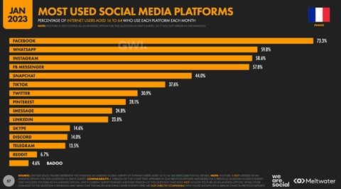
The 10 most popular social networking applications among the French are: Facebook, Instagram, LinkedIn, Pinterest, Reddit, Snapchat, TikTok, Twitch, Twitter and Youtube. We have used We are social statistics from January 2023 to project environmental impacts.

Given the use case selected, we’ve focused on social networks with a news feed, which excludes messaging applications such as Whatsapp, Messenger, Imessage, Skype, Discord and Telegram. You’ll probably find them in a future article 😉

User path definition

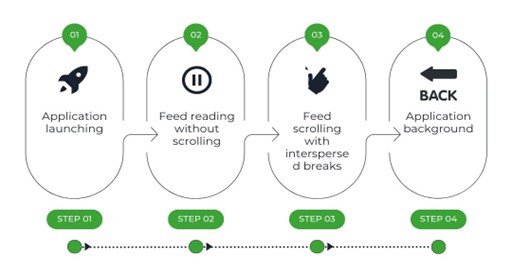
We evolved the user journey by creating a news feed scrolling scenario with the following steps

  • Step 1: launch the application
  • Step 2: read news feed without scrolling (30 sec)
  • Step 3: News feed scrolls with pauses.
  • Step 4: application background (30 sec)
Step 1: launch the application
Step 2: read news feed without scrolling (30 sec)
Step 3: News feed scrolls with pauses.
Step 4: application background (30 sec)

This path consists of a 2-second scroll followed by a 1-second read (pause), all repeated and weighted over a 1-minute duration.

Regarding Snapchat, its operation forced us to consider a click and not a scroll scenario, but not calling into question the pause and content scroll times. What’s more, the chosen news feed is the stories page, which is not the application’s home page. In order to have comparable scenarios, the step of accessing the stories page was not measured on this path and therefore not included in the impact generated.

The pauses in scrolling through the news feed simulate the most realistic reading behavior possible.
This path does not transcribe the most frequent uses on these platforms (reading a post or associated rich content, a video, reaction, generated exchange, ….) but it does give us an indication of the level of sobriety of the applications.

For this study, data was measured using our Greenspector Test Runner solution, which enables automated tests to be carried out locally on smartphones.

We measured resource consumption (energy, memory, data) and response times. These data were then used to calculate the environmental impact of the applications.

Please note that the methodology used in this study compares only the scrolling of the most common news feeds. This means that the comparison is not necessarily equivalent, as some news feeds focus on video scrolling and others on multimedia posts (text, image, video, animated gif, etc.).

Measurement context

  • Samsung 10, Android 10
  • Network: Wi-Fi
  • Brightness: 50%.
  • Tests carried out over at least 3 iterations to ensure reliability of results

Assumptions used for environmental projections

  • User location: 100% France
  • Server localization: 100% worldwide (in the absence of information for each application)
  • Devices used: 100% smartphone
  • Server type: 100% complex

The environmental footprint depends on the location of application servers, their type, the location of users and the type of devices they use. We have decided to study the use of applications only on smartphones and on the share of French users.

Top and flop apps in France according to results

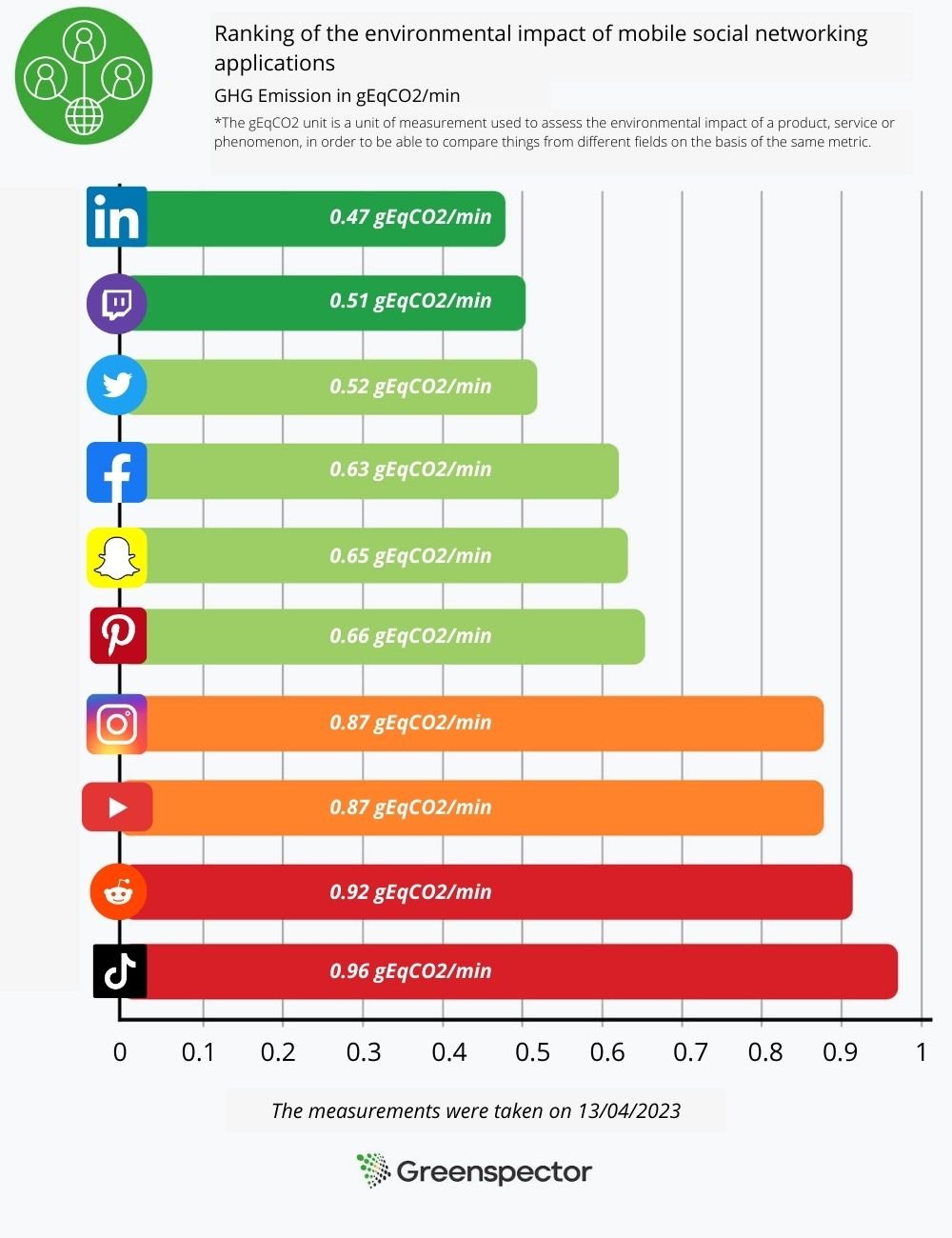
The graph below ranks the various social networking applications according to the environmental footprint of the path we defined above.

Ranking of the environmental impact of mobile social networking applications
1 - linkedIn :0.47gEqCO2/min
2- twitch : 0.51 gEqCO2/min
3- Twitter : 0.52 gEqCO2/min
4- Facebook: 0.63 gEqCO2/min
5- Snapchat: 0.65 gEqCO2/min
6- Pinterest: 0.66 gEqCO2/min
7- Instagram: 0.87 gEqCO2/min
8- Youtube: 0.87 gEqCO2/min
9- Reddit: 0.92 gEqCO2/min
10 - Tiktok: 0.96 gEqCO2/min
The measurements were taken by Greenspector on 13/04/2023

The less sober app

Tiktok comes last in the ranking, but that’s no great surprise. In fact, the application is very energy-hungry, consuming 22.4 mAh at launch and exchanging a lot of data as it scrolls through the news feed. This enormous exchange is due in particular to the constantly running video launch and the many advertisements present on the application.

The application preloads a wide range of content, so if the user is offline, he or she can still access the videos. Tiktok loads around 5 MB of data for 30s after launch, equivalent in this test to 10 preloaded videos.

The most sober application

LinkedIn is the least impactful application according to our results. It exchanges a very low volume of data when the application loads, as well as when scrolling through the news feed. The fact that the social network is focused on sharing text-based posts with a low amount of photos and videos explains this score in particular. What’s more, LinkedIn consumes 13.9 mAh of energy, 15% less than the other applications on the panel.


Other applications preload less content, and often less volume. A preloaded video consumes more energy and generates more data exchanges than a preloaded text post.

One-year projection of the impact of the 2 applications most used by the French

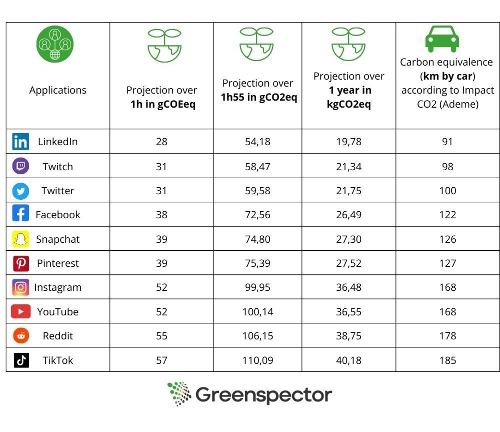
According to the We Are Social annual report, the average time spent on social networks is 1h55 per day. When we project the environmental impact over one year for each application, the environmental impact represents 20 to 40 kg eqCO2 depending on the social network. This represents 185km by car for the least sober network.

According to Ademe’s Impact CO2 website, which offers an online converter, approximately 200g CO2eq = 1km. This includes direct emissions, vehicle construction (manufacture, maintenance and end-of-life) and the production and distribution of fuel and electricity. Infrastructure construction (roads, railways, airports, etc.) is not included in this calculation.

We have chosen to compare the 2 applications most used by the French, namely Facebook, which has around 38.1M users, and Instagram, which has around 30.5M users.

Facebook 

The report states that 52 million people in France are present on social networks. Facebook is the most popular social network among 16-64 year-olds (73.3%). If we multiply Facebook’s environmental impact by the number of French users present on this platform (approx. 38.1M), this represents more than 24 tonnes eqCO2/min (or the production of 773 smartphones/min). That’s almost 1M tonnes of eqCO2 per year!

Instagram 

Instagram is the 2nd most popular social network among 16-64 year-olds after Facebook. If we multiply Instagram’s environmental impact by the number of French users present on this platform (58.6%), this represents more than 26.5 tonnes eqCO2/min (or the production of 853 smartphones/min). That’s over 1.1M tonnes of eqCO2 per year!

We can see that despite a gap of almost 8 million users, Instagram has a greater carbon impact than Facebook.

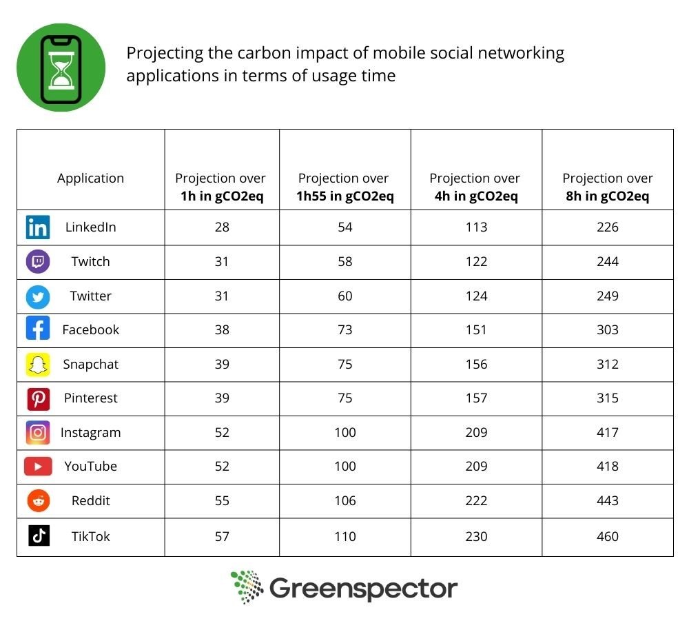
It’s worth pointing out that the amount of time devoted to social networking varies according to the audience concerned. Some people spend less time on them, while others spend considerably more, sometimes up to 8 hours a day.

The table below projects the carbon impact in terms of uptime.

What about international projection?

With an average time spent on social networks of 2 hours and 31 minutes across all networks, we estimate the consumption of these applications worldwide.

Facebook has 2.958 billion users worldwide, making it once again the most popular network. The daily consumption of a user spending an average of 2h31 on this network would be around 95g eqCO2. For the almost 3 billion Facebook users who spend an average of 2h31 a day on this social network, the platform would have an environmental footprint of more than 281,000 tonnes eqCO2/day, or more than 102 million tonnes eqCO2 a year!

Internationally, Instagram has around 2 billion users. Per day, the consumption of a user spending 2h31 on Instagram would produce around 132g eqCO2. On the scale of 2 billion users, this would represent 262,000 tonnes eqCO2/day, or almost 96 million tonnes per year.

And what happens if we use a dark theme?

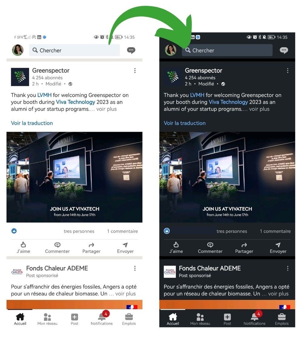
We carried out our measurements a second time with the applications in dark mode, so as to be able to compare the energy impacts generated.

The measurements were carried out on a Samsung S10, equipped with AMOLED technology, known for the fact that a dark pixel is actually a partially extinguished pixel, which explains why dark modes reduce power consumption. Conversely, when the screen uses LCD technology, color has no influence on consumption, which explains why dark mode is no more energy-efficient than light mode, see article here.

screenshot feed LinkedIn en white mode Versus Screenshot feed LinkedIn en darkmode
RS visuel – 9

Nowadays, more and more phones are equipped with AMOLED screen technology, and it’s worth activating the dark mode to reduce power consumption and preserve battery discharge.

In this study, we noticed that only 8 of the 10 applications studied offered dark mode. Snapchat and Tiktok didn’t, so we excluded them from the measurements. As their interface is based on scrolling videos and photos only, only a few pages such as messaging would lower the energy consumption measurement.

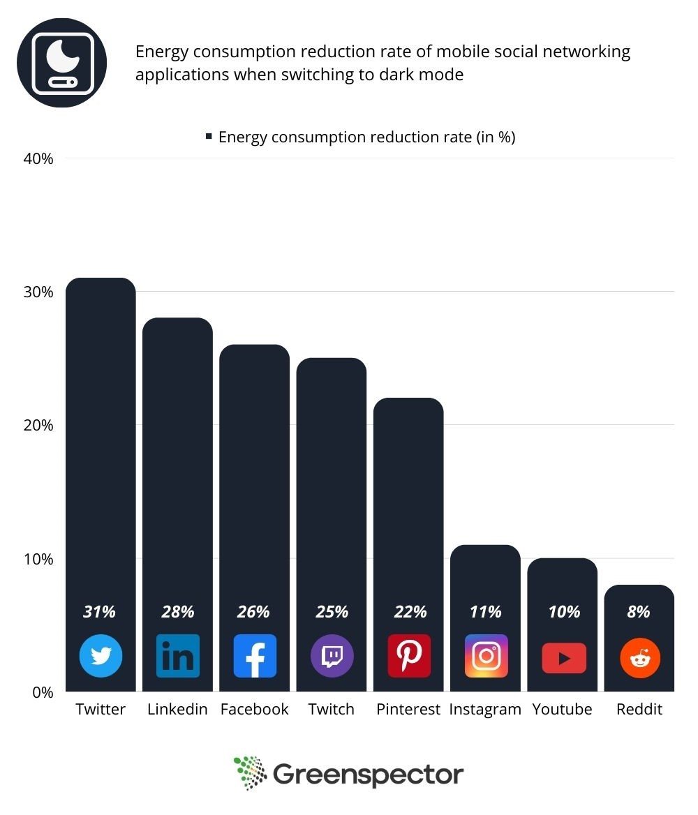
ApplicationEnergy consumed in light mode /1 min(mAh)Energy consumed in dark mode /1 min(mAh)Energy consumption reduction rate
Twitter12,28,531%
LinkedIn11,78,528%
Facebook12,59,326%
twitch107,525%
Pinterest11,38,822%
Instagram13,211,811%
YouTube13,411,910%
Reddit14,113,18%

It can be seen that activating the dark mode reduces the energy consumption measured on the battery.

We can see that when dark mode is activated on the application, energy consumption is reduced by an average of 20%, and the rate of battery discharge is therefore reduced by an average of 18%, relative to their equivalents in light mode.

On text-heavy applications such as Twitter, LinkedIn and Facebook, dark mode is more energy-efficient, as it inverts the colors of a block of text, turning it into fine white writing on a black background. On the other hand, images and videos will not have their colors inverted, so there will be little difference when displaying multimedia content.

darkmode consumption

Conclusion

In this study, we observe that the GHG impact is around twice as great between the most and least impacting platforms.

Applications with a lot of multimedia content consume a lot of energy and require a lot of data exchange over the network to display this content. Text-based content, on the other hand, is much easier to load and consumes much less energy.

In conclusion, although social networks facilitate the exchange and accessibility of information, they are not as totally virtual as we might think, and raise the question of our relationship to the consumption of these applications. Are we really using them to communicate and inform ourselves, or rather to feed on a barrage of information and content that is generally neither desired nor expected?

At a time when climate change is a matter of urgency, it’s time to examine our relationship with our screens and adopt eco-friendly gestures, such as reducing time spent online and activating dark mode on mobile applications.

If you’re an application publisher, you also have a role to play! Here are a few ways in which you can reduce your impact:

  • Default to dark mode when downloading the application
  • Avoid massive pre-loading of heavy content
  • Avoid auto-starting videos or auto-re-launching at the end of videos

Sources  

For social network usage statistics :

https://wearesocial.com/fr/blog/2023/02/digital-report-france-2023-%f0%9f%87%ab%f0%9f%87%b7/

For equivalents in terms of carbon impact :

https://impactco2.fr/

Best practice: optimizing fonts

Reading Time: 4 minutes

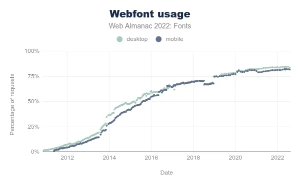
In recent years, the use of fonts on the web has exploded (both in terms of the number of existing fonts and the number of sites using them).

As usual, the Web Almanac is a mine of information, especially via the chapter dedicated to fonts. We learn that the two main suppliers of web fonts are Google and Font Awesome, the latter consisting in the provision of icons. Beyond the potential cost on performance and environmental impacts, some countries have already established that this could contravene the GDPR (General Data Protection Regulation).

Proportion of websites using web fonts

Let’s see what good practices can reduce the impact of fonts on the web.

Existing reference systems

The fonts are mentioned in the UX/UI family of the RGESN (Référentiel Général d’écoconception de services numériques) :

  • 4.10 – Does the digital service use mostly operating system fonts?

They are also found in GR491 (Responsible Digital Service Design Reference Guide):

Finally, the 115 web ecodesign best practices also mention them:

Good practices

Objectives

In order to reduce the impacts of fonts, several best practices are applicable:

  • Give preference to standard/ system fonts : This avoids additional requests
  • Use an optimal compression format (today, it is the WOFF2 format). Online tools as Everything Fonts can provide this conversion.
  • Limit the number of variants used or use a variable font
  • Load only the characters that are really used (for example via a subset)

When ?

These good practices must be implemented as soon as the visual design of the service is done in order to favor standard fonts as much as possible. If this is not possible, then limit the number of variants to be loaded. Finally, when fonts are integrated, use the woff2 format, variable fonts and make sure to load only the characters or languages actually used.

Ease of implementation

If the site is already online, it can be complicated to change the font used. On the other hand, technical optimizations are easy to implement (format, variable font, Subset).

Estimated gains

These best practices reduce the number of HTTP requests and the volume of data transferred.

Specific cases

Google Fonts

To avoid problems with the RGPD, it is recommended to host Google Fonts yourself.
If variable versions are not available for all, some creators offer these versions for free. In addition, the Google API allows you to directly create a Subset with a request of this type: https://fonts.googleapis.com/css?family=Montserrat&subset=latin

Icons

Icon fonts are quite common. Using them directly may imply loading many icons that will not necessarily be used. The best way to use icons is to use each of them directly in SVG format. In this form they can be embedded directly in the HTML (without any additional HTTP request). If an icon font must be kept for practical reasons, limit the file to the icons actually used.

Case study

As part of the support Docaposte teams receive for their corporate site, fonts are often a separate project.

The fonts used here are two Google Fonts: Montserrat and Barlow. The site being already online, it is complicated to impose the use of standard fonts.

To avoid violating the GDPR and to improve site performance, fonts are hosted directly on Docaposte’s servers. In a second phase, a dedicated subdomain could be set up to eliminate the need for cookies.

The integration in the form of a variable font requires some additional adjustments, especially in the style sheets. In the meantime, it was decided to apply two best practices:

  • Propose the files in woff2 format rather than woff
  • The site being proposed only in French and English, a Subset was created keeping only the Latin alphabet.

Original requests

Requests after Subset and conversion to woff2

The woff2 format offers an average of 30% more compression than the woff format and even more than other formats like ttf.

This change in format, combined with Subset, reduced the total weight of the fonts from just over 400 kb to just under 90 kb, a reduction of about 78%.

To go further

DOM as a metric for monitoring web sobriety?

Reading Time: 3 minutes

Choosing the right metric to assess its impact is critical in a sobriety approach.

We have validated the use of energy in our tools (https://greenspector.com/fr/pourquoi-devriez-vous-mesurer-la-consommation-energetique-de-votre-logiciel/ and https://greenspector.com/fr/methodologie-calcul-empreinte-environnementale/ for more details). We do however use and measure other metrics such as CPU. This metric can however be complex to measure and some tools or teams use other more technically accessible elements. The CPU is an interesting metric to measure the resource footprint on the terminal side. Indeed, we have carried out measurements on several hundred sites and it is clear that the CPU is the most important metric for analysing the impact of software. This is why all the models that use the data exchanged to calculate the impact of the terminal are not consistent. CPU-based models (such as the Power API) are preferred.

However, it is necessary to be rigorous in the analysis of this metric as there may be interpretation biases (Example of criticism on the CPU). The criticism must be even more important on the way to obtain this metric, and more particularly in the case of modelling the CPU. This is the case, for example, with methods for projecting the CPU into the web from DOM elements.

This is based on the assumption that the structure of the DOM has an impact on the resource consumption of the terminal. The more complex the dom, the more it needs to be processed by the browser, the more resources (CPU and RAM) it uses and the more environmental impact it creates.

Assuming that the hypothesis of a correlation between DOM complexity and environmental impact is valid, the metric often used is the number of elements. A DOM with many elements may be complex but not systematically so. To take into account the complexity of the DOM, it would be necessary to take into account the architecture of the DOM, in particular the depth, the type of node (not all nodes have the same impact on the browser…). The choice of the number of DOM elements is therefore debatable.

But is the choice of DOM complexity a viable assumption? There are several criticisms of this.

The DOM is a raw structure that is not sufficient for the browser to display the page. The style is used with the DOM to create the CSSOM, a complexity of the style can thus greatly impact the CSSOM, even with a simple DOM. Then the layout tree is a structure that will allow the display to be managed (typos, sizes…), this management is much more complex to handle for browsers.

A DOM can be modified after its creation. This is called reflow and repaint. The browser will recalculate the layout and other things. This can happen several times during loading and after loading. The depth of the DOM (and not the number of elements) can influence but not only: the loading and execution of JS code are to be taken into account.

Independently of the DOM, resource consumption can be impacted by various processes on the terminal. In particular, all the JS processing that will be executed when the page is loaded. This cost is currently the main cost on the CPU in the web. And you can have a DOM with 100 elements (not many) and a JS gas factory.

Graphics animations will increase resource consumption without necessarily impacting the DOM. Even if most of this processing is handled by the GPU, the resource impact is not negligible. We can also put in this category the launching of videos, podcasts (and more generally media files) and ads.

There are also many other sources of resource consumption: ungrouped network requests, memory leaks.

The use of the DOM should therefore be used with great care. It is best used as a software quality metric that indicates “clean HTML”. Reducing the number of DOM elements and simplifying the DOM structure may be a good sobriety practice but not a sobriety reduction or CO2 calculation KPI.

Are we really having a positive impact?

Reading Time: 4 minutes

At Greenspector, our mission is to help our customers reduce the environmental impact of their digital services. We work on this every day, but is it enough to offset our own impacts?

To this fundamental question, we must admit that we do not have a simple answer at this time. We will propose to our Mission Committee to work on this subject in order to go further. In the meantime, here is what we can share with you.

To verify that we are having a positive impact, we need to know our own impacts, and estimate the impacts that our clients are avoiding thanks to us. For this exercise, we will focus on the most easily assessable impact data: greenhouse gas emissions.

Our impacts

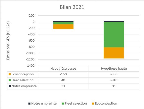
This is the “easy” part of the calculation. We have been doing our carbon footprint every year since 2019, using the excellent software from our friends at Toovalu. So we know our greenhouse gas emissions. In 2021, they were 31 tCO2e.

Is this a lot? We can reduce this value to a monetary ratio commonly used in this type of approach: 31 tCO2e for 851 k€ of turnover in 2021, which represents 36.9 kgCO2e/k€ of turnover. By way of comparison, ADEME indicates an average value of 110 kgCO2e/k€ for the category “low material services”. We are therefore 66% below the sector average. This is good, but we can certainly do better.

Avoided impacts

This is where things get complicated. On the one hand, our activities are diverse (sales of licenses, audits of mobile applications or websites, help in choosing Android fleets, etc.). On the other hand, it is not so easy to know how much we have helped to avoid. We need to be able to measure “before” and “after” (which does not always happen) and ideally, between “before” and “after”, only our recommendations to reduce impacts should have been applied. However, if you develop applications or websites, you know that between two versions, it is rare that there are not multiple changes of all kinds.

Finally, there is a methodological question: let’s suppose an audit on a version 1.0, which leads to 30% less impact on a version 1.1. Can we consider that this 30% will be avoided ad vitam aeternam, in other words, can we consider that version 1.7, which will be released in 18 months, will have 30% less impact than 1.7 would have had if we had not intervened on version 1.0? For want of a better answer, we have chosen to consider that the avoided impacts apply for the next 12 months.

So we do not have the possibility of calculating avoided impacts on all our projects or for all our clients – which we regret. However, we can get an idea from a few cases for which this calculation was possible.

Let’s take three examples:

  • The SNCF Connect mobile application (Android version): we were able to determine the impact avoided on the TER ticket reservation process: -18.9% or -10 tCO2e over one year.
  • At the opposite extreme, the Orange Group’s Integrated Annual Report (IAR): the RAI 2021 website has a 55% lower impact than the RAI 2020, which for its audience – modest for this type of content – represents an avoidance of 0.024 tCO2e over one year.

Here we have 2 projects typical of our activity, extreme in their audiences, accumulating 10 tCO2e avoided, so an average of 5 tCO2e per project. However, in 2021 we worked on more than 70 application or website projects. By taking the average of these two projects, multiplied by 70 projects, we arrive at 356 tCO2e avoided. Another approach based on a categorisation of each service according to its intensity of use gives us 150 tCO2e. Let us retain this lowest value.

As a reminder, our own footprint that year was 31 tCO2e: even if our low value of 150t was still overestimated, it would be very surprising if it turned out to be less than 31t.

“And the third example?”, say those who follow

The third example is a lesser known service in our catalogue. This is our “Fleet Selection” offer, which consists, thanks to our laboratory measurements, of assisting our customers in choosing a smartphone for their business mobile fleet. The measurements and recommendations focus on autonomy criteria, of course, but also on the durability of the terminals (battery life, robustness, etc.) in order to check that they will be able to meet business needs for as long as possible.

In 2021, we helped a client choose the most sustainable device for a fleet of 35,000 smartphones and 5,000 tablets. Thanks to our measurements, he was able to ensure that he chose a model with an expected lifespan of 4 years instead of 3. The manufacturing impact of a smartphone is on average 54 kg CO2e, that of a tablet 108 kgCO2e (values extracted from the Greenspector impact model). Extending this fleet by one year before replacement therefore represents a saving of 810 tCO2e. It can be argued that we are not 100% responsible for this choice. If we attribute even 10% of these 810t to ourselves, this represents 81 tCO2e avoided – compared to the 31t we emit.

Conclusion

We don’t yet know how to quantify our positive impact precisely, and we may never know. But it is important for us to make sure that we do have a positive impact. This 2021 exercise has demonstrated that.

We will continue to work on this assessment of avoided impacts in order to arrive at more accurate results in the future. But even under conservative assumptions, we are confident that our actions are saving greenhouse gas emissions.

In addition, it should be remembered that improving the sobriety of apps has other positive impacts, particularly on the social aspect by enabling people with old and/or low-end terminals to access these digital services that are often indispensable in daily life.

All this makes us proud and strengthens us to continue our mission.

Reading grid for environmental commitments of web hosting offers

Reading Time: 7 minutes

After a first article where we based ourselves on the websites of the hosting companies to compare the hosting companies proposing “eco-responsible” offers, let’s take a closer look at the offers in question. 

The choice of a web hosting service is often complex because of the many factors to be taken into account (security, availability, storage capacity, sovereignty, etc.). If you also want to choose an offer based on its environmental impact, the choice becomes even more complex.

The main objective of this article is to present some criteria to be taken into account when choosing a web hosting offer.

We first look at the existing good practice guidelines.

Once the list of environmental criteria has been established, we will go into more detail on each of the criteria in order to better understand them but also to have the right information to understand the available criteria or even discuss them directly with the hosts.

Indirectly, this reading grid can also be useful for accommodation providers who are concerned about their environmental impact.

Our objective here is to propose a simple reading grid, allowing anyone to understand what to base their choice of an “eco-responsible” host on. However, all this information will not necessarily be on the websites of the hosting companies. The easiest way is to contact these companies directly to get the missing data.

We obviously welcome feedback and constructive comments in order to improve this reading grid and to know how it is used.

Existing benchmarks

In order to better understand how the environmental impacts of accommodation offers are translated, we started by looking at what the existing standards suggest on this subject.

In order to choose an eco-responsible host, the 115 good web design practices propose the following items (see below for details of each):

The RGESN (Référentiel général d’écoconception de services numériques) proposes a dozen good practices relating to hosting. Among other things, it deals with :

Note: most of these criteria can be found in those selected for this comparison, with the exception of those relating to the location of servers (mentioned in the social commitments) or to data management (which depend on usage, in particular according to the criticality of the service and the data).

As usual, the GR491 (Reference Guide to Responsible Digital Service Design) offers many recommendations on the subject. If we stick to the essentials, we find :

  • Waste management
  • PUE
  • Sizing of the physical fleet
  • End of life of equipment
  • Indicators on the software used

In addition, DINUM (Direction Interministérielle du Numérique) offers a practical guide to responsible digital purchasing, with in particular a sheet on IT infrastructure equipment and hosting services (and hosted solutions). The AGIT (Alliance GreenIT), for its part, updated a white paper in March 2023 on the control and optimisation of the environmental impact of a data centre.

By cross-referencing all these elements, we have drawn up a list of criteria to be checked, which is intended to be complete but not exhaustive.

Note 1: Currently, a working group within W3C is building a set of guidelines for website sustainability. One of the areas of work concerns hosting and infrastructure.

Note 2: In January 2023, the ADEME (Agence de l’Environnement et de la Maîtrise de l’Énergie) published a methodological reference framework for the environmental assessment of hosting and cloud services. This document defines the information to be gathered and displayed. At the time of publication of this article, the companies concerned have not adopted it, but it is hoped that this will be the case in the near future.

Reading grid for the environmental commitments of accommodation providers

Let us now look at what constitutes the reading grid in question.

The criteria used

On the basis of the benchmarks seen above and in order to better evaluate the accommodation offers, the choice was made to base ourselves on several criteria (which we will detail below):

  • WEEE Management
  • PUE
  • WUE
  • CUE
  • Purchasing policy
  • Social commitments
  • Management of the heat produced
  • Renewable energy supply
  • Carbon offsetting
  • ISO standards, labels, certificates

Description of the criteria

Management of WEEE (Waste Electrical and Electronic Equipment)

How electronic and electrical waste is dealt with. To date, most of this waste is trafficked (What is the status of recycling?).

WEEE management is about extending the life of electronic equipment through recycling or upcycling and reuse. For example, servers used for hosting can sometimes be reused in other contexts.

PUE  

The PUE (Power Usage Effectiveness) represents the proportion of energy used to power IT equipment (servers, storage and network) in relation to the total electricity consumed (for cooling, UPS, etc.). It is always greater than 1 and should be as close to 1 as possible. It is estimated that the oldest data centres have a PUE of around 2, whereas the most efficient ones are more like 1.1.

Many structures advertise very low PUE. Here again, it would be important to see how this is calculated. See the Scaleway website: https://www.scaleway.com/fr/leadership-environnemental/

WUE  

Following a similar reasoning as for the PUE, the WUE (Water Usage Effectiveness) evaluates the efficient use of water, especially for cooling equipment, by comparing it to the amount of electricity used for the equipment. Indeed, the amount of water used by hosts is very high, which increases the risk of water stress.

The aim is to get as close as possible to zero water consumption per kWh.

Few organisations today report CUE or WUE. However, this type of information is an essential complement to the PUE in order to ensure, for example, that a low PUE is not explained by higher water use.

CUE 

Carbon Usage Effectiveness (CUE) compares the amount of greenhouse gas emissions to the amount of electricity used. In order to improve it, technologies with lower CO2 emissions should be selected (which may be the case when a generator is used to produce the electricity rather than using the electricity grid directly). The objective may be to have a UEC of less than 0.1 kg of CO2.

Purchasing policy

The manufacture of equipment remains the most impactful stage in its life cycle, notably because of the many resources (including metals and rare earths) required. The purchasing policy is therefore an essential element in limiting the environmental impact of a hosting company, even if the manufacture of data centre equipment has less impact than its electricity consumption. Thus, some opt for reconditioned equipment or manufacture their own equipment and all must keep in mind the efficiency and durability of the equipment purchased.

Social commitments

It is impossible to make it an objective and directly measurable criterion. However, this category includes what some companies do to reduce the impact of their activity or to contribute to society, which is an essential component of responsible digital. Global elements such as a CSR plan or the Lucie label can testify to this. It may also be interesting to consider the location of buildings as well as local actions, choice of service providers, etc. 

Gestion de la chaleur produite  

Due to its activity and the demand on its equipment, a hosting company can produce a lot of heat. In order to keep the equipment in working order, it is necessary to cool it down, most often by using electricity via air conditioning for example (hence the notion of PUE seen above) or water. When released directly, this heat can have a negative impact on the environment (sometimes referred to as waste heat or energy). Some accommodation providers therefore use it to heat neighbouring buildings. This can be measured by the Energy Reuse Factor (ERF).

Renewable energy supply

Data centres are often criticised for their electricity consumption. While the priority is to ensure that as little electricity as possible is used, it is important to rely on renewable energy as much as possible to limit the environmental impact. This can be measured by the Renewable Energy Factor (REF).

Most hosting companies are focusing on renewable energy. We have based our analysis on the companies’ statements on the proportion of renewable energy used. By way of comparison, the Green Software Foundation’s approach to this (for their Green Hosting Directory which is mentioned by several of the organisations compared here) is rather simple. They distinguish between but take into account organisations that :

  • Use only renewable energy
  • Invest in renewable energy to offset their own use of non-renewable energy
  • Use carbon offsetting

This choice may be debatable (particularly with regard to the inclusion of carbon offsetting). It is up to each individual to see what he or she deems necessary (in terms of procedures and evidence).

It is also important to distinguish between decarbonised energy (e.g. nuclear) and renewable energy.

Finally, claims of “100% renewable energy” can be misleading. It is therefore up to each individual to find out more directly from the companies.

Carbon offsetting

Carbon offsetting is the final step in the process of reducing environmental impacts. It should only be used when emissions have first been reduced as much as possible through sobriety and efficiency. Moreover, the effectiveness of some carbon offsetting solutions is regularly questioned. As there are several ways of offsetting, it is advisable to approach companies to find out more about the precise nature of their approach. In accordance with the recommendations of ADEME and EcoInfo, the notion of carbon neutrality should be approached with caution and avoided as much as possible.

ISO standards, labels, certificates

We look at a number of elements as a matter of priority. These include ISO50001 (energy management), ISO27001 (information security) and ISO14001 (environmental management). In addition to this, we sometimes find the HDS (Health Data Hosting, which includes ISO27001 and ISO50001 among other standards). Finally, the Code of Conduct on Data Centre Energy Efficiency includes many good practices. Greenethiquette is sometimes mentioned, but has disappeared in favour of more detailed standards (such as the European Code of Conduct).

Conclusion 

The notion of an eco-responsible host has been around for several years (notably via the Greenethiquette), but the precise criteria are still under consideration (not to mention what one is entitled to expect from it). Even if some companies are very transparent on their websites (notably via dedicated pages), this cannot replace a more in-depth discussion, both to find out about missing criteria and to better understand the actions already taken. It is therefore to be hoped that hosting companies will move towards concrete criteria to demonstrate their environmental impacts and communicate them in a transparent manner.

For the time being, it is to be hoped that this reading grid will be useful for those who wish to move towards more environmentally friendly accommodation offers, but also so that everyone can be in a position to push companies towards more virtuous actions.

Web hosts, impact and sobriety actions

Reading Time: 8 minutes

The article is based on measurements taken in November 2022. It is possible that some companies have since redesigned their websites.


Summary of the article

More and more web hosting providers are claiming to be environmentally friendly.

– We measured the homepage of 21 web hosting providers.
– We analysed the homepage of the first ranked provider, which is Digital Footprint.
– We then analysed the homepage of the last one in the ranking which is Infomaniak.
– We then took a look at Greenshift’s site by exposing an extract of the HTTP requests of the homepage.

Finally, we reviewed the good practices of sobriety and accessibility which reveal that Eolas and Empreinte Digitale have the fewest accessibility errors unlike Infomaniak which has the most.

In the next article, we will look at the criteria needed to assess the environmental friendliness of a hosting company.

When we are interested in digital sobriety, the question of the host comes up very often. Indeed, this is a very interesting and cross-cutting lever for reducing the environmental impact of digital services. Things get more complicated when you try to sort out the real from the fake in order to choose the best possible host according to the project’s business constraints. Some providers go so far as to talk about carbon neutrality or even carbon negativity.

Claims of carbon neutrality are most often based on the source of the electricity used according to a market-based (supplier’s claims) or location-based (geographical energy mix) approach. Given that some of the scopes 1, 2 and 3 are often neglected, all of this makes these claims invalid. The purpose of this article is not necessarily to go into this point in detail, but you will find some initial answers here:

Today, in all cases, the claims of eco-responsibility of hosting providers are mostly based on PUE (Power Usage Effectiveness) and the source of the electricity used. This does not seem to be enough. At Greenspector, we decided to look into the subject, to see what was being offered today and to base ourselves on the existing literature in order to determine what criteria to use to choose a hosting company. We were then able to classify several French (or nearby) hosts.

In this first article, we decided to evaluate the homepage of their sites from the point of view of digital sobriety, in order to check whether they reflect their environmental claims. This approach is of course biased and unrepresentative, but it already gives an idea of where each of them stands from this point of view.

It is only with the second article that we will really be able to decide between the hosts, by sifting through the criteria we have chosen.

Comparison of home pages

Based on their intentions regarding environmental impacts, 21 accommodation providers were selected. We have selected as a priority those that show efforts to reduce the environmental impacts of the services they offer. We may have missed some. If so, please let us know!

Based on this list, we measured the homepage of each with the Greenspector tool in order to compare them.

NomURLEcoscoreEnergie (mAh)Données transférées (Mo)Requêtes HTTP
Webaxyshttps://webaxys.fr/894,1731920,4791321
Empreinte Digitalehttps://cloud.empreintedigitale.fr/855,0098830,31311166718
Greenshifthttps://www.greenshift.co/fr/804,2531081,07974166751
Eolashttps://www.eolas.fr/734,4498221,41620333359
IONOShttps://www.ionos.fr724,5860760,996712727
Scalewayhttps://www.scaleway.com/725,0837582,24784966329
OVHhttps://www.ovhcloud.com/fr/725,5531751,83202033464
Neutral IThttps://neutral-it.com/696,622361,28623949
o2switchhttps://www.o2switch.fr/675,38240,97976366790
Ikoulahttps://www.ikoula.com/665,3153841,5460696733
PlanetHosterhttps://www.planethoster.com/665,4691591,77847476
DRIhttps://www.dri.fr/605,989070,45114833327
Datacampushttps://datacampus.fr/605,69127513,1412466764
EX2https://www.ex2.com/585,4742029,75604991
Data Center Lighthttps://datacenterlight.ch/564,6863412,8627603751
Sostradatahttps://www.sostradata.fr/527,23515317,1943103389
Digital Foresthttps://digitalforest.fr/516,2256420,89760235
OVEAhttps://www.ovea.com/457,012554,253318032111
Infomaniakhttps://www.infomaniak.com/3910,300433,09277299772

Résultats des mesures sur les pages d’accueil


Results of the environmental projection

Now let’s look in more detail

In terms of the Ecoscore (whose calculation methodology can be found on the Greenspector blog), the Webaxys home page does best and Infomaniak does worst. For Infomaniak, this can be explained by the fact that the energy impact of the site is very high. It is even the highest in the sample. On the other hand, from this point of view, it is once again Webaxys that comes out on top. Empreinte Digitale presents the lowest volume of transferred data while Sostradata transfers the most (more than 17 MB!). Concerning HTTP requests, the home page of Empreinte Digitale uses the least while the one of OVEA has the most (at first sight, some optimizations would be quite easy to implement by avoiding duplicates and by delaying the loading of the chat or even by questioning its relevance).

The home pages of the Webaxys and Empreinte Digitale sites clearly stand out and we will now analyze them in more detail. We will then complete our analysis with a quick look at the elements of the Infomaniak site that make it more impactful. We’ll finish with a brief overview of the other sites.

Empreinte Digitale

This homepage is particularly light, which is an opportunity to note the application of several good practices:

  • Optimised and lazy-loaded images
  • Third-party services mastered and, in principle, all self-hosted
  • Very little JS and CSS
  • Use of system fonts only

The site is pleasant and attractive. The score could be even better without the animation but this is absent on mobile. The choice of dithering for some images highlights the desire to produce a site as light as possible but is not necessarily necessary.

Webaxys

We find here light and lazy-loaded images, with a simple and attractive service.

On this type of very optimized and light site, some flaws stand out even more, especially the use of Google fonts.

Here we see 7 requests only for these fonts whereas a system font would probably have been suitable. It should also be remembered that their use from Google servers may pose a problem with respect to the RGPD. A variable font could limit the number of files and a subset (limit to useful characters) could reduce the size. But the priority would be to use a system font.

Finally, the last request of the list is probably FontAwesome. So here we get an icon font while only a few icons are useful (and could be integrated in optimized SVG, maybe even directly in the HTML).

Infomaniak

The Infomaniak site stands out for its low Ecoscore and high energy impact.

If you take a closer look, you’ll notice that most of the weight of the page is due to numerous JS files (about forty in all!).

In addition, the animation at the top of the page (for the search of a domain name) seems to be one of the causes of the overconsumption of energy, highlighted in the Greenspector tool:

Sollicitation du CPU pour l’affichage de la page

Other possible explanations for this over-consumption may be found in JS processing. In any case, it should be analysed and limited.

Other websites

Greenshift’s homepage shows a low energy impact, despite the inclusion of animations when the page is loaded. However, in terms of usability, the presence of horizontal scrolling on mobile phones is not ideal.

For the Sostradata site, which has the highest volume of data transferred in the sample, a quick glance reveals the first areas of improvement:

  • Avoid including a Google Maps component directly on the homepage
  • Optimise images (size, format, quality, lazy-loading)
Extrait des requêtes HTTP de la page (via les DevTools de Firefox)

Good practice in digital sobriety

In terms of good practice, it is worth noting that the Neutral IT homepage meets the most criteria.

From this point of view, we found that some good practices are almost never implemented on the pages in our sample. To improve impact, one should systematically consider :

  • Do not let the browser resize images, this limits the consumption of terminal resources
  • Only download the necessary images and do lazy loading
  • As far as possible, do not integrate css and js code into HTML files; this will avoid systematically reloading the whole file if necessary
  • And of course, once the css and js files are independent, they should be minified to save space

Best practices for accessibility

In addition to measurements and verification of good practices (two complementary approaches that are difficult to separate), we were curious to briefly evaluate the selected sites from the perspective of accessibility. While it is important to reduce the environmental impact of digital services, this cannot be done without ensuring that the site adapts to all contexts of use so as not to exclude anyone. What is the point of having the least impactful site possible if it is unusable for a part of the population?

As we do not wish to be exhaustive, we have relied on the aXe tool (it should be remembered that this type of tool is not intended to cover all the WCAG or RGAA criteria) and on the manual verification of certain criteria (200% zoom, content linearisation, textual alternatives, etc.) In accessibility as in digital sobriety, there is no magic wand!

In the end, our findings are as follows:

  • The Eolas and Empreinte Digitale websites have the fewest accessibility errors
  • Despite its reduced environmental impact, the Webaxys site has several errors that are fairly easy to fix.
  • The Infomaniak site is among the sites with the most errors
  • Among the most frequent errors, we find mainly those highlighted by the WebAIM Million study (which is consistent):
étude WebAIM Million

So here we see (once again) that accessibility and digital sobriety are linked. It would be difficult to say that those who do not take care of the sobriety of their websites do not care about accessibility (and vice versa). On the other hand, it is important to remember that it will be all the easier to apply accessibility criteria to a sober site, and even more so when the two approaches are carried out jointly throughout the project’s life cycle.

Conclusion

A first quick analysis of the websites of the selected hosting providers allows us to distinguish those who make the effort to create a sober (and accessible) site. While this does not indicate that they are paying attention to reducing the environmental impact of their hosting offers, it will be interesting to see if the trends noted here are confirmed later.

In the next article in this series, we will look at the criteria needed to assess the environmental responsibility of a web host. We will return to the websites of the selected hosts to see how each one measures up against the criteria in question.

For each of these websites and applications, measured on an S9 smartphone (Android 10), the measurements were performed using our Greenspector Benchmark Runner, which allows automated testing. Only the homepage of the websites was measured.

Scenario details:

  • Loading the application
  • Inactivity of the website in the foreground
  • Scrolling
  • Website inactivity in background

Each measurement is the average of 5 homogeneous measurements (with a small standard deviation). The consumption measured on a given smartphone with a wifi network can be different on a laptop with a wired network for example. For each iteration, the cache is emptied beforehand.

Learn how Greenspector assesses the ecological footprint of a digital service.

Reducing the impact of autocompletion 

Reading Time: 4 minutes

When we browse the web, autocompletion is almost everywhere. In particular, this functionality is implemented on search engines, whether they are website-specific or not. So, when the user types in the words they are looking for, suggestions are made dynamically, whether to complete the words or phrases they type in or to display the search results as characters are added. 

In the case of Google, these suggestions are often derided as incongruous.  Not to mention the SEO chestnut about the death of the search engine.

Take the example of the Google search engine: 

Here, the blue arrows represent character inputs and the black rectangles represent autocomplete queries.  

We arrive at a total of 16 XHR type queries for 5.1 kb transferred.  

The number of queries remains the same whether the input is fast (input in 2 seconds for the whole search) or longer (7 seconds in total for the input). 

Autocompletion can also be found in some input forms, to ensure that the text entered corresponds to what is expected (city, country, etc).   

While this mechanism can be an aid to the user, the environmental impact of the queries generated should not be overlooked. Let’s see how to limit them.

First recommendations 

If sobriety is a priority, the best thing to do is not to integrate an autocomplete mechanism. However, input help is a definite advantage for users in most cases. 

In the case of forms, the GreenIT.fr collective’s collection of 115 good practices in web ecodesign recommends input assistance. In this way, less strain is placed on the server while ensuring that the text entered remains consistent with what is expected. 

On the GR491 side, there are two recommendations:   

Rather than systematically implementing autocompletion and search, it is sometimes possible to make filters (and sorting mechanisms) available to the user.   

With these initial elements in mind, let’s look at how we can go even further.

Recommendations  

Ensure that requests are as light as possible   

When the client sends a request to the server, ensure that it contains only the elements necessary to provide a relevant response.   

When the server sends a response, again ensure that :   

  • Only relevant fields are returned. For example, it is not always necessary to display an image for each result  
  • Only the necessary elements are returned (relevance of responses and pagination of results)

Do not offer autocompletion before a few characters  

Before launching the first query, it is preferable to wait until 5 characters have been entered or at least 2 seconds have elapsed since the last entry by the user.   

This avoids returning results for a request that is too vague (when the number of characters entered is insufficient), while taking into account the case where the term searched for is deliberately short (“summer”, etc).

Spacing out the queries in time  

After the initial query, wait until 3 new characters have been entered or at least 2 seconds have elapsed since the last query. 

Limit the number of queries for fast entries  

In addition to the previous rule, in the case of fast input, wait at least one second between each request. Indeed, some particularly fast users can enter a character every 200 ms. 

Measuring local relevance  

When a user adds characters to his search, the results become more precise and their number decreases. It is possible to perform this filtering directly locally, without additional requests to the server. For example, if results were obtained for “housing assistance”, it is possible to filter on the client side if the user continues by typing “housing assistance”.   

This good practice is particularly relevant in the case of an input field in a form. For example, when entering a city or country, the elements of an initial query can be refined locally as the user continues to type.  

Be aware that if a space is entered and new terms are added, the logic chosen for the search results must be taken into account. In particular, should a result contain all the terms entered or only some of them?  

Be careful also to take into account the case where the user deletes some of the characters entered. You may also want to temporarily store the queries you have already made so that you can use them again if necessary.

Back to the example of the Google search engine  

Taking the case of the Google search engine mentioned at the beginning of the article (16 queries, 5.1 KB transferred), we arrive at 3 queries in total for 1 KB transferred.

  • A first query only performed when at least 5 characters have been entered.   
  • A second query when 3 more characters have been entered.   
  • A third query when 3 more characters have been entered.   
  • The local evaluation of the results to be returned at the end of the input, since it is only a question of filtering the results obtained following the third query.

Conclusion  

If autocompletion is a necessity and assisted input is not possible, the following good practices should be implemented:   

  • Ensure that queries are as light as possible  
  • Do not offer autocompletion before a few characters  
  • Spacing out queries over time  
  • Limit the number of queries for quick entries
  • Measure relevance locally

Finally, although this input help may be beneficial to many users, do not neglect its accessibility