Today, we focus on a question that comes up very often when we address the question of web eco-design or digital sobriety: is an eco-designed site necessarily ugly? Often, the request consists of obtaining examples of “pretty and eco-designed sites” (preferably with a purpose similar to the current project). Specialists in web accessibility have no doubt encountered this type of question frequently. It is already not easy to define what would be, in absolute terms, a “pretty” site. The concept is itself very subjective.
We will therefore proceed differently. We will first compile a list of sites that are sober. There are lists and directories for this, which will be listed later. After compiling the list, we will do a quick analysis to exclude sites that are not as sober as advertised (too much data transfer, too many requests, etc.). Finally, we will use the Greenspector tool to decide between them (by classifying them and identifying those that are more impactful at first sight).
Finally, armed with this list, we will look at what they look like and try to identify design trends, depending on their purposes (an information site does not necessarily look like an e-commerce site or a web agency, for example). Moreover, it will provide an opportunity to keep in mind other aspects of Digital Sobriety, such as accessibility. Having a site that is light and pleasant to look at does not make sense if it is unusable for part of the population.
The purpose here is to offer a list of websites with a lower environmental impact. Everyone is free to find those that seem attractive to them and that correspond to their expectations (in terms of purpose, target, etc.). Thus, this list could be a source of counter-arguments concerning eco-designed sites which would necessarily be ugly. It can also be a way to find sources of inspiration in order to design eco-designed and attractive sites.
Where are the sober sites?
We have chosen to go through the lists and catalogues of sober sites, with the bonus of other sites crossed elsewhere.
Here are the lists in question:
- https://www.lowww.directory/
- https://greentheweb.com/best-practices/
- https://www.linkedin.com/pulse/48-exemples-de-sites-internet-basse-consommation-c%C3%A9dric-liardet/
There are probably others, but this is already a good starting sample. If you have others in mind or want to test your site’s sobriety, do not hesitate to contact us.
A first analysis was carried out with this first list (more than a hundred references in the end). This is mainly based on the Network tab of the DevTools to watch the HTTP requests and the amount of data transferred.
In the end, only about forty sites are left, which are then used for a benchmark with the Greenspector tool.
Sober sites: the verdict by measurement
The benchmark of the selected sites makes it possible to classify them according to their respective EcoScores (the idea being to obtain an EcoScore as close as possible to 100).
[table “” not found /]By classifying the results (by EcoScore) and looking at the extremes, we already notice two things:
- Some sites have scores above 80 or even 90. This is a rare occurrence and highlights sites that have made an effort to maintain digital sobriety.
- Some sites have an abnormally “low” EcoScore. Thus, these are rather light sites, but they are still impactful.
https://daviddaumer.com/ (EcoScore Greenspector 50): few requests on the page, little data transfer. We look with EcoIndex, and the score A is obtained (which is the best possible score). EcoScores drop due to animations that continuously drain the device’s battery. Therefore, by displaying this page, the battery is discharged faster, which increases its wear and predicts the need to replace the battery. It induces heavy environmental impacts, most of which come from the device fabrication. The impact of CSS and JS processing should be limited. Are animations necessary? What are their accessibility and attention capture impacts?
The reasoning is pretty much the same for:
- https://www.wholegraindigital.com/ (EcoIndex B, EcoScore Greenspector 58… and some animations, some of which are continuous)
- https://www.ec-lyon.fr/ (EcoIndex B, EcoScore Greenspector 59… and a carousel that should be avoided)
- https://becolourful.co.uk/ (EcoIndex A, EcoScore Greenspector 60)
- https://heylow.world/ (EcoIndex A, EcoScore Greenspector 62)
- https://flowty.site/- (EcoIndex B, EcoScore Greenspector 63)
- https://theadccawards.ca/ (EcoIndex A, EcoScore Greenspector 71) : the environmental impact of the animations here is far from negligible, the site is also very light and sober. On the other hand, this abundance of visual effects seriously harms the usability of the site, in particular from the point of view of accessibility.
In the end, the examples illustrate the need to consider all factors before claiming that a site is sober or has benefited from eco-design. It is good to make efforts to reduce the number of requests and the amount of data transferred. On the other hand, JS or CSS treatments (more particularly animations) can cancel out a good part of the benefits thus obtained. Especially (and I insist on this point) that these animations potentially have a detrimental effect in terms of capturing attention but above all accessibility. On this subject, I invite you to refer, among other things, to criterion 13.8 of the RGAA (On each web page, is each moving or flashing content controllable by the user?). The most glaring example here is https://heylow.world/ with its very present animations which further impair readability for all users.
Analysis of the ranking of sober sites
We started with what to avoid to produce an eco-designed website that is visually pleasing without sacrificing usability. Let’s now take a closer look at the sites to extract relevant examples.
We can already consider the list of sites with an EcoScore > 70% as sites on which a sobriety effort has been made. It remains to be seen what can make them attractive and which ones to highlight.
Note: to avoid possible bias, we haven’t included the Greenspector site has not been included (even if its EcoScore is around 72).
E-commerce
The list contains 3 e-commerce sites:
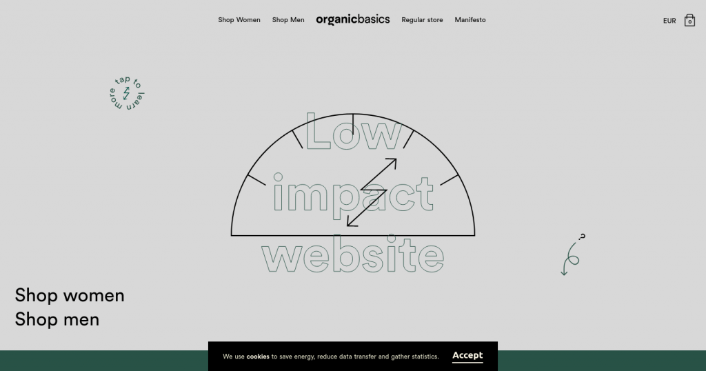
https://lowimpact.organicbasics.com: as of this writing, the standard site is under maintenance. In the “low impact” version, the choice of sobriety is clearly displayed. The focus is on simple shapes (via SVG) and solid colours. On the other hand, it is regrettable that this version is not the default version of the site. This significantly undermines the impact of this approach.
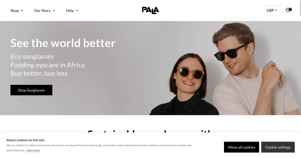
https://palaeyewear.com: the homepage is rather light and pleasant. It includes the classic elements for such a site: a video (integrated soberly), some products, consumer opinions, some news, an impact report, etc. Several good efficiency practices are not respected but this page is doing better than most other e-commerce sites. Everything gets complicated when you access a product sheet. Here, more than 100 requests and several MB of data are transferred. The eco-design effort should therefore have been pushed further, in particular by basing itself on a user journey (navigation and purchase of a product) rather than only on the home page.
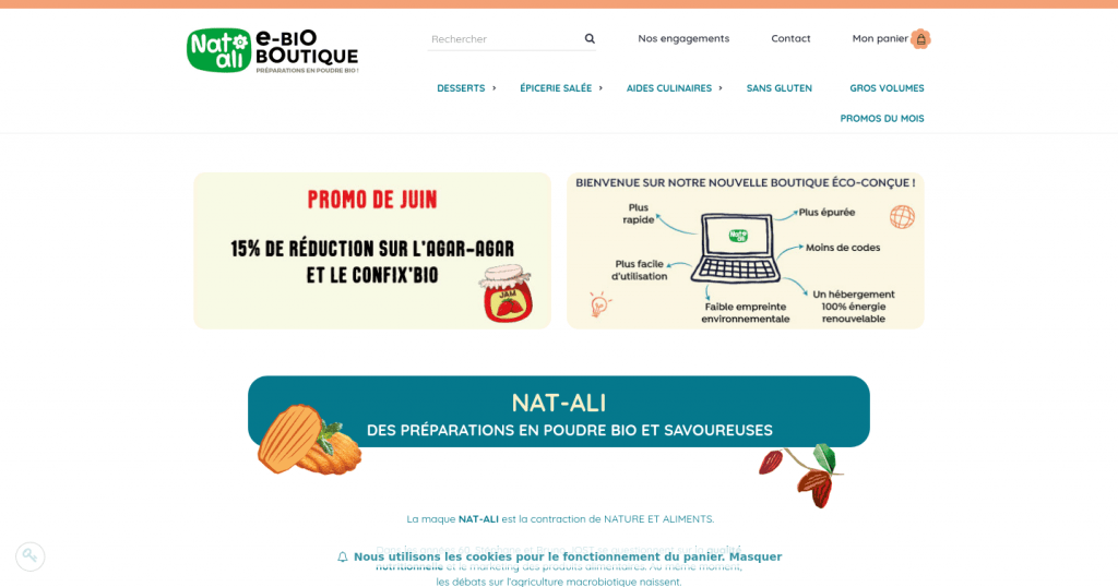
https://www.boutique-natali.com: On this page, we also find several elements specific to this type of site (current promotions, reinsurance elements, products highlighted, etc.) in addition to highlighting the eco-design approach implemented. The same sobriety can be found on the product sheets. Admittedly, some types of products sold online probably require more images (for example in the field of fashion or cosmetics) but in my opinion, this is a good basis for thinking about designing an online store. light and pleasant to use.
Magazines and online press
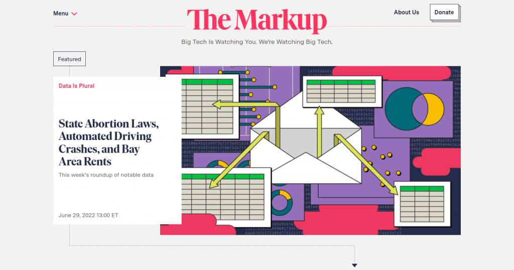
https://themarkup.org is a sober and elegant site at the same time, which is all the more remarkable for the online press. These sites are usually weighed down by advertising and trackers, among other things, which is not the case here. An important site to keep in mind is an example of an eco-designed online press site. Be careful, however, the lightness of this site compared to other similar sites is partly due to choices of an economic model. Once again, this highlights the role that all the actors of a project have to play on the subject of digital sobriety.
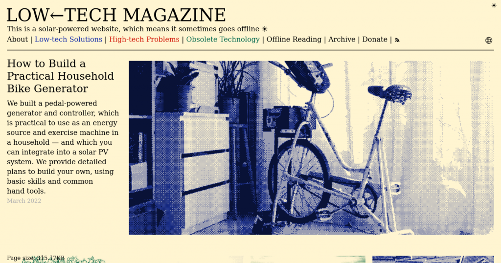
https://solar.lowtechmagazine.com: This is probably one of the best-known examples. The radical choice of environmental impact reduction is clearly displayed here. This will not necessarily be unanimous (notably because of dithering).
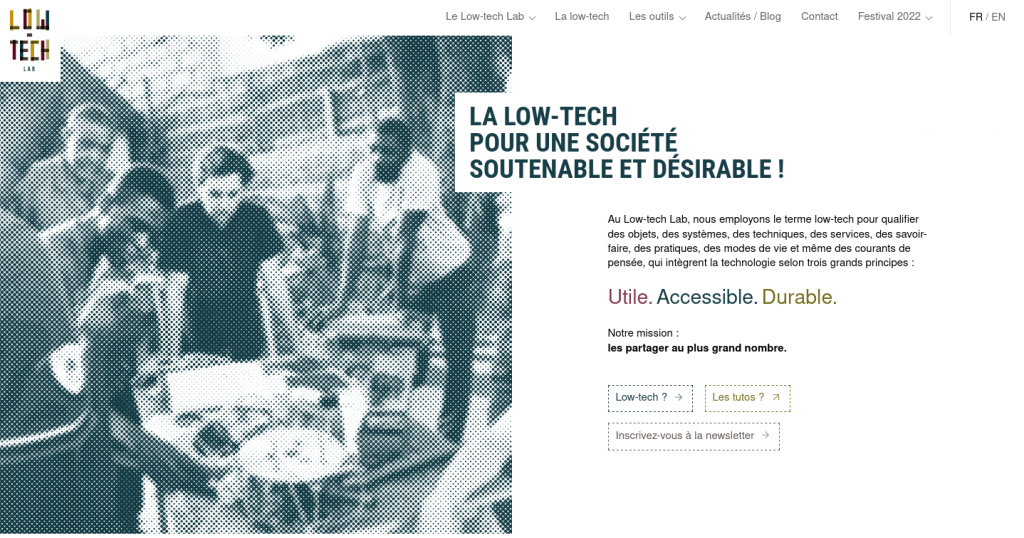
We find a similar logic on the Designers Ethiques site (layout similar to an old-fashioned paper newspaper for a more sober result) or even (for the structure) on that of Pikselkraft. The Low-tech Lab site, if it takes up certain elements, goes to a page richer in content and with a less rigid structure. The home page then seems more attractive and the content easier to identify.
Others sites
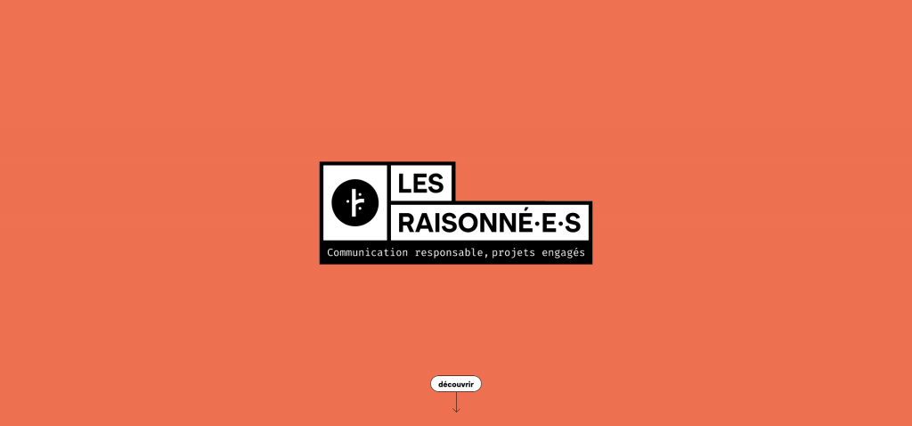
https://lesraisonnees.co: a scroll-based one-page site. An agency site with classic content but produced in a very sober and efficient way, very clear. A very good example.
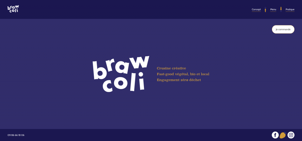
https://brawcoli.fr: the classic elements are grouped together on a single page, putting well before what this restaurant offers.
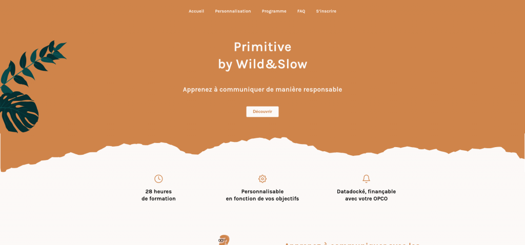
https://primitive.wildandslow.fr: we find in the list of many agency sites or freelancers specialising in the creation of sober sites (which is logical and even reassuring). The idea is generally to present everything on a single page with solid colours and few images (all optimised). Primitive by Wild&Slow is quite representative while standing out, among other things, for areas with non-linear contours. In other cases, the emphasis is on geometric shapes rather than more complex images.
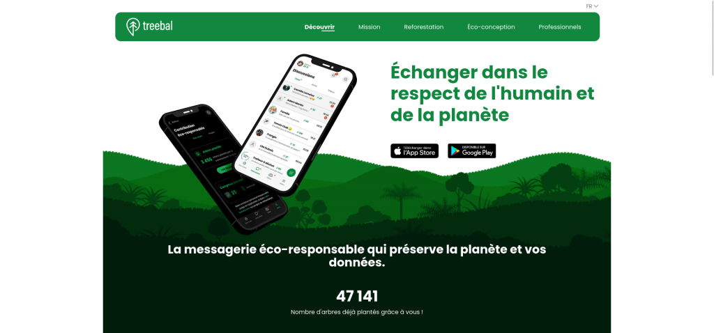
https://www.treebal.green is a much richer variant graphically and for all that quite sober.
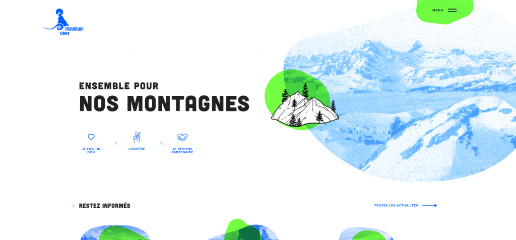
https://www.mountain-riders.org is a good example of using the principles seen above with a very contrasting graphic charter for a clean and attractive final rendering.
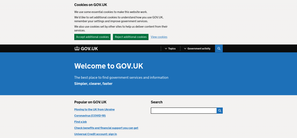
Although it may seem less attractive than others, https://www.gov.uk shines with its lightness and accessibility. Great efforts have been made here at the level of information architecture. It is in any case interesting to have here an example of accessible and sober public service.
Even if continuous and ubiquitous animations are to be avoided, some lightweight sites use them sparingly:
In any case, it is advisable to keep in mind the accessibility as well as the fact that this type of addition is only cosmetic. For some sites like https://dolo.biz/, the attractiveness of the home page relies heavily on the animations but everything remains efficient and rather pleasant (even if it will not necessarily be practical for everyone’s navigation, in particular, the keyboard).
In a totally subjective way, I also retain https://zugvoegelfestival.org for the choice of colours and navigation on the home page. It is just unfortunate that the various navigation elements on the site are not available (at least by click) upon arrival on the site.
And a last special mention for https://sustainablewebdesign.org which uses geometric shapes, and bright colours and emphasises accessibility while being a mine of information on web eco-design.
Conclusion
The ranking presented here should give you a better idea of what is possible with a sober website. This list is expected to grow over time and serve as an inspiration for those who wish to create sober websites.
One must consider accessibility when using a site and dig as deep as necessary into the notion of sobriety if the feeling one can get is partly subjective.