The advent of instant messaging has transformed communications in the business world. In a world where speed is crucial, these applications offer a platform for real-time exchange, coordination and decision-making. Applications such as Microsoft Teams, Slack, WhatsApp and Discord and many others have thus changed the way teams interact, removing geographical limitations and facilitating communication. Instant messaging has also played a crucial role in the evolution of remote working, providing continuous connectivity between collaborators. However, behind this ease of use and speed lies an aspect that is often overlooked: the environmental impact of these applications.
Discord
Slack
Whatsapp
Teams
The impact of these applications is all the greater because they are widely used in companies, but also because they are consumed over long and frequent periods. That’s why it’s interesting to know the unitary impact of these uses, and to be able to project more global impacts.
Methodology
User path definition
For the measurement, we have determined a scenario that is compatible with all applications:
Step 0: 30s reference pause (with no application open)
Step 1: open application
Step 2: 30s pause with application open
Step 3: send message
Step 4: pause for 30s to read message
Step 5: receive reply
Step 6: send reply
Step 7: pause conversation for 30s while the other writes the message
Step 8: send an image (60.54 Kb)
Step 9: pause for 30s to view the image
Step 10: receive image (6.50 kB)
Step 11: send .gif file (3.36 MB)
Step 12: pause for 30s to view .gif file
Step 13: receive .gif file (3.36 MB)
Step 14: pause for 30s with application running in background
Step 15: 30s pause with application in background and message received
Step 16: pause for 30s after user closes application
Step 17: 30s pause after forced application closure
In order to compare performance between the different applications, two smartphones were used to send responses automatically after reception.
For this evaluation, we decided to use blank accounts for each application, so that the weight of previous conversations would not interfere with our results.
Measurement context
Samsung Galaxy S10, Android 12
Network: Wi-Fi
Brightness : 50%
Tests carried out over a minimum of 3 iterations to ensure reliability of results
Measurement context
Samsung Galaxy S10, Android 12
Network : Wi-Fi
Brightness : 50%
Tests carried out over a minimum of 3 iterations to ensure reliability of results
Applications
Required OS
In order to continue using the application to its full potential in complete safety, it’s important to have an up-to-date application. In 2020, according to the European Commission’s Eurobarometer, 19% of the reasons for renewing a digital device are due to software problems. It is therefore the responsibility of publishers to support older OSes.
Minimum Android version required
Percentage of Android phone owners able to download the application (February 14, 2024)
Minimum iOS version required
Percentage of iOS phone owners able to download the application (January 4, 2024)
WhatsApp
Android 5.0
99,5
iOS12
98,8
Discord
Android 7.0
97,1
iOS12
98,8
Slack
Android 10
84,3
iOS15
94,2
Teams
Android 11
75,4
iOS15
94,2
The best pupil here is WhatsApp, which supports Android 5.0 (version dating from 2014), iOS 12.0 (dating from 2018) and all subsequent versions.
The worst performer is Teams, which only supports Android 11 (2020) and iOS 15.0 (2021). This means that 24 out of every 100 users with an Android smartphone cannot use this application.
Application size
A lightweight application is one that concentrates on the most useful features, and goes against the grain of the obese, which will offer unusable and/or unused functions. It also fills the smartphone’s memory, which may lead some users to change their terminal.
WhatsApp
Discord
Slack
Teams
Installed application size (MB)
108
165
189
226
Once again, WhatsApp is the best pupil, with Teams, the worst performer, taking up more than double the space.
Environnemental Impact
Following a detailed analysis, we were able to highlight the applications with the largest environmental footprint for this route.
Environmental assessment assumptions
User localization: 100% France or 100% worldwide
Server localization: 100% worldwide
Devices used: smartphones only
Application
Impact of the journey (gCO2e) for users in France
Impact of journey (gCO2e) for users outside France
WhatsApp
3,6
3,7
Discord
4,5
4,6
Teams
4,6
4,8
Slack
5,2
5,4
Application
Water consumption (l)*
Land use (cm2)*
WhatsApp
0,5
6,2
Discord
0,6
5
Teams
0,6
6,2
Slack
0,7
7,8
*Due to lack of data, for the water and surface area indicators, the network part is not considered.
The most sober application
WhatsApp has the lowest environmental impact on this route. This is mainly due to very low data consumption.
The least sober application
Slack has the highest environmental impact on this route. This is due to its high energy consumption.
Measurement analysis
Energy consumption
To preserve battery life, it is imperative that the application is optimized for minimum power consumption, as the number of charge/discharge cycles of the phone plays a crucial role in the battery degradation process.
WhatsApp
Teams
Discord
Slack
Energy impact of course (mAh)
11,1
10,6
11
16
The most sober application
Teams offers the lowest energy consumption on this route.
The least sober application
Slack offers the highest energy consumption on this route.
The graph shows that for WhatsApp, the action of sending a gif seems to have a greater impact than for other applications.
What about dark mode?
Today’s applications offer a dark mode. This offers a number of advantages, not least of which is the ability to save screen power on devices with OLED screens, such as the Samsung Galaxy, on which tests were carried out. Discord offers two options, with a dark mode and a Midnight mode.
WhatsApp Dark
Teams Dark
Discord Dark
Discord Midnight
Slack Dark
Energy impact of course (mAh)
7,8
7,6
7,3
7,2
12,7
Reduction compared to light mode
-30%
-28%
-34%
-35%
-21%
As a result, the energy consumption of all applications is reduced by between 21 and 35%.
Mobile data consumption
WhatsApp
Teams
Discord
Slack
Consommation de données mobiles du parcours (Mo)
0,8
7,8
7,3
7,5
The most sober application
WhatsApp offers the lowest data consumption on this route. This is due to the default compression of sent items.
The least sober application
Teams offers the highest data consumption on this path. We can see that more data is consumed during the application opening stage than during the other stages.
Usage performance
Performance enables us to meet a need by mobilizing a terminal for a shorter period of time, and therefore to have a lower manufacturing quota, which ultimately generates a lower impact.
WhatsApp
Teams
Discord
Slack
Running time (in seconds, excluding breaks)
55,6
37,4
42,5
49,9
The most sober application
Teams offers the shortest duration on this course.
The least sober application
WhatsApp offers the longest duration on this route. When we look at the duration of the different stages, we see that the longest stages for WhatsApp are sending and receiving GIFs.
Conclusion
Among the range of solutions measured, the use of WhatsApp is the most effective in limiting CO2eq emissions in this scenario, thanks in particular to the compression of images and GIF files. This analysis also shows the cost of this compression, both in terms of energy and performance, but that the cost-benefit ratio is still in favor of this compression. The most impactful application, Slack, will emit 44% more than WhatsApp. Finally, the use of dark mode reduces the energy impact of phones with OLED screens by between 20% and 35%.
The constant evolution of regulations, such as the RGPD (General Data Protection Regulation) and the REEN (Reducing the Digital Environmental Footprint) law, highlights a paradigm shift in the digital world. Companies and organizations are increasingly aware of the importance of regulatory compliance and the need to reduce their environmental impact. This has far-reaching implications for the tools and technologies used, particularly when it comes to web analytics solutions.
Today, these tools are used on a massive scale to monitor our behavior, and their impact is often underestimated when compared with other subjects, such as advertising. These are major challenges, as tracking is omnipresent in the paths and pages of digital services. What’s more, analyzing the areas frequented by the user via analytics makes it possible to target the points through which the user often passes, and therefore its main impacts. Tracking also helps to determine the usefulness of functionalities, encouraging the deactivation of unused functional elements. In this way, judicious use of analytics can bring environmental benefits by avoiding widespread impacts. Optimization and moderation in its use are crucial to minimize systemic impacts.
Choosing the right tools and adopting a good tracking strategy therefore seems to be a key element in the Digitally Responsible approach of your digital service.
In this article, we’ll explore the environmental impact of different solutions for web page tracking, to give you some idea of the impact generated by tracking, and to help you make an informed choice about which solutions to implement, based on their level of sobriety.
Why use Analytics?
Web tracking, also known as web monitoring, is the activity of collecting data on users’ interactions on the Internet, including website visits, clicks, browsing behavior and much more. It enables companies and organizations to analyze and understand users’ online behavior, measure the effectiveness of their marketing campaigns and personalize user experiences.
Web analytics focuses on the measurement and interpretation of website usage data, giving operators a detailed insight into the online activity of their visitors. This practice encompasses a wide range of information, such as :
Number of visitors over time, distinguishing between regular visitors and newcomers, as well as the duration of their visit and the pages consulted
Traffic sources: whether direct (when a user enters the site address directly), from other websites, from advertising or via search engines
Geographical location of visitors
Technical details, such as visitors’ operating system, screen resolution and web browser version
And much more, depending on the tool used
The initial idea behind web analytics is to collect and analyze this information for a number of reasons:
Personalizing the user experience: by gathering data collected in user profiles, these are then used to personalize ads. Instead of showing random ads to users, their profile information, such as age, gender and the sites they have visited in the past, is used to select content that matches their interests. This enables advertisers to focus their budgets on consumers who are likely to be influenced.
Security: law enforcement and intelligence agencies can use web tracking technologies to spy on individuals. The unique identification of individuals on the Internet is important in the fight against identity theft and for the prevention of credit card fraud, for example. This subject remains closely linked to the notion of privacy, because of the potential for abuse.
Web application usability testing or understanding user behavior: by observing the steps taken by an individual when trying to solve a certain task on a web page, usability problems can be discovered and corrected.
Measuring performance and objectives: the aim is to maximize revenues, for example by evaluating which pages generate the most revenue, which banner ads generate the most traffic, or which stages of the order process lose customers.
These motivations support data-driven decision-making. Indeed, the data collected through web tracking helps companies or other entities to make decisions based on proven statistics. Information on user behavior helps to identify potential problems, spot opportunities for improvement and guide decisions on marketing investments, user experience and other aspects of online activity. In particular, this is how the impact of SEO (Search Engine Optimization) or SEA (Search Engine Advertising) can be assessed.
However, retrieving such a mass of information not only generates data traffic and storage for daily or long-term analysis, but also involves processing on the user’s side, whether or not they use the digital service in question. This also involves the risk of temporarily blocking the loading of a website, or failing to respect the user’s consent.
As a site owner/operator, you need to think about the economic, social and environmental impact of these tracking solutions.
While it’s important to collect digital service usage data, you need to keep it to the essentials (which is in line with the RGPD: General Data Protection Regulation).
All the more so as external services tend to weigh down sites, notably via unwanted scripts collecting user data, for example. Examples include Google Analytics, Google Recaptcha (bot detection), Google Maps and FontAwesome.
What criteria should you use to make your choice?
So what criteria should you take into account when choosing an analytics tool? Which solutions can help you make this informed collection?
We won’t go into all the criteria for user requirements in terms of ergonomics, technical support, functionality, etc. of course, but these are of prime importance in making the right choice. Of course, this remains a key point in this choice, but it differs from one organization to another.
It’s important to prioritize tools that rigorously comply with data protection regulations, such as the RGPD. Sensitive user data must be secure and treated confidentially.
When selecting analytics tools, it’s crucial to maintain a smooth user experience that’s accessible to all users.
It’s also important to consider the tool’s ecological footprint. Does the data collected correspond to the stated need? The tool must also be able to evolve with technological advances and changes in the analytics landscape. Do servers and data centers have renewable energy sources and are they managed sustainably?
It can be difficult to have access to all this information, but it can help refine the search for more respectful solutions. If the tool is transparent about how it collects, processes and uses data, this reflects a commitment to the company’s values. Users need to have a clear understanding of how their data is used.
Selection of solutions and definition of measurement scope
We’ve taken the trouble to select 3 analytics tools that are available free of charge. Here is our selection:
Google Analytics
Matomo
Plausible
Methodology
Choice of solutions studied
The choice of solutions to be analyzed was made taking into account several key criteria, such as market popularity and cost. The aim was to select solutions representative of the current web analytics landscape, in order to obtain relevant and significant results.
It should be noted that this experimental study is not intended to promote a specific solution, but rather to provide an objective assessment based on concrete data. The results of this study can serve as a reference and decision-making tool for digital players seeking to optimize their web analytics while taking into account environmental and privacy issues.
As part of this comparative study of web analytics solutions, a necessary step is to measure the performance of a reference page that has no web analytics solution implemented, and to measure this same page with pages implementing web tracking solutions. This approach enables us to assess the specific impact of each solution in terms of page performance and consumption (energy, data, etc.). It’s important to note that we’ve deliberately excluded more advanced uses such as Tag Manager or advanced configuration of collected data. In addition, we have taken into account as far as possible the reality of the impact of server-side processing and storage of collected data, as projected by our model detailed in this article. Also excluded is the administrative part of these tools and the analysis of dashboards.
It’s worth noting that Matomo also offers a server-side only solution, which avoids worries about the RGPD (General Data Protection Regulation) in addition to reducing the environmental impact on the client side. We have not evaluated this solution.
We deployed a simple reference web page as well as 3 identical pages on which we implemented the 3 respective solutions. The reference page is a black screen with a standard text font and no script.
User path definition
To measure the activity of Analytics tools, we have established the following path:
Step 1: launch browser application
Step 2: launch url of page to be measured
Step 3: pause (30 sec)
Step 4: page scroll
The course consists in launching the browser application (here Chrome) and entering the url of the page to be measured (reference or with implemented solution). The process then pauses for 30 seconds to measure what happens when the user is inactive. Finally, a scroll is performed to detect the sending of additional requests describing the user’s behavior.
Measurement context
Samsung S7, Android 10
Network: 3G: used here to extend test performance and enable more measurement points
Brightness: 50%.
Tests carried out over at least 5 iterations to ensure reliability of results
Assumptions used for environmental projections
User location: 2% France, 98% Worldwide
Server localization: 100% worldwide (if not available for each application)
Devices used: 60% smartphone, 38% PC, 2% tablet
Google Analytics
Matomo
Plausible
User location
98% World 2% France
Server localization
100% World
Devices Used
60% smartphone, 38% PC, 2% tablet
The environmental footprint depends on the location of the application’s servers, their type, the location of users and the type of devices they use. We have chosen to study all users, which corresponds to a breakdown of 2% in France and 98% for the rest of the world. This ratio is taken from We are Social’s Digital report. The global report states that 5.16 billion people are Internet users, and the French edition indicates that 53.96 million French people are Internet users.
For the overall breakdown of devices used, the previous year’s report stated a split of around 60% for smartphones, 38% for PCs and 2% for tablets.
What’s the environmental impact?
By carrying out our actual environmental impact measurements for each of our web analytics solutions, we can directly calculate the unit impact of the tool alone on a visit (loading, pausing and scrolling) from which we have subtracted the impact of the reference page. The unit impact shown below is the delta between the black page presented with analytics and the black reference page without analytics implemented.
Solution
Unitary impact per route (g CO2e)
Impact for 10 visits/day of each instance over one year
Google Analytics
0,069
2 490 T CO2e
Matomo
0,012
508 kg CO2e
Plausible
0,039
2,5 T CO2e
For each of the analytics solutions, we have assumed that each of the sites using the solutions has a visit frequency of 10 per day.
For Google Analytics, which produces 0.069 g CO2e per visit, generates almost 2,500 tonnes of CO2e on the scale of its 9,887,783 hits over a year.
Plausible, it has a unit impact per load of 0.039 g CO2e, i.e. 2.5 T CO2e over one year for 17,628 hits.
Finally, Matomo, with 11,610 hits and an impact of 0.012 g CO2e per trip, produces 508 kg CO2e per year.
We can specify that the difference is very small because the pages are very sober, but there is very little difference between a very business-oriented solution like Google Analytics, and Plausible, which is supposed to offer a lighter solution in terms of environmental impact. The biggest impact is on the volume of use of analytics solutions.
While the difference in unit impact is very small, at the same utilization rate, some solutions are much more environmentally sober.
It is therefore in our interest to limit the use of these solutions and to favor those with the lowest impact.
For example, if web services using Google Analytics transferred their analytics usage to Matomo, the environmental impact would be greatly reduced: while visits to the almost 10 million hits of Google Analytics have an impact of 2,490 T CO2e, using the Matomo alternative, this impact would be 433 T CO2e. That’s 6 times less than the impact of Google Analytics!
Especially as Matomo offers a server-side solution. Apart from the privacy benefits of having no intermediary at data collection level and improved performance for website visitors, greenhouse gas emissions are also reduced.
21.6 kb of data are transferred to Google per visit
50 M sites use Google Analytics according to Marketing Land in 2015 (which does not correspond to our estimates)
For an estimated total of 10 visits per day per website using Google Analytics, this represents 500M page views and therefore nearly 10,800GB transferred per day or 4MGB/year.
According to his research, 1GB = 4.2 g CO2eq. So the pollution caused by the Google Analytics solution amounts to 16556kg/year.
So, for the simplest use of the tool on a very sober page, Gerry McGovern’s estimates are very low compared to the impact we’ve measured.
However, this estimate is made by taking into account only the weight of the data to make a carbon impact projection, which differs from our methodology.
To go further…
Beyond general considerations of environmental impact, an in-depth technical analysis of the requests generated by analytics tools can provide information on how these solutions operate and interact with websites (request weight, delayed loading, third-party services, etc.).
Here are the measurement values for the path (loading, pause, scroll) of the 3 web pages from which we have subtracted the reference values:
Performance (s)
Battery discharge rate (µAh/s)
Mobile data (Ko)
Google Analytics
2,3
21 955
145,9
Plausible
1,6
3 604
29,1
Matomo
0,4
15 272
9,2
Unsurprisingly, Google Analytics is the most consuming and least efficient, followed by Plausible and Matomo. In fact, for every 150KB of data exchanged on the route, the Javascript file responsible for sending the request to the Google server weighs over 90KB. That’s 66 times more than Plausible. Matomo, on the other hand, uses over 40kb for this request.
Page with GA implemented – Firefox Inspector, network tab
On the other hand, this suggests that the larger the JS file, the more information it retrieves about the user, even if this is not necessarily a direct correlation. Other factors, such as client-side processing or code optimization, can also influence performance and data collection.
Here, a large volume of data is transmitted to the Google Tag Manager platform, yet this is not implemented in the code. The difference is obvious with Matomo, which transfers a smaller volume of data than its competitor.
What’s more, both Google Analytics and Matomo transfer cookies.
Basically, cookies were designed for a simple purpose: to store a user’s log-in information on a given site, so they’re not problematic in themselves, but they do serve many advertising, marketing and other needs to enable more targeted content based on user behavior.
So it’s important to look at the size and expiration date of these cookies. Google’s cookies are easily distinguished by their _ga prefix, while Matomo’s cookies can be identified by their _pk prefix. Google’s cookies have a total size of 80 bytes and expire only 13 months later, corresponding to the expiration date of advertising cookies. Matomo’s cookies account for 56 bytes, and one of the 2 cookies loaded expires on the same day. In both cases, the relevance of these cookies on such sober pages is questionable.
As we’ve seen, Google Analytics is the least efficient and most ecologically damaging solution, especially as the request to Google Analytics is loaded asynchronously. Although asynchronous loading is a common performance practice to avoid delaying page display, it can actually mask the real environmental impact of this solution.
In our measurement process, we sought to obtain a complete view of Google Analytics loading. It’s important to note that Google has implemented various strategies to minimize its impact on website performance. However, despite these efforts, our measurement data reveals that the impact in terms of energy and data transfer remains higher for GA than for its competitors.
The limits of our study
The results of our study have a number of limitations. Firstly, the pages measured are very simple in terms of functionality and visuals, which also implies a simple scenario, which is not necessarily representative of websites equipped with analytics tools. What’s more, due to their sobriety, these pages are very light, and the measurements taken may therefore fall within the margin of error of our measurement tool. Finally, we have very little information on the varying factors of environmental impact (server location, for example).
To conclude
In conclusion, our study of the various web analysis tools highlights some interesting nuances in terms of their environmental impact. It’s important to note that our analyses were carried out on a sober page and a very basic use case, which considerably limits the differences in impact. However, even in this context, we note high data volumes with efficiency techniques differing in certain loadings. All this for ever more analysis of user behavior, with a high environmental impact to boot.
The primary objective of this article is to validate the classification proposed in this activity by measurement, but also to go further. This article was produced in collaboration with INRIA (thanks Benjamin!) and the MOOC activity will be modified accordingly in the near future.
Methodology
In order to measure the various elements that make up a web page, we started by creating as basic an HTML/CSS page as possible to serve as a reference for the measurements. This page has an all-black background. For each element to be measured, an HTML page is created from this reference page, to which only the element to be measured is added. The CSS is created in a separate file, containing at least the all-black background. This file is not minified (deletion of characters not required for code interpretation), as the input on such a short file is negligible.
Next, a simple path is automated in GDSL (Greenspector’s automation language) to simulate standard user behavior, based on a basic usage of the measured component. Then, once the measurements have been taken on the measurement bench, we generate a dashboard and environmental projection. These results are then used to analyze and rank the impact of the various elements measured.
As far as the media integrated into the page as an example for measurement purposes are concerned, we have used the elements used in the MOOC activity. The latter originally featured a Twitter feed, which has since been removed. With INRIA, we decided to replace it with a Facebook feed (INRIA’s own), both in the activity and in the sample measured here.
Furthermore, we decided to measure elements based on their nominal usage :
Images, animation and animated image : loading, pause
Audio and video files : loading, pause, playing
Facebook embed, table, text : loading, pause, scrolling, pause
Interactive map : loading, pause, zooming, pause.
The measurements were carried out on a Samsung Galaxy S9, using WIFI.
Various assumptions have been made for the environmental projection:
Warning: this article contains spoilers. It is based on the expected result for the activity “Compare the weight of elements on a web page”. If you haven’t done this activity yet, do it now.
In the MOOC activity, the proposed ranking is as follows (from the component with the highest weight to the one with the lowest weight):
High Definition Video
Low Definition Video
Audio podcast
Raw image
OpenStreetMap
A social network feed
Autres traductions
Text only
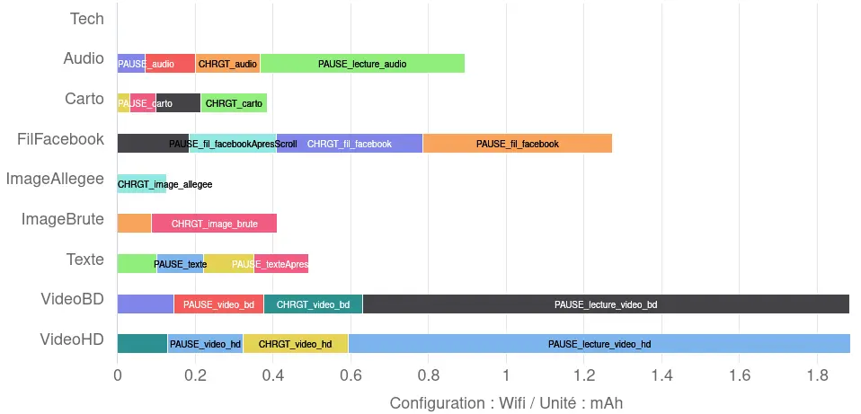
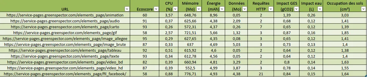
As a result of the measurements we have carried out, the data transferred when the corresponding pages are loaded gives the following results:
Data transferred at page load for activity elements
This is more or less the same classification as in the activity, with slight differences due to the content chosen for each content type.. It should be noted that the weight of these elements depends on several factors, in particular the social network selected and the content integrated here (message, message thread, etc.). The same applies to the other elements measured here, but the order of magnitude is still quite correct.
So here we can validate the ranking of element weights as proposed in the INRIA MOOC activity. We could stop here, but now let’s take it a step further. To do so, let’s take a look at what happens after the page has loaded, as well as at other metrics and indicators.
Other impacts of web page elements
So we’re sticking with the eight elements proposed in the activity.
The dashboard generated via Greenspector Studio lists several other metrics and indicators. The first score calculated concerns performance. However, on such lightweight pages, loading is too fast to be able to differentiate between elements in any meaningful way due to “noise”, in particular TTFB (Time to First Byte), which can vary slightly from one iteration to the next.
Data transferred beyond initial upload
Let’s start by looking at the data transferred after the page has loaded: pause for 30 seconds, scroll to the bottom of the page, then pause again for 30 seconds.
Data transferred over the entire measure for activity elements
We see here that the data transferred beyond loading is most of the time not negligible. In particular, in the case of video and audio playback (as one might expect) but also for the Facebook feed.
Energy consumption
Over all the stages measured, the energy consumed according to the elements is as follows:
We see that the order remains generally coherent with a few exceptions (we will come back to this later) but especially the Facebook feed which, although less impactful than the video, is more so than the other elements (notably the audio player).
Facebook feed
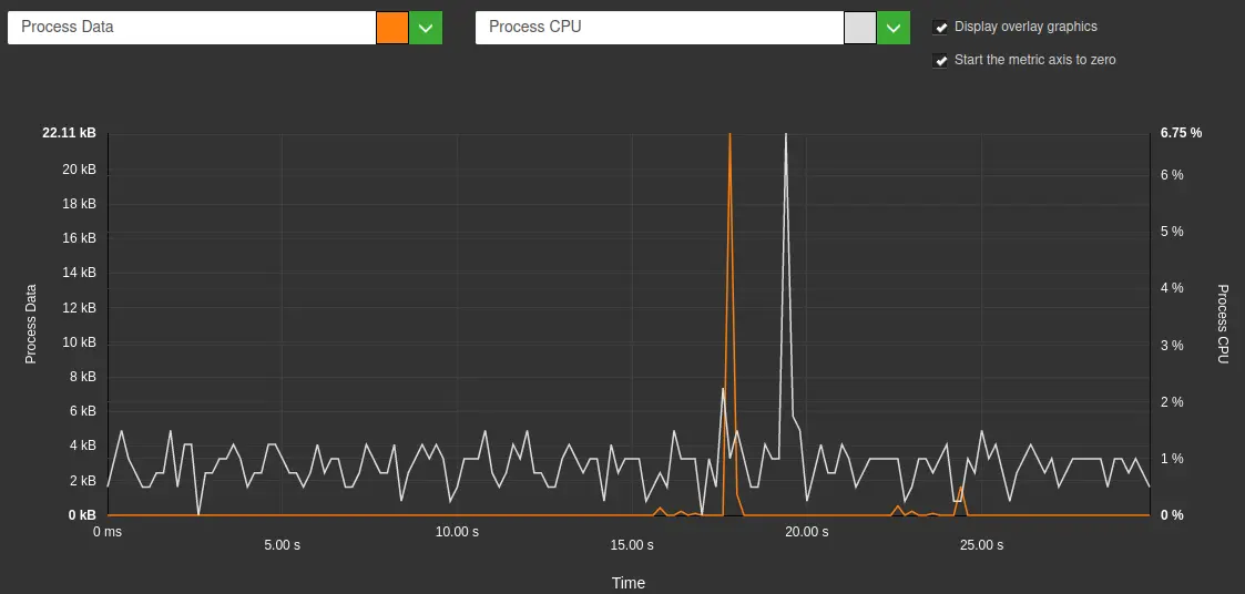
The page containing the Facebook feed is by far the most impactful in terms of energy. While it’s logical that scrolling and loading should have an impact (since these steps involve at the very least a modification of the display), it’s even more surprising when it comes to pauses. Indeed, when the user is inactive, the display is normally not modified. So it remains to be seen whether any “parasite” requests occur. In the Greenspector Studio web interface, we obtain the following representation:
CPU visualization and data transferred during the pause after scrolling on the page containing the Facebook feed
On a “normal” pause stage, no data transfer takes place (apart from any requests related to Chrome browser telemetry). If, in addition, the display is not modified, we would expect to see a stable, low CPU load and no data transfer. This is not the case here. Apart from a strong CPU peak, correlated with data transfer, the CPU peaks seem to be more related to tracking.
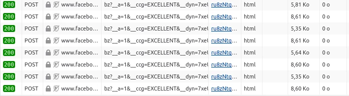
Extract of HTTP requests captured in the Network tab of Firefox DevTools
When integrating content from an external service, it is common for requests to be sent at regular intervals to the source site to inform it of user behavior and interactions with the integrated content. We see it here in the case of Facebook but be aware that most social networks do this (in this regard, I recommend that you test the integration of Linkedin content…).
The text appears more impactful for energy than the interactive map or images. All these contents do not cause any change in the display once loaded and just viewed. On the other hand, on an AMOLED screen (like that of the S9 used here), the display of the text is more impactful than the images and the interactive map because the background is black but the text white. On this type of screen (and this is the reason for dark mode from a energy consumption point of view), a black pixel is much less expensive to display than a white pixel. We are therefore here in a special case but one which allows us to understand where the impact of a page in consultation only comes from.
For MOOC activity elements, the measurement of transferred data confirms the expected ranking, with only a slight downside related to integrated social networking content.
However, if we look more closely at the energy consumed, we see that much of the impact of the Facebook feed occurs after loading, via regular requests to third-party services. This underlines the need to go beyond measuring requests, transferred data and the DOM, and also to measure what happens after the initial load, at the risk of missing out on third-party services (and elements whose loading is deferred, often for performance reasons). Also, it is a question (at the risk of insisting) of being as close as possible to user behavior.
Let’s take a look at how to add to the initial list of new items often found on the web.
Other elements integrated into a web page
In addition to the elements proposed in the MOOC activity, we looked at other items:
The methodology for measuring and creating the sample pages is exactly the same as that described above.
Let’s take a look at the results.
Data transferred during initial loading
As a result of the measurements we have carried out, the data transferred when the corresponding pages are loaded gives the following results:
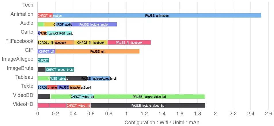
Data transferred at page load for all elements
In addition to the above ranking of activity elements, we note that the selected GIF is heavier than most elements (which is of course linked to the content chosen for integration).
The table is less voluminous than the text because it contains fewer characters (fewer sentences of dummy content have been introduced into the table than into the page used to measure the impact of the text alone). We’ll see later that, in the case of the table, the overconsumption lies elsewhere. The animation here appears rather light (a few lines of HTML and CSS).
Note that the elements added here do not involve any additional data transfer beyond the initial loading stage.
Data transferred on all stages for all elements
Energy consumption
The results obtained here are as follows:
Energy consumed over the entire measure for the elements
When limited to the elements of the MOOC activity, we noted a few differences with the ranking initially proposed. In particular, the Facebook feed stood out as the most impactful in terms of energy.
Here, we can see that the CSS animation is by far the most impactful in terms of energy. The Facebook feed comes right after the videos, followed by the animated GIF. This order is noteworthy: unlike the animated GIF, which continuously modifies the display, the Facebook feed appears rather static when the user is inactive. As mentioned above, its excessive energy consumption is due to what is not visible: requests to Facebook and video preloading.
The native HTML table is slightly more energy-intensive than plain text, even though it contains fewer characters. So, from the moment it’s displayed, the table makes slightly greater demands on the CPU (more on this later).
When an element on a page causes continuous or almost continuous changes to the display, the energy impact can be considerable. We’ll see in the last part of this article how this affects environmental impact.
Intermediate conclusion
The three added elements fit in unsurprisingly with the initial ranking based on data transferred. However, from an energy point of view, the CSS animation and the animated GIF have a considerable impact. This underlines the need for measurement to go beyond HTTP requests, transferred data and DOM. The usefulness of the latter metric for environmental projection remains debatable. The cases presented here are good illustrations of cases where the DOM is very light but the impacts are very significant.
Finally, we’re going to use a different measurement methodology and collect data to get a more global view of the various elements.
Measuring pages with a “classic” benchmark
For this new series of measurements, we started with the same sample of pages, but used a classic benchmark. Each page is measured over a period of 70s, using the following steps:
Page loading
A pause with the page displayed in the foreground
A pause step with the page displayed in the background
Aggregation of item benchmark results (sorted by quantity of data transferred)
As far as data transfer is concerned, we can see what we’ve already observed. However, it is more difficult to distinguish between CSS animation, text and HTML tables, as the quantities of data transferred are very small.
As for the CPU, we note some slight variations but above all the excess consumption for the CSS animation, the GIF and the Facebook feed are all the clearer. Following this top trio, we find the HTML table which, despite the small amount of data necessary for its loading, turns out to be impactful for the CPU.
In terms of HTTP requests, the Facebook feed and the OpenStreetMap map are unsurprisingly at the top of the list. This involves the integration of dynamic elements provided by third-party services, which require more files to function. It’s worth noting that requests to and from Facebook are almost continuous, reaching more than 170 in all after a few minutes of user inactivity (as we saw above).
Regarding greenhouse gas emissions equivalents, animation and moving images have the most impact, followed by the Facebook feed (due to its high data and CPU consumption). For information, land use and water are also indicated (see the article on environmental projection: https://greenspector.com/en/environmental-footprint-methodology/). The rankings for these two other indicators remain broadly identical.
Intermediate conclusion
These new measurements, with a slightly different methodology, once again underline the need to take into account not only different metrics, but also the discrepancies observable during the evaluation of several environmental indicators.
Overall conclusion
Staying within the same perimeter (data transferred during initial loading), the measurements confirm the ranking of elements proposed by INRIA’s MOOC activity. The only point to be discussed is the integration of a social network element. In the sample selected here, the integration of the Facebook feed has a greater impact than the interactive map from OpenStreetMap (without even counting the other impacts identified beyond the initial loading or energy-related data).
If we go beyond this measurement perimeter (by also looking at other environmental metrics and indicators), the ranking may change, particularly because of the impact on energy consumption.
Lastly, the addition of new elements that can be integrated into a web page inevitably modifies the ranking, but above all refines the mental model mentioned in the introduction to this article. In particular, CSS animation and animated GIFs (as well as HTML tables to a lesser extent) highlight the impact on metrics that are not currently measured by most tools, even though they play a key role in environmental impact. For example, the CPU’s impact on the terminal’s battery discharge can lead to an acceleration in the terminal’s battery renewal, and therefore to major environmental impacts linked to this operation. This observation directly calls into question the widely adopted mental model for the environmental impacts of digital technology, which leads some people to “compensate” for their self-imposed diet of transferred data by setting up animations. By extension, this also raises questions about the impact of different formats and codecs for certain content (where the reduction in weight can be offset by a calculation overload that reduces or even cancels out the environmental gains).
While it’s normal to start with a simple mental model, this article also aims to highlight the need to refine it so that you have all the elements in hand to make informed choices. Hopefully, some of the results presented here will contribute to this.
In conclusion, two rankings are proposed here.
The first relies only on the data transferred during the initial loading, as initially planned in the activity (from least to most impacting):
Table
Text
Animation
Optimized image
Interactive map
Integration of social network content
Animated GIF
Audio file
Low-definition video
Raw image
High-definition video
The second ranking is based directly on the projection of greenhouse gas emissions over all measurement stages (which means going back to the metrics to explain, but also being transparent about the environmental projection model):
What do printers, connected cars and airliners have in common?
These are playgrounds for the ingenuity of cybercriminals, who exploit the slightest security loophole to infiltrate networks or take control of our most critical systems. Just as a drug lord like El Chapo escapes from his high-security prison through the least secure place: the toilet, a hacker will always try to find the most vulnerable part to attack you. As these attacks can be dramatic for the person or company that falls victim to them, it’s essential to think carefully about the subject.
In this article, we will mention a few stories of surprising computer attacks. This will enable us to question our choices when it comes to implementing new features. These misadventures all have a common cause: an increase in the attack surface.
The multiplication of access points is a risk factor
In recent years, we’ve all seen objects that communicate with the outside world appear in our living rooms. From connected voice assistants to smart thermostats, these objects provide more or less useful services. The business world is no exception to this rule. Whether as part of the Industry 4.0 vision, or simply to facilitate remote communication, these connected systems are playing an increasingly important role.
Unfortunately, some devices pose major risks. Combining a low level of security with a connection to a company’s internal network, connected objects are a goldmine for malicious individuals. And they don’t hold back.
The proliferation of these objects poses a real social problem that we cannot ignore.
From an environmental point of view, the distribution of these systems also has significant impacts. From mineral extraction to distribution, the production of IT systems generates significant CO2 emissions, not to mention other impacts such as soil pollution and the erosion of biodiversity.
For all these reasons, the purchase of a new connected device should not be taken lightly. The question is: do we really need it?
How can an ancillary feature turn into a Trojan horse?
New connected objects aren’t the only systems that can be attacked: existing software can be as well.
Nor is it just a question of resources. Aviation, one of the world’s most financially powerful industries, which has invested considerable resources in security, has also been the victim of criminal acts.
In this article, we won’t be discussing the impacts of flying, but rather the specific subject of in-flight entertainment.
The many films and series available bring undeniable benefits for users: boredom reduction, keeping children occupied, forgetting about stress (and the fact that you’re in an aircraft that burns thousands of liters of fuel per hour) …
Nevertheless, the screen is not a system totally isolated from the rest of the world. For example, cutting video during a staff call necessarily implies communication between the box and at least part of the rest of the device.
This last attack is an interesting one. It illustrates the issue of a well-known developer philosophy: “Why do it? Because we can.”
Hackers have taken advantage of a security flaw in a service of Meta’s flagship social network. The functionality in question allowed users to see how their profile was viewed by another user. Admittedly, this is of interest to the user, but it is not essential to the smooth operation of the social network. On the other hand, the consequences of an attack are extremely damaging, both for users and for the company, whose image is tarnished.
When the group became aware of the flaw, they immediately removed the service. The question then arises: did users notice the disappearance of the functionality?
From a general point of view, we can list a few disadvantages of the multiplication of possibilities offered by a digital service:
dispersion of resources that could have been allocated to securing key application or website services
implementation of little-used functionalities that receive little attention from the development team and are therefore more vulnerable
the need to reduce compatibility with older versions of Android or iOS. And consequently reduce the number of potential users
increase the weight of an application due to the development of more code or embedded media. Increasing the application’s environmental impact.
Taking into account the associated risks, we must always ask ourselves: is the comfort it brings really worth the impact it causes?
It’s also worth remembering that cybersecurity is an integral part of digital sustainability. As a designer of digital services, it is therefore our duty to protect users. Implementing security mechanisms is an important part of this, but we also need to think globally, encompassing all functionalities.
Malicious individuals will try to get into every nook and cranny of your system. By increasing the number of functions, you are giving them new doors that they will be happy to open.
Finally, all these attacks show us that digital sufficiency is not only a useful tool in the context of the ecological transition, but is also of interest in the fight against cybercrime.
Conclusion
In short, digital sufficiency is proving to be our unexpected ally in the daily battle for IT security. Before rushing off to buy the latest gadget or design a new feature, let’s ask ourselves the following 2 questions:
Is that useful ?
Is the risk worth the benefit?
In some cases, the answer is obviously yes. The seatbelt makes the car heavier and therefore increases fuel consumption, but it considerably reduces the number of deaths on the roads. The reduction in comfort was worth it.
In many cases, the answer is the opposite. Today’s cars can reach speeds well in excess of 150km/h. Yet it is forbidden to exceed 130km/h. This measure, taken in France in 1974 to combat the 1973 oil crisis, was the result of a balancing act between individual freedoms on the one hand, and the collective effort needed to counter the consequences of the oil crisis on the other. It wasn’t worth the risk.
This central consideration in any decision must be at the heart of a development team’s questioning.
Today, only the advantage part of a feature is highlighted. But that’s forgotten:
User security
The financial cost of a computer attack
Damage to the image of the company that suffers a computer attack
The environmental impact of this functionality
Loss of compatibility with certain users
And many more…
33 years after the introduction of compulsory rear seat belts, the question of discomfort versus safety is no longer an issue in the automotive world. It must also become a reflex for digital service design teams in the IT world.
Everyday car-sharing is a way of sharing the environmental impact of car travel. There are applications that put drivers and passengers in touch with each other. However, the savings made during a journey must not be outweighed by the impact of the IS of these services. In this article, we will look at the eco-design practices of three daily car-sharing applications: BlaBlaCarDaily, Karos and Klaxit.
Methodology
This comparative study of mobile applications examines various aspects, such as the size of APK files (the installation files for Android applications), application compatibility and the greenhouse gas (GHG) emissions caused by their use. The results highlight significant differences between applications, underlining the importance of implementing an eco-design approach.
First of all, it’s important to remember that the vast majority of a smartphone’s environmental impact is due to its manufacturing phase. A great deal of energy and materials, some of them rare, are needed to manufacture the product. Therefore, to effectively reduce the impact of a mobile application, it is necessary to ensure that it does not force users to change phones in order to obtain a suitable user experience. This involves evaluating a number of criteria, including but not limited to the following:
Compatibility: an application must be compatible with all user terminals (OS, screen resolution, etc.). We found that some applications were designed exclusively for more recent versions, limiting access for users with older devices. This incompatibility often leads to frequent replacement of devices, which can waste natural resources and increase electronic waste.
Battery use: battery wear and tear is one of the material causes of the need to buy a new phone. One of the factors that wear out the battery is the number of charge/discharge cycles the phone goes through. It is therefore essential that using the application does not require too much energy so as not to accelerate the draining of the battery.
Performance: this criterion corresponds to the application’s response time. Firstly, the aim of an eco-design approach is to enable users who do not wish to renew their phone to have a pleasant user experience, even on older devices. Secondly, longer charging times mean faster battery wear. Finally, if the factor limiting performance is network quality, mobile users will be even more affected.
– Taille de l’APK : cet indicateur provoque 2 impacts différents. Premièrement, une application avec une taille importante nécessite un échange de données plus important pour être installée ou mise à jour. Deuxièmement, un utilisateur qui souhaite conserver son téléphone longtemps peut être amené à devoir gérer des problèmes de manque de mémoire. En effet, la taille des logiciels et des applications va croissante (on parle d’obésiciel). Dans un objectif de l’encourager dans cette démarche, il est nécessaire que le stockage utilisé par l’application soit le plus réduit possible. Dans cet article, nous allons nous focaliser uniquement sur la taille de l’APK, mais une démarche d’éco-conception doit également être menée sur l’ensemble des données stockées sur le téléphone, comme le cache.
APK size: this indicator has 2 different impacts. Firstly, a large application requires more data to be exchanged in order to be installed or updated. Secondly, users who want to keep their phone for a long time may have to deal with memory shortages. This is because software and applications are becoming increasingly large (known as “bloatware“). To encourage this, the storage used by the application needs to be as small as possible. In this article, we will focus solely on the size of the APK, but an eco-design approach must also be applied to all the data stored on the phone, such as the cache.
During an environmental impact analysis at Greenspector, we examine all these points to provide recommendations that will enable our clients to gain an accurate picture of their situation and reduce their environmental impact.
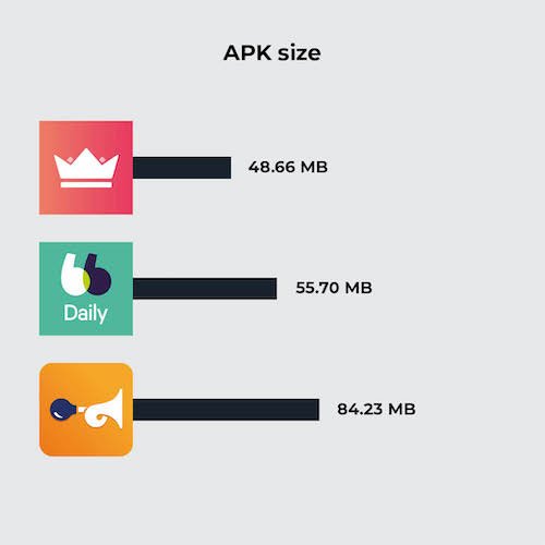
APK size comparison
First of all, let’s assess the size of each app, once installed on a Samsung Galaxy S9 (Android 11). Given that they all fill the same functional areas, we’d expect them to be roughly similar in size. However, the Klaxit application stands out because of its size. There may be several reasons for this difference. For example, the application uses more external SDKs, or it embeds more uncompressed resources (images, videos, etc.).
Application
APK size
Karos
48.66 MB
BlaBlaCarDaily
55.70 MB
Klaxit
84.23 MB
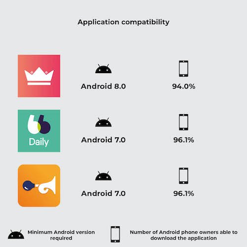
Application compatibility comparison
Another essential criterion we studied was the compatibility of applications with different versions of Android. For example, an application that is not compatible with a version lower than Android 8 would prevent 7.1% of Android owners from using the application.
Application
Minimum Android version required
Number of Android phone owners able to download the application
Karos
Android 8.0
94.0%
BlaBlaCarDaily
Android 7.0
96.1%
Klaxit
Android 7.0
96.1%
The Karos application therefore enables 2.1% less users to use their car-sharing service. This difference may not seem significant, but let’s calculate the emissions avoided by supporting Android 6.0 instead of just 7.0.
According to ARCEP, 37% of smartphone renewals are due to a partial malfunction (real or supposed), including breakage of non-essential components, battery wear, obsolescence and software obsolescence. Let’s assume a fair distribution of these four reasons. We arrive at a renewal rate due to the OS (software obsolescence) of 9.25%.
According to ARCEP, there will be an estimated 48.4 million smartphone owners in France in 2021. Let’s assume that each smartphone owner has just one device. Let’s also assume that 10% of French people need access to a daily car-sharing service (strong assumption). This is equivalent to saving on the manufacture of N smartphones:
N = 10% * 9.25% * 2.1% * 48.4 M
N = 9.4 k
According to our environmental assessment model, the entire life cycle of a smartphone, excluding the use phase, emits an average of 59 kgCO2eq. The emissions avoided represent:
Etot = 9.4 * 59 = 554 T CO2 eq
Comparison of GHG emissions
a) Explanation of our methodology
Pour évaluer les émissions de gaz à effet de serre des applications, nous avons suivi une méthodologie rigoureuse basée sur la collecte de métriques pendant le parcours automatisé sur un téléphone réel : la consommation d’énergie de l’appareil, la quantité de données mobiles échangées et le nombre de requêtes HTTP effectuées. Grâce à ces données mesurées et le modèle d’évaluation d’impact environnemental Greenspector Studio, nous sommes en mesure de réaliser une estimation des émissions de CO2. Une explication plus précise du modèle utilisé est détaillée dans cet article : https://greenspector.com/fr/methodologie-calcul-empreinte-environnementale/
Assumptions used in the environmental assessment
Location of users: 100% in France
Location of servers: 100% in France
Devices used: smartphones only
b) Explanation of the route
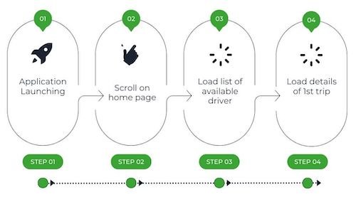
These measurements have been carried out on the basis of user journeys that we have broken down into short stages. We are looking at the situation from the point of view of a passenger wishing to travel daily from the centre of Nantes to Carquefou. These routes have been set up in such a way that the same functionalities are evaluated, namely “listing available drivers” and “having details of a particular journey”. Each route is therefore made up of all or some of these stages:
Launching the application
Scroll to the home page
Load a list of available drivers
Load details of first journey
These different stages give us an overview of several elements generally present in a mobile application, such as a scrolling page or a complex element (integration of a route map). The launch stage is also very important because it can provide us with essential information, for example on the caching of data or the time taken to launch the application.
In order to obtain the most reliable measurement possible, we are writing a GDSL script to automate the execution of 5 identical series of tests. GDSL is a language developed by Greenspector that can be used to script test runs on Android and iOS smartphones. For more information, see our dedicated article.
Measurement context
Samsung Galaxy S10, Android 10
Network: Wi-Fi
Brightness: 50
Tests carried out over at least 3 iterations to ensure reliability of results
C) Results
Once the measurements had been taken, the results were analysed to establish an assessment of the carbon footprint of the route chosen for the three car-sharing applications. A table comparing the results was drawn up. The following results are expressed in grams of CO2 equivalent.
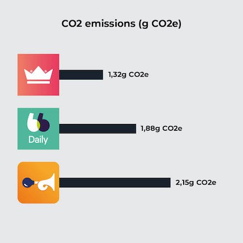
Application
CO2 emissions (g CO2e)
Karos
1,32
BlaBlaCarDaily
1,88
Klaxit
2,15
The results show a certain disparity between the different applications, which clearly demonstrates the impact that the design and development of an application can have on its greenhouse gas emissions. In this article, we will confine ourselves to a superficial analysis, including only comparative elements for the sake of brevity. For example, the choice of implementation of the interactive map will not be analysed. However, in the context of an application optimisation project, the analysis would be extended to provide more exhaustive recommendations.
In addition to our study on CO2 emissions, it should be emphasised that the environmental impact of applications goes beyond greenhouse gas emissions alone. The manufacture of a smartphone generates other pollution factors. Taking other environmental factors into account, such as aquatic eco-toxicity or the depletion of abiotic resources, would enable us to understand the issues linked to digital pollution in their entirety.
Analyse
Les résultats de l’évaluation environnementale ont montré que le parcours Klaxit était plus émetteur en GES que les deux autres, à hypothèses équivalentes. La cause de ses moins bonnes performances est double : la quantité de données échangée de Klaxit est très importante comparée aux consommations d’énergie et la consommation en énergie se démarque du meilleur parcours, Karos. 95% des consommations de données du parcours de Klaxit se font lors du lancement de l’application.
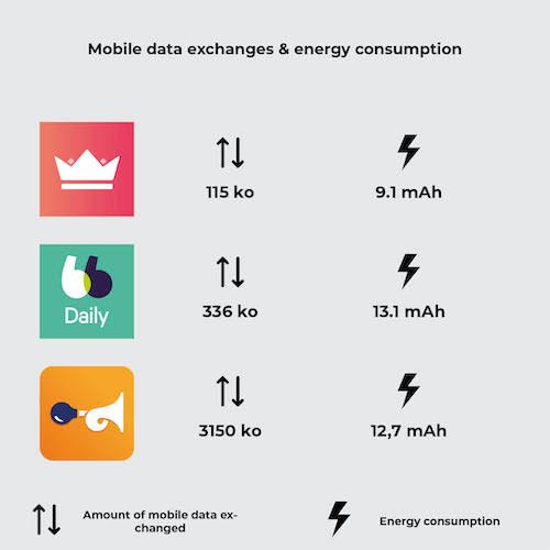
Application
Amount of mobile data exchanged
Energy consumption
Karos
115 ko
9,1 mAh
BlaBlaDaily
336 ko
13,1 mAh
Klaxit
3150 ko
12,7 mAh
On inspecting the Klaxit screen, we noticed the presence of an image carousel, a practice we tend not to recommend to our customers: as well as making navigation unintuitive, the animation leads to continuous energy consumption. As it happens, none of the images in this carousel are cached, which leads to very large data exchanges from the very first screen of the application.
In terms of energy consumption, the Klaxit application is not really more intense than the others. In fact, it’s the number of steps required to complete the same functions that is greater, which lengthens the user journey and consequently increases energy consumption. In fact, compared with Karos, additional scrolling and loading are required. Reviewing the user path and proposing optimisations to shorten it would bring the Klaxit application up to the level of the other two.
So, by simply taking measurements on a rudimentary path, we find two fundamental levers for action in digital eco-design: upstream conception and design (optimisation of the user path, carousel), and development practices (image caching). These two areas for improvement need to be considered together, in order to bring together two key players in the design of digital services: designers and developers.
Conclusion
The analysis highlights the fact that some applications are lagging behind in terms of eco-design. However, there are ways of improving digital services. By better understanding every aspect of a mobile application, we can identify opportunities to reduce the ecological footprint while improving the user experience. For example, designers and developers need to work together to encourage more sustainable and responsible use to ensure the environmental benefits of using a virtuous service. We are ready to support any company wishing to improve its approach to application design.
An ecodesign approach for digital services can only be successful if all project stakeholders are involved at all stages of the project lifecycle. Sometimes, despite all the efforts made to apply eco-design principles to the creation of a website, environmental impacts can increase due to elements outside the defined scope. In particular, it’s essential to involve those who will be producing content for the site. It’s not all that simple. Some best practices can be technically automated, while others require you to keep in mind all the content proposed, as well as its durability. This article suggests a number of best practices aimed at facilitating content management with a view to reducing the impact (environmental and otherwise) of proposed content.
Integrate as little non-textual content as possible
Context
Each piece of integrated content will generate requests and data transfers. It is therefore important to integrate as little as possible, while maintaining the attractiveness of your publications. Once only essential content remains, it’s time to integrate it as efficiently as possible (see below).
Most often, at impact level: video > podcast > moving image > static image > text
Please note that animated GIF images can be very large, posing accessibility problems.
The INRIA (Institut national de recherche en informatique et en automatique) MOOC offers a simple activity to help you understand these impacts.
How can we do it?
Limit the number of contents, taking into account their respective impacts
Avoid purely decorative content as much as possible (e.g. stock images or carousels)
Keep accessibility in mind
Reduce the weight of videos
Context
Especially in the age of social networks, video is often favored as a communication channel.
Beyond the design of each publication, it is important to keep in mind all the publications available. The goal here is to keep content relevant and up-to-date. The point is to prevent the content from being drowned out in the crowd, which in turn helps improve natural referencing.
How to do it ?
Rely on concrete indicators: number of visits, number of arrivals on the site via this page, bounce rate, etc.
Update older posts that are still of interest. Possibly take advantage of this to change the format: the video becomes an article
Combine publications similar in their themes: informative articles are aggregated into a reference article
Delete posts that are no longer seen or no longer relevant (outdated content or relating to past events)
To go further, it is also possible to:
Set an expiration date for the publications created (examples: hot content VS cold content, unpublish date for temporary content)
Publish content in a reasoned and relevant way, particularly for its distribution on social networks and in newsletters. The latter must themselves be subject to an eco-design and accessibility process.This subject alone could be the subject of an article.
Propose explicit labels for links
Context
When browsing content, it is common to come across links that enrich the content in question. In order to avoid unpleasant surprises for users, the labels of these links must be as explicit as possible. The interest in the user experience is obvious but it is also a question here of preventing the user from loading content which is not useful to them or which their terminal or their internet connection does not allow them to use in specific situations. good conditions.
The criteria for this good practice are mostly derived from the rulesOPQUAST (OPen QUALITY STANDARDS). It is appropriate here to emphasize again the need to offer accessible links (but also more generally content).
We have discussed here what can be done to ensure that content is as light as possible. If certain actions rely mainly on contributors, it is ultimately important that thecontent management tools such as CMS (Content Management System) integrate tools to assist contributors. This may involve, for example, automating certain technical optimizations, visualizing the environmental impacts of the content produced but also facilitating the implementation of a more global content management approach (expiry of documents, visualization of consultations, etc. .). Some publishers have already taken the initiative to initiate such an approach; it remains to be hoped that it will become systematic.
In France, the accessibility of digital services has had a legislative framework for several years now (initiated by article 47 of the 2005-102 law of 11 February 2005 [FR] and specified in decree no. 2019-768 of 24 July 2019 [FR]). This is based primarily on the RGAA [FR] (Référentiel Général d’Amélioration de l’Accessibilité – General Accessibility Improvement Reference Framework). The eco-design of digital services, which has been discussed in France for over 15 years, has gained considerable momentum in recent years. However, the subject is still struggling to establish itself, or even to take precise shape within organisations. The legislative framework has been taking shape since 2021 and should enable the eco-design of digital services to take hold over the next few years. The aim of this article is to shed some light on the subject.
A quick reminder
ADEME (Agence de l’Environnement et de la Maîtrise de l’Energie) and ARCEP (Autorité de régulation des communications électroniques, des postes et de la distribution de la presse) are working together on the environmental impact of digital technology. Their work covers, in particular, the estimation of these impacts on a French scale, as well as best practices and prospects. This information can be found here: https://www.arcep.fr/nos-sujets/numerique-et-environnement.html [FR]
Ecodesign [FR] can be defined as an approach that integrates the reduction of environmental impacts right from the design stage of a digital service, with a global vision of the entire life cycle, via continuous improvement.
A digital service [FR] is a set of human, software and hardware resources needed to provide a service.
Consequently (but we’ll come back to this in a later article), talking about an eco-designed website can be perceived as a misuse of language. As part of an eco-design approach, we need to take an interest in all the site’s digital services (or at least a representative sample), through continuous improvement and by covering all the stages in the project’s lifecycle. All this goes much further than simply measuring a sample of pages on a site that is already online.
The laws
In France, there are currently 2 main laws: the AGEC law (Anti-Gaspillage pour une Économie Circulaire) and the REEN law (Réduction de l’Empreinte Environnementale du Numérique).
Even if certain elements still need to be clarified, the REEN law [FR] goes further by mentioning (among other things) :
The need to train engineering students in digital-related courses in the eco-design of digital services. But there is also a need to raise awareness of digital sobriety from an early age.
The creation of an observatory on the environmental impact of digital technology, via ADEME (Agence de l’Environnement et de la Maîtrise de l’Énergie) and ARCEP (Autorité de régulation des communications électroniques, des postes et de la distribution de la presse).
The fight against the various forms of obsolescence, as well as actions to promote re-use and recycling.
Reduce the impact of data centres (in particular by monitoring the efficiency of energy and water consumption) and networks. The decree is currently being published [FR].
Require municipalities and groups of municipalities with more than 50,000 inhabitants to draw up and implement a Responsible Digital Strategy by 2025. This strategy must include elements relating to the eco-design of digital services. A number of guides have been published to help establish this strategy, including this one: https://www.interconnectes.com/wp-content/uploads/2023/06/web-Guide-methodologique_V8.pdf [FR]
All of this is accompanied by the establishment of the HCNE (High Committee for Eco-responsible Digitisation), various roadmaps and an eco-responsible digital acceleration strategy. All this is detailed on this page: https://www.ecologie.gouv.fr/numerique-responsable [FR]
What’s next?
Once all these elements have been defined, the question arises of what remains to be done.
In 2024, the REEN law will require public websites to be designed in a sustainable way. By 2025, local authorities with more than 50,000 inhabitants will have to have integrated this dimension into their Responsible Digital Strategy.
Greenspector has been involved in the eco-design of digital services for several years. This evolution in the legislative framework coincides with our involvement in projects at an increasingly early stage, sometimes even from the expression of need. This inevitably requires changes in practices, including the introduction of ideation workshops that take into account the environmental footprint of a service. More and more often, the RGESN is used as a reference to guide the approach throughout the project. This reference framework is ideal for this type of support, but it also provides a basis for managing eco-design as a continuous improvement process.
This way of rethinking support for the eco-design of digital services also makes it possible to move towards greater impact reduction levers and to involve more types of profiles in the projects supported.
As the process begins with public institutions, it is to be hoped that companies will follow suit. In fact, some have already begun the process of complying with the RGESN. Not just in anticipation of a possible change in the legislative framework affecting them, but also because these standards provide a long-awaited framework for the eco-design approach.
On all the issues raised here, France has made great strides. Now it’s up to other countries to follow suit. In September, the W3C (World Wide Web Consortium) published its WSG [FR] (Web Sustainability Guidelines). They are now out for public consultation with a view to making further progress on the subject and perhaps eventually establishing web standards. They are also accompanied by discussions on the best way to introduce levers directly at institutional level. In Europe, some countries, notably Belgium and Switzerland, are federating around structures similar to the INR. It is to be hoped that the RGESN and other elements currently in place in France can be adapted to other countries.
Older users may remember a time when browsers didn’t yet offer the option of opening content in multiple tabs. The emergence of this possibility has given rise to a debate that has yet to find a definitive answer: should links be opened by default in another tab or not?
Key numbers
The results obtained for opening links in another tab are summarized as follows: The overall impact is 1.9 gCO2eq, 0.4 L water consumption and 4.1 cm2 land use.
The results obtained for opening links in the same tab are summarized as follows: The overall impact is 1.8 gCO2eq, 0.3 L water consumption and 3.9 cm2 land use.
On a website, the default behavior when a link is clicked is to open it in the tab the user is already in. To return to the initial page, the easiest thing to do is to use the browser’s (or your phone’s) backspace function. This may be seen by some Internet users as an inconvenience. There are at least two possible solutions:
On the user’s side: hold down the Ctrl key to open the link in another tab, or click with the mouse wheel.
For developers: force the link to open in a new tab (via the target=”_blank” attribute or via JS). However, this means leaving the user no choice. It is therefore advisable to notify the user of this behavior (Opquast Rule 141 – Users are notified of new window openings). Otherwise, this may lead to accessibility problems.
In all cases, target=”_blank” must be accompanied by additional attributes for security reasons, as follows:
From the point of view of environmental impact, there is also room for discussion. Opening the link in another tab could lead to an unnecessary multiplication of open tabs, thus increasing the environmental impact (by putting more strain on the terminal). Conversely, opening the link on the same page could lengthen the user’s journey on the original site, risking a loss of progress after going back (entering information, reading an article in progress, etc.).
As always, it’s important to get back to the real reasons behind this choice, especially if it’s a question of improving your own site’s statistics by keeping it open while the user explores other links (which is not a good way of doing things).
In the absence of an ideal answer to this problem, we decided to use measurement to shed further light on the issue.
Methodology
We’ve created a test page that’s as simple as possible. It features two links leading to the same page. The first opens in the same tab, the second in another tab.
For the measurement, two GDSL scripts were created to automate the route and take the measurements:
A script that consists of clicking on the link that opens in another tab and then returning to the first tab (three times in a row)
A script that consists in clicking on the link that opens in the same tab and then going back via the browser directly (three times in a row)
Each of these routes follows the same stages :
Load test page
Pause for 30s on test page
Load destination page (click on link)
Pause for 30s on destination page
Going back
Pause for 30s on original page
Steps 3 to 6 are repeated 3 times each, in this order.
In all cases, the link destination page is the same. The idea here was to choose a lightweight page with enough content for the measurements to be meaningful. We therefore chose an article from the Greenspector blog: https://greenspector.com/fr/le-petit-bout-de-la-lorgnette/ Beyond the first iteration, the cache limits the number of requests made by relying on elements stored on the client side (as with any web page, provided it is correctly configured).
The measurements are performed on the latest version of the Chrome browser on a Samsung S9 phone with brightness set to 50%, in WIFI. Ten iterations of measurements were performed for each script.
Measurements were taken between August 24 and 29, 2023. Following these measurements, a campaign dashboard (aggregating data from Greenspector tools) was generated, in particular to be able to compare measurement stages and calculate an overall Ecoscore based on Performance, Transferred Data and Energy scores.
For the environmental projection, the following assumptions are made:
The results obtained for opening links in another tab are summarized as follows:
The overall impact is 1.9 g CO2e, 0.4 L water consumption and 4.1 cm2 land use.
The results obtained for opening links in the same tab are summarized as follows:
The overall impact is 1.8 g CO2e, 0.3 L water consumption and 3.9 cm² land use.
Initially, therefore, it appears that opening links in the same tab is slightly more advantageous from an environmental point of view. In particular, it appears that the path is much shorter when opened in the same tab. In fact, it’s easier to go back via the button on Android phones than to go through the list of open tabs.
Presumably, keeping tabs open has a greater impact on the phone’s battery. Let’s take a closer look.
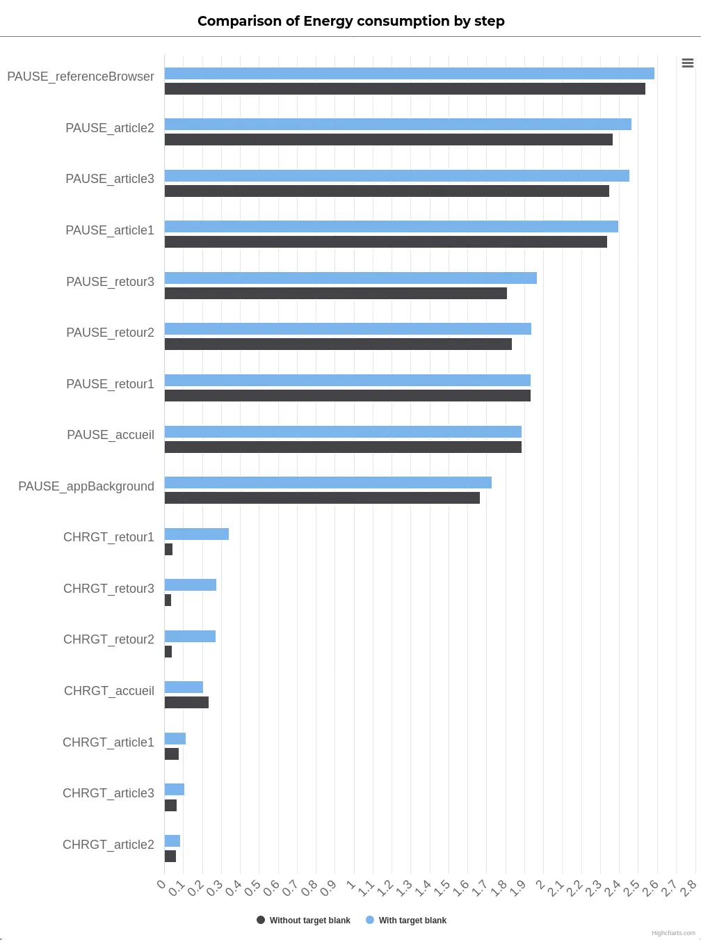
The following diagram shows the energy consumption of the various stages:
Blue indicates the opening of links in another tab. Black indicates opening in the same tab.
Stages of the journey with links opened in the same tab are almost systematically less impactful. In particular, this is true for pause steps, which seems to confirm the impact of multiple tabs opened when pausing on the current tab. This also reflects the fact that going back is much easier via the phone button than via the tab list.
For all the steps measured, very little data is transferred. However, for users who need to go back, it’s important to integrate the bfcache (https://web.dev/bfcache/ [EN]). This browser optimization makes backtracking and forwarding smoother.
Conclusion
Based on the environmental metrics and projections for the test case chosen here, it seems more advantageous to open the links in the same tab by default. On the other hand, it’s important to bear in mind that the user mustn’t lose progress in this way (e.g. while typing or reading a long page). What’s more, the bfcache must be correctly implemented to allow subsequent backtracking. In this case, the user is free to open the link in another tab using the shortcuts provided. However, it is essential to provide information on the behavior of links if this is not the default behavior (as well as the language of the destination page if it differs from the original page). In conclusion, let’s not forget that accessibility and quality (as implemented via the Opquast rules) must remain a priority when integrating links.
The W3C (World Wide Web Consortium: official website https://www.w3.org/) is an organisation that defines web standards (such as the technical elements governing the operation of HTML, for example) and guidelines. It was founded by Tim Berners-Lee in 1994.
As part of the Responsible Digital Initiative, the W3C is best known for its publication of the WCAG (Web Content Accessibility Guidelines: https://www.w3.org/WAI/standards-guidelines/wcag/). These rules for web content accessibility are a worldwide reference. In particular, they serve as the basis for the RGAA (Référentiel Général d’Amélioration de l’Accessibilité: https://design.numerique.gouv.fr/accessibilite-numerique/rgaa/ ), which in turn serves as the basis for the introduction of regulations on this subject in France.
We will be coming back to this legislative framework in the very near future to provide you with a summary and outlook.
Nevertheless, we were very enthusiastic when W3C announced its intention to work on the subject of ecodesign in a concrete way (https://www.w3.org/community/sustyweb/2022/04/19/sustainability-recommendations-working-group/). I was lucky enough to take part in this working group (with Thierry Leboucq). The aim was to produce guidelines so that standards could subsequently be defined. It was an opportunity to meet some great people and compare digital sobriety practices with experts from all over the world. Well done to Tim Frick and Alexander Dawson for overseeing all this, and to all those who contributed to the sub-groups dedicated to specific themes:
The publication of the WSGs represents a historic milestone in the application of digital sobriety to the web. But let’s not forget that this is just the beginning. The main purpose of this publication is to gather feedback from experts and then to see how this framework can be defined even more precisely. It is also hoped that this work will serve as a basis for wider adoption of the subject, so that countries can use it to define a legislative framework. This foundation also appears to be essential for training and raising awareness on the subject, but also as a support for initiatives to reduce the environmental impact of websites.
At Greenspector, we intend to continue contributing to these guidelines, in particular by providing feedback based on our practical experience of the eco-design of digital services. Very soon, these guidelines will be incorporated into the best practices on which we rely on a daily basis, as well as into the eco-design awareness-raising sessions that we offer.
In this way, we will be able to see in more detail how WSGs can be reconciled with existing reference systems (mainly RGESN and RG491).
The first thing that stands out compared to the previous mobile games ranking is that three games reappear: Subway Surfers, Candy Crush Saga, and 8 Ball Pool. In terms of downloads, Subway Surfers remains in the first position of the ranking
Looking at the APK deployments, we notice that the frequency of new APK versions varies widely: at most one every 15 days or so for Candy Crush Saga or Race Master 3D, and at least one per week for Roblox. These updates undoubtedly have an environmental impact. For the sake of simplicity, we will focus here on the impact of their usage, assuming the conditions of the initial game launch. The functional unit would thus be: “starting a game session for the first time on a mid-range Android mobile device using Wi-Fi.
This will allow us to assess the environmental impacts of these games to compare them.
While the initial intention was to assess the expected increase in revenue generated by mobile games, some interesting facts have emerged:
More than half of mobile gamers are female.
73% of gamers spend money on these games.
Most of the gamers are in Asia and the Pacific region.
Methodology
Definition of the User Journey
For measurement, it was essential but challenging to define a common user journey for all the games. As mentioned earlier, the obvious choice for us was a journey starting with the launch of the application and then the start of a game session. However, things quickly became more complex.
For most of the games studied, the initial launch involves several intermediate screens:
Gathering GDPR-related consent
Input of the player’s age
Gathering consent related to advertisements
Creating a profile or linking to an account on a third-party service (Google, Facebook, etc…) (It would be interesting to analyze the third-party services used in each game in more detail at a later stage)
Loading content updates
If the first three items on the list are only filled out once, content updates can occur unexpectedly and independently of the APK update.
Linking the games to a Google account made automating the Bridge Race game too complex compared to the time we had decided to allocate for this study. This led to the exclusion of the game from the sample studied here. We observed differences in behavior when linking the Google profile depending on the device used. In the future, we will consider conducting a complementary study that directly assesses the impacts of one minute of gameplay using Greenspector’s Testunner tool.
In the end, we still attempted to automate the following user journey for each game:
Step 1: Launching the application
Step 2: Loading the title screen
Step 3: Starting a game session
Between these measured steps, some actions for consent validation or login that were not measured because they were absent in some applications. The significant number of elements to click on and intermediate screens during the initial launch of the FIFA Mobile game prevented us from reaching the actual gameplay launch. The measurements and calculations presented here are therefore below the actual values but have been retained to highlight other aspects.
As part of this study, the data was collected between August 11th and August 16th, 2023, using Greenspector Studio. We utilized the Greenspector Domain-Specific Language (GDSL) to create test scripts that automatically replicate the actions to be performed on a mobile phone. The Testrunner module then enabled us to take measurements on an Android smartphone, providing us with energy and resource consumption (memory, CPU, data exchanged), and response times for each step of the user journey.
Subsequently, based on these measurements, the impact model integrated into Greenspector Studio assessed the corresponding environmental impact and Eco-Scores. As a reminder, in the case of a user journey measurement, the overall Eco-Score is divided into three Eco-Scores: Performance, Mobile Data, and Energy. Each is rated on a scale from 0 to 100, with 100 being the best score. Each of these scores is derived from the ratings achieved for each measurement step, which depend on predefined thresholds. For instance, in the case of mobile data for loading steps:
Hypotheses
During this evaluation, we started from the perspective of the initial application launch. This inherently represents a more impactful journey than subsequent uses but provides a better understanding of the game’s operation. It’s worth noting that during actual gameplay, there are often regular updates that can also have an impact.
Measurement Context
Device: Samsung Galaxy S9, Android 10
Network Connection: Wi-Fi
Screen Brightness: 50%
Tests were conducted over at least 3 iterations to ensure result reliability.
Hypotheses for Environmental Projections
User Location: 100% World
Server Location: 100% World
Devices Used: Smartphones only
The environmental footprint depends on the location and type of application servers, user locations, and the type of devices they use. We have focused our study solely on the use of applications on smartphones. We have also assumed that users and servers are overwhelmingly located outside of France, as precise statistics were unavailable.
Résultats
App name
APK size (Mo)
Data exchanged (MB)
Total battery discharge (mAh)
Subway Surfers
177,1
5,3
18,3
Stumble Guys
198
46,4
44,9
Roblox
160,8
17
15,4
Candy Crush Saga
92,2
12,1
22,3
Race Master 3D
182,6
33,2
17,1
8 Ball Pool
89,9
0
7,8
FIFA Mobile
180,4
161,5
34,3
Merge Master - Dinoasaur game
175
26,1
24,5
Garena Free Fire
400,8
5,7
19,8
Bridge Race
170,9
First and foremost, we observe that APK files for initial downloads are mostly between 160 and 200 MB, which is already quite substantial. Only Candy Crush Saga and 8 Ball Pool are below this range, at around 90 MB. For Free Fire, the file size goes up to 400 MB!
The duration of usage is estimated to be a little over 20 minutes per day according to this study by Statista: https://www.statista.com/statistics/1272891/worldwide-game-apps-time-spent-daily-age/. The impact of installation and updates, assuming daily or near-daily usage, has therefore been excluded from the present study. However, it’s possible that for a game used sporadically over time, updates might have a more significant impact than actual usage. In such cases, there is a risk for the game publisher that users may lose interest in the game. While the APK update can be managed daily like other mobile applications, it’s the content update during the game launch that can become problematic. As we will discuss later, everything is designed to encourage daily play.
Regarding the data transferred for the initial launch of the game, most games require a few additional megabytes. Only 8 Ball Pool does not require any data transfer. Conversely, FIFA Mobile, Stumble Guys, Race Master 3D, and Merge Master require downloading a few tens of megabytes. In particular, FIFA Mobile requires downloading over 160 MB, which includes updating the content based on sports news. This is seen as added value by the publisher but is considered a poor practice from a sustainability perspective. Initially, efforts should focus on how to reduce the technical size of the necessary information, and ideally, limit the refresh frequency and the comprehensiveness of the information.
These substantial data transfers are often correlated with degraded performance. For instance, for Stumble Guys and FIFA Mobile, it sometimes takes 1 to 2 minutes for the screen that allows the game to appear to be launched. For half of the games, simply launching the application takes between 10 and 20 seconds, which is particularly long. In the case of Roblox, the title screen loads quickly, with content loading occurring after selecting a game (and generally taking quite a while). The longest launch time is for 8 Ball Pool, but for this game, no data is transferred, and the impact on the battery is relatively low (particularly due to the limited number of animations). This game ultimately has the best scores. In general, the scores obtained are as follows:
We can observe that 8 Ball Pool is the game with the best scores, mainly due to what we just discussed (few animations, no data transferred). In this regard, its operation during launch is closer to what I would tend to associate with “old-school” mobile games: offline and relatively simple games (though not as basic as Snake and similar games). It’s worth noting that once the onboarding process of 8 Ball Pool is completed, it reverts to a more typical operation, including online gameplay by default, which would need to be measured separately.
In comparison, the other games have lower scores. Only Race Master 3D and Subway Surfers stand out somewhat. It appears that the games studied here have scores that are at best around the average, with very few exceptions. All of this may indicate concerns regarding efficiency or sustainability but is more likely attributed to the nature of these applications themselves: animation, data exchanges, and often a multitude of persuasive design mechanisms. We will revisit this later.
As for the environmental impacts, the calculations lead to the following results:
App name
GHG emissions in gCO2e
Water consumption in L
Land use in cm2
Subway Surfers
1,1
0,1
1,3
Stumble Guys
6,5
0,6
3,6
Roblox
2,5
0,2
1,6
Candy Crush Saga
1,9
0,2
1,6
Race Master 3D
4,4
0,4
1,9
8 Ball Pool
0,2
0
0,6
FIFA Mobile
20,1
1,6
6,1
Merge Master - Dinoasaur game
3,8
0,4
2,4
Garena Free Fire
1,1
0,1
1,3
The high impacts observed here are correlated with findings made previously, particularly significant data loads that lead to performance degradation and increased battery consumption on the device. Consequently, the games with the highest impacts are FIFA Mobile (far ahead of the others), as well as Stumble Guys and Merge Master. Unsurprisingly, 8 Ball Pool is also the least impactful game in this regard.
Analyse
The measurements conducted highlight certain design choices that directly contribute to increased environmental impacts.
As mentioned earlier, the length of onboarding processes often highlights three interrelated concerns: the collection of personal data, advertising, and more broadly, the use of persuasive design mechanisms. As a reminder, these mechanisms are aimed at keeping the user engaged with the application for as long as possible and are present in many applications and websites. Ethical Designers, among others, have a keen interest in this matter. However, let’s delve into the case of the games studied here.
The RGPD consent, as well as that related to advertisements (and sometimes age verification), aim to minimize the display of ads during the game. This, of course, serves as a source of revenue for game developers. The level of intrusiveness of advertisements can vary. Often, players are offered the option to watch video ads in exchange for rewards or to continue playing. Sometimes, it’s even possible to purchase the game to get rid of these ads. The vigilance and attention of players make them more susceptible to such suggestions, which is linked to persuasion mechanisms.
In the field of design, particularly in terms of user interface and interaction design, the concept of “gamification” has been discussed for several years. This involves incorporating game elements to increase user engagement and make the experience more enjoyable. This shouldn’t be underestimated, as some games are very skilled at attracting and retaining players. Furthermore, by taking this approach further, it’s possible to encourage players to spend money.
For example (among many others), let’s consider Candy Crush Saga. It would be possible to offer this game in a more limited form, focused solely on the gameplay itself: progressing through levels of varying difficulty with the objective of clearing candies or obstacles. The rules and challenges are simple and form the core of the game as such. However, various artificial elements have been added here:
Bright colors, visual effects, and sounds are used to enhance the impact of user actions. This is referred to as feedback.
Limited resources (lives, bonuses, etc.) are introduced to create the need and, more importantly, a sense of scarcity. Often, it’s possible to replenish these resources by watching videos or spending money (virtual or real).
Progress bars (level or otherwise), trophies, rewards, avatars, and scores are incorporated to encourage constant improvement and enable users to compare themselves with others. This leads us to another important element of gamification and attention capture:
Social connection: seeing what others are doing, comparing oneself with them, and allowing them to see what one is doing. Like social networks (often through a connection with them), this mechanism encourages more and better gameplay but also creates attachment to the game through connections with other players. This is accomplished through online gameplay or by connecting with social networks (for sharing achievements, finding players, etc.).
All of this contributes to the player’s motivation, particularly through a subtle balance of their frustration between two states that the player consciously or unconsciously seeks to achieve:
Flow: The player’s state of concentration where objectives seamlessly follow one another. This is typically the period when time seems to fly by. Consequently, this can encourage the player to invest (time, virtual resources, real money) to maintain this state and avoid frustration.
Fiero: A state of satisfaction linked to overcoming a particularly formidable obstacle (in non-mobile video games, this is one of the basic mechanics in what is sometimes called “Souls-like” games: games that emphasize player mastery to offer a very high challenge).
The game design often revolves around these two states, directly or indirectly (gradual increase in difficulty, rewards, etc.). This delicate balance will be crucial for the quality of a game and, more importantly, the gaming experience. For publishers, it also affects the time players spend on the game and the money they spend. This can sometimes lead to higher environmental impacts.
Directly, it encourages players to spend as much time as possible on the game by utilizing online play and links with social networks, displaying advertisements, and designing interfaces that are rich in information and visual effects.
Indirectly, it promotes consumption (spending money) but also overconsumption (wanting more and generating frustration). This leads to environmentally unfriendly behaviors that go against the principles of environmental sustainability.
It’s worth noting that the video game industry is becoming increasingly aware of its environmental impacts.
However, more and more relevant resources are emerging on the subject: https://playing4theplanet.org/resources. Some manufacturers are looking into the environmental impact of their hardware, while publishers are trying to assess their environmental footprint. The regular turnover of gaming machines and the release schedules of games themselves pose inherent environmental challenges. Online gaming and digitization do not necessarily make things better. In this regard, you can refer to the study by ADEME (French Agency for Ecological Transition) on the digitization of cultural services. Similar to what can be observed, for example, with websites, optimizations are possible (efficiency), but the real challenge lies in sustainability (in contrast to the extravagance of open-world games). There are also broader issues to consider:
How video games can implement systems that do not encourage excessive consumption (accumulation logic, power race, etc.)
How to strengthen our connection to nature? How to introduce game mechanics that go beyond accumulation and competition? How to portray possible (e.g., The Climate Trail ) or desirable futures?
Conclusion
Mobile games are an integral part of many people’s daily lives, making it even more essential to study their environmental impacts (although other aspects of Responsible Digital, such as the attention economy, accessibility, and personal data management, remain relevant). While technical optimizations are still possible, the crux of the issue lies in their design and the behaviors they induce (including the risk of addiction and financial risks for players).
Video games, in general, could and should become a catalyst for raising awareness about ecological issues. Just as with accessibility, some initiatives have already begun, and it will be interesting to see how they evolve in response to the urgent challenges at hand.
Greenspector may use cookies to improve your experience. We are careful to only collect essential information to better understand your use of our website.
This website uses cookies to improve your experience while you navigate through the website. Out of these, the cookies that are categorized as necessary are stored on your browser as they are essential for the working of basic functionalities of the website. We also use third-party cookies that help us analyze and understand how you use this website. These cookies will be stored in your browser only with your consent. You also have the option to opt-out of these cookies. But opting out of some of these cookies may affect your browsing experience.