What is the environmental impact of the top 30 websites of the French daily press?
– 2023 Edition –
Many questions are being asked today about the environmental impact of the press and digital media. Beyond the contents, advertising and data tracking are integrated both to satisfy the economic requirements of a free or semi-free model and to better know the user to better serve him (center of interest). Moreover, the press and media often use rich content to illustrate their articles (videos, images …). All this often implies an overconsumption of digital titles at each passage of a reader.
A year ago, we have realized a ranking of the carbon impact of the top 100 most visited websites of the French daily press on mobile. Its objective was to quantify the impact of the online press via mobile. Indeed, this impact is becoming more and more important every year.
For this new ranking, we decided to reduce the study to 30 sites and to evolve our approach, taking into account one article per site (dated 13/04/2023) in addition to the homepage. This is all the more interesting because users spend most of their time on the articles.
We based ourselves on the ranking of the ACPM site (made according to last year’s filters: Fixed Web Site News / News Information / General Information). The benchmarks were performed with a Samsung Galaxy S9 without Sim card and with 3 iterations. The measurements were performed in March and April 2023.
Condensed Results
Less impactful homepages :
- Le Monde
- Actu.fr
- Ouest-France
Most impactful homepages :
- Rfi
- france24
- L’Est Républicain
Less impactful articles pages:
- Huffingtonpost
- Actu.fr
- France Info
Most impactful articles pages :
- Sud Ouest
- la Nouvelle République
- Rfi
Here is the list of sites on which the study is based:
INSERT TAB
Discover the Greenspector analysis methodology.
Limitations of the measure
One of the problems encountered concerns the methods of access to content. Indeed, some articles are much shorter because their complete access is paying. 25% of the sites in the ranking are concerned. This influences the results of the benchmark for these websites by indirectly benefiting sites that restrict access to their content.
Also, some sites are only partially loaded until the user has made his choice for the data collection consent popup (RGPD). This does not necessarily prevent scrolling on the page. More generally, we can only regret that such artifices are detrimental to the user experience.
In particular, this is what we see on the first ranking for home pages (Le Monde).
Here is for example the RequestMap (a tool created by Simon Hearne) for lemonde.fr with the requests seen by the measurement tool (Greenspector, Webpagetest or other) we can see that there are few requests and third party services at first sight :
Here is for comparison the complete RequestMap for lemonde.fr, built from a HAR file obtained via Chrome after acceptance of all cookies by the user:
It thus appears that the data transferred and requests made are multiplied after the Internet user’s consent has been obtained. This phenomenon is observed on a large number of similar sites. Here are some additional resources on online advertising, closely related to the online press:
- How the whole bubble around microtargeting and especially online advertising could burst: https://www.wired.com/story/ad-tech-could-be-the-next-internet-bubble/
- How many ads we see every day (the result will surprise you. Or not, unfortunately): https://www.gradschools.com/degree-guide/how-many-ads-do-you-see-each-day
- Why the technical integration of ads on sites is still so problematic: https://schepp.dev/posts/ad-integration-in-2020/
- The environmental impact of ads and stats collection: https://marmelab.com/blog/2022/01/17/media-websites-carbon-emissions.html
- The links between cookies, online advertising and the online press: https://www.wired.com/story/can-killing-cookies-save-journalism/
What we have to remember today is that the results of the measurements proposed here (and via other tools available elsewhere) offer a sometimes truncated vision of the reality of online press sites. However, we already have here a good overview of what could be improved on some of these sites and their respective impacts.
Analysis of the results at the global level
For the home pages of the 30 sites measured, the average carbon impact per page and per minute is 0.44 gEqCO2. This average is 0.42 gEqCO2 for the articles.
On the analysis of home pages, 19 sites are positioned below this average. While on the measurement of the articles, 23 sites are below.
We noticed a difference in results between the 7 sites offering restricted access to their articles (sometimes paying or obligation to create an account to continue reading) and the 23 others where the articles are 100% accessible.
The home pages with restricted access have an average impact of 0.42gEqCO2. For the free access sites, the average impact on the home pages is 0.44 gEqCO2.
This difference is explained by the display of numerous advertisements on some sites with free content, which considerably weigh down the pages.
Due to a richer content, the home pages consume in general slightly more than the articles (we notice an increase of more than 0.02 gEqCO2 on average).
Here is a synthesis of the different metrics measured on the home pages of this ranking of the Press websites consulted on mobile :
| Metrics | Average | Minimum | Maximum |
| CO2 impact per page / min en gEqCO2 | 0.44 | 0.26 | 1.10 |
| Ecoscore Greenspector | 54 | 31 | 72 |
| Energy consumed in mAh | 7.2 | 4.58 | 21.98 |
| Data exchanged en Mo | 2.63 | 0.68 | 7,27 |
| Number of web requests | 76 | 30 | 169 |
If we compare these results with our previous analysis on homepages, we can see a slight degradation of the results with an average of 53 for the ecoscore against 54 today. On average, the three metrics of data energy consumed and number of requests have decreased. The energy consumed by the homepages went from 4.22 mAh on average to 7.2 mAh, the data consumed went from 2.31 MB to 3.63 MB, and the number of requests from 78 to 76.
Here is a synthesis of the different metrics measured on the article pages of this ranking of press websites consulted on mobile:
| Metrics | Average | Minimum | Maximum |
| CO2 impact per page / min in gEqCO2 | 0.37 | 0.21 | 1.19 |
| Ecoscore Greenspector | 58 | 24 | 75 |
| Energy consumed in mAh | 7.15 | 4.62 | 21,26 |
| Data exchanged in Mo | 4.52 | 0.58 | 31.42 |
| Number of web requests | 66 | 26 | 213 |
For the study, these articles were compared with articles coming from the same press sites and dating from 05/07/2022. The result is quite negative because we can see on average a lower Ecoscore on the recent articles with a score of 58 contrary to 59 for the articles of 05/07/2022. The energy consumed by these pages has also increased from 6.58 mAh in July 2022 to 7.15mAh for the articles of April 2023. Similarly, the volume of data exchanged increased from 3.46MB in July 2022 to 4.52MB for the April 2023 articles. On the other hand, we can observe a lower CO2 equivalent impact for the April 2023 articles with a score of 0.37 gEqCO2 and 0.42 gEqCO2 for the July 2022 articles. Similarly, we can see an improvement on the number of requests exchanged from 68 on average for the July 2022 articles to 66 for the April 2023 articles.
Home pages
Top 3 (least impactful home pages)
1st
Le Monde gets the first place thanks to its efforts to reduce the environmental impact of its website. We notice a good application of sobriety practices, especially on the management of images. Also, data and requests are optimized thanks to the progressive loading of the page. Thus, the content is loaded only when it becomes visible. That said, the site can still be improved in terms of third-party services that are not detected in the measurements and yet are very present. Indeed, the collection of data after the acceptance of cookies increases considerably the number of requests to third party services (see above) and has previously raised concerns about privacy and security.
2nd
Actu.fr
The web page uses progressive page loading. This allows to limit the number of requests. Moreover, actu.fr uses mostly the right formats for its images. However, actu.fr is invaded by advertising. This reduces the accessibility for the users and increases the number of requests considerably. As for the first ranking, the measurements only took into account what happens before cookies are accepted.
3rd
Ouest-France
Ouest- France loads its page progressively and uses a very good image format, like AVIF or Webp. However, advertising increases the number of requests, thus increasing the environmental impact of the site. The measurements here are also limited to what happens before accepting cookies.
Conclusion for the top 3 homepages
We can notice that the top 3 use the best practices of progressive page loading and image formats. However, the measurements were done via the cookie page and, if we take a closer look, we can see that these sites use a lot of ads. This considerably increases the number of requests to third party sites and therefore the environmental impact.
Flop 3 (most impactful homepages)
The site has a lot of images, one for each article highlighted. However, we emphasize the good practice of the webp image format. The fonts are not standard fonts, which increases the environmental impact of the site. In the end, the number of requests is considerable and the errors displayed in the console are numerous.
RequestMap of the rfi.fr homepage
France 24
The structure and the findings are similar for this page.
We are indeed, as for the site of France24 on sites resulting from France Médias Monde thus with a similar architecture and a similar structure.
The site takes a long time to fully load because it makes a lot of requests to third party sites when the page loads. Moreover, it launches videos automatically. The content of the page is very long compared to other sites, which explains its ranking.
Conclusion for the flop 3 homepages
The main problem of the sites in the flop 3 is the number of requests. Especially made within the site itself and can slow down the loading of the page. In addition to that, we can deplore a lack of sobriety and sometimes even the automatic launch of videos.
Let’s move on to the articles.
The articles
Top 3 ( Less impactful articles)
1st
The general sobriety of the site is a good point that earned it its first place in the ranking. The site uses little video or image content in its articles and gradually loads the content on its page. But it is especially that unlike many press sites, Huffingtonpost does not have ads on its articles, and this is verified at the level of its third party services which are very few. This strongly reduces the impact of the site. Besides this, the font format used is good, but the site uses too many. It also generates too many files in JavaScript format used to format the site. Finally, there is a very impactful point which is to load a video and launch it automatically on a page. Thus, even the first place of this ranking can still strongly reduce its environmental impact.
2nd
Actu.fr
We find here the same optimizations as on the home page. However, the page is largely occupied by advertising, including a video that launches automatically. This last point is particularly problematic from the point of view of environmental impact and accessibility, in addition to harming the user experience.
Underneath the article, there is a lot of additional content, mostly advertising. There are more than 40 thumbnails leading to internal and external articles. Despite this, the majority of the requests are internal, which reduces the use of third-party services.
3rd
France Info
The article is at first sight quite sober, but the end of the article is made of a lot of images for the article recommendations. This number of images can easily be reduced but the images have at least the good point to be in Webp format which is among the least impacting image formats.
What allows to give this place to this article is the number of requests. Indeed, the site has few requests before the recommendations of articles compared to other press sites and loads gradually its page. Considering the number of requests, the number of third party services is rather significant but it remains reasonable compared to other news sites.
Conclusion for the top 3 articles
The articles in this Top 3 have in common that they don’t use many third party services and that they load progressively the content in order to limit the number of requests. The articles are rather sober but the additional content of recommendation weighs down these article pages.
Flop 3 (most impactful articles)
This article is long unlike many other articles in the ranking. However, if it is the most impactful of the ranking, it is because it uses a lot of images in JPEG and PNG format, JS and CSS scripts for formatting, fonts, and contains audio files, and ads. The site is not at all sober and uses a lot of requests and third party services.
The article contains a lot of images, scripts and links to other articles. These practices add to the environmental impact of the site. With this, the site uses a lot of requests and third party services. This increases the environmental impact but also reduces the performance of the site which takes longer to load. A good point to raise is the number of fonts used which is 1 and in woff2 format.
The article is sober because of its subscription system which hides a good part of it. There are few images but most of them are in png format which is not necessarily ideal from an efficiency point of view. However, we would like to point out that the most impactful image is in Webp format, which is one of the best compression formats. We find here a lot of requests and the multiplication of third party services.
Conclusion for the flop 3 articles
The main problem of the sites in the flop 3 is the number of requests, especially towards third party services. We can also add the lack of sobriety of these pages and question the functional needs.
Conclusion
When we look at the environmental impacts of online press sites, we can see that good efficiency practices are already widely adopted, especially regarding the management of images (which remain an essential vector to attract the Internet user and support the subject).
However, there are still efforts to be made to be more sober, in particular concerning the use of third-party services but also the use of video (and to a lesser extent fonts). As seen above, this is closely linked to the business model behind these newspapers. The model in question, beyond its considerable environmental impact, demonstrates once again its negative effects on the user experience, notably through the collection of personal data and the security risks that this may entail.
It is also worth noting that improvements to reduce the environmental impact of these sites would be all the more effective as some of them are read several hundred thousand times a day.
It would also be interesting to take a closer look at the accessibility of the sites in question (if this has not already been done), as this is fundamental for everyone to be able to access information related to current affairs (which is an essential part of a citizen’s life).
Best Practice: Limit the number of third-party services
Content in 3 minutes
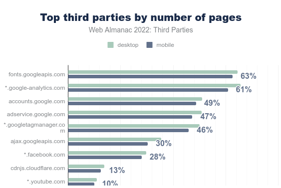
What is a third party service? They are services that allow to integrate a functionality or a complex content via code that we have little control over. The 10 most frequent third-party services block the loading of sites for about 1.4s. Google fonts are the most common service even though its use may contravene the RGPD.
The impacts of third-party services are far from negligible. In terms of environment, performance, security but also personal data management, attention grabbing and sometimes even accessibility. It is therefore advisable to use them as little as possible. This last point is supported by the RGESN and GR491 guidelines.
Best practices for limiting third-party services?
- Your site is under construction: do not include third-party services
- Your site is already built: limit the addition of content or remove certain third-party services (by checking compatibility with the design, marketing or strategy already in place)
- Your site will load faster: a bonus for sustainable digital as well as user experience.
A concrete example:
During a client audit, it was decided to remove the twitter feed present on several pages of the site. Results:
A significant improvement in metrics and indicators. In particular:
- Reduction of the battery discharge rate by 36%.
- Reduction of the CPU load by 76%
- Reduced the volume of data transferred by 68%.
Context
Third-party services are present on 94% of websites and represent 45% of the requests made by all websites. These services are used to integrate a functionality or complex content via code most often hosted on another site, with little or no control over it. Thus, it can be an analytics solution, a video, the contents of a social network, a captcha, trackers, etc.
Here is a list (sorted by categories), built by Patrick Hulce.

You can find more information about them as well as statistics on their use in the Third-parties chapter of the Web Almanac : https://almanac.httparchive.org/en/2022/third-parties
The statistics show that the 10 most frequent third-party services block the loading of sites for an average of 1.4s and that technical optimizations are often possible (minification, compression, delayed loading, but also removal of obsolete JS code). Also, most of the most used third-party services are linked to Google.
It is interesting to note that Google fonts are the most widely used service, even though their use may contravene the GDPR. One way to fix this is to host the corresponding files yourself. Of course, the best thing to do is to stick to the available system fonts as much as possible.
All this shows that the impact of third-party services, especially on websites but also on mobile applications, is far from negligible. In terms of environment, performance, security, but also in terms of personal data management, attention grabbing and sometimes even accessibility (see the Temesis article on this subject [FR]: https://www.temesis.com/blog/contenus-tiers-exemptes-deroges-audites/). It is therefore advisable to use them as little as possible.
At Greenspector, this is something we look at very closely for our customers, using specific tools to list third-party services and estimate their respective impacts. This is a significant added value of measurement. It is also an essential step in reducing environmental impacts and improving the user experience.
Today, let’s look at a best practice of sobriety, which consists of integrating as few third-party services as possible into a digital service.
Existing reference systems
This criterion can be found in the Specifications family of the RGESN [FR](Référentiel Général d’écoconception de services numériques): 2.5 – Has the digital service taken into account the environmental impacts of third-party services used during their selection ?
This is also found in GR491 (Reference Guide to Sustainable Design of Digital Services): Are third-party services (social network feeds, social wall, carousels, google maps, etc.) not used for convenience to compensate for the lack of content production resources ?
Good practice
Objective
This sobriety best practice consists in limiting the number of third-party services in a digital service.
When to use it?
It occurs at the design stage of the service (choose not to include the services in question) but also when adding content (for example, do not integrate directly a Youtube video in an article).
Ease of implementation
It is technically easy to remove a third-party service. On the other hand, this removal may require upstream discussions on design, marketing or strategy. That’s why this decision should be made as early as possible in the project.
Estimated gains
The gains can be significant in several areas related to Sustainable Digital. In all cases, this proves beneficial to the user.
Case study
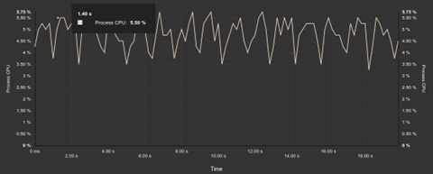
While working for a client (initial audit then daily measurements and expertise), it was decided to remove the Twitter feed on all pages of the site. The modification took place on February 1st, 2023. The measurements on the homepage highlight the gains linked to this modification, which can be observed by measuring the consumption of IT resources and energy via the Greenspector tool.
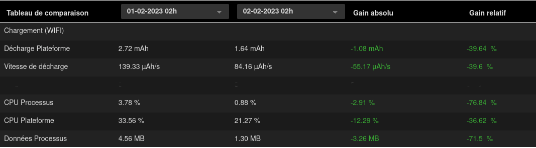
Evolution of page load metrics between February 1 and 2, 2023
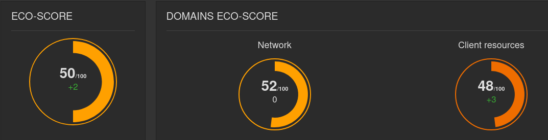
Ecoscore (web benchmark) of February 1st 2023
Ecoscore (web benchmark) of February 2, 2023
We can see here a significant improvement of the metrics and indicators. In particular:
- 36% reduction in battery discharge rate
- 76% reduction in CPU load
- Reduction in the volume of data transferred by 68%.
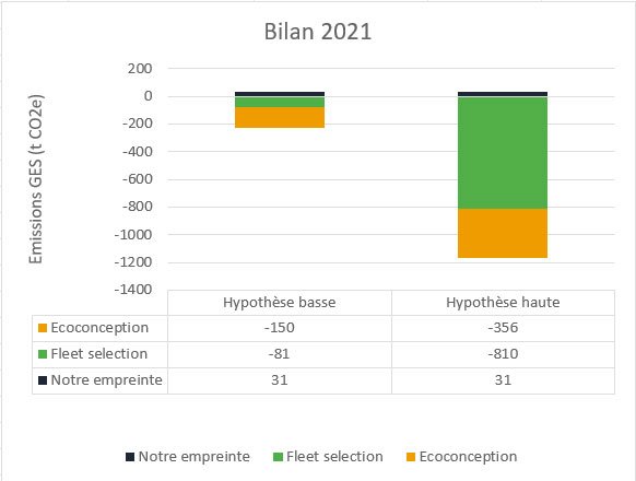
Following the environmental projection via the Greenspector methodology, we can see that the impact of this homepage was, before deleting the Twitter feed, 0.95g eqCO2. After deleting this feed, it is 0.54g eqCO2.
The page in question has more than 2.5 million views per year.
For the sake of simplicity, we leave aside here the contributions of the client-side cache (even if they are certainly non-negligible), the disparities of time spent by each person on this page, as well as the modifications made during this time.
We go from an impact of 2.38T eqCO2 to 1.36T eqCO2 over one year, which is a reduction of more than 40% of the impact in terms of greenhouse gas emissions.
For the other impacts assessed, the trend is similar. Thus, over one year, we go from 383047 to 224675 L of water consumed and from 383 to 230 m² of land use.
To go further
For third-party services that are deemed essential, there are methods to reduce their impact (via efficiency). This can include integrating an interactive map or video as a clickable thumbnail.
Some articles approach the subject from a web performance perspective:
- Reducing the Site-Speed Impact of Third-Party Tags, par Andy Davies : improving performance through tag management
- How to Find the Third-Parties on Your Site, par Simon Hearne : presentation of the RequestMap tool, used on Webpagetest to detect third-party services. This tool was already discussed on an article about auditing Android applications.
- Identifying, Auditing, and Discussing Third Parties, par Harry Roberts : how to audit third-party services on a website
- Reducing The Web’s Carbon Footprint: Optimizing Social Media Embeds, par Michelle Baker
- Partytown : a library to handle third-party services through a WebWorker
- Are my third parties green, par Fershad Irani : an online tool to assess the environmental impacts of third-party services through the origin of electricity used by the servers
Are we really having a positive impact?
At Greenspector, our mission is to help our customers reduce the environmental impact of their digital services. We work on this every day, but is it enough to offset our own impacts?
To this fundamental question, we must admit that we do not have a simple answer at this time. We will propose to our Mission Committee to work on this subject in order to go further. In the meantime, here is what we can share with you.
To verify that we are having a positive impact, we need to know our own impacts, and estimate the impacts that our clients are avoiding thanks to us. For this exercise, we will focus on the most easily assessable impact data: greenhouse gas emissions.
Our impacts
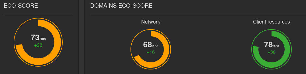
This is the “easy” part of the calculation. We have been doing our carbon footprint every year since 2019, using the excellent software from our friends at Toovalu. So we know our greenhouse gas emissions. In 2021, they were 31 tCO2e.
Is this a lot? We can reduce this value to a monetary ratio commonly used in this type of approach: 31 tCO2e for 851 k€ of turnover in 2021, which represents 36.9 kgCO2e/k€ of turnover. By way of comparison, ADEME indicates an average value of 110 kgCO2e/k€ for the category “low material services”. We are therefore 66% below the sector average. This is good, but we can certainly do better.
Avoided impacts
This is where things get complicated. On the one hand, our activities are diverse (sales of licenses, audits of mobile applications or websites, help in choosing Android fleets, etc.). On the other hand, it is not so easy to know how much we have helped to avoid. We need to be able to measure “before” and “after” (which does not always happen) and ideally, between “before” and “after”, only our recommendations to reduce impacts should have been applied. However, if you develop applications or websites, you know that between two versions, it is rare that there are not multiple changes of all kinds.
Finally, there is a methodological question: let’s suppose an audit on a version 1.0, which leads to 30% less impact on a version 1.1. Can we consider that this 30% will be avoided ad vitam aeternam, in other words, can we consider that version 1.7, which will be released in 18 months, will have 30% less impact than 1.7 would have had if we had not intervened on version 1.0? For want of a better answer, we have chosen to consider that the avoided impacts apply for the next 12 months.
So we do not have the possibility of calculating avoided impacts on all our projects or for all our clients – which we regret. However, we can get an idea from a few cases for which this calculation was possible.
Let’s take three examples:
- The SNCF Connect mobile application (Android version): we were able to determine the impact avoided on the TER ticket reservation process: -18.9% or -10 tCO2e over one year.
- At the opposite extreme, the Orange Group’s Integrated Annual Report (IAR): the RAI 2021 website has a 55% lower impact than the RAI 2020, which for its audience – modest for this type of content – represents an avoidance of 0.024 tCO2e over one year.
Here we have 2 projects typical of our activity, extreme in their audiences, accumulating 10 tCO2e avoided, so an average of 5 tCO2e per project. However, in 2021 we worked on more than 70 application or website projects. By taking the average of these two projects, multiplied by 70 projects, we arrive at 356 tCO2e avoided. Another approach based on a categorisation of each service according to its intensity of use gives us 150 tCO2e. Let us retain this lowest value.
As a reminder, our own footprint that year was 31 tCO2e: even if our low value of 150t was still overestimated, it would be very surprising if it turned out to be less than 31t.
“And the third example?”, say those who follow
The third example is a lesser known service in our catalogue. This is our “Fleet Selection” offer, which consists, thanks to our laboratory measurements, of assisting our customers in choosing a smartphone for their business mobile fleet. The measurements and recommendations focus on autonomy criteria, of course, but also on the durability of the terminals (battery life, robustness, etc.) in order to check that they will be able to meet business needs for as long as possible.
In 2021, we helped a client choose the most sustainable device for a fleet of 35,000 smartphones and 5,000 tablets. Thanks to our measurements, he was able to ensure that he chose a model with an expected lifespan of 4 years instead of 3. The manufacturing impact of a smartphone is on average 54 kg CO2e, that of a tablet 108 kgCO2e (values extracted from the Greenspector impact model). Extending this fleet by one year before replacement therefore represents a saving of 810 tCO2e. It can be argued that we are not 100% responsible for this choice. If we attribute even 10% of these 810t to ourselves, this represents 81 tCO2e avoided – compared to the 31t we emit.
Conclusion
We don’t yet know how to quantify our positive impact precisely, and we may never know. But it is important for us to make sure that we do have a positive impact. This 2021 exercise has demonstrated that.
We will continue to work on this assessment of avoided impacts in order to arrive at more accurate results in the future. But even under conservative assumptions, we are confident that our actions are saving greenhouse gas emissions.
In addition, it should be remembered that improving the sobriety of apps has other positive impacts, particularly on the social aspect by enabling people with old and/or low-end terminals to access these digital services that are often indispensable in daily life.
All this makes us proud and strengthens us to continue our mission.
Reading grid for environmental commitments of web hosting offers
After a first article where we based ourselves on the websites of the hosting companies to compare the hosting companies proposing “eco-responsible” offers, let’s take a closer look at the offers in question.
The choice of a web hosting service is often complex because of the many factors to be taken into account (security, availability, storage capacity, sovereignty, etc.). If you also want to choose an offer based on its environmental impact, the choice becomes even more complex.
The main objective of this article is to present some criteria to be taken into account when choosing a web hosting offer.
We first look at the existing good practice guidelines.
Once the list of environmental criteria has been established, we will go into more detail on each of the criteria in order to better understand them but also to have the right information to understand the available criteria or even discuss them directly with the hosts.
Indirectly, this reading grid can also be useful for accommodation providers who are concerned about their environmental impact.
Our objective here is to propose a simple reading grid, allowing anyone to understand what to base their choice of an “eco-responsible” host on. However, all this information will not necessarily be on the websites of the hosting companies. The easiest way is to contact these companies directly to get the missing data.
We obviously welcome feedback and constructive comments in order to improve this reading grid and to know how it is used.
Existing benchmarks
In order to better understand how the environmental impacts of accommodation offers are translated, we started by looking at what the existing standards suggest on this subject.
In order to choose an eco-responsible host, the 115 good web design practices propose the following items (see below for details of each):
- Management of WEEE (Waste Electrical and Electronic Equipment)
- PUE (Power Usage Effectiveness)/CUE (Carbon Usage Effectiveness)/WUE (Water Usage Effectiveness)
- Responsible purchasing policy
- Respect for the social dimension
- Low carbon energy supply
- Carbon offsetting
The RGESN (Référentiel général d’écoconception de services numériques) proposes a dozen good practices relating to hosting. Among other things, it deals with :
- European Code of Conduct for Energy Efficiency in Data Centres.
- Presence of an environmental impact reduction approach (supporting indicators)
- PUE/CUE/WUE
- Equipment management
- Use of renewable energy
- Fatal heat
- Location of servers
- Good data management practices
Note: most of these criteria can be found in those selected for this comparison, with the exception of those relating to the location of servers (mentioned in the social commitments) or to data management (which depend on usage, in particular according to the criticality of the service and the data).
As usual, the GR491 (Reference Guide to Responsible Digital Service Design) offers many recommendations on the subject. If we stick to the essentials, we find :
- Waste management
- PUE
- Sizing of the physical fleet
- End of life of equipment
- Indicators on the software used
In addition, DINUM (Direction Interministérielle du Numérique) offers a practical guide to responsible digital purchasing, with in particular a sheet on IT infrastructure equipment and hosting services (and hosted solutions). The AGIT (Alliance GreenIT), for its part, updated a white paper in March 2023 on the control and optimisation of the environmental impact of a data centre.
By cross-referencing all these elements, we have drawn up a list of criteria to be checked, which is intended to be complete but not exhaustive.
Note 1: Currently, a working group within W3C is building a set of guidelines for website sustainability. One of the areas of work concerns hosting and infrastructure.
Note 2: In January 2023, the ADEME (Agence de l’Environnement et de la Maîtrise de l’Énergie) published a methodological reference framework for the environmental assessment of hosting and cloud services. This document defines the information to be gathered and displayed. At the time of publication of this article, the companies concerned have not adopted it, but it is hoped that this will be the case in the near future.
Reading grid for the environmental commitments of accommodation providers
Let us now look at what constitutes the reading grid in question.
The criteria used
On the basis of the benchmarks seen above and in order to better evaluate the accommodation offers, the choice was made to base ourselves on several criteria (which we will detail below):
- WEEE Management
- PUE
- WUE
- CUE
- Purchasing policy
- Social commitments
- Management of the heat produced
- Renewable energy supply
- Carbon offsetting
- ISO standards, labels, certificates
Description of the criteria
Management of WEEE (Waste Electrical and Electronic Equipment)
How electronic and electrical waste is dealt with. To date, most of this waste is trafficked (What is the status of recycling?).
WEEE management is about extending the life of electronic equipment through recycling or upcycling and reuse. For example, servers used for hosting can sometimes be reused in other contexts.
PUE
The PUE (Power Usage Effectiveness) represents the proportion of energy used to power IT equipment (servers, storage and network) in relation to the total electricity consumed (for cooling, UPS, etc.). It is always greater than 1 and should be as close to 1 as possible. It is estimated that the oldest data centres have a PUE of around 2, whereas the most efficient ones are more like 1.1.
Many structures advertise very low PUE. Here again, it would be important to see how this is calculated. See the Scaleway website: https://www.scaleway.com/fr/leadership-environnemental/
WUE
Following a similar reasoning as for the PUE, the WUE (Water Usage Effectiveness) evaluates the efficient use of water, especially for cooling equipment, by comparing it to the amount of electricity used for the equipment. Indeed, the amount of water used by hosts is very high, which increases the risk of water stress.
The aim is to get as close as possible to zero water consumption per kWh.
Few organisations today report CUE or WUE. However, this type of information is an essential complement to the PUE in order to ensure, for example, that a low PUE is not explained by higher water use.
CUE
Carbon Usage Effectiveness (CUE) compares the amount of greenhouse gas emissions to the amount of electricity used. In order to improve it, technologies with lower CO2 emissions should be selected (which may be the case when a generator is used to produce the electricity rather than using the electricity grid directly). The objective may be to have a UEC of less than 0.1 kg of CO2.
Purchasing policy
The manufacture of equipment remains the most impactful stage in its life cycle, notably because of the many resources (including metals and rare earths) required. The purchasing policy is therefore an essential element in limiting the environmental impact of a hosting company, even if the manufacture of data centre equipment has less impact than its electricity consumption. Thus, some opt for reconditioned equipment or manufacture their own equipment and all must keep in mind the efficiency and durability of the equipment purchased.
Social commitments
It is impossible to make it an objective and directly measurable criterion. However, this category includes what some companies do to reduce the impact of their activity or to contribute to society, which is an essential component of responsible digital. Global elements such as a CSR plan or the Lucie label can testify to this. It may also be interesting to consider the location of buildings as well as local actions, choice of service providers, etc.
Gestion de la chaleur produite
Due to its activity and the demand on its equipment, a hosting company can produce a lot of heat. In order to keep the equipment in working order, it is necessary to cool it down, most often by using electricity via air conditioning for example (hence the notion of PUE seen above) or water. When released directly, this heat can have a negative impact on the environment (sometimes referred to as waste heat or energy). Some accommodation providers therefore use it to heat neighbouring buildings. This can be measured by the Energy Reuse Factor (ERF).
Renewable energy supply
Data centres are often criticised for their electricity consumption. While the priority is to ensure that as little electricity as possible is used, it is important to rely on renewable energy as much as possible to limit the environmental impact. This can be measured by the Renewable Energy Factor (REF).
Most hosting companies are focusing on renewable energy. We have based our analysis on the companies’ statements on the proportion of renewable energy used. By way of comparison, the Green Software Foundation’s approach to this (for their Green Hosting Directory which is mentioned by several of the organisations compared here) is rather simple. They distinguish between but take into account organisations that :
- Use only renewable energy
- Invest in renewable energy to offset their own use of non-renewable energy
- Use carbon offsetting
This choice may be debatable (particularly with regard to the inclusion of carbon offsetting). It is up to each individual to see what he or she deems necessary (in terms of procedures and evidence).
It is also important to distinguish between decarbonised energy (e.g. nuclear) and renewable energy.
Finally, claims of “100% renewable energy” can be misleading. It is therefore up to each individual to find out more directly from the companies.
Carbon offsetting
Carbon offsetting is the final step in the process of reducing environmental impacts. It should only be used when emissions have first been reduced as much as possible through sobriety and efficiency. Moreover, the effectiveness of some carbon offsetting solutions is regularly questioned. As there are several ways of offsetting, it is advisable to approach companies to find out more about the precise nature of their approach. In accordance with the recommendations of ADEME and EcoInfo, the notion of carbon neutrality should be approached with caution and avoided as much as possible.
ISO standards, labels, certificates
We look at a number of elements as a matter of priority. These include ISO50001 (energy management), ISO27001 (information security) and ISO14001 (environmental management). In addition to this, we sometimes find the HDS (Health Data Hosting, which includes ISO27001 and ISO50001 among other standards). Finally, the Code of Conduct on Data Centre Energy Efficiency includes many good practices. Greenethiquette is sometimes mentioned, but has disappeared in favour of more detailed standards (such as the European Code of Conduct).
Conclusion
The notion of an eco-responsible host has been around for several years (notably via the Greenethiquette), but the precise criteria are still under consideration (not to mention what one is entitled to expect from it). Even if some companies are very transparent on their websites (notably via dedicated pages), this cannot replace a more in-depth discussion, both to find out about missing criteria and to better understand the actions already taken. It is therefore to be hoped that hosting companies will move towards concrete criteria to demonstrate their environmental impacts and communicate them in a transparent manner.
For the time being, it is to be hoped that this reading grid will be useful for those who wish to move towards more environmentally friendly accommodation offers, but also so that everyone can be in a position to push companies towards more virtuous actions.
What is the environmental impact of the most used dating applications in France?
Article Summary
In 2022, a third of the French population used a dating application. But what is the environmental impact of looking for love?
We measured the 10 most popular mobile dating apps (on a common user journey).
Here is the Flop 3 (the most impactful apps): Lovoo, Grindr and OkCupid.
Here is the Top 3 (the least impactful apps): Bumble, Tinder and Happn.
The impactful number: Projected over a month, the impact of these 10 dating apps is 9614 tons EqCO2. That’s equivalent to driving around the Earth 1102 times in a combustion engine car (counting 23 million French users with an average use of 55 minutes per day).
Note that many people use several applications (even if it means maximizing their chances 😉 )
Since the creation of the geolocation feature for smartphones, dating applications have become very popular. Today, there are more than 8,000 of them in the world, including 2,000 in France. Nearly a third of French people use or have used a dating application. Moreover, users spend 55 minutes a day on them.
Given these figures, we can wonder about the impact of these applications on the environment.
The dating applications we chose to measure
Three criteria were used to choose the 10 applications we evaluated: popularity, free access, and availability on Android. Indeed, we chose to evaluate applications that are free to use because they are among the most used. Less than 3% of French people use paid applications.
Regarding the evaluation, a common scenario was determined that is compatible with all applications, namely consulting profiles, liking or not liking the profile, and sending a message. This allows us to get as close as possible to the real use of the application.

Step 1: Launching the application

Step 2: Dislike a profile (by swiping or clicking on “reject”)

Step 3: Like a profile (or send a tap) (by swiping or clicking on “like”)

Step 4: View the details of a profile (by scrolling)

Step 5: Like the profile (or send a tap) (by swiping or clicking on “like”)

Step 6: View the last conversation

Step 7: Send a message in this conversation
Ranking of the environmental footprint of the 10 most used free dating applications in France
The 3 most impactful applications: are Lovoo, Grindr, and OkCupid.

The 3 applications with the least impact: are Bumble, Tinder, and Happn.

We note that the most impactful application (Lovoo) has an impact 5 times greater than that of the least impactful application (Bumble).
The average carbon impact of these applications is 0.25 gEqCO2 for an average duration of 25 seconds. This is equivalent to driving 1 meter in a combustion engine car.
Projecting carbon impacts over one month
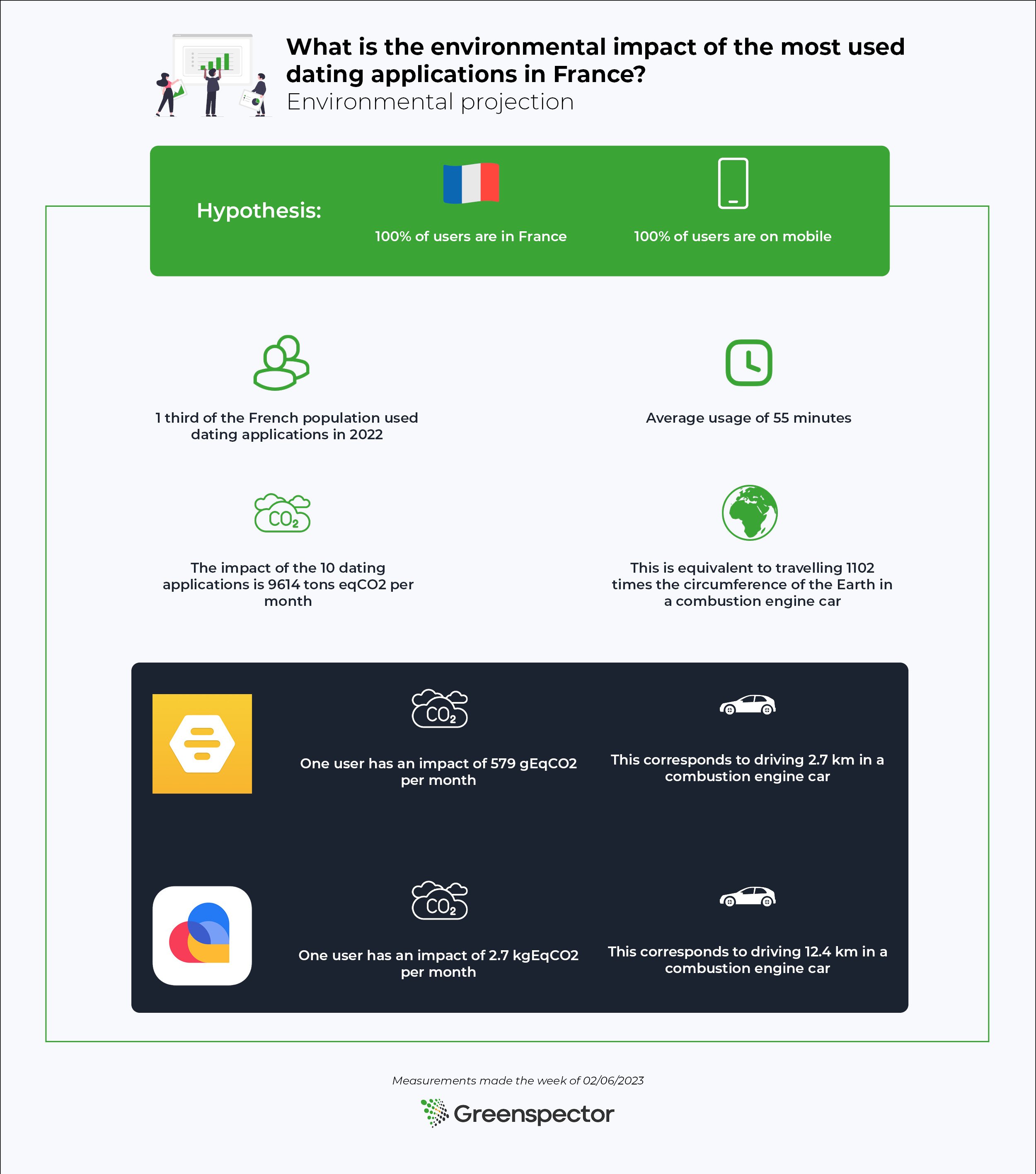
To project the impact of the applications in this ranking, we will use the following assumptions
- 100% of users are in France
- 100% of users are on mobile phones
Various studies show that one-third of the French population (23 million individuals) used dating applications in 2022 with an average of 55 minutes spent on them.
Projected over a month, the impact of these 10 dating apps is 9614 tons of CO2e. This is equivalent to driving around the Earth’s circumference 1102 times in a combustion engine car.
For the highest-ranked application (Bumble), for an average of 55 minutes per day for a month, a user has an impact of 579 gEqCO2. This is equivalent to driving 2.7 kilometers in a combustion-engine car.
For the lowest ranked application (Lovoo), for an average of 55 minutes per day for a month, a user has an impact of 2.7 kgEqCO2. This is equivalent to driving 12.4 kilometers in a combustion-engine car.
Greenspector experts focus on the soberest application: Bumble

The Bumble application is particularly sober during the launch and opening phases of the message page. During these phases, little data is loaded and there is no major energy overconsumption.
On the page where the profiles are displayed, only about 4 are pre-loaded. Animations are also limited during actions on the application and a delayed loading of photos has been implemented for those not seen on the screen.
Greenspector experts focus on the least sober application: Lovoo


The Lovoo application is at the bottom of the ranking with a much higher impact than its competitors. Although the performance is excellent except for the rather long opening time of the application, the energy and data consumption is very high. The integration of ubiquitous advertising with carousels or videos contributes greatly to this over-consumption.
Opening the page to swiping loads an average of 1.9 MB of data. Many profiles are pre-loaded to be displayed smoothly after each swipe compared to competing applications. More than 20 profiles are preloaded compared to about 4 on other applications.
Summary
Between the soberest dating application and the least sober application, we note that the impact is 5 times more important.
Note that the differences are mostly due to animations, the consequent loading of data (photos, videos…), and the management of the elements displayed on the screen. By applying good practices, it is possible to reduce the environmental impact of applications.
As a user, we can reduce our impact by using only one dating application if we have several.
And to go further in digital sobriety, it is always possible to meet people in real life!
Results table
| Applications | Version | Energy (mAh) | Data exchanged (MB) | Carbon impact (gEqCO2) | Water Footprint (Litres) | Soil Footprint (cm²) | Scenario duration (seconds) |
|---|---|---|---|---|---|---|---|
| Lovoo | 143.0 | 58,9 | 5,3 | 0,7 | 0,1 | 0,2 | 25,3 |
| Grindr | 9.2.0 | 44,5 | 3,3 | 0,4 | 0,0 | 0,2 | 21,0 |
| Happn | 26.31.2 | 36,6 | 0,9 | 0,2 | 0,0 | 0,1 | 30,7 |
| Fruitz | 3.6.2 | 41,4 | 0,9 | 0,2 | 0,0 | 0,1 | 27,6 |
| Hinge | 9.15.1 | 36,6 | 1,0 | 0,2 | 0,0 | 0,1 | 29,0 |
| Adopte un mec | 4.9.21 | 86,0 | 0,6 | 0,2 | 0,0 | 0,2 | 30,4 |
| Badoo | 5.306.0 | 37,2 | 1,5 | 0,2 | 0,0 | 0,1 | 23,6 |
| OKCupid | 74.1.0 | 42,1 | 1,5 | 0,2 | 0,0 | 0,1 | 20,2 |
| Bumble | 5.307.0 | 35,6 | 0,8 | 0,1 | 0,0 | 0,1 | 23,2 |
| Tinder | 14.2.0 | 55,2 | 0,6 | 0,1 | 0,0 | 0,1 | 21,4 |
Web hosts, impact and sobriety actions
The article is based on measurements taken in November 2022. It is possible that some companies have since redesigned their websites.
Summary of the article
More and more web hosting providers are claiming to be environmentally friendly.
– We measured the homepage of 21 web hosting providers.
– We analysed the homepage of the first ranked provider, which is Digital Footprint.
– We then analysed the homepage of the last one in the ranking which is Infomaniak.
– We then took a look at Greenshift’s site by exposing an extract of the HTTP requests of the homepage.
Finally, we reviewed the good practices of sobriety and accessibility which reveal that Eolas and Empreinte Digitale have the fewest accessibility errors unlike Infomaniak which has the most.
In the next article, we will look at the criteria needed to assess the environmental friendliness of a hosting company.
When we are interested in digital sobriety, the question of the host comes up very often. Indeed, this is a very interesting and cross-cutting lever for reducing the environmental impact of digital services. Things get more complicated when you try to sort out the real from the fake in order to choose the best possible host according to the project’s business constraints. Some providers go so far as to talk about carbon neutrality or even carbon negativity.
Claims of carbon neutrality are most often based on the source of the electricity used according to a market-based (supplier’s claims) or location-based (geographical energy mix) approach. Given that some of the scopes 1, 2 and 3 are often neglected, all of this makes these claims invalid. The purpose of this article is not necessarily to go into this point in detail, but you will find some initial answers here:
- [Youtube, 24min 16s] Carbon footprinting tools for public clouds, a presentation by Pierre Rust from Orange Innovation
- Carbon neutrality’ for digital companies, by EcoInfo
Today, in all cases, the claims of eco-responsibility of hosting providers are mostly based on PUE (Power Usage Effectiveness) and the source of the electricity used. This does not seem to be enough. At Greenspector, we decided to look into the subject, to see what was being offered today and to base ourselves on the existing literature in order to determine what criteria to use to choose a hosting company. We were then able to classify several French (or nearby) hosts.
In this first article, we decided to evaluate the homepage of their sites from the point of view of digital sobriety, in order to check whether they reflect their environmental claims. This approach is of course biased and unrepresentative, but it already gives an idea of where each of them stands from this point of view.
It is only with the second article that we will really be able to decide between the hosts, by sifting through the criteria we have chosen.
Comparison of home pages
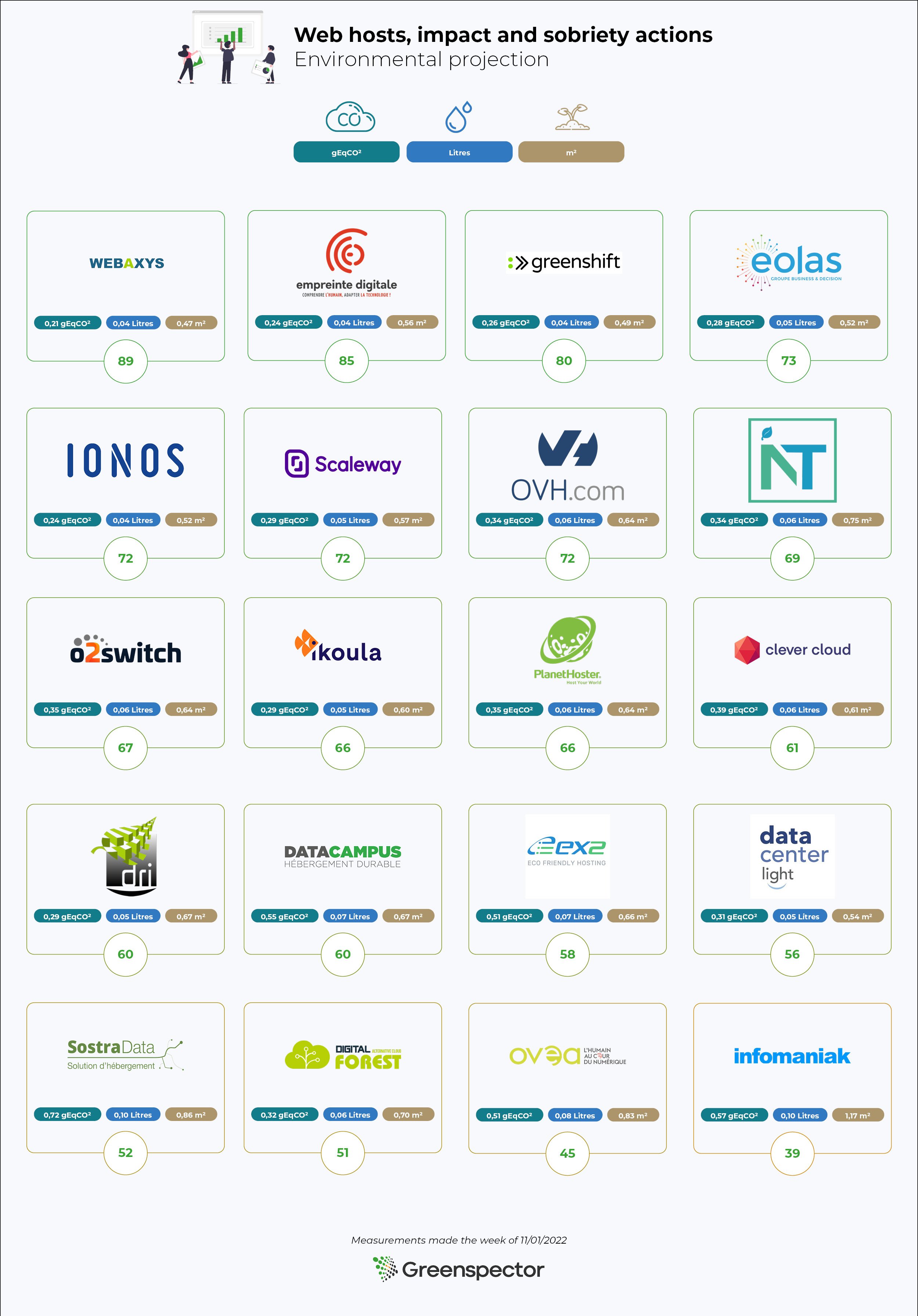
Based on their intentions regarding environmental impacts, 21 accommodation providers were selected. We have selected as a priority those that show efforts to reduce the environmental impacts of the services they offer. We may have missed some. If so, please let us know!
Based on this list, we measured the homepage of each with the Greenspector tool in order to compare them.
| Nom | URL | Ecoscore | Energie (mAh) | Données transférées (Mo) | Requêtes HTTP |
|---|---|---|---|---|---|
| Webaxys | https://webaxys.fr/ | 89 | 4,173192 | 0,47913 | 21 |
| Empreinte Digitale | https://cloud.empreintedigitale.fr/ | 85 | 5,009883 | 0,313111667 | 18 |
| Greenshift | https://www.greenshift.co/fr/ | 80 | 4,253108 | 1,079741667 | 51 |
| Eolas | https://www.eolas.fr/ | 73 | 4,449822 | 1,416203333 | 59 |
| IONOS | https://www.ionos.fr | 72 | 4,586076 | 0,9967127 | 27 |
| Scaleway | https://www.scaleway.com/ | 72 | 5,083758 | 2,247849663 | 29 |
| OVH | https://www.ovhcloud.com/fr/ | 72 | 5,553175 | 1,832020334 | 64 |
| Neutral IT | https://neutral-it.com/ | 69 | 6,62236 | 1,286239 | 49 |
| o2switch | https://www.o2switch.fr/ | 67 | 5,3824 | 0,979763667 | 90 |
| Ikoula | https://www.ikoula.com/ | 66 | 5,315384 | 1,54606967 | 33 |
| PlanetHoster | https://www.planethoster.com/ | 66 | 5,469159 | 1,778474 | 76 |
| DRI | https://www.dri.fr/ | 60 | 5,98907 | 0,451148333 | 27 |
| Datacampus | https://datacampus.fr/ | 60 | 5,691275 | 13,14124667 | 64 |
| EX2 | https://www.ex2.com/ | 58 | 5,474202 | 9,756049 | 91 |
| Data Center Light | https://datacenterlight.ch/ | 56 | 4,686341 | 2,86276037 | 51 |
| Sostradata | https://www.sostradata.fr/ | 52 | 7,235153 | 17,19431033 | 89 |
| Digital Forest | https://digitalforest.fr/ | 51 | 6,225642 | 0,897602 | 35 |
| OVEA | https://www.ovea.com/ | 45 | 7,01255 | 4,253318032 | 111 |
| Infomaniak | https://www.infomaniak.com/ | 39 | 10,30043 | 3,092772997 | 72 |
Résultats des mesures sur les pages d’accueil
Now let’s look in more detail
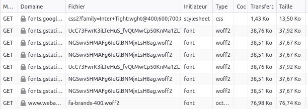
In terms of the Ecoscore (whose calculation methodology can be found on the Greenspector blog), the Webaxys home page does best and Infomaniak does worst. For Infomaniak, this can be explained by the fact that the energy impact of the site is very high. It is even the highest in the sample. On the other hand, from this point of view, it is once again Webaxys that comes out on top. Empreinte Digitale presents the lowest volume of transferred data while Sostradata transfers the most (more than 17 MB!). Concerning HTTP requests, the home page of Empreinte Digitale uses the least while the one of OVEA has the most (at first sight, some optimizations would be quite easy to implement by avoiding duplicates and by delaying the loading of the chat or even by questioning its relevance).
The home pages of the Webaxys and Empreinte Digitale sites clearly stand out and we will now analyze them in more detail. We will then complete our analysis with a quick look at the elements of the Infomaniak site that make it more impactful. We’ll finish with a brief overview of the other sites.
Empreinte Digitale
This homepage is particularly light, which is an opportunity to note the application of several good practices:
- Optimised and lazy-loaded images
- Third-party services mastered and, in principle, all self-hosted
- Very little JS and CSS
- Use of system fonts only
The site is pleasant and attractive. The score could be even better without the animation but this is absent on mobile. The choice of dithering for some images highlights the desire to produce a site as light as possible but is not necessarily necessary.
Webaxys
We find here light and lazy-loaded images, with a simple and attractive service.
On this type of very optimized and light site, some flaws stand out even more, especially the use of Google fonts.
Here we see 7 requests only for these fonts whereas a system font would probably have been suitable. It should also be remembered that their use from Google servers may pose a problem with respect to the RGPD. A variable font could limit the number of files and a subset (limit to useful characters) could reduce the size. But the priority would be to use a system font.
Finally, the last request of the list is probably FontAwesome. So here we get an icon font while only a few icons are useful (and could be integrated in optimized SVG, maybe even directly in the HTML).
Infomaniak

The Infomaniak site stands out for its low Ecoscore and high energy impact.
If you take a closer look, you’ll notice that most of the weight of the page is due to numerous JS files (about forty in all!).
In addition, the animation at the top of the page (for the search of a domain name) seems to be one of the causes of the overconsumption of energy, highlighted in the Greenspector tool:
Other possible explanations for this over-consumption may be found in JS processing. In any case, it should be analysed and limited.
Other websites
Greenshift’s homepage shows a low energy impact, despite the inclusion of animations when the page is loaded. However, in terms of usability, the presence of horizontal scrolling on mobile phones is not ideal.
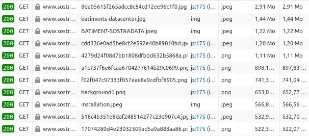
For the Sostradata site, which has the highest volume of data transferred in the sample, a quick glance reveals the first areas of improvement:
- Avoid including a Google Maps component directly on the homepage
- Optimise images (size, format, quality, lazy-loading)
Good practice in digital sobriety
In terms of good practice, it is worth noting that the Neutral IT homepage meets the most criteria.
From this point of view, we found that some good practices are almost never implemented on the pages in our sample. To improve impact, one should systematically consider :
- Do not let the browser resize images, this limits the consumption of terminal resources
- Only download the necessary images and do lazy loading
- As far as possible, do not integrate css and js code into HTML files; this will avoid systematically reloading the whole file if necessary
- And of course, once the css and js files are independent, they should be minified to save space
Best practices for accessibility
In addition to measurements and verification of good practices (two complementary approaches that are difficult to separate), we were curious to briefly evaluate the selected sites from the perspective of accessibility. While it is important to reduce the environmental impact of digital services, this cannot be done without ensuring that the site adapts to all contexts of use so as not to exclude anyone. What is the point of having the least impactful site possible if it is unusable for a part of the population?
As we do not wish to be exhaustive, we have relied on the aXe tool (it should be remembered that this type of tool is not intended to cover all the WCAG or RGAA criteria) and on the manual verification of certain criteria (200% zoom, content linearisation, textual alternatives, etc.) In accessibility as in digital sobriety, there is no magic wand!
In the end, our findings are as follows:
- The Eolas and Empreinte Digitale websites have the fewest accessibility errors
- Despite its reduced environmental impact, the Webaxys site has several errors that are fairly easy to fix.
- The Infomaniak site is among the sites with the most errors
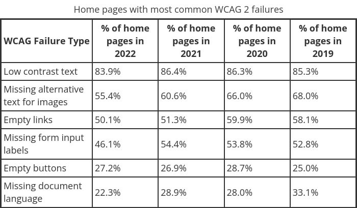
- Among the most frequent errors, we find mainly those highlighted by the WebAIM Million study (which is consistent):
So here we see (once again) that accessibility and digital sobriety are linked. It would be difficult to say that those who do not take care of the sobriety of their websites do not care about accessibility (and vice versa). On the other hand, it is important to remember that it will be all the easier to apply accessibility criteria to a sober site, and even more so when the two approaches are carried out jointly throughout the project’s life cycle.
Conclusion
A first quick analysis of the websites of the selected hosting providers allows us to distinguish those who make the effort to create a sober (and accessible) site. While this does not indicate that they are paying attention to reducing the environmental impact of their hosting offers, it will be interesting to see if the trends noted here are confirmed later.
In the next article in this series, we will look at the criteria needed to assess the environmental responsibility of a web host. We will return to the websites of the selected hosts to see how each one measures up against the criteria in question.
Optimising your website for print
With the arrival of digital technology and in particular the web, many people predicted that this would greatly limit the volume of printing. In reality, the opposite has happened as these new technologies, coupled with the democratisation of personal printers, have made it easier for everyone to print. In passing, this can be seen as an illustration of the rebound effect or Jevons’ paradox.
It should be borne in mind that printing is still used for personal or business purposes for the transmission or storage of information.
We will therefore look here at how to make the printing of website content as low impact as possible. We won’t discuss the printer, paper or inks used (printing in draft quality, double-sided, multiple sheets per page, etc). Instead, we will look at good design practices that can make printing less impactful and the printed content more readable.
To begin with, let’s look at what the existing guidelines mention on this subject.
- The GreenIT.fr collective’s repository of 115 good practices in web ecodesign proposes BP_027: “Provide a print CSS”. The brief example provided already covers a good part of the recommendations that we will detail in the rest of the article.
- GR491 suggests checking that a clean version is available for print and that a font optimised for print is used.
This is partly in line with what we will now see in terms of recommendations.
Limit the number of pages
Often, when trying to print a simple web page directly, the number of sheets used seems disproportionate. This is the case, for example, when printing an electronic ticket, such as a train ticket. There are a number of ways of overcoming this:
- Reduce page margins
- Reduce the spacing between elements
- Reduce the size of titles and texts
- Linearise content
- Remove peripheral content (decorative images, contextual elements such as blocks presenting similar articles or the latest articles, menus, top and bottom of the page, navigation elements, etc)
Limiting ink surfaces
If we saw in the previous good practice how to limit the amount of paper used, it is also possible to limit the use of ink. If a dark mode is in place, make sure that the background is white when printed. Again, it may be worth removing unnecessary visuals such as decorative images.
Some fonts are specially designed to reduce the amount of ink used in printing. Take a look at Ryman Eco or tools like EcoFont.
Another option is to allow the user to print the content without the images. In some contexts, images can help with comprehension, but you might as well give the user the choice of printing a page with or without the images.
In addition, CSS filters can limit the ink cost of images: Quality print versions with CSS filters.
How to implement these good practices?
As mentioned in the 115 best practices for web eco-design, the easiest way is to set up a stylesheet dedicated to print and used for the whole website. For this, I invite you to read the Smashing Magazine article “Print stylesheets in 2018“.
Conclusion
In order to facilitate the printing of website content, we have seen here the best practices to implement. The development costs are limited but the benefits for users can be substantial. It is indeed essential to keep in mind all the contexts of use of a website.
Reducing the impact of autocompletion
When we browse the web, autocompletion is almost everywhere. In particular, this functionality is implemented on search engines, whether they are website-specific or not. So, when the user types in the words they are looking for, suggestions are made dynamically, whether to complete the words or phrases they type in or to display the search results as characters are added.
In the case of Google, these suggestions are often derided as incongruous. Not to mention the SEO chestnut about the death of the search engine.
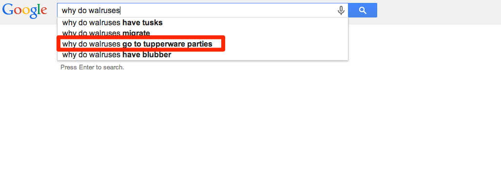
Take the example of the Google search engine:
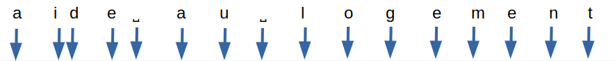

Here, the blue arrows represent character inputs and the black rectangles represent autocomplete queries.
We arrive at a total of 16 XHR type queries for 5.1 kb transferred.
The number of queries remains the same whether the input is fast (input in 2 seconds for the whole search) or longer (7 seconds in total for the input).
Autocompletion can also be found in some input forms, to ensure that the text entered corresponds to what is expected (city, country, etc).
While this mechanism can be an aid to the user, the environmental impact of the queries generated should not be overlooked. Let’s see how to limit them.
First recommendations
If sobriety is a priority, the best thing to do is not to integrate an autocomplete mechanism. However, input help is a definite advantage for users in most cases.
In the case of forms, the GreenIT.fr collective’s collection of 115 good practices in web ecodesign recommends input assistance. In this way, less strain is placed on the server while ensuring that the text entered remains consistent with what is expected.
On the GR491 side, there are two recommendations:
- Limit unnecessary searches by local search engines: this is based on the number of letters entered in order to space out the queries
- Limit the number of requests between the client and the server: this more general good practice applies perfectly here
Rather than systematically implementing autocompletion and search, it is sometimes possible to make filters (and sorting mechanisms) available to the user.
With these initial elements in mind, let’s look at how we can go even further.
Recommendations
Ensure that requests are as light as possible
When the client sends a request to the server, ensure that it contains only the elements necessary to provide a relevant response.
When the server sends a response, again ensure that :
- Only relevant fields are returned. For example, it is not always necessary to display an image for each result
- Only the necessary elements are returned (relevance of responses and pagination of results)
Do not offer autocompletion before a few characters
Before launching the first query, it is preferable to wait until 5 characters have been entered or at least 2 seconds have elapsed since the last entry by the user.
This avoids returning results for a request that is too vague (when the number of characters entered is insufficient), while taking into account the case where the term searched for is deliberately short (“summer”, etc).
Spacing out the queries in time
After the initial query, wait until 3 new characters have been entered or at least 2 seconds have elapsed since the last query.
Limit the number of queries for fast entries
In addition to the previous rule, in the case of fast input, wait at least one second between each request. Indeed, some particularly fast users can enter a character every 200 ms.
Measuring local relevance
When a user adds characters to his search, the results become more precise and their number decreases. It is possible to perform this filtering directly locally, without additional requests to the server. For example, if results were obtained for “housing assistance”, it is possible to filter on the client side if the user continues by typing “housing assistance”.
This good practice is particularly relevant in the case of an input field in a form. For example, when entering a city or country, the elements of an initial query can be refined locally as the user continues to type.
Be aware that if a space is entered and new terms are added, the logic chosen for the search results must be taken into account. In particular, should a result contain all the terms entered or only some of them?
Be careful also to take into account the case where the user deletes some of the characters entered. You may also want to temporarily store the queries you have already made so that you can use them again if necessary.
Back to the example of the Google search engine
Taking the case of the Google search engine mentioned at the beginning of the article (16 queries, 5.1 KB transferred), we arrive at 3 queries in total for 1 KB transferred.
- A first query only performed when at least 5 characters have been entered.
- A second query when 3 more characters have been entered.
- A third query when 3 more characters have been entered.
- The local evaluation of the results to be returned at the end of the input, since it is only a question of filtering the results obtained following the third query.
Conclusion
If autocompletion is a necessity and assisted input is not possible, the following good practices should be implemented:
- Ensure that queries are as light as possible
- Do not offer autocompletion before a few characters
- Spacing out queries over time
- Limit the number of queries for quick entries
- Measure relevance locally
Finally, although this input help may be beneficial to many users, do not neglect its accessibility.
Press Release: NOWU and Greenspector take next step in collaboration

NOWU, France Televisions’ environmental media, is accelerating its sobriety with the Greenspector solution, to go further in the eco-design of its media. After a first work on the evaluation and the reduction of the environmental impact during the creation of the NOWU media, the Digital Direction of France Televisions now wishes to go to a new step in the collaboration with Greenspector. Initially, the Greenspector solution will be deployed and managed by the NOWU team.
December 1, 2022 in Paris
A first stage of collaboration between France Télévisions and Greenspector
NOWU’s goal is to be able to assess and reduce its impact during the usage phase. Greenspector had already assisted the project team with its partner EcoAct to conduct this assessment, train the teams in best practices and identify recommendations.
A new step: France Televisions decides to integrate the Greenspector solution into NOWU’s digital creation process
NOWU and France Televisions decided to acquire a solution to help teams manage their eco-design process. The continuous assessment tool is present at all stages of the project’s design and development. After a study and a competition of the solutions on the market, France Televisions chose the Greenspector solution for a first deployment on the NOWU media.
What were the main reasons for choosing Greenspector for NOWU and for France Télévisions in general?
“Greenspector has the advantage of being able to address different technologies in its digital services (Web and mobile), to perform a physical measurement on real devices without prior installation and closer to the reality of the service uses. It is also a player recognized for its expertise and solutions, the French leader for over 12 years with whom we have already worked. We are also considering deploying this solution beyond the NOWU media”.
France Télévisions reaffirms its ambition to develop an eco-responsible media.
Through this first project, France Télévisions intends to become a benchmark for the eco-responsibility of digital services in the media field.
What is NOWU’s goal in this new partnership?
“With NOWU, our ambition is to be a benchmark eco-friendly media brand in Europe. In order to be in perfect harmony with our editorial positioning and our values, we want to show a new approach to the group’s digital services. As a public service player, it seems essential to us to position ourselves as a pioneer of responsible digital, concerned about the carbon footprint of its digital activities.”
Gautier CURTIL, Director of the NOWU offering
Greenspector is positioning itself as a key player in the eco-design of digital services through its analysis and measurement solutions. Through this new collaboration with the France Televisions Group, Greenspector illustrates the growing expectations of organizations towards eco-design. In this way, digital sobriety measurement approaches enable them to take action and reduce their impacts. This is especially true for massively used digital services such as media.
“We are delighted to continue our collaboration with the NOWU teams and to be able to give them the ability to manage this process in total autonomy via our expert solutions. For Greenspector, this is a great first step and we are proud to support a great project that promotes ecological values for youth. It is also a great opportunity to deploy our solutions more widely and thus help the France Televisions Group in the decarbonization of its digital activities.”
Thierry LEBOUCQ, president of Greenspector.
About NOWU
NOWU is France Télévisions’ environmental media, to be launched in the fall of 2021. It is a service media that offers the young generation of 15-35 year olds concrete solutions and tools to take part in the fight against global warming and environmental issues.
With an optimistic and guilt-free tone, NOWU’s content focuses on three main areas:
MOVE, GET INFORMED, and GET INSPIRED.
About France Télévisions
France Télévisions is the leading French audiovisual group in terms of audience (29.1% audience share in the 4+ age group in 2021) and includes :
- 1 france.tv video platform and a full range of themed digital offerings (news, youth, sports, culture, education, overseas)
- 4 national television channels: France 2, France 3, France 4/Culturebox, France 5
- 1 global continuous news medium on all media: France info
- 2 networks: 24 regional antennas in metropolitan France (France 3) and 9 global TV/radio/web media in overseas (les 1ère)
France Televisions occupies a preponderant place in the French audiovisual landscape: 4 out of 5 French people watch France Televisions every week, on all screens.
France Télévisions in pictures, it’s here | More information : francetelevisions.fr
About Greenspector
Greenspector is a French pioneer in digital responsibility since 2010. Its technological innovations are made available to professionals via SaaS software tools and expert services. They enable the control and reduction of the environmental impact of mobile and web digital services and more broadly of any connected object. The innovation of the solution lies in a measurement that automatically reproduces user paths on real remote devices without prior installation. The solution is certified by the Solar Impulse label.
Deleting emails is useless, working on sober email solutions is mandatory
The discovery that digital technology was not so virtual and that it could have an impact on the environment brought a multitude of injunctions followed by a multitude of criticisms and counter-injunctions. “You have to delete your e-mails”, “No, it’s like peeing in the shower, it’s useless”… The criticism of these actions by the digital actors is quite strong relative to the large part of the “non-technical” population that took this to heart (and increased its eco-anxiety!).
These discussions have also led to a decision on which is the most polluting between use and manufacture. Use of the mail versus manufacture of the terminal on which the mail was read. The latter being announced as more impacting, this was in the sense of uselessness to optimize the mail part!
Yes, the impact is concentrated on the manufacturing of the terminals. Yes, the unit impact of an email is low, especially compared to a raclette (this is a private joke, a joke that circulates among the detractors of digital sobriety). These are quite reassuring messages in a binary world. Reassuring to limit eco-anxiety. But mostly reassuring for the digital actors to not deal with the problem and continue business-as-usual.
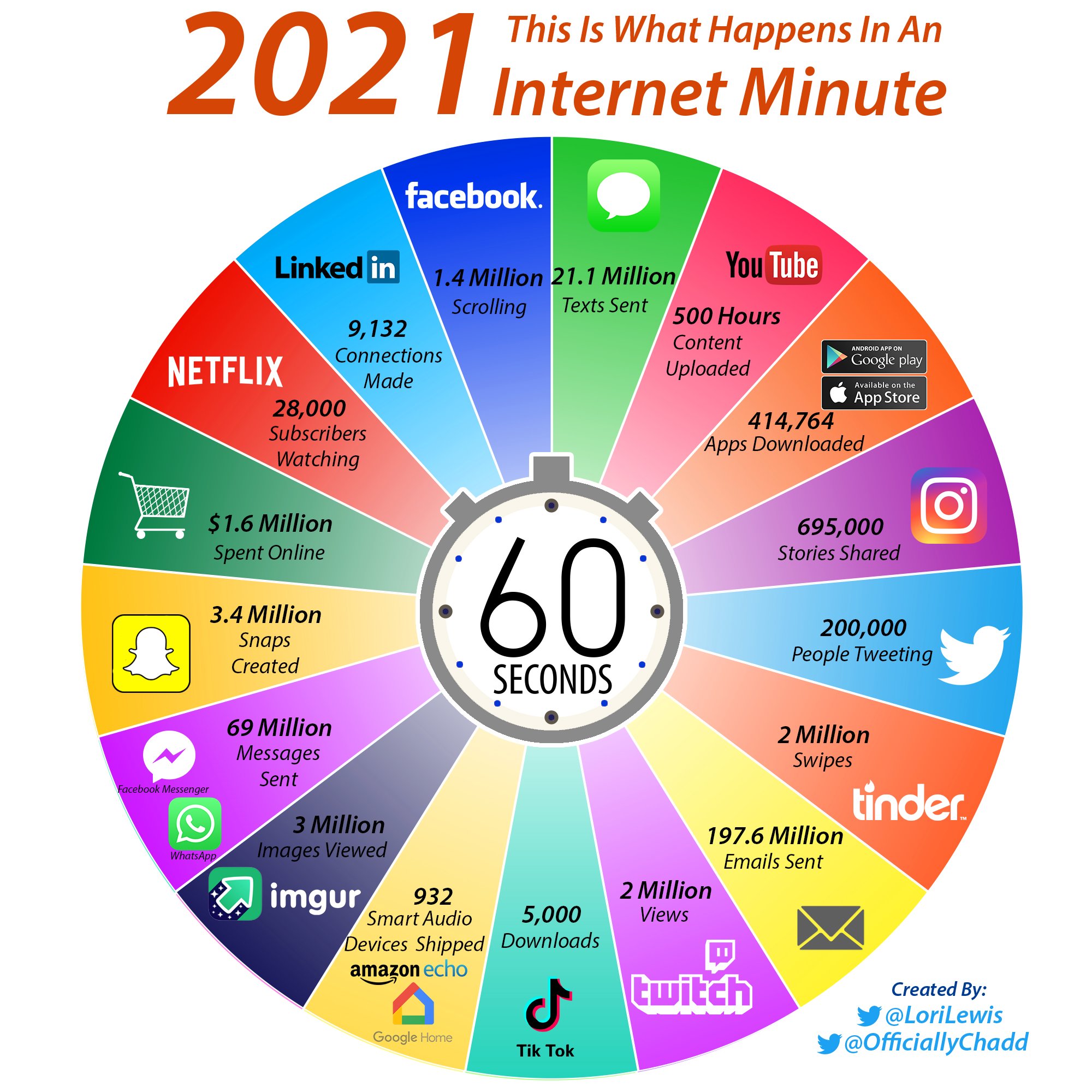
Because yes, there is a potential problem. Because of the scale effect, a low unit impact can lead to a high global impact with a large number of users and more and more uses. The 4% impact of digital technology does not just happen. Especially when you list and observe what happens on the internet every minute https://www.allaccess.com/merge/archive/32972/infographic-what-happens-in-an-internet-minute. A diversity and a frequency much more important than raclette (for information, we should eat raclette 12 times a year https://journal-des-etudes.com/selon-la-science-il-faudrait-manger-de-la-raclette-12-fois-par-an/ )
The plastic packaging of our food, taken individually, does not have a huge impact. A few milligrams of plastic. But plastic is indeed a global environmental problem. As Gerry McGovern would say, plastic is an environmental plague but if you have a plastic bag, use it! https://gerrymcgovern.com/books/world-wide-waste/exploding-plastic-inevitable/
“Avoid plastic packaging. Bring your own bag and avoid the barcodes. Whenever you can replace plastic with another material, do, but don’t replace it simply for the sake of it. If you have a plastic bag, use the hell out of it.”
As a digital player, we need to work on impacts because the effect of scale means that our solutions have a significant global impact. Using the “order of magnitude” argument by taking only the unit impact is not valid.
Behind an email, there is a solution provider. Behind a social network, too. Each digital actor contributes to a brick that is ultimately used by a user.
It is therefore necessary to optimize our solutions, to offer better management of solutions. What about smart email deletion options that would be proposed in email solutions? What about providing solutions to help writing sober emails (attachments, signatures…)? It is possible, editors have done it for spam management, why not go further?
As for user awareness, it is necessary but it must be less anxiety-provoking, without becoming whataboutism (https://fr.wikipedia.org/wiki/Whataboutism).