The W3C (World Wide Web Consortium: official website https://www.w3.org/) is an organisation that defines web standards (such as the technical elements governing the operation of HTML, for example) and guidelines. It was founded by Tim Berners-Lee in 1994.
As part of the Responsible Digital Initiative, the W3C is best known for its publication of the WCAG (Web Content Accessibility Guidelines: https://www.w3.org/WAI/standards-guidelines/wcag/). These rules for web content accessibility are a worldwide reference. In particular, they serve as the basis for the RGAA (Référentiel Général d’Amélioration de l’Accessibilité: https://design.numerique.gouv.fr/accessibilite-numerique/rgaa/ ), which in turn serves as the basis for the introduction of regulations on this subject in France.
We will be coming back to this legislative framework in the very near future to provide you with a summary and outlook.
Nevertheless, we were very enthusiastic when W3C announced its intention to work on the subject of ecodesign in a concrete way (https://www.w3.org/community/sustyweb/2022/04/19/sustainability-recommendations-working-group/). I was lucky enough to take part in this working group (with Thierry Leboucq). The aim was to produce guidelines so that standards could subsequently be defined. It was an opportunity to meet some great people and compare digital sobriety practices with experts from all over the world. Well done to Tim Frick and Alexander Dawson for overseeing all this, and to all those who contributed to the sub-groups dedicated to specific themes:
The publication of the WSGs represents a historic milestone in the application of digital sobriety to the web. But let’s not forget that this is just the beginning. The main purpose of this publication is to gather feedback from experts and then to see how this framework can be defined even more precisely. It is also hoped that this work will serve as a basis for wider adoption of the subject, so that countries can use it to define a legislative framework. This foundation also appears to be essential for training and raising awareness on the subject, but also as a support for initiatives to reduce the environmental impact of websites.
At Greenspector, we intend to continue contributing to these guidelines, in particular by providing feedback based on our practical experience of the eco-design of digital services. Very soon, these guidelines will be incorporated into the best practices on which we rely on a daily basis, as well as into the eco-design awareness-raising sessions that we offer.
In this way, we will be able to see in more detail how WSGs can be reconciled with existing reference systems (mainly RGESN and RG491).
The first thing that stands out compared to the previous mobile games ranking is that three games reappear: Subway Surfers, Candy Crush Saga, and 8 Ball Pool. In terms of downloads, Subway Surfers remains in the first position of the ranking
Looking at the APK deployments, we notice that the frequency of new APK versions varies widely: at most one every 15 days or so for Candy Crush Saga or Race Master 3D, and at least one per week for Roblox. These updates undoubtedly have an environmental impact. For the sake of simplicity, we will focus here on the impact of their usage, assuming the conditions of the initial game launch. The functional unit would thus be: “starting a game session for the first time on a mid-range Android mobile device using Wi-Fi.
This will allow us to assess the environmental impacts of these games to compare them.
While the initial intention was to assess the expected increase in revenue generated by mobile games, some interesting facts have emerged:
More than half of mobile gamers are female.
73% of gamers spend money on these games.
Most of the gamers are in Asia and the Pacific region.
Methodology
Definition of the User Journey
For measurement, it was essential but challenging to define a common user journey for all the games. As mentioned earlier, the obvious choice for us was a journey starting with the launch of the application and then the start of a game session. However, things quickly became more complex.
For most of the games studied, the initial launch involves several intermediate screens:
Gathering GDPR-related consent
Input of the player’s age
Gathering consent related to advertisements
Creating a profile or linking to an account on a third-party service (Google, Facebook, etc…) (It would be interesting to analyze the third-party services used in each game in more detail at a later stage)
Loading content updates
If the first three items on the list are only filled out once, content updates can occur unexpectedly and independently of the APK update.
Linking the games to a Google account made automating the Bridge Race game too complex compared to the time we had decided to allocate for this study. This led to the exclusion of the game from the sample studied here. We observed differences in behavior when linking the Google profile depending on the device used. In the future, we will consider conducting a complementary study that directly assesses the impacts of one minute of gameplay using Greenspector’s Testunner tool.
In the end, we still attempted to automate the following user journey for each game:
Step 1: Launching the application
Step 2: Loading the title screen
Step 3: Starting a game session
Between these measured steps, some actions for consent validation or login that were not measured because they were absent in some applications. The significant number of elements to click on and intermediate screens during the initial launch of the FIFA Mobile game prevented us from reaching the actual gameplay launch. The measurements and calculations presented here are therefore below the actual values but have been retained to highlight other aspects.
As part of this study, the data was collected between August 11th and August 16th, 2023, using Greenspector Studio. We utilized the Greenspector Domain-Specific Language (GDSL) to create test scripts that automatically replicate the actions to be performed on a mobile phone. The Testrunner module then enabled us to take measurements on an Android smartphone, providing us with energy and resource consumption (memory, CPU, data exchanged), and response times for each step of the user journey.
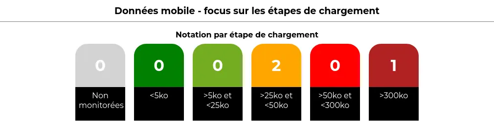
Subsequently, based on these measurements, the impact model integrated into Greenspector Studio assessed the corresponding environmental impact and Eco-Scores. As a reminder, in the case of a user journey measurement, the overall Eco-Score is divided into three Eco-Scores: Performance, Mobile Data, and Energy. Each is rated on a scale from 0 to 100, with 100 being the best score. Each of these scores is derived from the ratings achieved for each measurement step, which depend on predefined thresholds. For instance, in the case of mobile data for loading steps:
Hypotheses
During this evaluation, we started from the perspective of the initial application launch. This inherently represents a more impactful journey than subsequent uses but provides a better understanding of the game’s operation. It’s worth noting that during actual gameplay, there are often regular updates that can also have an impact.
Measurement Context
Device: Samsung Galaxy S9, Android 10
Network Connection: Wi-Fi
Screen Brightness: 50%
Tests were conducted over at least 3 iterations to ensure result reliability.
Hypotheses for Environmental Projections
User Location: 100% World
Server Location: 100% World
Devices Used: Smartphones only
The environmental footprint depends on the location and type of application servers, user locations, and the type of devices they use. We have focused our study solely on the use of applications on smartphones. We have also assumed that users and servers are overwhelmingly located outside of France, as precise statistics were unavailable.
Résultats
App name
APK size (Mo)
Data exchanged (MB)
Total battery discharge (mAh)
Subway Surfers
177,1
5,3
18,3
Stumble Guys
198
46,4
44,9
Roblox
160,8
17
15,4
Candy Crush Saga
92,2
12,1
22,3
Race Master 3D
182,6
33,2
17,1
8 Ball Pool
89,9
0
7,8
FIFA Mobile
180,4
161,5
34,3
Merge Master - Dinoasaur game
175
26,1
24,5
Garena Free Fire
400,8
5,7
19,8
Bridge Race
170,9
First and foremost, we observe that APK files for initial downloads are mostly between 160 and 200 MB, which is already quite substantial. Only Candy Crush Saga and 8 Ball Pool are below this range, at around 90 MB. For Free Fire, the file size goes up to 400 MB!
The duration of usage is estimated to be a little over 20 minutes per day according to this study by Statista: https://www.statista.com/statistics/1272891/worldwide-game-apps-time-spent-daily-age/. The impact of installation and updates, assuming daily or near-daily usage, has therefore been excluded from the present study. However, it’s possible that for a game used sporadically over time, updates might have a more significant impact than actual usage. In such cases, there is a risk for the game publisher that users may lose interest in the game. While the APK update can be managed daily like other mobile applications, it’s the content update during the game launch that can become problematic. As we will discuss later, everything is designed to encourage daily play.
Regarding the data transferred for the initial launch of the game, most games require a few additional megabytes. Only 8 Ball Pool does not require any data transfer. Conversely, FIFA Mobile, Stumble Guys, Race Master 3D, and Merge Master require downloading a few tens of megabytes. In particular, FIFA Mobile requires downloading over 160 MB, which includes updating the content based on sports news. This is seen as added value by the publisher but is considered a poor practice from a sustainability perspective. Initially, efforts should focus on how to reduce the technical size of the necessary information, and ideally, limit the refresh frequency and the comprehensiveness of the information.
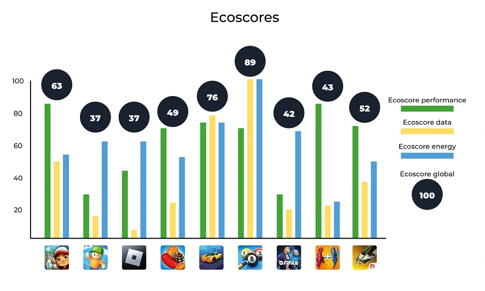
These substantial data transfers are often correlated with degraded performance. For instance, for Stumble Guys and FIFA Mobile, it sometimes takes 1 to 2 minutes for the screen that allows the game to appear to be launched. For half of the games, simply launching the application takes between 10 and 20 seconds, which is particularly long. In the case of Roblox, the title screen loads quickly, with content loading occurring after selecting a game (and generally taking quite a while). The longest launch time is for 8 Ball Pool, but for this game, no data is transferred, and the impact on the battery is relatively low (particularly due to the limited number of animations). This game ultimately has the best scores. In general, the scores obtained are as follows:
We can observe that 8 Ball Pool is the game with the best scores, mainly due to what we just discussed (few animations, no data transferred). In this regard, its operation during launch is closer to what I would tend to associate with “old-school” mobile games: offline and relatively simple games (though not as basic as Snake and similar games). It’s worth noting that once the onboarding process of 8 Ball Pool is completed, it reverts to a more typical operation, including online gameplay by default, which would need to be measured separately.
In comparison, the other games have lower scores. Only Race Master 3D and Subway Surfers stand out somewhat. It appears that the games studied here have scores that are at best around the average, with very few exceptions. All of this may indicate concerns regarding efficiency or sustainability but is more likely attributed to the nature of these applications themselves: animation, data exchanges, and often a multitude of persuasive design mechanisms. We will revisit this later.
As for the environmental impacts, the calculations lead to the following results:
App name
GHG emissions in gCO2e
Water consumption in L
Land use in cm2
Subway Surfers
1,1
0,1
1,3
Stumble Guys
6,5
0,6
3,6
Roblox
2,5
0,2
1,6
Candy Crush Saga
1,9
0,2
1,6
Race Master 3D
4,4
0,4
1,9
8 Ball Pool
0,2
0
0,6
FIFA Mobile
20,1
1,6
6,1
Merge Master - Dinoasaur game
3,8
0,4
2,4
Garena Free Fire
1,1
0,1
1,3
The high impacts observed here are correlated with findings made previously, particularly significant data loads that lead to performance degradation and increased battery consumption on the device. Consequently, the games with the highest impacts are FIFA Mobile (far ahead of the others), as well as Stumble Guys and Merge Master. Unsurprisingly, 8 Ball Pool is also the least impactful game in this regard.
Analyse
The measurements conducted highlight certain design choices that directly contribute to increased environmental impacts.
As mentioned earlier, the length of onboarding processes often highlights three interrelated concerns: the collection of personal data, advertising, and more broadly, the use of persuasive design mechanisms. As a reminder, these mechanisms are aimed at keeping the user engaged with the application for as long as possible and are present in many applications and websites. Ethical Designers, among others, have a keen interest in this matter. However, let’s delve into the case of the games studied here.
The RGPD consent, as well as that related to advertisements (and sometimes age verification), aim to minimize the display of ads during the game. This, of course, serves as a source of revenue for game developers. The level of intrusiveness of advertisements can vary. Often, players are offered the option to watch video ads in exchange for rewards or to continue playing. Sometimes, it’s even possible to purchase the game to get rid of these ads. The vigilance and attention of players make them more susceptible to such suggestions, which is linked to persuasion mechanisms.
In the field of design, particularly in terms of user interface and interaction design, the concept of “gamification” has been discussed for several years. This involves incorporating game elements to increase user engagement and make the experience more enjoyable. This shouldn’t be underestimated, as some games are very skilled at attracting and retaining players. Furthermore, by taking this approach further, it’s possible to encourage players to spend money.
For example (among many others), let’s consider Candy Crush Saga. It would be possible to offer this game in a more limited form, focused solely on the gameplay itself: progressing through levels of varying difficulty with the objective of clearing candies or obstacles. The rules and challenges are simple and form the core of the game as such. However, various artificial elements have been added here:
Bright colors, visual effects, and sounds are used to enhance the impact of user actions. This is referred to as feedback.
Limited resources (lives, bonuses, etc.) are introduced to create the need and, more importantly, a sense of scarcity. Often, it’s possible to replenish these resources by watching videos or spending money (virtual or real).
Progress bars (level or otherwise), trophies, rewards, avatars, and scores are incorporated to encourage constant improvement and enable users to compare themselves with others. This leads us to another important element of gamification and attention capture:
Social connection: seeing what others are doing, comparing oneself with them, and allowing them to see what one is doing. Like social networks (often through a connection with them), this mechanism encourages more and better gameplay but also creates attachment to the game through connections with other players. This is accomplished through online gameplay or by connecting with social networks (for sharing achievements, finding players, etc.).
All of this contributes to the player’s motivation, particularly through a subtle balance of their frustration between two states that the player consciously or unconsciously seeks to achieve:
Flow: The player’s state of concentration where objectives seamlessly follow one another. This is typically the period when time seems to fly by. Consequently, this can encourage the player to invest (time, virtual resources, real money) to maintain this state and avoid frustration.
Fiero: A state of satisfaction linked to overcoming a particularly formidable obstacle (in non-mobile video games, this is one of the basic mechanics in what is sometimes called “Souls-like” games: games that emphasize player mastery to offer a very high challenge).
The game design often revolves around these two states, directly or indirectly (gradual increase in difficulty, rewards, etc.). This delicate balance will be crucial for the quality of a game and, more importantly, the gaming experience. For publishers, it also affects the time players spend on the game and the money they spend. This can sometimes lead to higher environmental impacts.
Directly, it encourages players to spend as much time as possible on the game by utilizing online play and links with social networks, displaying advertisements, and designing interfaces that are rich in information and visual effects.
Indirectly, it promotes consumption (spending money) but also overconsumption (wanting more and generating frustration). This leads to environmentally unfriendly behaviors that go against the principles of environmental sustainability.
It’s worth noting that the video game industry is becoming increasingly aware of its environmental impacts.
However, more and more relevant resources are emerging on the subject: https://playing4theplanet.org/resources. Some manufacturers are looking into the environmental impact of their hardware, while publishers are trying to assess their environmental footprint. The regular turnover of gaming machines and the release schedules of games themselves pose inherent environmental challenges. Online gaming and digitization do not necessarily make things better. In this regard, you can refer to the study by ADEME (French Agency for Ecological Transition) on the digitization of cultural services. Similar to what can be observed, for example, with websites, optimizations are possible (efficiency), but the real challenge lies in sustainability (in contrast to the extravagance of open-world games). There are also broader issues to consider:
How video games can implement systems that do not encourage excessive consumption (accumulation logic, power race, etc.)
How to strengthen our connection to nature? How to introduce game mechanics that go beyond accumulation and competition? How to portray possible (e.g., The Climate Trail ) or desirable futures?
Conclusion
Mobile games are an integral part of many people’s daily lives, making it even more essential to study their environmental impacts (although other aspects of Responsible Digital, such as the attention economy, accessibility, and personal data management, remain relevant). While technical optimizations are still possible, the crux of the issue lies in their design and the behaviors they induce (including the risk of addiction and financial risks for players).
Video games, in general, could and should become a catalyst for raising awareness about ecological issues. Just as with accessibility, some initiatives have already begun, and it will be interesting to see how they evolve in response to the urgent challenges at hand.
According to the ADEME/Arcep study for 2022, the network in France is responsible for between 2% and 14% of the impact of digital technology. Fixed networks generate more impact than mobile networks (between 75% and 90%). However, given the greater use of fixed networks, the unit impact (per user or per GB of data exchanged, for example) is lower for the fixed network.
This observation has led to a number of recommendations encouraging the use of fixed networks rather than mobile networks. For example, here are ADEME’s recommendations for teleworking:
“8. Using WiFi rather than 4G on mobile phones
On your mobile phone, it’s best to use WiFi when you’re working at home. It puts less strain on the network than 4G. You can also use the wired network to connect your computer to your box.
This impact of the network is even reflected in the AGEC law. Communication operators are required to display the CO2 cost associated with user consumption.
Network evaluation for digital services
When it comes to assessing the impact of a digital service, the network must be taken into account. The commonly used approach is to use the intensity in gEqCo2/Gb. This assumes linearity between the CO2 impact and the data exchanged.
Note: Despite common usage, this approach is criticised. The reality of a network is that there is a constant consumption of energy, consumption which is not dependent on the data in transit. However, the intensity approach is applicable because there is a need to allocate this existing energy. In addition, the impact of manufacturing must also be allocated according to use. Other allocation methodologies by time of use would be preferable. However, this requires more precise data for each part of the network. Allocation by subscriber is also possible, but this metric is ill-suited to the granularity of a unitary digital service.
This impact-accounting methodology makes it possible to take into account the threshold effect caused by an increase in infrastructure and its use if the overall volume increases (new equipment, larger quantities of equipment and electricity to power it).
For certain parts, such as the user box, we have used a time allocation method rather than one based on intensity.
When assessing the digital service, it will also be necessary to have details of the different connections (Wifi, 4G, etc.).
With the AGEC Act, we have two interesting metrics:
50 gEqCO₂ / Go for mobile networks
18 gEqCO₂ / Go for fixed networks
However, the associated assumptions are not made explicit enough. The impact of the network will depend on many factors and assumptions:
Scope taken into account (Scope 3 including network operator operations)
Whether or not the equipment is manufactured
Taking account of the user’s box
…
If we look at other sources that can be used directly, there is no more information. For example, the ADEME database contains Negaoctet data and in particular two metrics on mobile and fixed telephony:
“Fixed-line network; at consumer; xDSL, FFTx average mix; . Data come from equipment installation and energy consumption in 2020 – (…) Sources: French operators, ARCEP, ICT report: European Commission, ICT Impact study, (…), IEA-4E, (…)”.
Even if sourced, there is no information to analyse the data. All the more so when you want to analyse the impact of digital accurately. This is the case with our methodology.
To make our assessments more accurate, we have carried out R&D work to obtain more reliable emission factors.
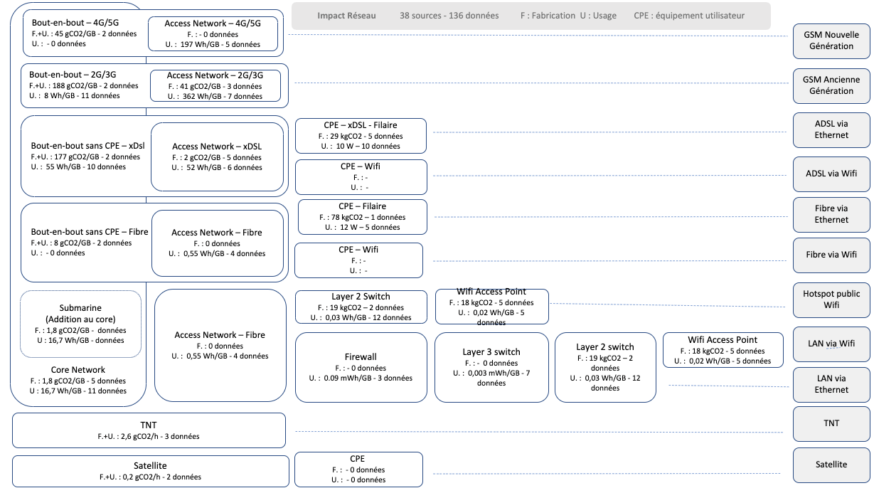
We have modelled the network in several thirds:
The backbone, which interconnects the network
The access network, closer to the user, with specific architectures for each type of connection (3G, fibre, etc.).
CPE (Customer Permise Equipment): Mainly the box on the user’s premises
We have excluded the user terminal from the modelling. We’ll look at how to deal with it specifically at the end of the article.
For access types, we have grouped :
Wired Fibre
Wired Copper (xDSL)
Old generation GSM (2G and 3G)
New generation” GSP (4G and 5G)
Public Wifi (hotspot)
Wifi corporate LAN
Company Ethernet LAN
It would be interesting to go further down the grouping (for example to separate 4G and 5G), but this grouping is adapted to the granularity of the data available.
We analysed 35 public sources (operators’ CSR reports, scientific papers, manufacturers’ data). Each data item identified in the documents was classified according to the 7 types of access, the third of the network, and the scope taken into account (Manufacturing/Usage in particular). 169 data items were identified. We selected 145 (some data did not seem relevant).
The quality of each data item was qualified according to our methodology. 39 parameters were thus qualified (Core network Usage, Core network Manufacturing, etc.) in a format compatible with our methodology (Trapezoidal determination usable in fuzzy logic). For example, for the impact of using the fibre access network, we have the following values: 0.1293 / 0.3181 / 0.7891 / 1.9415. This means that the impact of the fibre access network, according to the literature, is probably between 0.3 and 0.78 Wh/GB.
In the end, the model can be represented as follows:
This model can be used dynamically by specifying certain parameters: EPC lifespan, energy mix, etc. Our API handles this automatically.
What is the likely impact of each network?
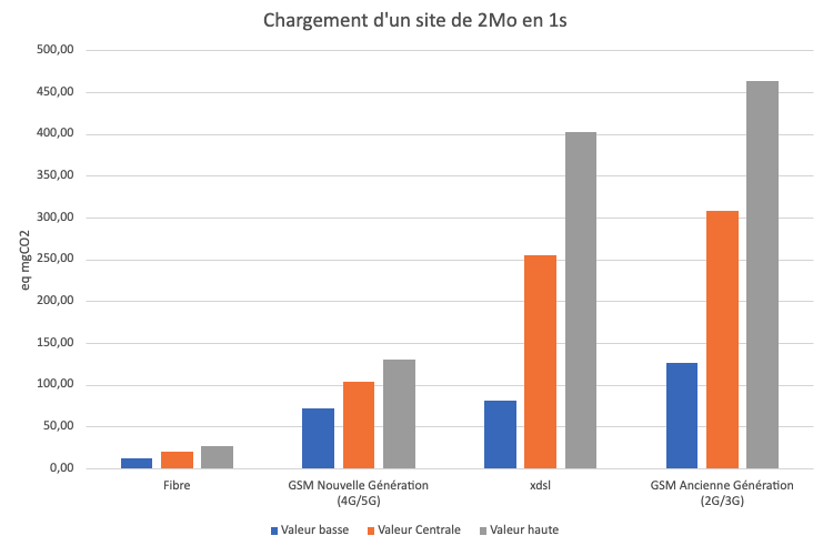
Taking the functional unit “Load a site of MB in 1s”, we obtain the following network impact:
Fibre has much less impact than other types of access. The ranking of 4G/5G ahead of ADSL seems counter-intuitive, especially in view of the messages we regularly hear: Favour wired connection over 4G as mentioned above. This data is wrong for a number of reasons:
The impact of base antennas and the access network of older GSM technologies is indeed more consumptive. The figures for older studies are based on these findings. It is important to adapt the recommendations according to the technologies and the age of the studies.
Some studies talk about the impact of the network on the terminal. For example, the Eco-index documentation states that “(…) a 4G connection requires up to 23 times more energy to transport the same amount of data as an ADSL connection. (..)” However, the source used is a study on the impact of LTE connections on smartphones at cell level. We’ll come back to the reality of smartphones later.
Margins of uncertainty can be observed for XDSL and old generation GSM networks:
This is due, on the one hand, to the older study data (and therefore weighted by our algorithm) and, on the other hand, to a greater diversity of technologies.
The proportion of manufacturing varies according to the technology used:
There has been a marked improvement in the energy efficiency of new-generation networks, and this is a widely cited argument for promoting new architectures.
Critical analysis of network impact data
Despite the model, which takes account of data sorting and qualification, the scope of all the data is not identified. We can find figures with the “raw” manufacturing impact and potentially others with the operator’s scope 3 (the impact of the operator’s offices, among other things). This will be taken into account in the model via the uncertainty margins.
The Co2/GB network intensity model is used. It is not fully representative of reality. In order to improve representativeness, we need more sources for temporal allocation (network throughput, consumption per user, etc.). We have begun to use this allocation mode for certain metrics such as Box data.
There are common elements between networks, and sometimes specific ones (for example, there are specific backbone elements for 5G). This needs to be taken into account.
Even though we have a level of granularity that allows us to take account of the energy mix dynamically, some of the data incorporates the mixes of different countries. This potentially overestimates the value of some data.
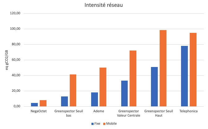
We compared our metrics with other market data (for 1GB).
Greenspector values are higher than NegaOctet and Ademe values (ARCEP/ADEME values are however higher than the low Greenspector threshold). Telephonica data is higher (for fixed) than the high Greenspector threshold (and identical for mobile).
This difference can probably be explained by the fact that we have incorporated many network manufacturing values. A second explanation is perhaps an underestimation of the values for France, which has set its figures at a low threshold. Without getting into a debate, these figures on the impact of the network are often monitored, so the tendency may be to underestimate the figures rather than overestimate them!
Specific
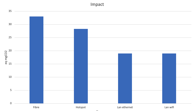
Are connections other than a private box more sober?
Yes, this is because this type of architecture is more shared. On the one hand, the hardware has a higher bandwidth capacity, so a lower allocation per item of data exchanged, and on the other, the impact of manufacturing is relatively low (in terms of capacity).
It should be noted that wifi has a slightly greater impact than ethernet. This is also true of boxes (for example, +3 Wh/h more on an Orange box).
Impact of the network on the terminal
We measure mobile applications and websites every day for our customers, so we deal with the impact of the network on the terminal and above all on the software. What we can say “from expert opinion”, but based on measurements, is that the impact of GSM networks is not 23 times greater, nor 10 times greater.
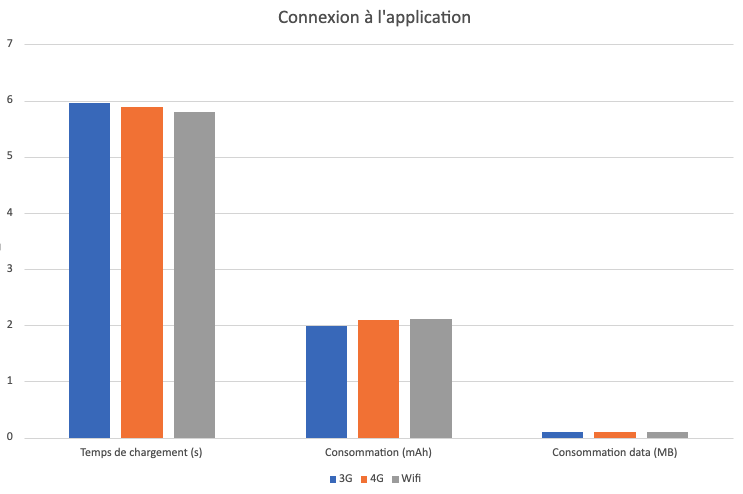
Here’s some measurement data on a streaming application (only the launch and connection to the application, not the streaming itself):
As can be seen for the connection (2nd graph), there is some data (~700 KB) and consumption is almost the same, or even slightly higher for the Wifi connection.
When it comes to loading the application (1st graph), WiFi consumes slightly less. However, there is a high level of data consumption (4MB vs 600kB). This can be explained by the different behaviour of the Wifi application (more data is loaded if the connection is Wifi). This has a major impact on loading times (from 4s to 7s for 3G).
The network will ultimately have an impact, but there are no set rules:
If the application adapts its behaviour to the type of connection and the speed, then potentially more data will be loaded on connections with a higher throughput. And potentially more CPU to process this data.
For 3G/2G connections, the loading time will be potentially longer (sometimes x2 or even x3).
Depending on whether or not requests are grouped together, the impact of GSM networks will be greater or lesser.
It is necessary to measure the final application to understand its behaviour in relation to the network. Implementing estimation rules in models is therefore complex and will lead to false data.
Conclusion
Assessing the environmental impact of the network is complex. We need more data from operators and manufacturers. This data needs to be more detailed and more transparent. However, existing data can be used, provided it is properly qualified and used. Given these observations, the use of averaged data is not an ideal approach. This is why we have adopted an approach that includes calculating uncertainties. As soon as we can, we have to measure in order to have contextualised and more accurate data. This is the approach we apply. This provides important clarifications for LCIs (life cycle inventories), digital impact assessments, or more individually for software evaluation.
With the emergence of transport apps in France, urban mobility has undergone a significant transformation in recent years. Indeed, these mobile applications are among the most downloaded and used by the French. Every major city has an app published by an urban transport company, offering practical, flexible solutions for getting around town. However, behind this ease of use and convenience lies an aspect that is often overlooked: the environmental impact of these applications.
These companies have understood that the development of mobile applications makes it possible to offer services to passengers (timetables, traffic information, transport maps, intermodality), but also to reduce costs by providing ticket sales and stamping services directly integrated into the application on our phones.
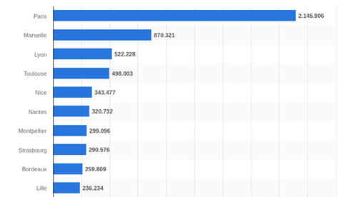
The aim of this study is to measure the environmental impact of transport applications in France’s 10 most populous cities, according to the Statista website:
Bonjour RATP for the Paris region
RTM in Marseille
TCL in Lyon
Tisséo for Toulouse
Lignes d’azur in Nice
TAN in Nantes
TAM in Montpellier
CTS in Strasbourg
TBM in Bordeaux
Ilevia in Lille
These applications differ in terms of user interface, but they all meet a set of essential user needs. We have therefore determined a common user path, enabling us to compare these applications in terms of carbon impact, energy consumption and data exchanged. Finally, in the second part, we analyze the causes of these results.
Ranking of France’s 10 most populous cities in 2020
Methodology
User path definition
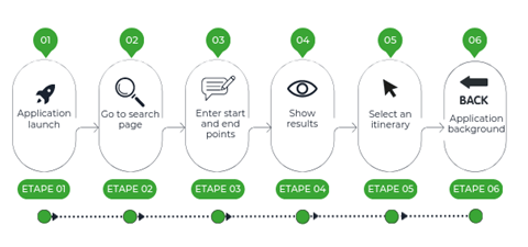
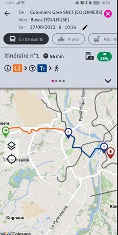
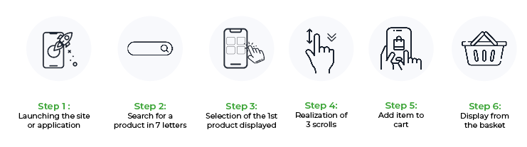
For the measurement, we determined a common scenario compatible for all applications, namely the search for a route from point A to point B (geolocation activated), with the following steps.
Step 1: Launch the application
Step 2: Access to search page
Step 3: Enter route
Step 4: Display results
Step 5: Route selection
Step 6: Application background (30 sec)
For this study, data was measured on June 19, 2023, using Greenspector Studio. We used GDSL (Greenspector Domain-Specific Language) to write test scripts, which automatically reproduce the actions to be performed on a phone. The Testrunner module then enabled us to carry out the measurements on an Android smartphone: we thus obtained energy and resource consumption (memory, CPU, exchanged data) and response times for each step of the journey. Finally, based on these measurements, the impact model integrated into Greenspector Studio evaluates the corresponding environmental impact.
Hypothesis
For this evaluation, we decided to study the behavior of a user who regularly uses the application and therefore searches for his itinerary with as few clicks as possible.
Measurement context
Samsung Galaxy S10, Android 10
Network: Wi-Fi
Brightness: 50%.
Tests carried out over at least 3 iterations to ensure reliability of results
Environmental projection hypothesis
User location: 100% in France
Server location: 100% in France
Devices used: smartphones only
The environmental footprint depends on the location of the application servers, their type, the location of the users and the type of devices they use. We have studied the use of applications only on smartphones and on users present on French soil, as their use is intended only for this part of the population. In the absence of better information, servers were considered to have a medium level of complexity.
Results
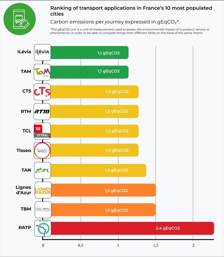
After a detailed analysis, we drew up a comparative table of the results, highlighting the applications with the lowest GHG emissions and those with the largest environmental footprint.
The following results are expressed in g of CO2 equivalent per trip.
The soberest application
Lille’s Ilévia and Montpellier’s Tam are the applications with the lowest impact according to our results. They consume very little energy. The fact that the route measured contains a small number of images and animations explains this figure in particular.
Least sober application
Bonjour RATP comes last in the ranking, but that’s no great surprise. In fact, the application consumes a lot of energy. This enormous power consumption is due in particular to the integration of third-party geolocation services and the large amount of multimedia content (photos, icons, etc.). What’s more, the application offers a host of features right from the home screen, such as scooter scanning.
The application preloads a wide range of content. Even if the user is offline, they can still access the interactive map to search for a station. This is a negative point for the application, as this pre-loading is not a critical step for the rest of the journey. It is irrelevant for the user to load a map that goes beyond the borders of Paris.
Projection for 10,000 regular users
Most apps have between 100,000 and 500,000 downloads on the Playstore. For each city, let’s take 10,000 regular users who use the app every day to make a round trip: this equates to 600,000 monthly visits.
Application (Ville)
Impact per visit (g CO2e)
Impact per day for 10000 users (2x/day) (kg CO2e)
Impact total par an (kg CO2e)
TAM (Montpellier)
1,1
22
8030
Ilévia (Lille)
1,1
22
8030
CTS (Strasbourg)
1.2
24
8760
Tisseo (Toulouse)
1.2
24
8760
RTM (Marseille)
1.2
24
8760
TCL (Lyon)
1.2
24
8760
TAN (Nantes)
1.3
26
9490
Azur (Nice)
1.5
30
10950
TBM (Bordeaux)
1.5
30
10950
RATP (Paris)
2.4
48
17520
The table shows the carbon impact of a single visit in g CO2e and presents the projection of twice-daily use for 10,000 users in kg CO2e. Finally, the projection is made over a one-year period using the same unit.
For low-impact applications such as TAM or CTS, such annual use represents 8.03 tonnes of CO2e. This is equivalent to more than 36,903 km driven in a light vehicle, according to Ademe’s Impact CO2 website.
For the RATP, by far the biggest contributor, the impact is more than double, amounting to 17.5 tonnes of CO2e per year. This is equivalent to over 80,000 km in a light vehicle.
According to the Ministry of Ecological Transition’s Bilan annuel des transports en 2019, a car registered in mainland France has driven an average of 12,200 km over the year. The impact of a sober transport app used by 10,000 people 2 times a day represents the annual emissions of more than 2 light vehicles, while the impact of the RATP represents the annual emissions of around 7 vehicles!
One-year impact projection
According to the RATP Group website, the Bonjour RATP application is visited by 2.5 million unique monthly visitors and generates over 20 million monthly visits. If we assume that each visit includes at least one route search, we can obtain the app’s monthly carbon impact.
This represents 48 t CO2e per month, or more than 220,000 km by car.
But what causes these impacts?
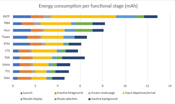
In this second part, we analyze where these environmental impact values may come from. Using energy consumption and data exchanged over the network during the user’s journey, applications are again ranked according to their energy consumption.
Application
launch
Incative foreground
Access route page
Input departure/arrival
Results display
route selection
Inactive background
TAM
0,4
1,2
0,1
1,3
0,3
0,2
1,1
TCL
0,6
1,1
0,3
1
0,3
0,5
1,2
ILévia
0,6
1
0,2
1,4
0,3
0,4
1,2
TAN
0,6
1,1
0,1
1,7
0,4
0,5
2
CTS
0,5
1
0,2
2,2
0,4
0,4
1,1
RTM
1,5
1,1
0,3
1,6
0,2
0,3
1,1
Tisseo
1,3
1,1
0,2
1,9
1
0
1,1
Azur
1,6
1
0,2
1,8
1
1,5
1
TBM
0,8
1,1
0,6
2,7
0,4
1,5
1,1
RATP
1,6
1,1
0,7
5,8
1,8
0,7
1,2
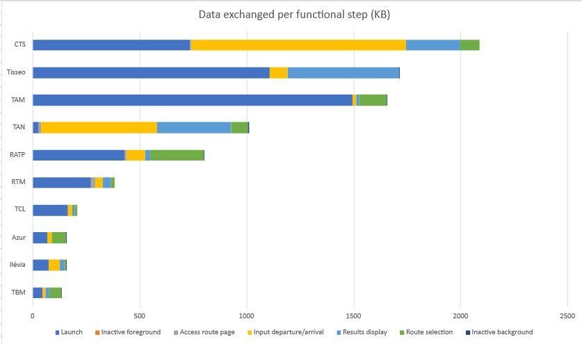
The graph above compares the different stages (apart from a few pauses) of each route measured in terms of energy consumed.
We notice that the pauses in the foreground are generally consuming, i.e. the user is present on the application’s home screen but without performing a single action. This can be explained by the fact that the launch is not long enough to generate all the content, so that even when inactive after being launched, it continues to generate content such as the little bus station icons, for example. It’s also possible that the user’s location is constantly being sought, as evidenced by the activity on the background pause stage.
We also note that background applications consume almost the same amount of energy in all measurements.
The most time-consuming step is the entry of the start and end points of the user’s itinerary, due to the search and loading of the itineraries entered for the section. Indeed, on many transport applications, it is necessary to perform several actions, or even load new pages for each entry step, whereas on other applications, entry is directly accessible from the home page. For example, CTS and Ilevia.
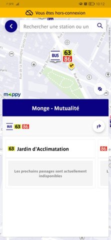
A disparity in consumption is also observed at the route selection stage in the applications. Some applications, such as Tisseo, directly propose the only route available in the next few minutes.
Moreover, RATP displays a route page access step that consumes much more power than the others. Some applications that display zero consumption at this stage simply don’t load a new page, as this functionality is present on the home page. The user’s journey is optimized by reducing actions, thus reducing energy consumption. This is the case with Tisséo, which has no results page to display the different routes. Instead, the application directly suggests the shortest route, as seen in the screenshot below.
One notable observation concerns the route entry stage, where Ratp stands out for its higher energy consumption, being 5.8 times more power-hungry than the TCL. This excessive consumption could be attributed to trackers and integrated third-party services.
Finally, on the Azur application from Nice and TBM from Montpelier, the route display stage consumes more energy than the others. This may be due to the map generated for this display being uncompressed or loading beyond what is necessary, i.e. beyond the limits of the city’s transport network.
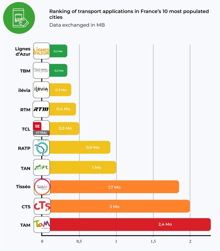
In terms of data exchanged, the CTS, Tisseo and TAM applications are the least frugal. TAM exchanges 2.4 MB, twice the average for all applications. The best performers in terms of data exchanged are Azur, Ilevia, TCL, RTM and TBM, which consume less than 0.5 MB.
According to Green IT, the average size of an e-mail is 81 Kb. So, on average, a route search is equivalent to the exchange of 12 e-mails.
According to our tool, during the launch stage of most applications, a significant amount of data exchange occurs to ensure a smooth and responsive user experience. However, some applications, such as TAN, have chosen to adopt a progressive data loading approach. This means that only essential information is retrieved initially, while other data is loaded as the application is used.
As mentioned earlier, the RATP application loads a lot of content at launch, as does TAM. This can be seen when the application is launched offline, with the map already loaded with metro and bus stations and stops, for example.
Are all these third-party services necessary?
The integration of third-party services will depend on the specific benefits they bring, their relevance to end-users and the overall impact on application performance and technical complexity. Testing, performance monitoring and user feedback are recommended to assess the effectiveness of third-party services and make informed decisions.
Conclusion
A study of the environmental impact of transport applications in France’s 10 largest cities reveals contrasting results. Some applications, such as RATP, TBM and Azur, have less sober journeys and consume more energy, which can have a negative impact on the environment. On the other hand, applications such as Azur, Ilevia and TAM stand out by consuming less data and energy.
It is essential that designers and product owners of transport applications become aware of the impact their solutions have on the environment, and look for ways to reduce their ecological footprint. Adopting best practices in terms of digital sobriety and carbon emissions reduction can help mitigate the environmental impact of these applications.
Just ten years ago, the subject of the environmental impact of digital technology was confined to a handful of specialists. Over the past few years, however, the subject has gained considerable momentum, particularly in France but also internationally. While some people are (rightly) concerned about the preponderance of discourse around net zero and carbon neutrality, this trend is merely a symptom of a biased approach to the subject.
Reducing a global crisis to a technical problem
The climate emergency is a key issue that has gained enormous momentum in recent years. The digital sector has not been spared, and studies and tools have made many people aware of the issue. The problem is alarming, but also complex, which is why some aspects have been lost along the way in favor of broader awareness.
In the case of digital services, it is understood that an LCA (Life Cycle Assessment) is an excellent way of estimating environmental impacts, but the process can prove cumbersome and costly. Defining the scope, selecting the indicators, collecting and analyzing the data. The complexity is all the more difficult to take into account when you want results quickly and, preferably, easily communicated. So, to gain in efficiency, some choose to measure only part of their digital services, thanks to easy-to-use tools. In just a few clicks, you have your answer and can share it.
This is also why solutions are being developed that analyze code to suggest ways of improving it to reduce its environmental impact. Some are even beginning to rely on artificial intelligence for this purpose.
It’s also what prompts some to optimize where their code will be executed, to move towards a location where energy has less impact from an environmental point of view (taking into account, of course, only greenhouse gas emissions). And what can’t be avoided or reduced can always be compensated for.
In the end, it’s all very human. Faced with a complex and urgent problem, we try to simplify and adopt or find a quick solution. That’s not a bad thing, but we can’t stop there. All the more so when some people rely on claims of “net zero” and carbon neutrality to artificially draw a finish line that can be reached via clever calculations and investments, whereas the problem is systemic by nature.
The risk here is of optimizing one indicator while degrading others that we didn’t have in mind (for example, requesting a data center presented as carbon neutral without taking into account its impact on water resources). As a result, we’re increasingly asking ourselves whether a sober site is necessarily ugly, without realizing that it’s not always accessible. Or really sober, for that matter.
Reminder
The environmental impacts of digital technology are not limited to greenhouse gas emissions. As we see in LCA, the indicators to be taken into account are much more numerous and varied. Little by little, we are also having to take into account the criticality of certain mineral resources, as well as that of water (as we saw recently with ChatGPT and Google’s data centers).
The environmental impact of digital services doesn’t just come from the code. In fact, according to GreenIT.fr, only around 20% of the impact comes from the code. Which makes perfect sense. Through code, we seek to improve efficiency (doing better with less). The real levers for reduction are to be found in the other stages of the lifecycle, notably design, strategy and content production. In this way, we can move towards sobriety for good.
Finally, the impacts of digital technology are not only environmental, and this is the heart of Responsible Digital. We need to keep in mind the impact on the individual (via accessibility, security, personal data management, the attention economy, ethics and inclusion). So, managing the climate emergency can only be done with an intersectional approach.
But how?
The technical approach is not necessarily bad in itself. It’s a good thing to have effective solutions to improve the efficiency of digital services (as long as we keep in mind the possible side-effects). Sometimes, it’s even an excellent starting point for taking initial action, initiating a continuous improvement process and getting to grips with the subject.
As we’ve already seen when examining the offerings of web hosting providers, the reality of the environmental impact of digital technology is more complex than it might seem. The problem won’t be solved with a single click, and perhaps that’s just as well. In fact, it’s an opportunity to rethink digital technology, the way we use it and the way we think about it. These constraints may well give rise to a digital world that is more respectful not only of the environment, but also of individuals.
The uses and functionalities of social networks are expanding, as are their communities and the time spent on our screens. Trends, corporate marketing and new channels of influence are all factors that are multiplying user connection and usage time.
We are social’s Digital report France 2023 estimates that 92.6% of French people are connected to the Internet. This represents an increase of +1% compared to 2022, or 600,000 people, over 80.5% of whom are present on social networks. The environmental impact generated by social networks is evolving with the increase in the number of people and time spent on applications. This implies a greater level of responsibility on these massively used digital services to assess and reduce their generated impacts. Is there an eco-responsible social network in the world? How can we raise the awareness of application publishers, and perhaps even their users? To answer these 2 questions, there’s nothing like a little consumption measurement and impact projection.
As not all these networks work in the same way, we chose to remeasure a use case common to all of them, namely, browsing and reading a news feed from the 10 most popular social network mobile applications in France.
Méthodology
Choice of social networks studied
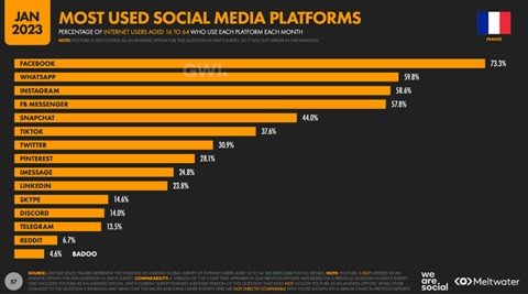
The 10 most popular social networking applications among the French are: Facebook, Instagram, LinkedIn, Pinterest, Reddit, Snapchat, TikTok, Twitch, Twitter and Youtube. We have used We are social statistics from January 2023 to project environmental impacts.
Given the use case selected, we’ve focused on social networks with a news feed, which excludes messaging applications such as Whatsapp, Messenger, Imessage, Skype, Discord and Telegram. You’ll probably find them in a future article 😉
User path definition
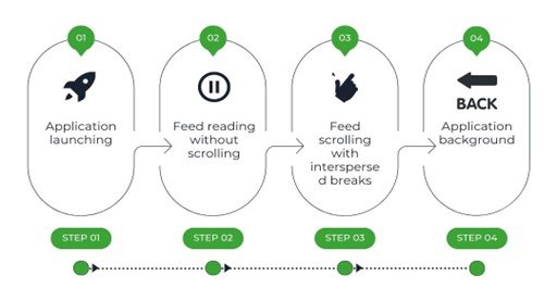
We evolved the user journey by creating a news feed scrolling scenario with the following steps
Step 1: launch the application
Step 2: read news feed without scrolling (30 sec)
Step 3: News feed scrolls with pauses.
Step 4: application background (30 sec)
This path consists of a 2-second scroll followed by a 1-second read (pause), all repeated and weighted over a 1-minute duration.
Regarding Snapchat, its operation forced us to consider a click and not a scroll scenario, but not calling into question the pause and content scroll times. What’s more, the chosen news feed is the stories page, which is not the application’s home page. In order to have comparable scenarios, the step of accessing the stories page was not measured on this path and therefore not included in the impact generated.
The pauses in scrolling through the news feed simulate the most realistic reading behavior possible. This path does not transcribe the most frequent uses on these platforms (reading a post or associated rich content, a video, reaction, generated exchange, ….) but it does give us an indication of the level of sobriety of the applications.
For this study, data was measured using our Greenspector Test Runner solution, which enables automated tests to be carried out locally on smartphones.
We measured resource consumption (energy, memory, data) and response times. These data were then used to calculate the environmental impact of the applications.
Please note that the methodology used in this study compares only the scrolling of the most common news feeds. This means that the comparison is not necessarily equivalent, as some news feeds focus on video scrolling and others on multimedia posts (text, image, video, animated gif, etc.).
Measurement context
Samsung 10, Android 10
Network: Wi-Fi
Brightness: 50%.
Tests carried out over at least 3 iterations to ensure reliability of results
Assumptions used for environmental projections
User location: 100% France
Server localization: 100% worldwide (in the absence of information for each application)
Devices used: 100% smartphone
Server type: 100% complex
The environmental footprint depends on the location of application servers, their type, the location of users and the type of devices they use. We have decided to study the use of applications only on smartphones and on the share of French users.
Top and flop apps in France according to results
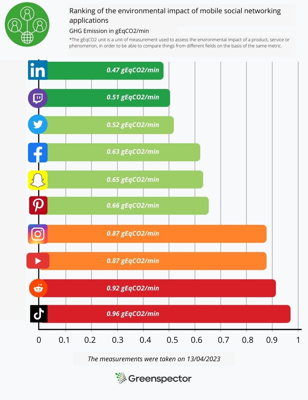
The graph below ranks the various social networking applications according to the environmental footprint of the path we defined above.
The less sober app
Tiktok comes last in the ranking, but that’s no great surprise. In fact, the application is very energy-hungry, consuming 22.4 mAh at launch and exchanging a lot of data as it scrolls through the news feed. This enormous exchange is due in particular to the constantly running video launch and the many advertisements present on the application.
The application preloads a wide range of content, so if the user is offline, he or she can still access the videos. Tiktok loads around 5 MB of data for 30s after launch, equivalent in this test to 10 preloaded videos.
The most sober application
LinkedIn is the least impactful application according to our results. It exchanges a very low volume of data when the application loads, as well as when scrolling through the news feed. The fact that the social network is focused on sharing text-based posts with a low amount of photos and videos explains this score in particular. What’s more, LinkedIn consumes 13.9 mAh of energy, 15% less than the other applications on the panel.
Other applications preload less content, and often less volume. A preloaded video consumes more energy and generates more data exchanges than a preloaded text post.
One-year projection of the impact of the 2 applications most used by the French
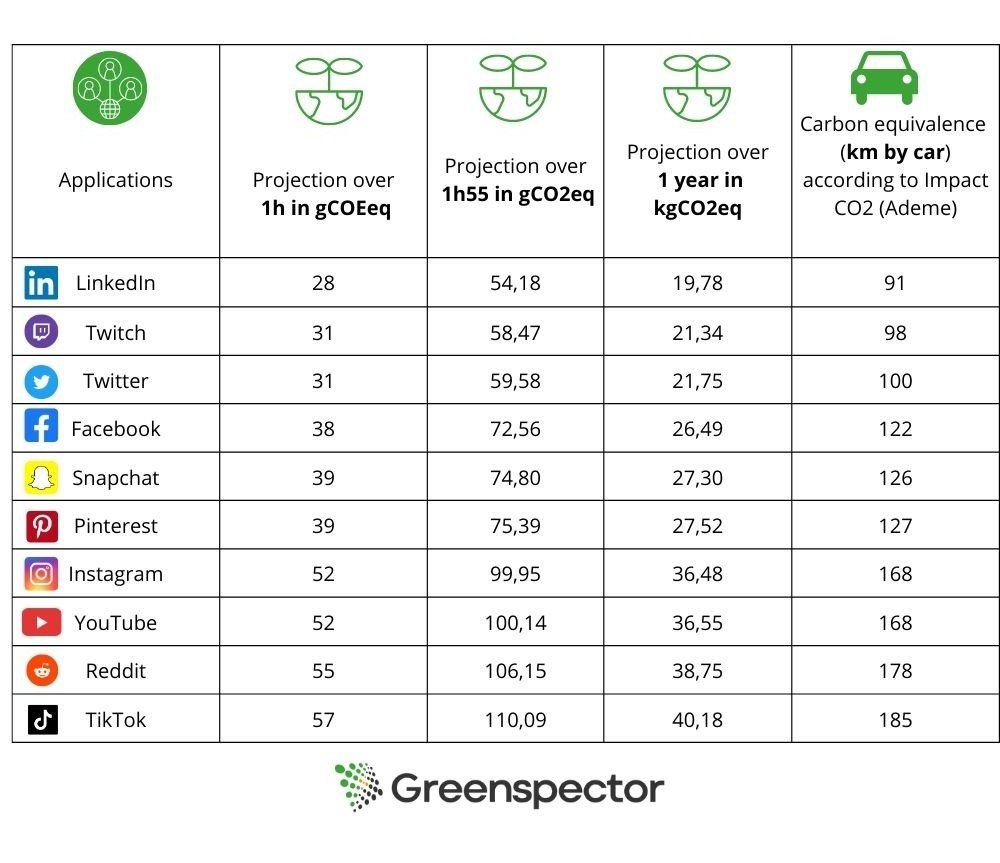
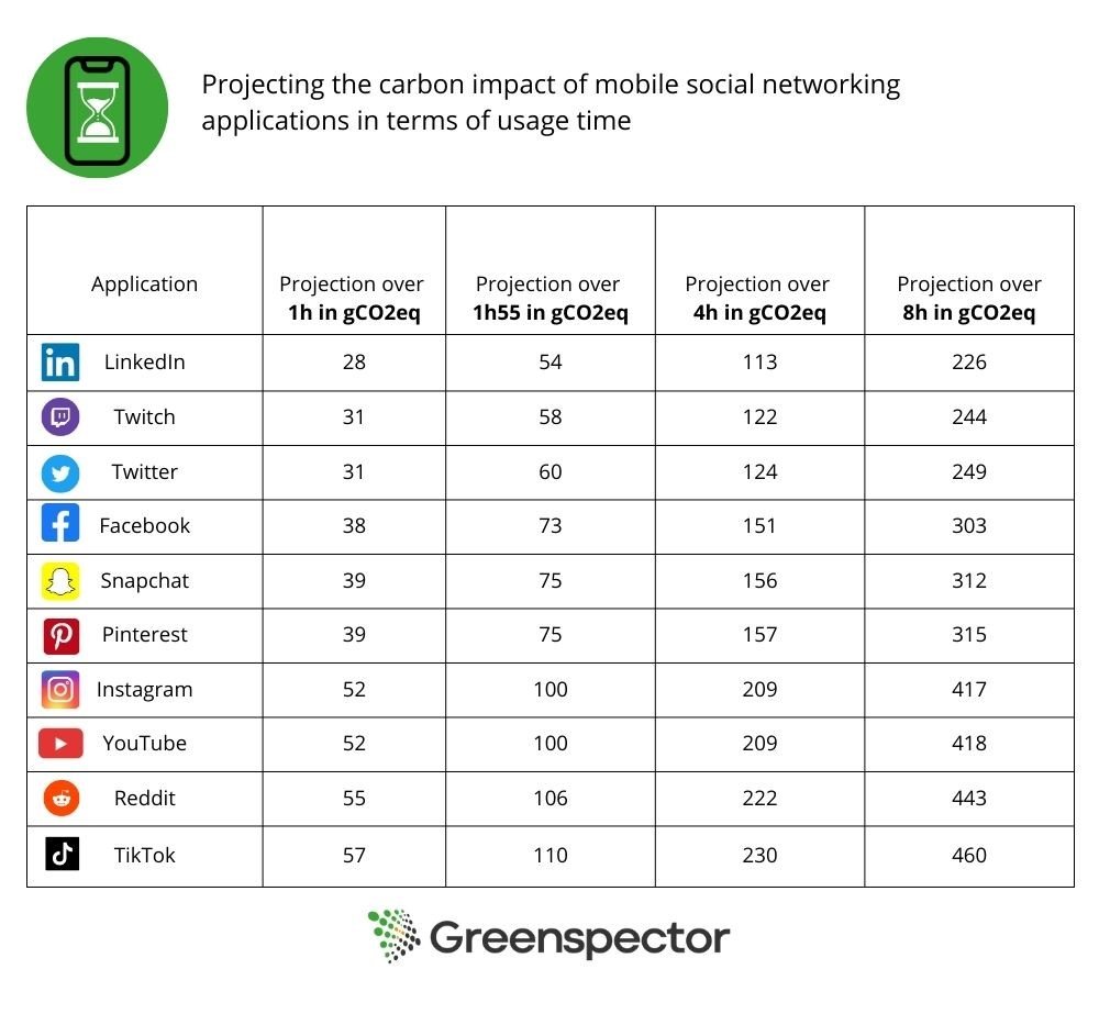
According to the We Are Social annual report, the average time spent on social networks is 1h55 per day. When we project the environmental impact over one year for each application, the environmental impact represents 20 to 40 kg eqCO2 depending on the social network. This represents 185km by car for the least sober network.
According to Ademe’s Impact CO2 website, which offers an online converter, approximately 200g CO2eq = 1km. This includes direct emissions, vehicle construction (manufacture, maintenance and end-of-life) and the production and distribution of fuel and electricity. Infrastructure construction (roads, railways, airports, etc.) is not included in this calculation.
We have chosen to compare the 2 applications most used by the French, namely Facebook, which has around 38.1M users, and Instagram, which has around 30.5M users.
Facebook
The report states that 52 million people in France are present on social networks. Facebook is the most popular social network among 16-64 year-olds (73.3%). If we multiply Facebook’s environmental impact by the number of French users present on this platform (approx. 38.1M), this represents more than 24 tonnes eqCO2/min (or the production of 773 smartphones/min). That’s almost 1M tonnes of eqCO2 per year!
Instagram
Instagram is the 2nd most popular social network among 16-64 year-olds after Facebook. If we multiply Instagram’s environmental impact by the number of French users present on this platform (58.6%), this represents more than 26.5 tonnes eqCO2/min (or the production of 853 smartphones/min). That’s over 1.1M tonnes of eqCO2 per year!
We can see that despite a gap of almost 8 million users, Instagram has a greater carbon impact than Facebook.
It’s worth pointing out that the amount of time devoted to social networking varies according to the audience concerned. Some people spend less time on them, while others spend considerably more, sometimes up to 8 hours a day.
The table below projects the carbon impact in terms of uptime.
What about international projection?
With an average time spent on social networks of 2 hours and 31 minutes across all networks, we estimate the consumption of these applications worldwide.
Facebook has 2.958 billion users worldwide, making it once again the most popular network. The daily consumption of a user spending an average of 2h31 on this network would be around 95g eqCO2. For the almost 3 billion Facebook users who spend an average of 2h31 a day on this social network, the platform would have an environmental footprint of more than 281,000 tonnes eqCO2/day, or more than 102 million tonnes eqCO2 a year!
Internationally, Instagram has around 2 billion users. Per day, the consumption of a user spending 2h31 on Instagram would produce around 132g eqCO2. On the scale of 2 billion users, this would represent 262,000 tonnes eqCO2/day, or almost 96 million tonnes per year.
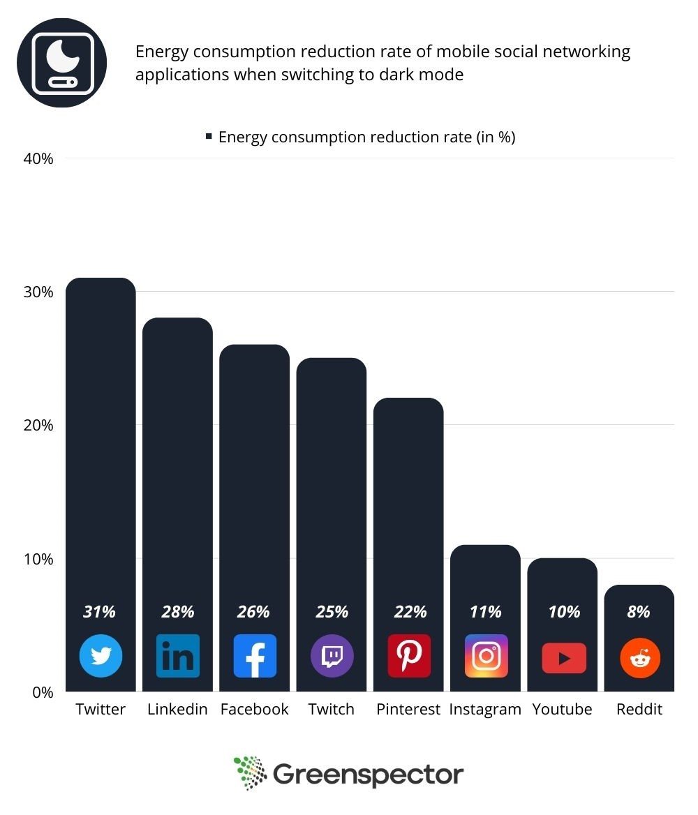
And what happens if we use a dark theme?
We carried out our measurements a second time with the applications in dark mode, so as to be able to compare the energy impacts generated.
The measurements were carried out on a Samsung S10, equipped with AMOLED technology, known for the fact that a dark pixel is actually a partially extinguished pixel, which explains why dark modes reduce power consumption. Conversely, when the screen uses LCD technology, color has no influence on consumption, which explains why dark mode is no more energy-efficient than light mode, see article here.
RS visuel – 9
Nowadays, more and more phones are equipped with AMOLED screen technology, and it’s worth activating the dark mode to reduce power consumption and preserve battery discharge.
In this study, we noticed that only 8 of the 10 applications studied offered dark mode. Snapchat and Tiktok didn’t, so we excluded them from the measurements. As their interface is based on scrolling videos and photos only, only a few pages such as messaging would lower the energy consumption measurement.
Application
Energy consumed in light mode /1 min(mAh)
Energy consumed in dark mode /1 min(mAh)
Energy consumption reduction rate
Twitter
12,2
8,5
31%
LinkedIn
11,7
8,5
28%
Facebook
12,5
9,3
26%
twitch
10
7,5
25%
Pinterest
11,3
8,8
22%
Instagram
13,2
11,8
11%
YouTube
13,4
11,9
10%
Reddit
14,1
13,1
8%
It can be seen that activating the dark mode reduces the energy consumption measured on the battery.
We can see that when dark mode is activated on the application, energy consumption is reduced by an average of 20%, and the rate of battery discharge is therefore reduced by an average of 18%, relative to their equivalents in light mode.
On text-heavy applications such as Twitter, LinkedIn and Facebook, dark mode is more energy-efficient, as it inverts the colors of a block of text, turning it into fine white writing on a black background. On the other hand, images and videos will not have their colors inverted, so there will be little difference when displaying multimedia content.
darkmode consumption
Conclusion
In this study, we observe that the GHG impact is around twice as great between the most and least impacting platforms.
Applications with a lot of multimedia content consume a lot of energy and require a lot of data exchange over the network to display this content. Text-based content, on the other hand, is much easier to load and consumes much less energy.
In conclusion, although social networks facilitate the exchange and accessibility of information, they are not as totally virtual as we might think, and raise the question of our relationship to the consumption of these applications. Are we really using them to communicate and inform ourselves, or rather to feed on a barrage of information and content that is generally neither desired nor expected?
At a time when climate change is a matter of urgency, it’s time to examine our relationship with our screens and adopt eco-friendly gestures, such as reducing time spent online and activating dark mode on mobile applications.
If you’re an application publisher, you also have a role to play! Here are a few ways in which you can reduce your impact:
Default to dark mode when downloading the application
Avoid massive pre-loading of heavy content
Avoid auto-starting videos or auto-re-launching at the end of videos
The world of football is one of the most popular and influential sectors of our society. Millions of fans come together every week to support their favourite team and experience moments of passion and excitement. However, it’s time to be aware of the environmental consequences of this all-consuming passion. In this article, we will look at the eco-design practices of the applications of the 4 semi-finalist clubs in the 2022-2023 Champions League.
Calculation methodology
In our comparative study of the mobile applications of the 4 semi-finalists in the Champions League, we examined various aspects, such as the size of the applications, their compatibility and the greenhouse gas (GHG) emissions caused by their use. The results highlight significant differences between the applications, underlining the importance of implementing an eco-design approach.
First of all, the vast majority of a smartphone’s environmental impact is due to its manufacturing phase. A great deal of energy and materials, some of them rare, have to be used in the manufacture of the product. Consequently, to effectively reduce the impact of a mobile application, it is necessary to ensure that it does not force users to change phones in order to obtain a suitable user experience. This involves a number of criteria, including but not limited to the following:
Compatibility: an application must be compatible with all users. For example, an application that is not compatible with a version lower than Android 8 would prevent 7.1% of Android owners from using the application.
Battery use: battery wear and tear is one of the main causes of the need to buy a new phone. One of the factors that wear out the battery is the number of charge/discharge cycles the phone goes through. It is therefore essential that using the application does not require too much energy so as not to accelerate the draining of the battery.
Performance: this criterion corresponds to the application’s response time. There are 2 reasons why this criterion needs to be taken into account. Firstly, the aim of an eco-design approach is to enable users who do not wish to renew their phone to have a pleasant user experience, even on older devices. Secondly, longer loading times mean more electricity used, and therefore faster wear and tear on the battery.
Application size: this indicator has 2 different impacts. Firstly, when the application is downloaded, a large application requires more data to be exchanged. Secondly, users who want to keep their phone for a long time may have to deal with problems of memory shortage. In order to encourage this sobriety approach, the amount of memory used by the application needs to be as small as possible. In this article we will focus solely on the size of the application, but a sober approach must also be taken to all the data stored on the phone, such as good cache memory management.
During an environmental impact analysis at Greenspector, we examine all these points to provide recommendations that will enable our clients to gain an accurate picture of their situation and reduce their environmental impact.
Analysis of results
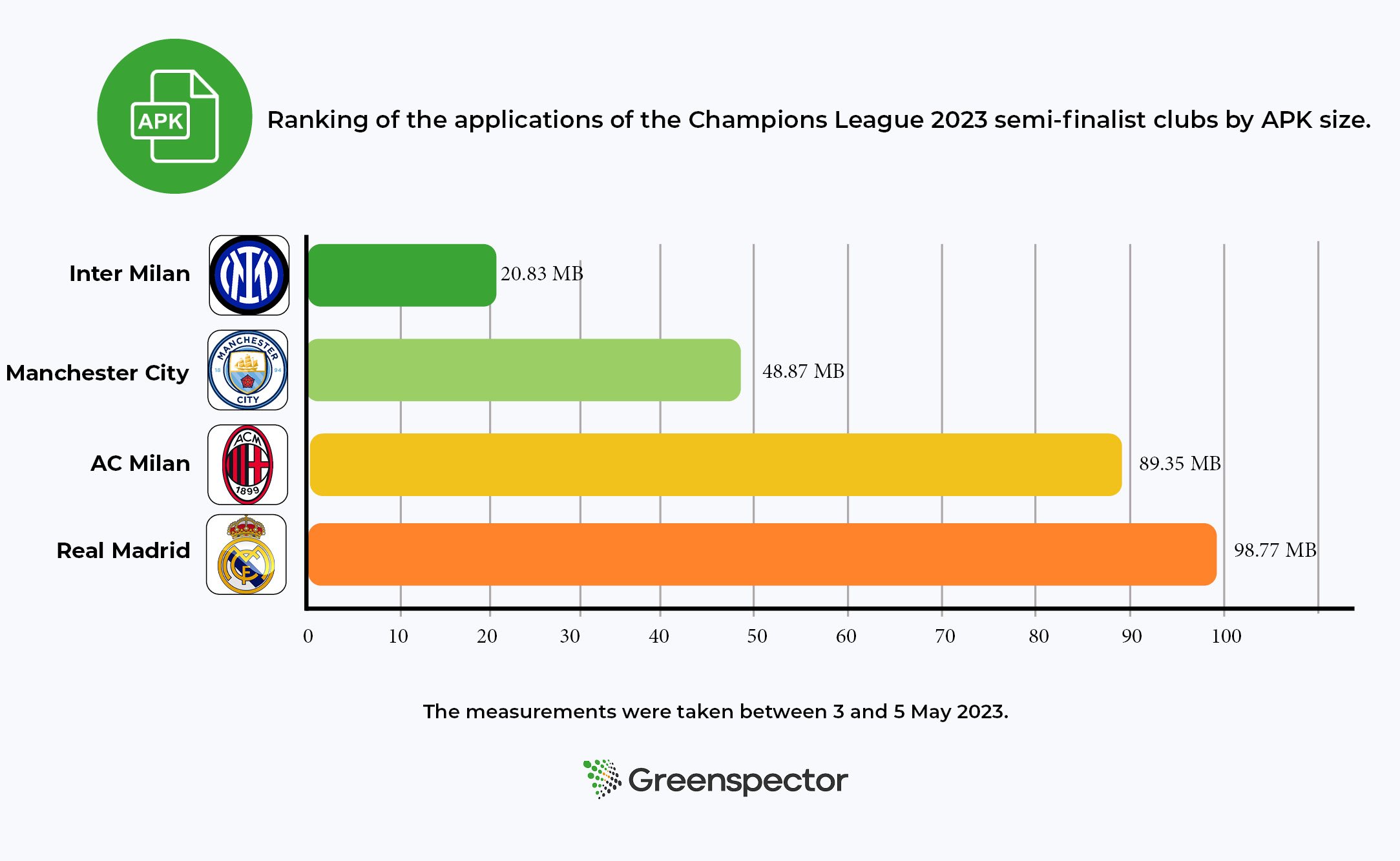
Comparison of application sizes
First of all, we evaluated the size of the APK files of the selected applications. We found considerable variations in their size, ranging from light, space-saving applications such as Inter Milan to larger ones such as Real Madrid. These differences can have an impact on mobile device storage memory and data consumption when downloading and updating applications.
The size of the application may vary depending on the phone. The following results were obtained with a Samsung S10 running Android 12.
Application compatibility comparison
Another key criterion we looked at was the compatibility of applications with different versions of Android. We found that some applications were designed exclusively for more recent versions, limiting access for users with older devices. This incompatibility often leads to frequent replacement of devices, which can waste natural resources and increase electronic waste.
Club
Minimum Android version required
Percentage of Android phone owners able to download the application
Real Madrid
Android 6.0
97,9%
Manchester City
Android 6.0
97,9%
Inter Milan
Android 7.0
96,2%
AC Milan
Android 5.0
99,3%
Comparison of greenhouse gas emissions
Explanation of our methodology
To assess the greenhouse gas emissions of applications, we have followed a rigorous methodology based on data measured on real phones concerning the energy consumption of mobile devices, execution time and the quantity of mobile data exchanged. Using this measured data and a model developed by our teams, we are able to estimate CO2 emissions. For a more detailed explanation of the methodology, please see our dedicated article.
Defining the journey
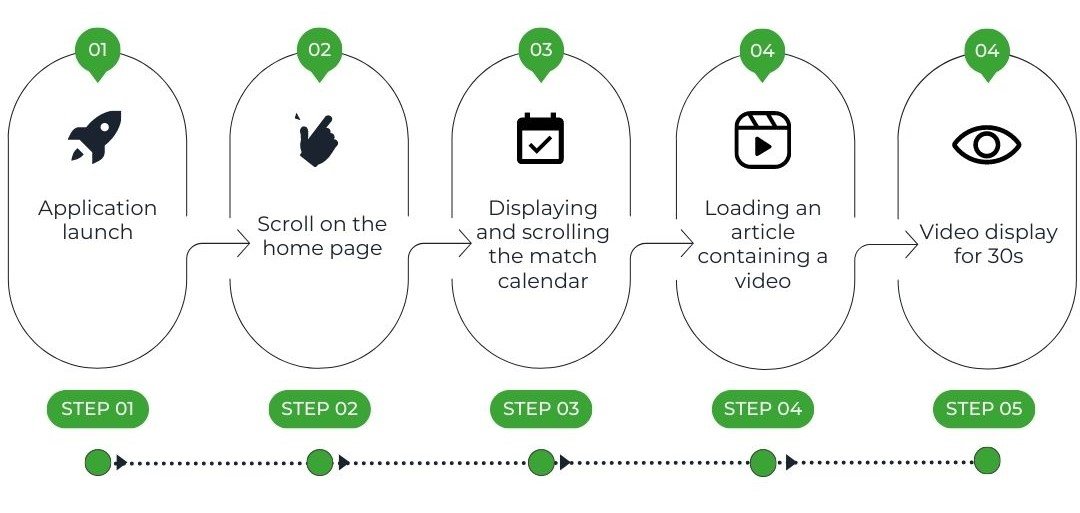
These measurements were carried out on the basis of a user journey that we divided into short steps. The criterion for choosing this journey was that it could be carried out on all 4 applications so that a comparison could be made:
These different steps give us a view of several elements that are typically present in a mobile application, such as a scrollable page, a complex element (a calendar in this case) and a video. The launch steps is also very important, as it can provide us with essential elements of understanding, such as data caching or the time taken to launch the application.
In order to obtain the most reliable measurement possible, we are creating a script to automate the execution of 3 identical series of tests.
The results
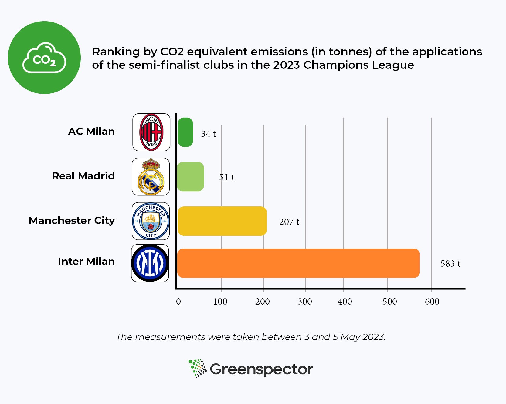
After carrying out a detailed analysis, we drew up a comparative table of the results, highlighting the applications with the lowest GHG emissions and those with the largest environmental footprint.
The following results are expressed in tonnes of CO2 equivalent.
The results obtained show a wide disparity between applications, demonstrating the extent to which the way in which an application is designed and developed has an impact on greenhouse gas emissions. In order to keep this article succinct, we are only going to analyse one element that explains this difference. But bear in mind that the analysis can (and should) be taken further to highlight all the critical points of the applications.
In addition to our study on CO2 emissions, it should be emphasised that the environmental impact of applications goes beyond greenhouse gas emissions alone. Experts such as mining geologist Aurore Stéphant have highlighted other aspects to consider when assessing the ecological footprint of the digital sector. In a recent conference entitled “Mining rush in the 21st century: how far will the limits be pushed?“, she addresses crucial issues such as the consumption of natural resources in the production of smartphones, the extraction of the minerals needed to manufacture them, and all the waste resulting from mining. There are many ethical issues to consider in our use of digital tools.
Video impact
During our comparative analysis, we identified a subject that largely explains the differences in environmental impact: video. Videos have become a central element in many applications, and their growing consumption is contributing to the increase in greenhouse gas emissions from the digital sector. The growing popularity of high-resolution video is leading to intensive use of hardware resources on mobile devices. Smartphones need to be equipped with more powerful processors and batteries to process and display this content, which can lead to more frequent replacement of devices. What’s more, they need servers to store and distribute the content, as well as solid network infrastructures to enable smooth streaming. These servers and infrastructures have material and energy requirements at the time of manufacture, and consume a significant amount of electricity.
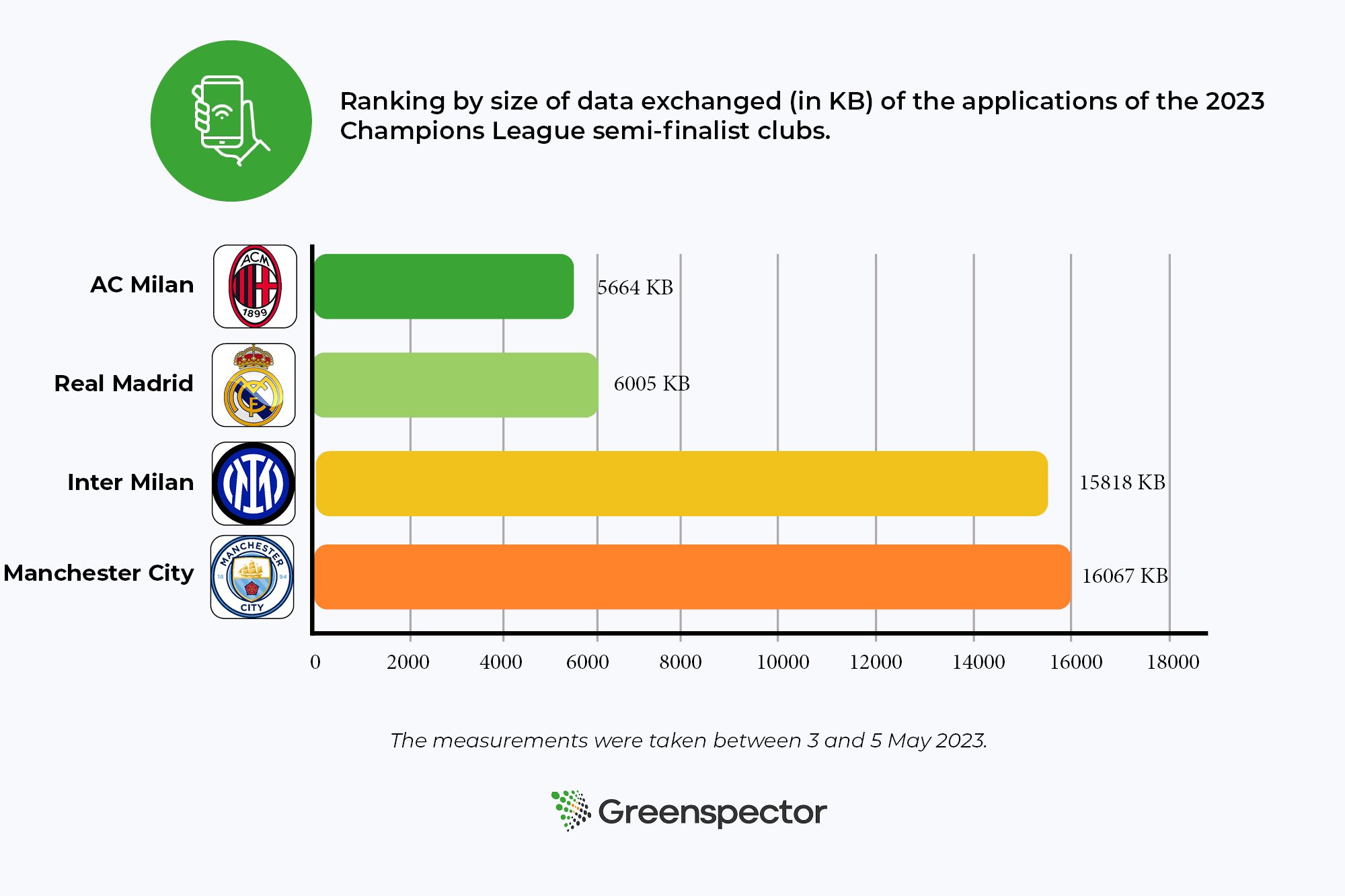
In this case, we see the following results for the amount of mobile data exchanged for each application:
Club
Amount of mobile data exchanged
Test execution time
Real Madrid
12.4 MB
3min 52s
Manchester City
73.3 MB
4min 08s
Inter Milan
211.3 MB
3min 57sec
AC Milan
5.8 MB
4min 01s
If we take the case of Inter Milan, we can see that this application consumes much more data than its competitors. There are several reasons for this:
Non-optimisation of the video: the results of the 30s video viewing steps are very interesting because they allow us to compare the data exchanged by the applications for a single video.
Autoplay: feature commonly used on websites and streaming platforms to automatically launch videos or multimedia content as soon as the user accesses a page or application. This practice has a significant environmental impact. Autoplay leads to increased energy consumption, as videos are launched and loaded automatically, even if the user is not actually watching them. The case of the Inter Milan application is quite striking in this respect, as autoplay is activated on all pages containing video. This is particularly the case on the home page, which means that a lot of data is exchanged each time the application is used, even if the user only wants to watch the score of a match.
Video consumption plays a major role in the differences in environmental impact between applications. Mobile developers can help to reduce this impact by optimising video compression, favouring low-resolution delivery by default and encouraging responsible use of video functionalities. Users, for their part, can adopt more conscious viewing practices and limit their video consumption wherever possible. A combination of efforts from all the players involved can contribute to a more sustainable and responsible use of mobile applications.
Video optimisation solutions
Fortunately, solutions do exist and a more in-depth analysis can drastically reduce the impact of videos on the environment.
One approach is to optimise video compression. By using efficient codecs and advanced compression algorithms, it is possible to reduce the size of video files while maintaining acceptable visual quality. This reduces the demand for bandwidth when broadcasting videos, thereby reducing the CO2 emissions associated with their transmission. Intelligent management of video resolution can also help to reduce the carbon footprint of applications.
Alongside these technical measures, it is also important to encourage responsible use of video. Making users aware of the environmental impact of excessive video broadcasting, and encouraging them to adopt practices such as limiting background streaming and reducing resolution when high quality is not required, can have a significant effect on reducing CO2 emissions.
Finally, by combining technical solutions with responsible practices on the part of users, it is possible to considerably reduce the environmental impact of videos in mobile applications. It is essential that developers, content providers and users work together to encourage more sustainable and responsible use of this popular and ubiquitous feature. By acting collectively, we can preserve the quality of our digital experiences while minimising our impact on the environment.
Conclusion
The 2023 Champions League semi-finalists, Real Madrid, AC Milan, Inter Milan and Manchester City, need to consider the environmental impact of their operations. While these clubs enjoy a global reputation and a passionate fan base, it is essential to recognise the environmental footprint associated with their operations, including the use of mobile applications. However, it is encouraging to see that solutions exist to improve this situation. By better understanding these aspects, we can identify opportunities to reduce the ecological footprint while improving the user experience. We are ready to support these clubs as they move towards greater environmental sustainability. Together, we can develop appropriate strategies, implement innovative practices and promote environmental awareness among fans. The aim is to create a genuine synergy between sport and the protection of our planet.
Players in the world of sport, measure the ecological footprint of your application now and take concrete steps to reduce your environmental impact. Together, let’s score goals for sustainability and protect our sport and our planet.
For each site and each application, measured on a Samsung Galaxy S10 (Android 12), the measurements were carried out using scripts based on GDSL (Greenspector Domain-Specific Language). This language is used to automate actions to be carried out on a phone. The measurements were carried out between 3 and 5 May 2023.
Each measurement is the average of 3 homogeneous measurements (with a small standard deviation). The power consumption measured on a given smartphone using a wifi network may be different on a laptop using a wired network, for example. For each iteration on the websites, the cache is emptied beforehand.
On the footprint projection side, the parameters taken into account for these rankings are :
Viewing ratio: 100% Smartphone
Viewing ratio: 100% Worldwide
Server location: 100% Worldwide
The number of users considered for the calculation is 100,000 per day.
In order to reduce the impacts of fonts, several best practices are applicable:
Give preference to standard/ system fonts : This avoids additional requests
Use an optimal compression format (today, it is the WOFF2 format). Online tools as Everything Fonts can provide this conversion.
Limit the number of variants used or use a variable font
Load only the characters that are really used (for example via a subset)
When ?
These good practices must be implemented as soon as the visual design of the service is done in order to favor standard fonts as much as possible. If this is not possible, then limit the number of variants to be loaded. Finally, when fonts are integrated, use the woff2 format, variable fonts and make sure to load only the characters or languages actually used.
Ease of implementation
If the site is already online, it can be complicated to change the font used. On the other hand, technical optimizations are easy to implement (format, variable font, Subset).
Estimated gains
These best practices reduce the number of HTTP requests and the volume of data transferred.
Icon fonts are quite common. Using them directly may imply loading many icons that will not necessarily be used. The best way to use icons is to use each of them directly in SVG format. In this form they can be embedded directly in the HTML (without any additional HTTP request). If an icon font must be kept for practical reasons, limit the file to the icons actually used.
Case study
As part of the support Docaposte teams receive for their corporate site, fonts are often a separate project.
The fonts used here are two Google Fonts: Montserrat and Barlow. The site being already online, it is complicated to impose the use of standard fonts.
To avoid violating the GDPR and to improve site performance, fonts are hosted directly on Docaposte’s servers. In a second phase, a dedicated subdomain could be set up to eliminate the need for cookies.
The integration in the form of a variable font requires some additional adjustments, especially in the style sheets. In the meantime, it was decided to apply two best practices:
Propose the files in woff2 format rather than woff
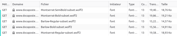
The site being proposed only in French and English, a Subset was created keeping only the Latin alphabet.
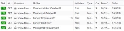
Original requests
Requests after Subset and conversion to woff2
The woff2 format offers an average of 30% more compression than the woff format and even more than other formats like ttf.
This change in format, combined with Subset, reduced the total weight of the fonts from just over 400 kb to just under 90 kb, a reduction of about 78%.
To go further
Best practices for fonts : overview of the different best practices related to fonts, mainly in order to improve the performance of a website
Choosing the right metric to assess its impact is critical in a sobriety approach.
We have validated the use of energy in our tools (https://greenspector.com/fr/pourquoi-devriez-vous-mesurer-la-consommation-energetique-de-votre-logiciel/ and https://greenspector.com/fr/methodologie-calcul-empreinte-environnementale/ for more details). We do however use and measure other metrics such as CPU. This metric can however be complex to measure and some tools or teams use other more technically accessible elements. The CPU is an interesting metric to measure the resource footprint on the terminal side. Indeed, we have carried out measurements on several hundred sites and it is clear that the CPU is the most important metric for analysing the impact of software. This is why all the models that use the data exchanged to calculate the impact of the terminal are not consistent. CPU-based models (such as the Power API) are preferred.
However, it is necessary to be rigorous in the analysis of this metric as there may be interpretation biases (Example of criticism on the CPU). The criticism must be even more important on the way to obtain this metric, and more particularly in the case of modelling the CPU. This is the case, for example, with methods for projecting the CPU into the web from DOM elements.
This is based on the assumption that the structure of the DOM has an impact on the resource consumption of the terminal. The more complex the dom, the more it needs to be processed by the browser, the more resources (CPU and RAM) it uses and the more environmental impact it creates.
Assuming that the hypothesis of a correlation between DOM complexity and environmental impact is valid, the metric often used is the number of elements. A DOM with many elements may be complex but not systematically so. To take into account the complexity of the DOM, it would be necessary to take into account the architecture of the DOM, in particular the depth, the type of node (not all nodes have the same impact on the browser…). The choice of the number of DOM elements is therefore debatable.
But is the choice of DOM complexity a viable assumption? There are several criticisms of this.
The DOM is a raw structure that is not sufficient for the browser to display the page. The style is used with the DOM to create the CSSOM, a complexity of the style can thus greatly impact the CSSOM, even with a simple DOM. Then the layout tree is a structure that will allow the display to be managed (typos, sizes…), this management is much more complex to handle for browsers.
A DOM can be modified after its creation. This is called reflow and repaint. The browser will recalculate the layout and other things. This can happen several times during loading and after loading. The depth of the DOM (and not the number of elements) can influence but not only: the loading and execution of JS code are to be taken into account.
Independently of the DOM, resource consumption can be impacted by various processes on the terminal. In particular, all the JS processing that will be executed when the page is loaded. This cost is currently the main cost on the CPU in the web. And you can have a DOM with 100 elements (not many) and a JS gas factory.
Graphics animations will increase resource consumption without necessarily impacting the DOM. Even if most of this processing is handled by the GPU, the resource impact is not negligible. We can also put in this category the launching of videos, podcasts (and more generally media files) and ads.
There are also many other sources of resource consumption: ungrouped network requests, memory leaks.
The use of the DOM should therefore be used with great care. It is best used as a software quality metric that indicates “clean HTML”. Reducing the number of DOM elements and simplifying the DOM structure may be a good sobriety practice but not a sobriety reduction or CO2 calculation KPI.
The e-commerce market in France in 2022 amounted to 146.7 billion euros in sales. This is a growth of 13.8% compared to 2021. Although the turnover (CA) of product sales is down compared to the previous year, the considerable increase (+36%) in the CA of service sales supports the overall growth of the e-commerce sector.
There were 2.3 billion transactions made on the internet in France in 2022, 6.5% more than in 2021. Inflation and the sale of services contributed to an increase in the average basket with 6.9% increase. It was on average 65 euros in 2022.
This article can be used as a comparison with the previous content made on the subject in 2022. The article focused on the e-commerce figures in 2021 and the ranking of m-commerce apps and websites in the 2nd quarter of 2021.
E-commerce refers to all transactions made on the Internet, while m-commerce refers to all types of purchases made on an e-commerce website with a mobile device. M-commerce is therefore a sub-category of e-commerce.
Selection method of websites and applications
For this new version, we based ourselves on the measurement of the 10 most visited m-commerce sites and applications in France (figures of the 4th quarter 2022 exposed by Fevad). Compared to the previous ranking, 2 players have appeared: Rakuten and Darty. It is eBay and ManoMano that are out of the top 10.
User path definition
After refining the selection of the 10 applications and websites to be measured, we went back to the path that was defined in last year’s article.
Implementation of Greenspector’s solution
We used our innovative solution to measure the environmental impact of different stages of the user journey. We ran the automated tests several times on a real device, in this case the Samsung Galaxy Note 8. We measured resource consumption (energy, memory, data) and response times. This data then allowed us to obtain the environmental impact of applications and websites. We explain it all in detail in our methodology.
Ranking of the environmental footprint of the 10 most visited m-commerce sites in France
The 3 sites with the least impact are : Leclerc, Leroy Merlin and Fnac. Compared to the article published last year, Cdiscount is back on the podium while the Fnac site is in the top 3 of the least impactful sites.
The 3 most impactful sites are: Amazon, Rakuten and Darty. The Amazon site is 2.2 times more impactful than the Leclerc site. The average carbon impact of these 10 websites is 1.09gEqCO2 for an average duration of the scenario (see methodology at the end of the article) of 1 minute and 58 seconds, which is the equivalent of 5 meters driven by light vehicle.
Projection of global carbon impacts over one month
For this projection, we consider that the share of global e-commerce traffic is 55% on mobile, 39% on PC and 6% on tablet (source). We also used the ADEME tool to project the equivalences.
With an average of 16.15 million monthly users and an average visit time of 5 minutes and 50 seconds, these 10 e-commerce sites have an average projected impact of 172 tons of CO2e per month (29 tons on mobiles, 139 tons on PCs, 4 tons on tablets). This is the equivalent of 20 times the circumference of the Earth covered by a light vehicle.
Impact projection for the most and least sober website
Concerning the best website of this ranking (Leclerc) for 14.84 million visits / month with a duration of 3 minutes, the total carbon impact would be 58 tons of EqCO2 per month (9 tons on mobile, 47 tons on PC and 1 ton on tablet). This is the equivalent of 6 times the circumference of the Earth travelled in a light vehicle. Concerning the worst website of this ranking (Amazon) for 38.29 million visits / month with a duration of 8 minutes, the carbon impact would be 690 tons of EqCO2 per month (121 tons on mobile, 553 tons on PC and 15 tons on tablet). This is equivalent to 79 times the circumference of the Earth travelled by light vehicle.
The fact that the Leclerc site is at the top of the ranking is mainly due to the low energy consumption of the product viewing and shopping cart viewing stages. Only the essential information is present on this search page (product name, price, availability). On the product page, there is the possibility to quickly add the product to the cart, and drop-down menus are proposed if the customer wants more information. This site is also the one that exchanges the least amount of data to complete the scenario.
By analyzing the product search results page with our measurement tool, we can see that many good practices are applied. There are few network exchanges with 19 HTTP requests and only one CSS file. The lazy-loading of images is applied.
The fact that the Amazon site is last in the ranking is explained by the search and product viewing stages. Indeed, this site consumes a lot of energy on these phases. The data exchange is also important. There are 2,62Mb of data exchanged for the search phase, and 5,85Mb of data exchanged for the visualization of the product sheet. During the search, a lot of information appears (indication “Suggestions”, “Sponsored”, “Amazon Choice” or “No. 1 in sales”, product name, rating, number of reviews, price, discount, delivery date). However, unlike last year, we notice that there are no more autoplay video ads on this phase. When viewing the product, a lot of information also appears (offers, delivery dates in case of free or accelerated delivery, product details, products frequently purchased together…). Moreover, the customer is obliged to scroll before being able to access and click on the “Add to cart” button.
Going into more detail on the product search page, there are a lot of network exchanges with 119 HTTP requests and 11 CSS files. These figures are up from last year’s 109 and 9 respectively. The lazy-loading of images is not applied, which implies that the images are not visible on the screen. This practice should be avoided, as the user will not necessarily scroll to these images.
Ranking of the environmental footprint of the 10 most visited m-commerce applications in France
The 3 applications with the least impact are: Carrefour, Darty and Veepee
The 3 most impactful applications are: Amazon, Aliexpress and Leroy Merlin We observe that the Amazon application has a carbon impact 3 times higher than the Carrefour application. The average carbon impact of these 10 applications is 0.81 gEqCO2 for an average scenario duration of 1 minute and 58 seconds, or the equivalent of 3 meters driven in a light vehicle.
The Carrefour application takes its place in the phases of viewing the product sheet and adding the product to the cart, which are lower in energy consumption and in the amount of data exchanged. On the add to cart stage, this can be explained by the fact that it does not automatically redirect to the cart and only generates a simple change on the add to cart button which becomes a quantity selector.
This year again Amazon is at the last place of the ranking. This result is explained once again by the product search and visualization phases, during which the application consumes a lot of energy. In terms of data exchanged we observe 4.73MB on the product visualization stage (against 0.05MB for Carrefour) and 4.15MB on the search stage (against 0.19MB for Carrefour).
Review of the study
This year again we observe that the impact is almost three times greater between the most sober platform and the one with the highest impact. To shop online, it is better to use applications than websites. Indeed, in the scenario studied, websites have on average 44% more impact. Only Leroy Merlin and Leclerc have a greater carbon impact on applications than on the web. We remind you that applications have an impact on their download and their updates. They are therefore to be preferred only in case of regular orders.
We would like to complete this assessment with an observation we made during our tests. Indeed, we observed that on some websites and applications the path could change or be altered. This is the case for Amazon which has implemented AB testing. This method allows the application and the website to vary the displays. For example, on the description of a product, the description can be different from one user to another.
In our case we encountered a phenomenon of change of path on the Amazon website. During a first test we were redirected directly to the shopping cart with the addition of the product to it. In a second test the next day we were no longer automatically redirected to the shopping cart page. Instead, we had to go to the shopping cart ourselves by clicking on the icon provided for this purpose.
Depending on the path, the site or application will consume more or less energy and exchange more or less data. AB testing is a feature used by many digital solutions in the world and we handle it in our path automation thanks to our GDSL language. In the case of our study we have of course taken care to base our measurements on a single path.
Results tables
Ranking of the 10 most visited websites in France
Sites web
url
Energy (mAh)
Exchanged Datas (Mo)
Impact carbone (gEqCO2)
Water Imprint (Litres)
Ground Imprint (cm2)
Scenario length (secondes)
Leclerc
e.leclerc
12,09
3,97
0,67
0,12
1,37
102,71
Leroy Merlin
leroymerlin.fr
14,85
4,19
0,79
0,14
1,67
123,27
Fnac
fnac.com
17,26
4,43
0,90
0,16
1,94
109,37
Cdiscount
https://cdiscount.com/
15,07
7,32
0,94
0,16
1,73
123,48
Carrefour
carrefour.fr
18,93
4,74
0,99
0,18
2,12
125,94
Aliexpress
https://fr.aliexpress.com/
18,35
6,75
1,05
0,18
2,08
128,71
Veepee
veepee.fr
17,00
14,27
1,32
0,20
2,03
118,11
Darty
https://www.darty.com/
22,19
9,98
1,35
0,23
2,54
117,84
Rakuten
https://fr.shopping.rakuten.com/
21,57
12,12
1,41
0,23
2,50
113,64
Amazon
amazon.fr
24,38
11,17
1,49
0,25
2,80
123,62
Ranking of the 10 most visited applications in France
Application
Version
Energy (mAh)
Data exchanged (Mo)
Impact carbone (gEqCO2)
Water Imprint (Litres)
Ground Imprint (cm2)
Length Scenario (secondes)
Carrefour
16.9.1
11,27
1,35
0,52
0,10
1,25
107,77
Darty
4.2.5
11,40
2,70
0,59
0,11
1,28
108,52
Veepee
5.43.1
9,87
5,70
0,65
0,11
1,15
102,25
Fnac
5.3.6
13,46
2,37
0,66
0,12
1,50
126,91
Cdiscount
1.62.0-twa
16,63
1,07
0,73
0,14
1,83
111,73
Leclerc
19.2.0
14,38
3,42
0,74
0,13
1,61
127,75
Rakuten
9.3.0
13,75
4,03
0,74
0,13
1,55
130,35
Leroy Merlin
8.11.2
13,30
8,85
0,93
0,15
1,56
119,27
Aliexpress
8.67.2
16,17
9,12
1,06
0,17
1,88
120,11
Amazon
24.6.0.100
21,59
14,29
1,51
0,24
2,53
130,15
The selection is based on applications and sites where we can define a common path. We therefore discarded some sites and apps that presented a path too different from the one displayed below. Example: Booking.com. We also discarded 2 solutions based on the purchase between individuals which are Leboncoin and Vinted. For each site and each application, measured on a Samsung Galaxy Note 8 (Android 9), the measurements were made from scripts using GDSL (Greenspector Domain-Specific Language). This language allows to automate actions to be performed on a phone. The measurements were performed between April 10 and 19, 2023.
The scenario is defined based on the user’s path to purchase a product. We do not go to the payment stage. We stop at the product visualization.
Details of the common scenario for the 20 measures:
-Launching the site or application -Pause for 30 seconds on the home page -Search for a product using the search bar, then view the products offered -Select a product, then view its characteristics (details, reviews…) -Add the product to the cart -Pause for 30 seconds on the shopping cart page
Each measurement is the average of 5 homogeneous measurements (with a low standard deviation). The consumptions measured on the given smartphone according to a wifi type network can be different on a laptop with a wired network for example. For each iteration on the websites, the cache is emptied beforehand.
Côté projection de l’empreinte, les paramètres pris en compte pour réaliser ces classements sont :
Greenspector may use cookies to improve your experience. We are careful to only collect essential information to better understand your use of our website.
This website uses cookies to improve your experience while you navigate through the website. Out of these, the cookies that are categorized as necessary are stored on your browser as they are essential for the working of basic functionalities of the website. We also use third-party cookies that help us analyze and understand how you use this website. These cookies will be stored in your browser only with your consent. You also have the option to opt-out of these cookies. But opting out of some of these cookies may affect your browsing experience.